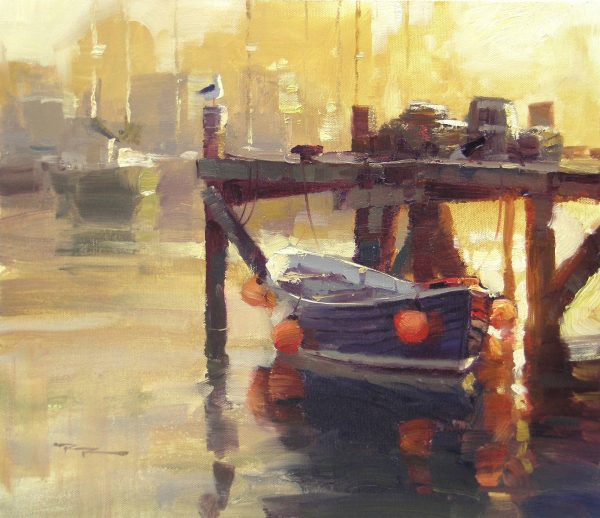
In this chapter, I invite you to explore the captivating world of sunsets, a subject that has fascinated artists for centuries with its vibrant colors and fleeting beauty. As we delve into the art of painting sunsets, you'll discover that capturing their essence is both a rewarding challenge and a profound learning experience. One of the key lessons here is recognizing that high chroma colors in sunsets often appear to have a higher value than they actually do. This can lead to the common mistake of painting them lighter than necessary, resulting in a chalky appearance. To maintain the vibrancy and depth of your sunset colors, it's crucial to avoid using your lightest value too early in the painting process. Remember, those bright reds, while striking, have a fairly dark value and can disrupt the harmony of your painting if not carefully balanced with the surrounding lighter values. Through this journey, you'll learn to master the delicate interplay of light and color, transforming your canvas into a breathtaking sunset that captures the magic of the moment.
This guide accompanies the full video lesson. The lesson includes the complete narrated video, the printable PDF chapter, and personalised critique support.
Recognize that high chroma colors in sunsets often appear to have higher value than they actually do. This can lead to painting them lighter than necessary, resulting in a chalky appearance.
Reserve Lightest Values
Avoid using your lightest value too early in the painting process. This helps maintain the vibrancy and depth of the sunset colors without making them appear washed out.
Be Cautious with Bright Reds
Remember that bright reds have a fairly dark value. Adding them to a sunset can disrupt the harmony if not carefully balanced with the surrounding lighter values.
Pro tipHold off using your lightest value until the last possible moment to maintain color vibrancy.
Embark on your sunset painting journey by understanding the interplay of values and colors. Begin with a focus on maintaining the vibrancy of your colors by reserving your lightest values for the final touches. This will help you avoid a chalky appearance and preserve the depth of your sunset. As you progress, pay attention to the gradients in the sky, both vertical and radial, to capture the natural transition of light and warmth.
Incorporate the dynamic relationship between warm light and cool shadows, especially when painting clouds. This contrast will add depth and drama to your scene. Be mindful of the natural saturation levels in your painting to avoid an exaggerated or gaudy look. Instead, aim for a balanced representation that reflects the true beauty of a sunset.
Finally, let real sunsets guide your palette choices. Avoid symbolic painting by observing the subtle greys and lower contrasts in nature. Use clouds strategically to add excitement without overworking them, and be cautious with color mixing to maintain the vibrancy of your hues. With these techniques, you can create a stunning and realistic sunset painting.
Points to remember
Hold off using your lightest value until the last possible moment.
Consider both vertical and radial gradients when painting skies.
Balance warm light and cool shadows to capture the sunset's beauty.
Avoid making grey colors too vibrant to maintain natural beauty.
Stop painting from memory; study real sunsets for true colors.
Use clouds to add drama, but avoid overworking them.
Avoid mixing warm and cool colors directly to maintain vibrant hues.