
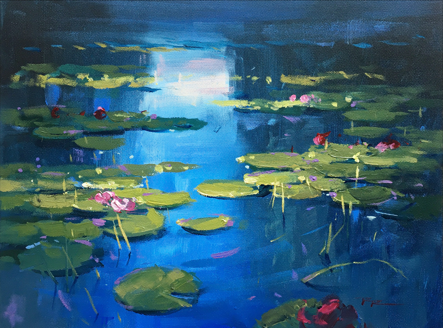
Find your peace painting these water lilies inspired by Monet. Follow me one brushstroke at a time as I take you through the process of creating an acrylic painting which has all the hallmarks of an oil painting. Learn to create large gradations, soft edged brushwork and sparkling impasto highlights. Good design, accurate drawing, passionate brushwork and a variety of fun techniques are all demonstrated in the video.
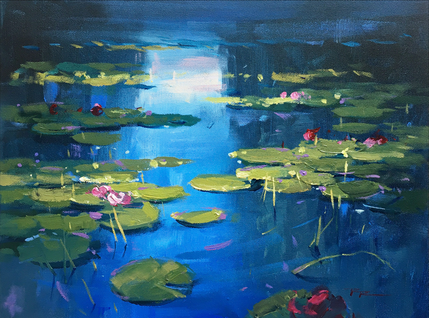
Water Lilies
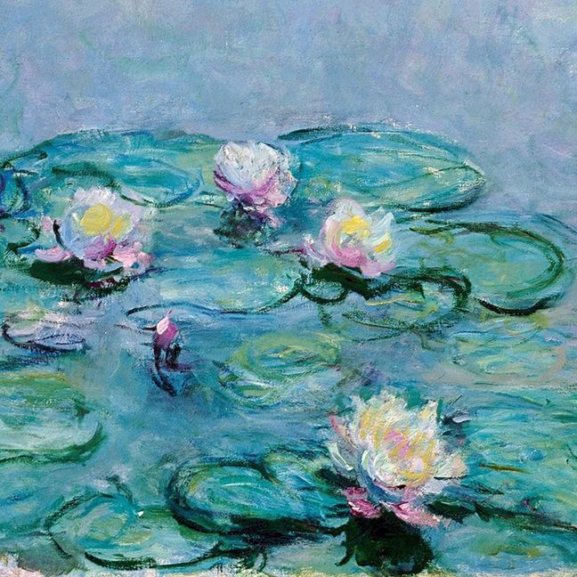
Monet
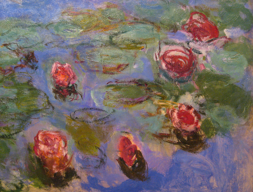
Monet
Monet
Monet
Monet
Monet
Monet
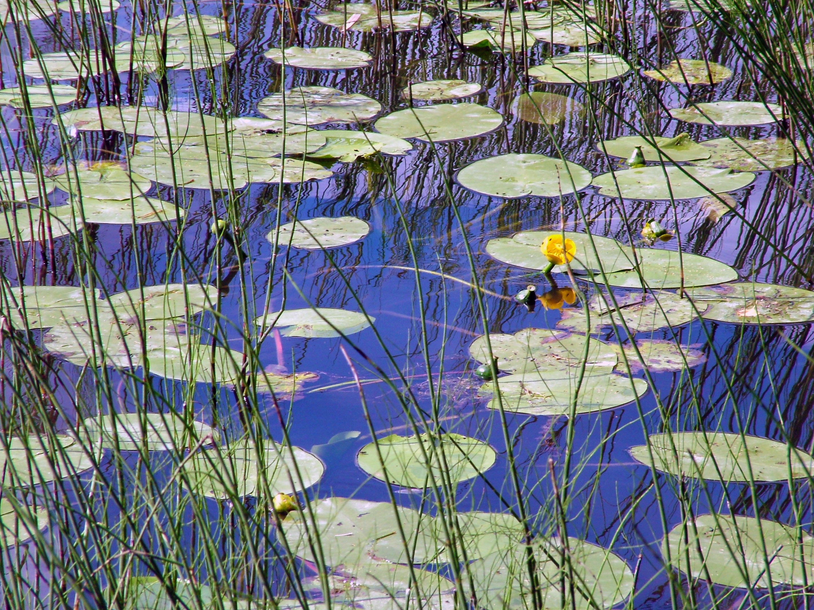
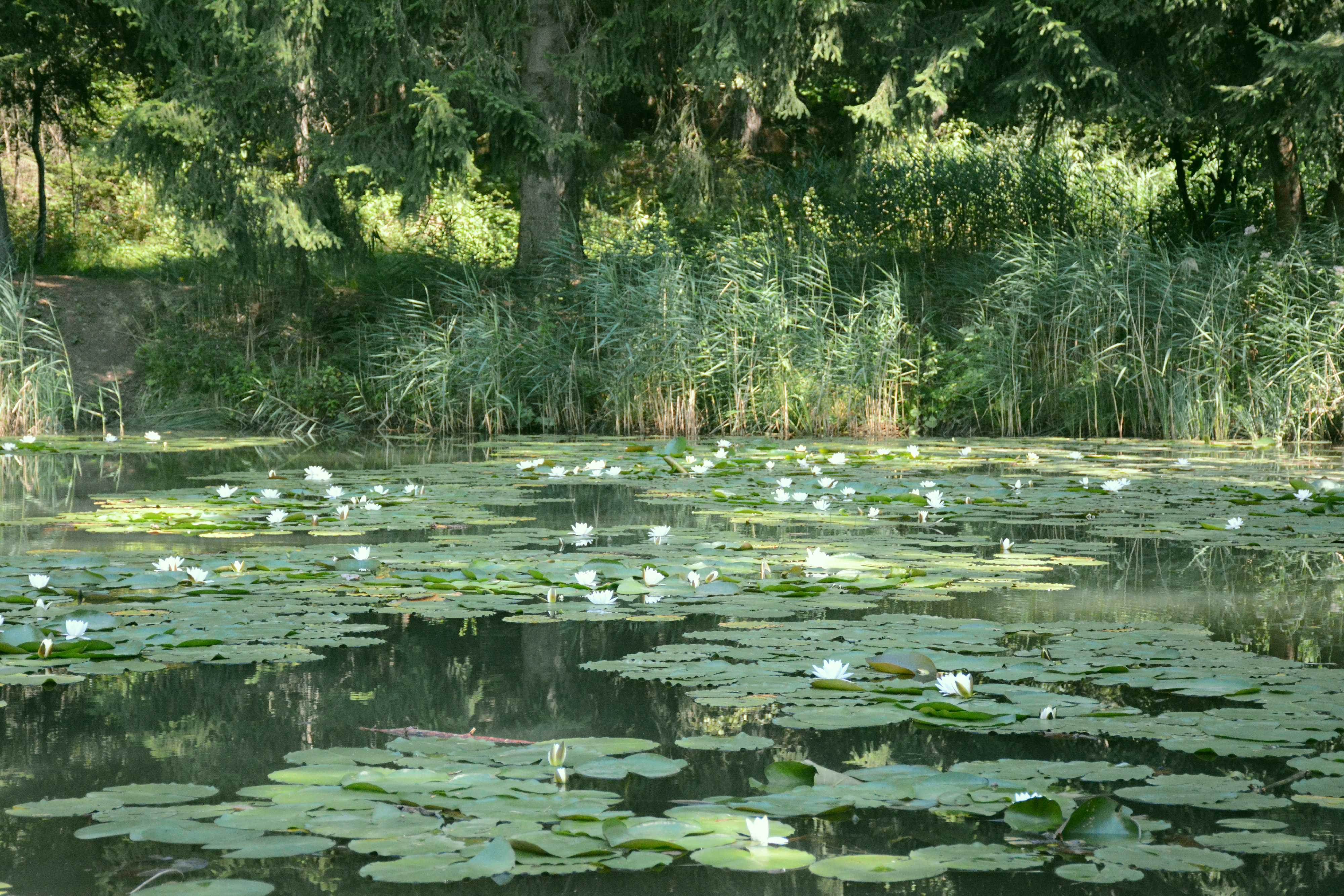
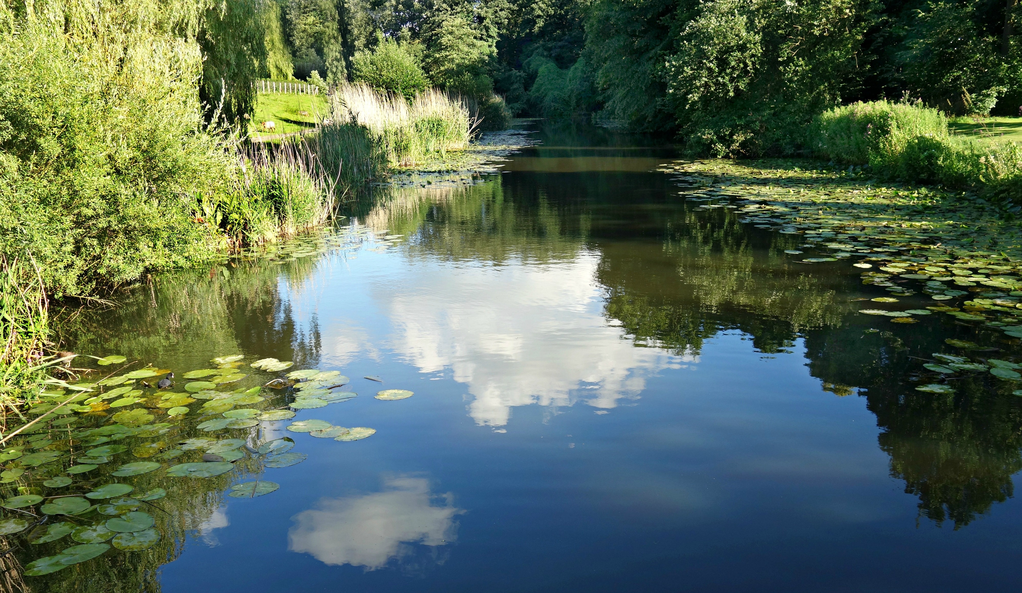
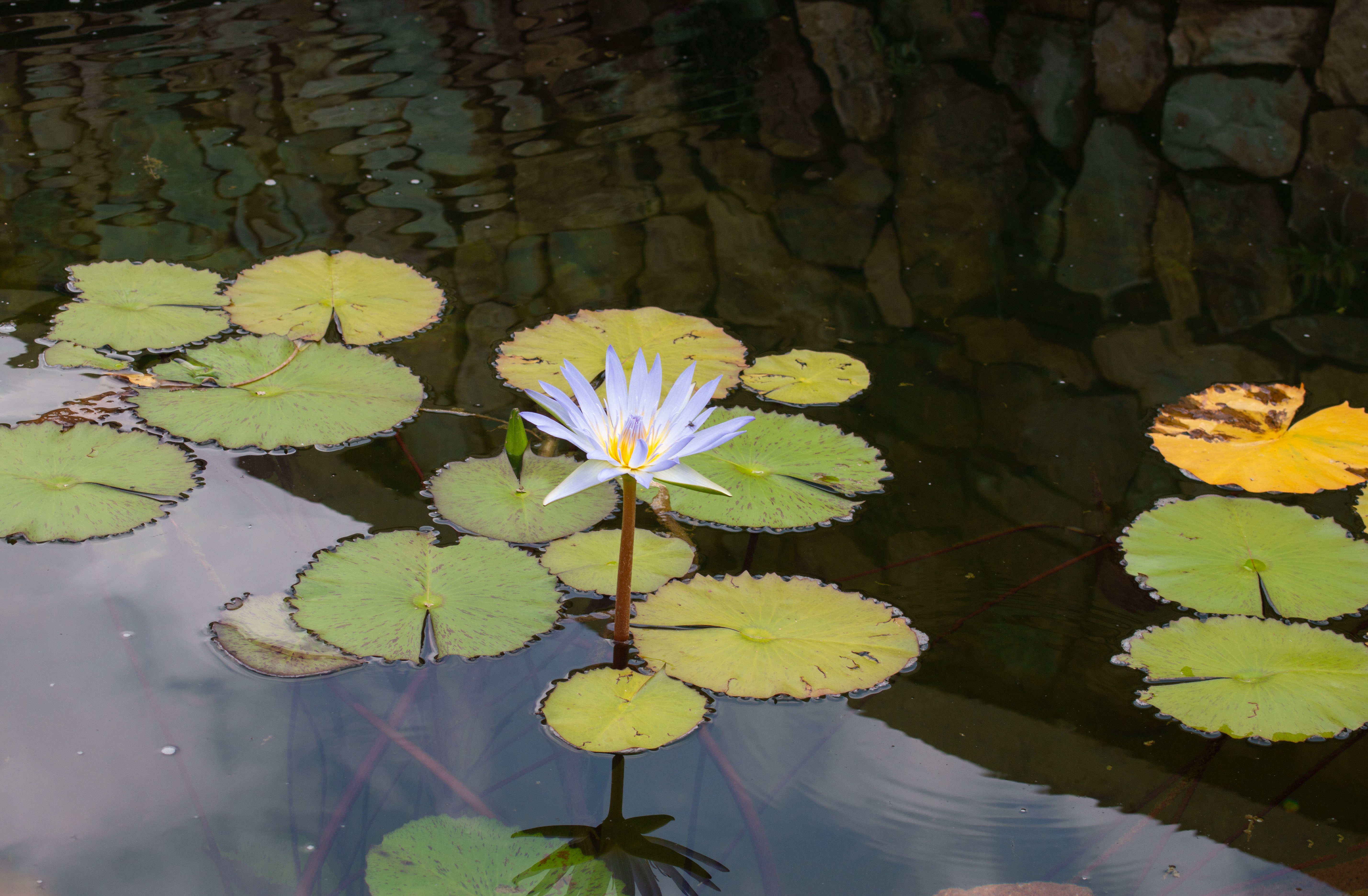
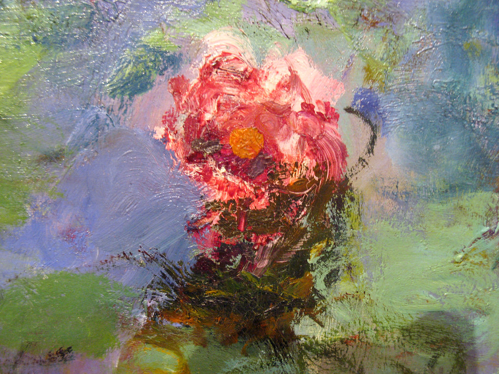
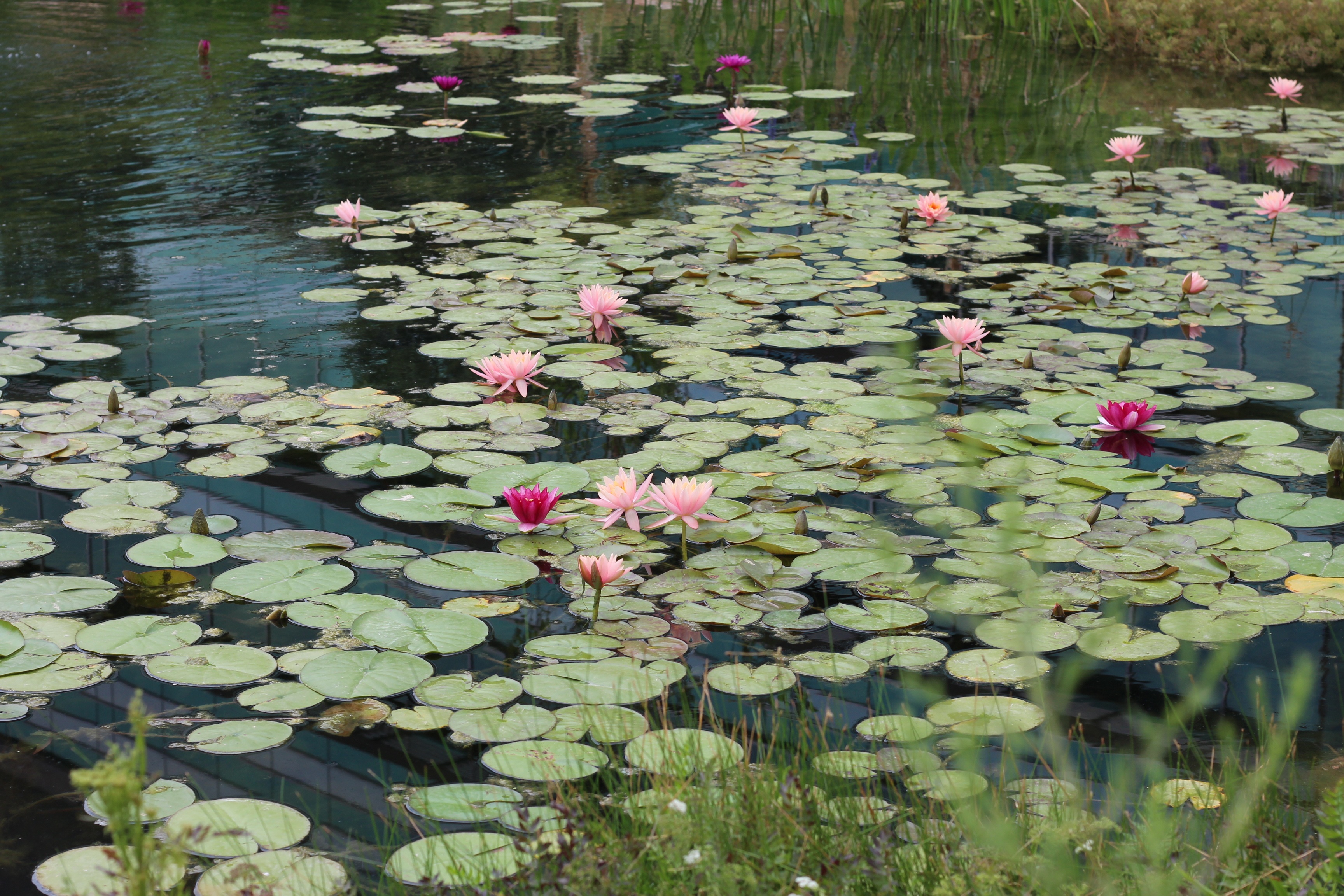
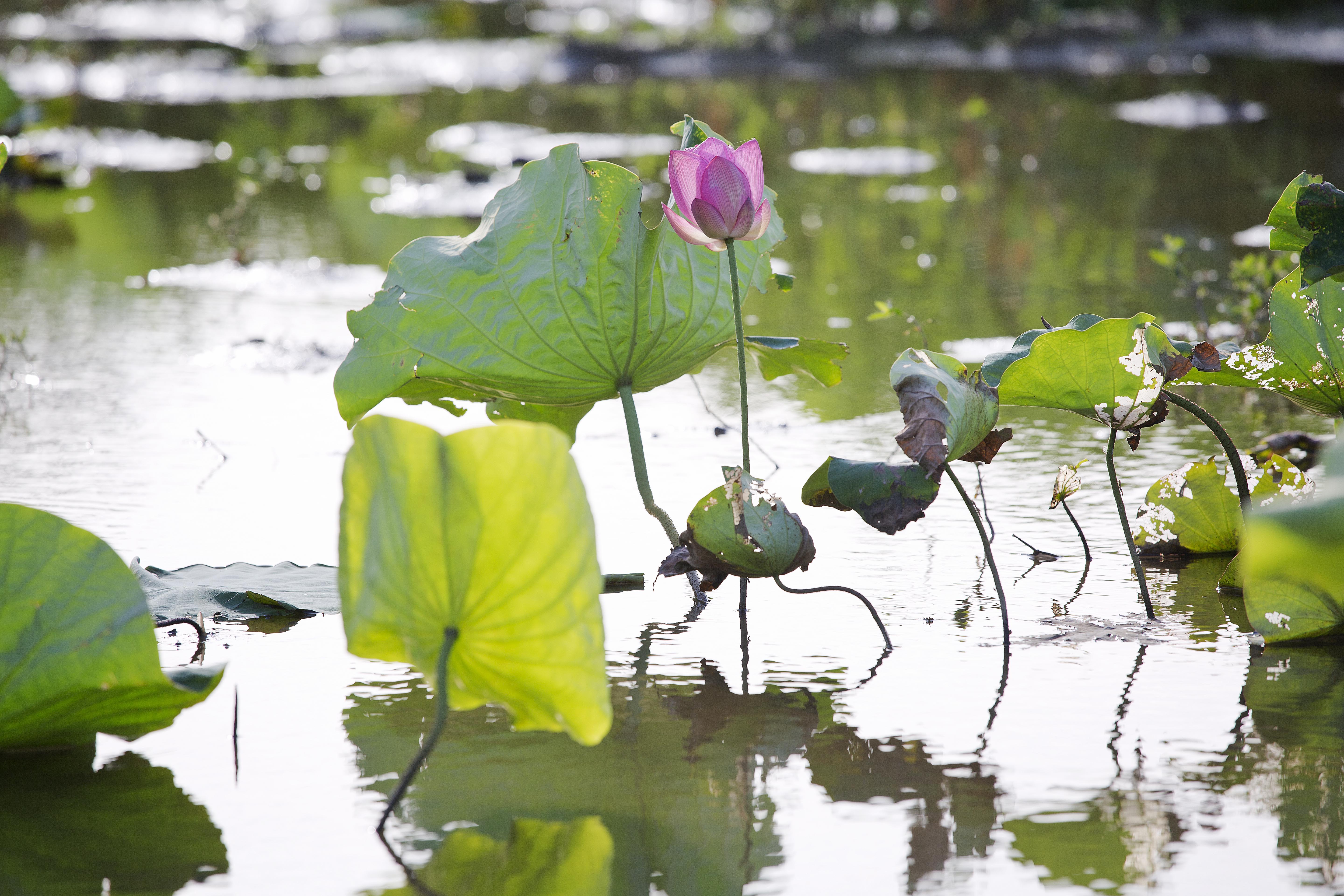
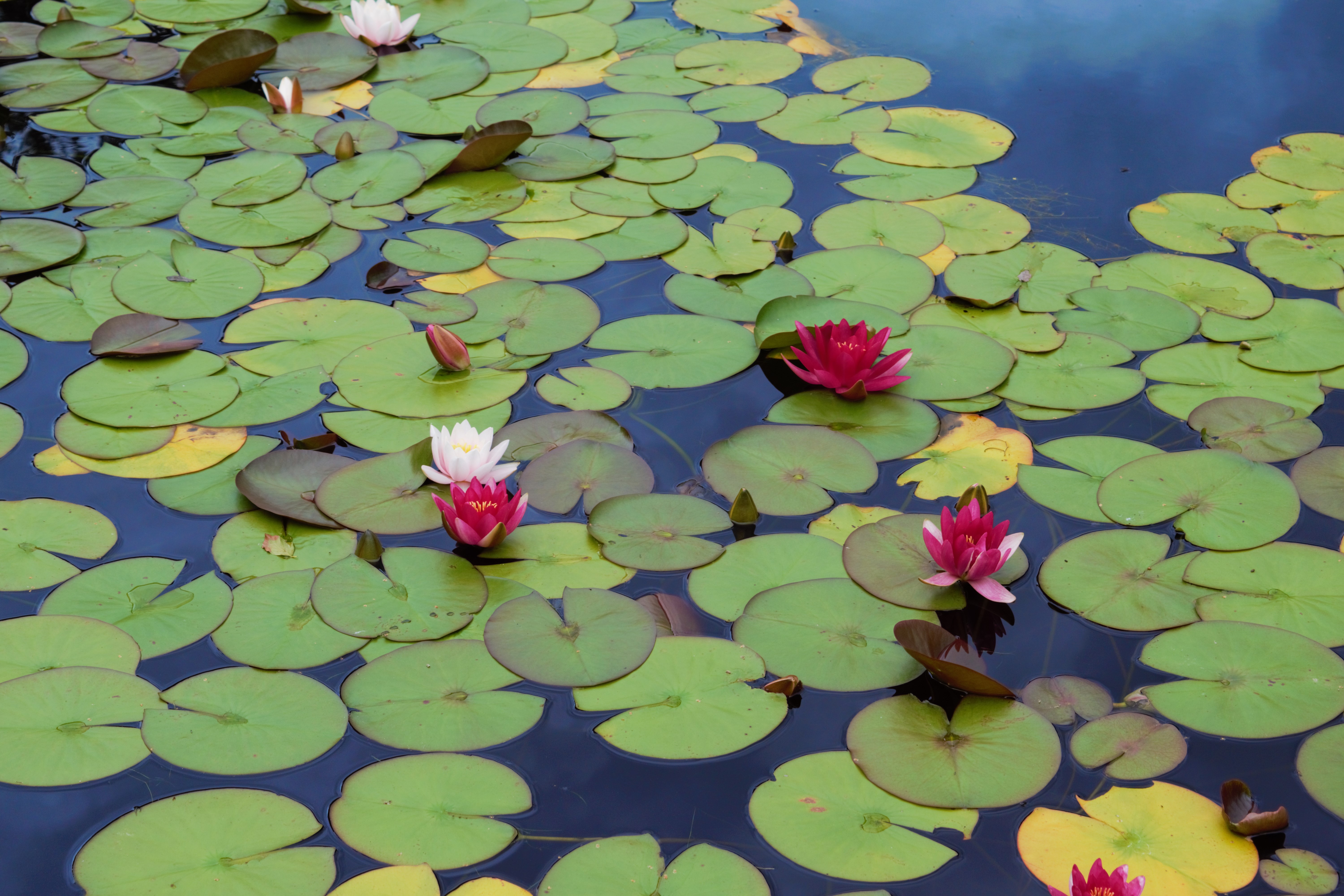
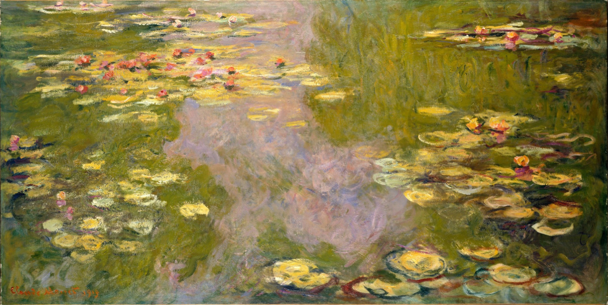
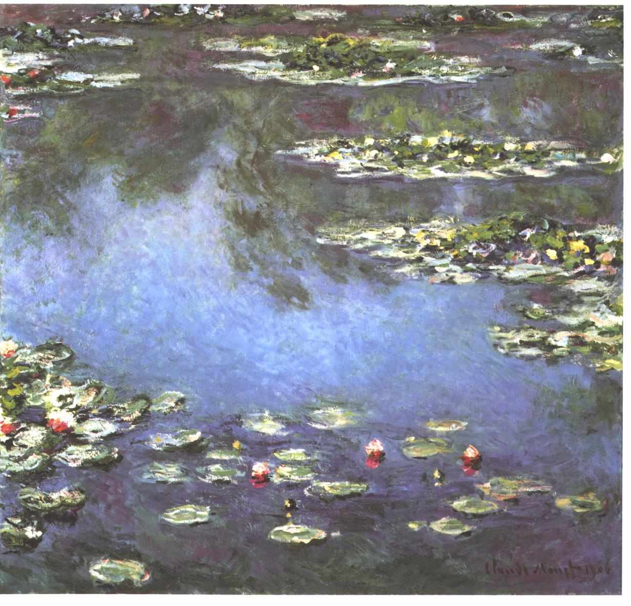
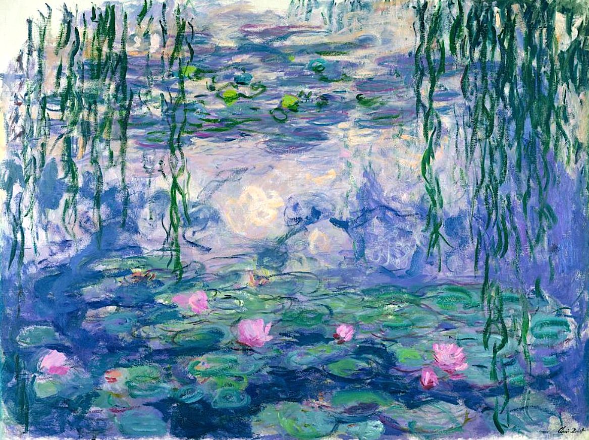
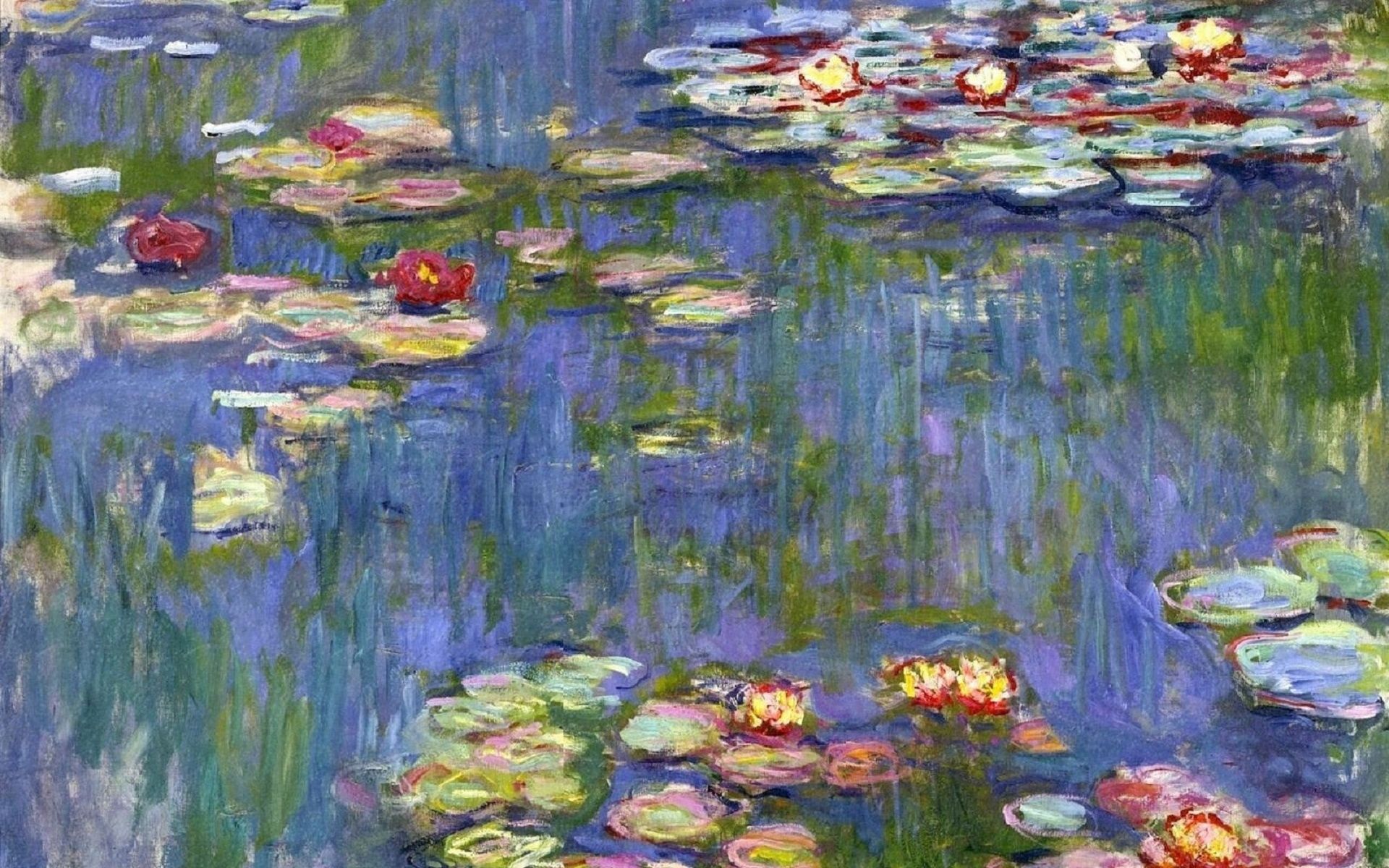
Welcome to the Water Lilies workshop, inspired by Monet yet grounded in a clear, modern process you can follow brushstroke by brushstroke. Above you’ll find 14 reference photos of the pond, pads and reflections—use them to fine-tune your composition, compare values, and study colour temperature shifts in the water. We’ll paint in acrylics with the lush character of oils, exploring large gradations, soft-edged brushwork, and sparkling impasto highlights. Along the way I’ll point out the design decisions that make this subject sing: the dance between cool sky-reflections and warm lily pads, the rhythm of shapes, and the way lost and found edges create a sense of depth and tranquility.
We begin with a simple block-in to establish the big shapes and the value structure of the water and reflections. Use a big brush and cover the canvas swiftly focusing on creating soft edges. If you are using oils, use just enough paint to cover the canvas so that you can't see the canvas through it.

Stage 1: Blocking in the water and reflections.
Next, I develop the water plane with broad, horizontal gradations to suggest depth and a gentle breeze. Using a larger brush, I blend cool blues into violets and muted greens, carefully controlling colour temperature to separate near from far. Edges remain soft, especially where reflections dissolve into shadow. Use only horizontal and vertical strokes.

Stage 2: Establishing the water’s gradations and reflective colour with soft brushwork.
With the water set, we turn to the lily pads, organising them by value and hue rather than by individual detail. I mix families of greens—cooler, bluer notes for shadowed pads; warmer, yellower mixes for those catching light. Brushwork becomes more intentional and the synthetic flat brush is smaller, but not small: a mix of soft edges where pads sink into reflections and sharper edges for focal pads that come forward.

Stage 3: Building colour families on the pads, balancing soft and firm edges to create depth and focus.
Now we enrich the surface with layered passes: I reinforce dark accents beneath key pads to anchor them, then vary the pad shapes to avoid repetition—odd groupings, overlapping ovals, and a few lost edges to breathe. This is where design choices shine: repeating motifs with variation, directing the eye in a gentle S-curve through the composition, and keeping the value hierarchy intact.

Stage 4: Strengthening darks for structure and depth.
Finally, we lay in the impasto highlights—reserved for the brightest sparkles on petals and tiny sun-kissed edges of pads. I switch to a smaller bristle or palette knife and place these notes sparingly; less is more. A few crisp accents near the focal point, subtle temperature shifts in the highlights, and a last pass softening any distracting edges bring the painting together. In the video, I’ll guide you through brush choice, paint consistency, and timing so your acrylics behave like oils. Take your time, enjoy the quiet rhythm of the process, and don’t be afraid to experiment—these techniques will serve you well whether you paint in acrylics or oils.

Stage 5: Final impasto sparkle, refined edges, and small temperature shifts to complete the Monet-inspired mood.
Here are some of the wonderful student paintings from this workshop, along with my critiques.
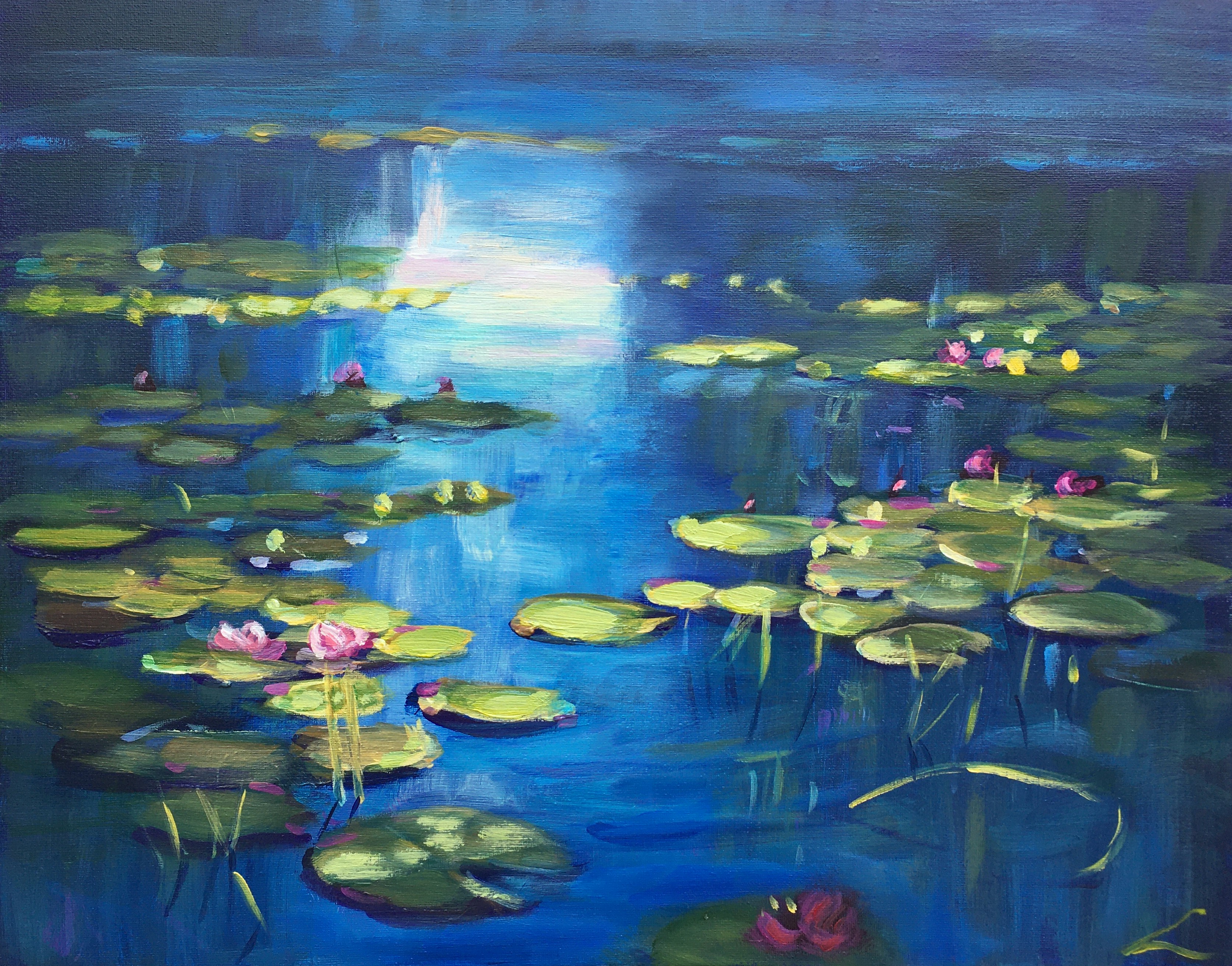
"Water Lilies"
Artist: Elena Sokolova
Hi Elena, what a serene, luminous piece—you’ve really captured that cool, tranquil pond light, and the soft glazes give the water a lovely sense of depth and movement. I especially enjoy the lost-and-found edges on the lily pads and the delicate pinks sitting against those deep blues!
I'd like to see you use a finer rigger or long dagger brush for those thin details in the stalks, the key skill there is to get the paint just thin enough (and to load the brush smoothly) so that it can glide off the brush in a single crisp stroke. Beautiful work - keep exploring those subtle temperature shifts and edge variety!
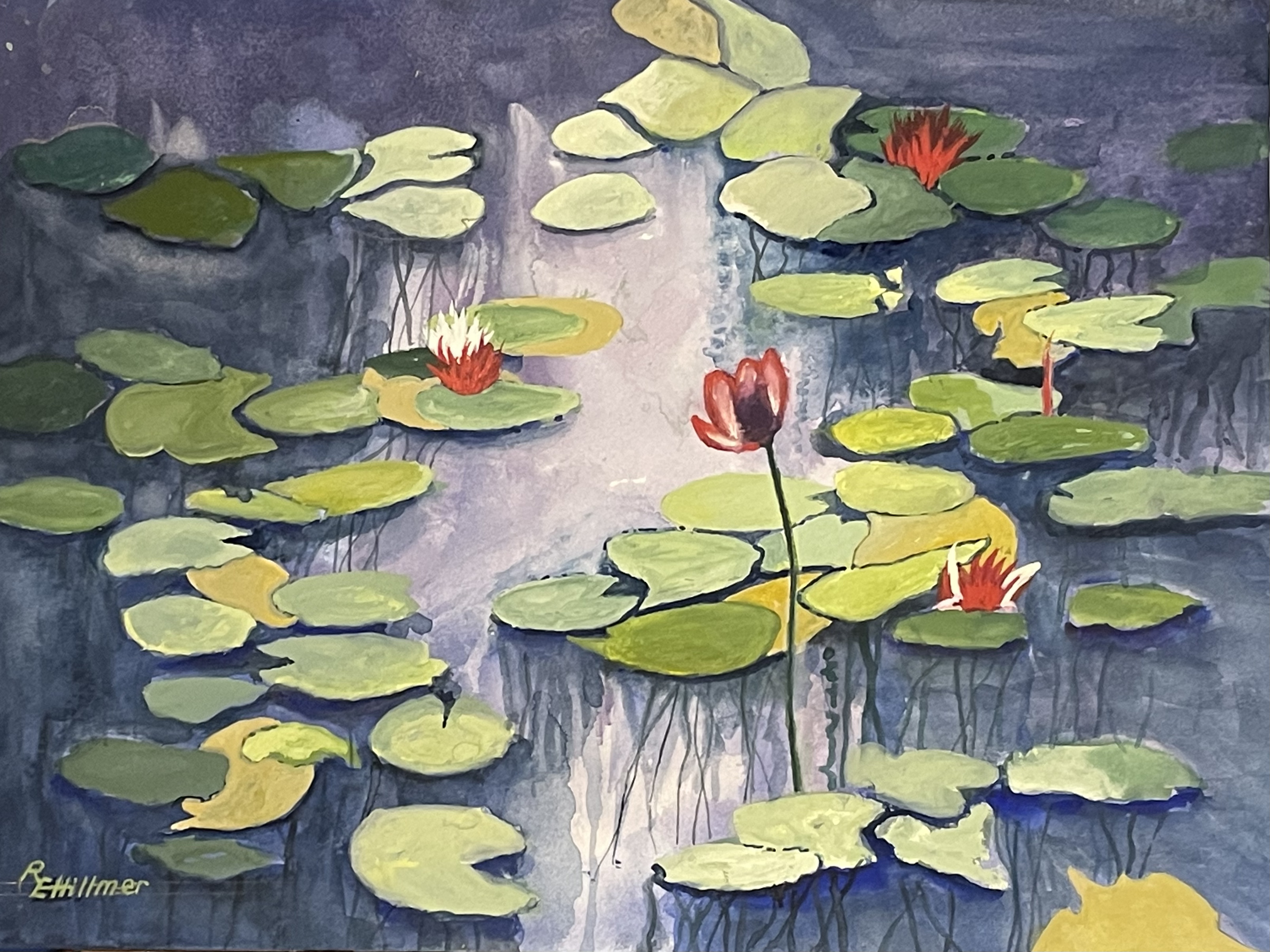
"Water Lilies" Watercolour & Gouache by Eric Hillmer, Toronto, ON, Canada
Artist: Eric Hillmer
Hi Eric, this has a lovely, tranquil mood and a strong sense of light—those warm reds popping against the cool violets and blues are doing great focal-point work! To push this further, try broadening the value structure: deepen a few of the darkest darks in the water (particularly around the outside of the scene) to increase depth and make the lit pads feel brighter.
Consider softening more of the pad edges in the distance and reserving your crispest, hardest edges for the main red bloom and its nearest pads—right now many edges compete equally. You could also glaze a subtle, cooler note into the background pads to help them recede, and introduce a touch of reflected red into adjacent pads to harmonize the focal colour. Your most distant pads need flattening out to help create more depth.
Lovely work—just a bit more edge control and value contrast will make this sing!
.jpg)
Water Lilies oil on canvas 12x14
Artist: Nancy Newton
Lovely mood here, Nancy—the cool, velvety blues and that luminous vertical reflection create a serene pathway of light, and your soft edges in the water feel spot on.
Your lilypad ellipses are well drawn for their positions, and you have a good amount of variety, thoughtfully done. Very succinct brushwork without over-working it - nice.
Beautiful work - keep leaning into that poetic light!
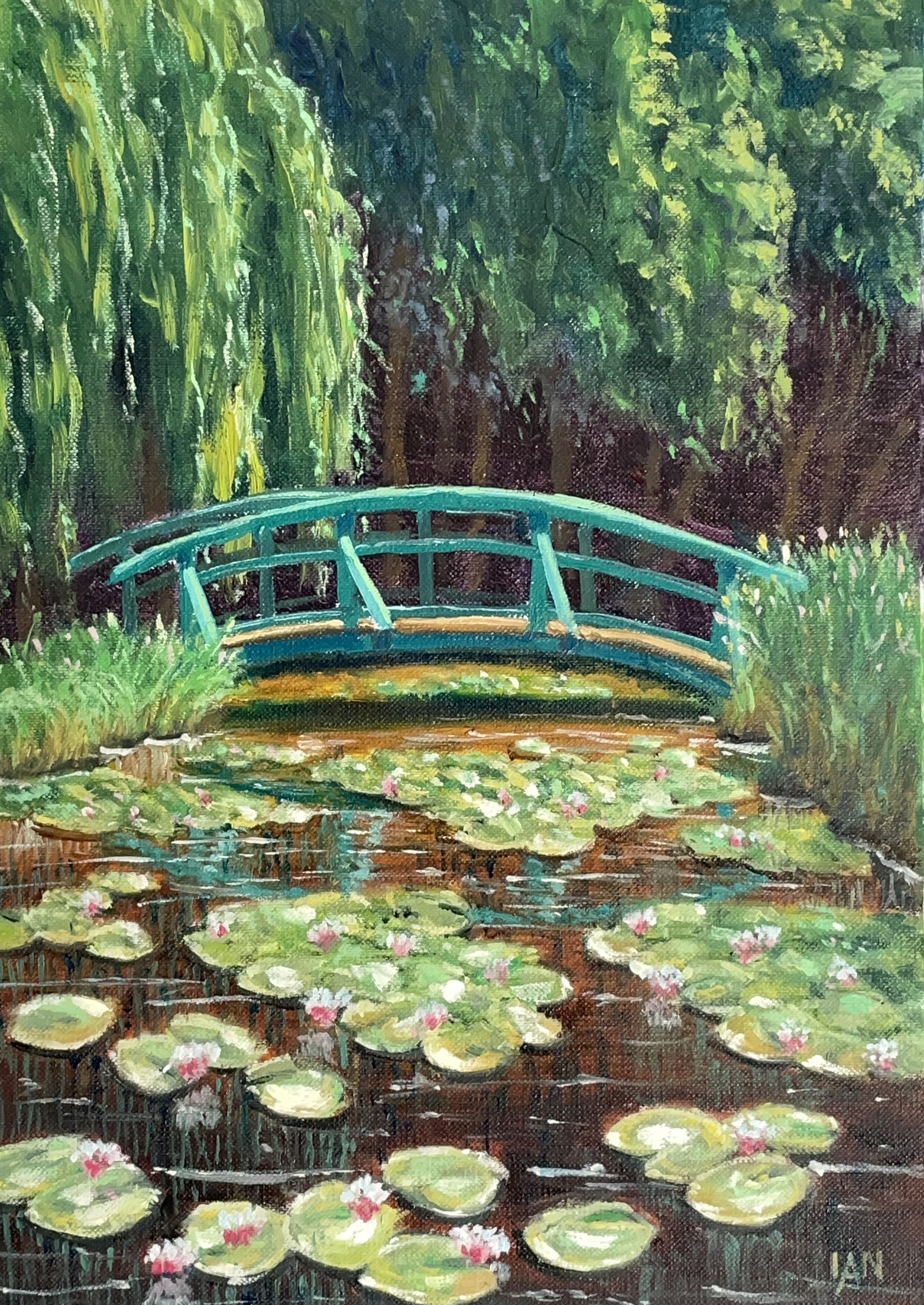
Monet's lily pond
Artist: Ian States
Hi Ian, lovely job capturing the serenity of the pond - the soft willows, the dappled reflections, and those delicate pinks on the lilies all sing, and Monet's turquoise bridge makes a strong, cheerful focal point. I think Monet would approve! To deepen the space, consider pushing the shadows under the background trees a touch cooler in contrast to the warmth in the foreground water. Your lilypad ellipses are working well, but I'd like to see those further back flattening out a little more. The effects of distance on shapes and colours in a landscape get exponentially more pronounced the closer it is to the horizon - it's not a linear progression.
Said another way, there's more distance contained within one inch down from the horizon than there is from the bottom of that inch to your feet. It helps me to remember that when painting landscapes.
Beautiful work - I can feel the sunlight!
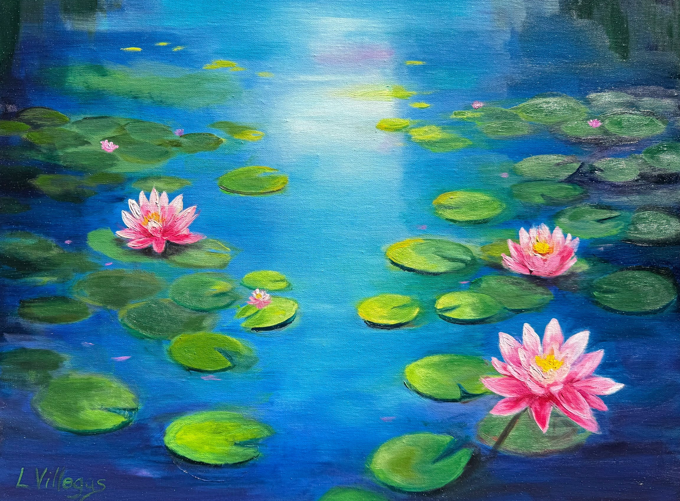
Water Lilies by Louise Villegas - 16 x 20 Oil. I used PaintyBot for some help!
Artist: Louise Villegas
Hi Louise, lovely work—those pink blooms sitting on that cool, luminous water are instantly engaging, and I like the soft gradation from dark to light up the canvas. The warm-cool play between the lilypads (cool greens in shadow, warmer yellow-greens catching light) feels convincing, and your edge variety on those is spot on - softer in the distance. I recommend trying to paint with fewer brushstrokes to avoid the paint surface looking overworked and softened. Then you can add some much thicker paint in the foreground to add more interest and also help create depth by contrasting with the smoother paint in the back of the scene. Beautiful, serene piece - well done!
Congratulations and thanks to everyone who entered a painting into the workshop. Great work!
Get the full lesson here: https://mypaintingclub.com/lessons/217-Water-Lilies
- Richard.
Login to your account to post a comment.