
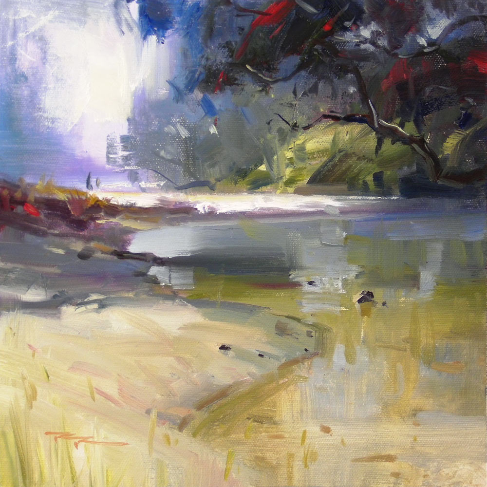
Loosen up your painting.
A good painting, no matter what style or subject, is an interesting collection of shapes, colours, textures and lines. That’s what it all boils down to. All painters fall on a line somewhere between pure abstraction and super realism.
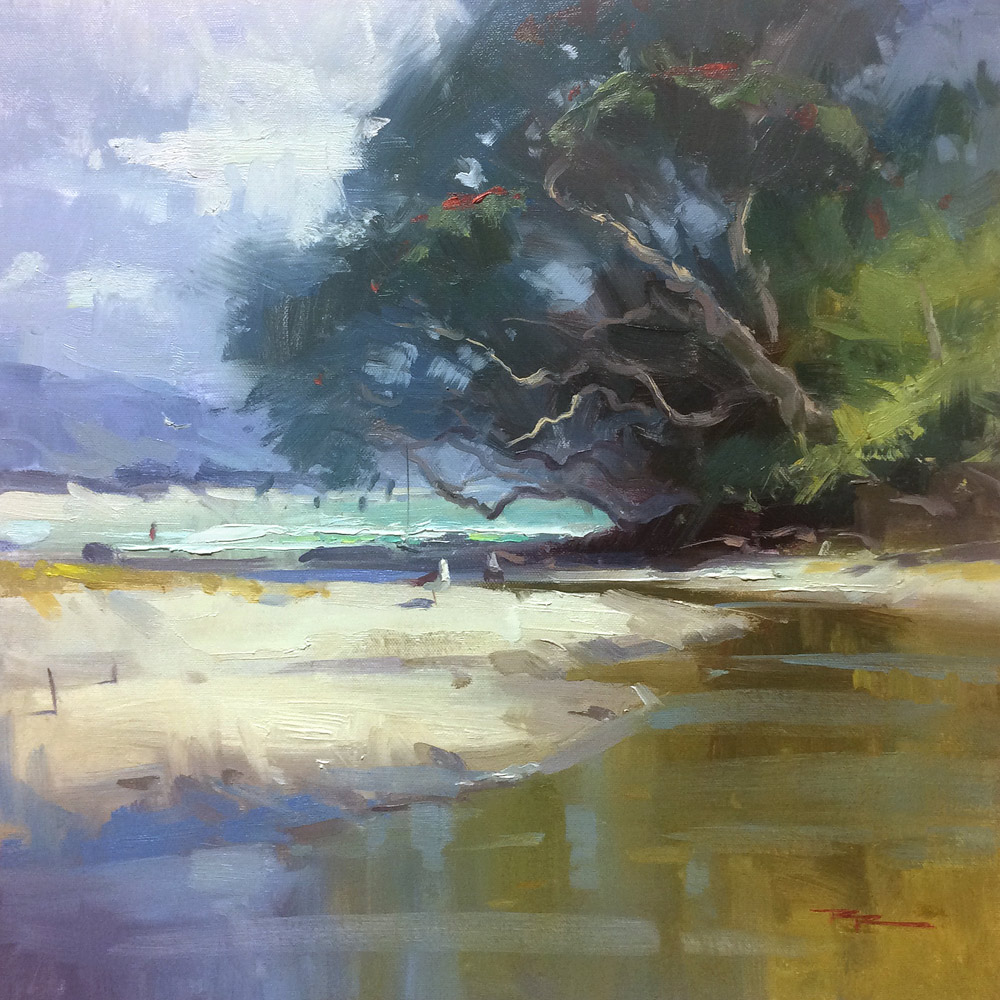
"Summer at the Cove" 15x15" Oil on Canvas by Richard Robinson
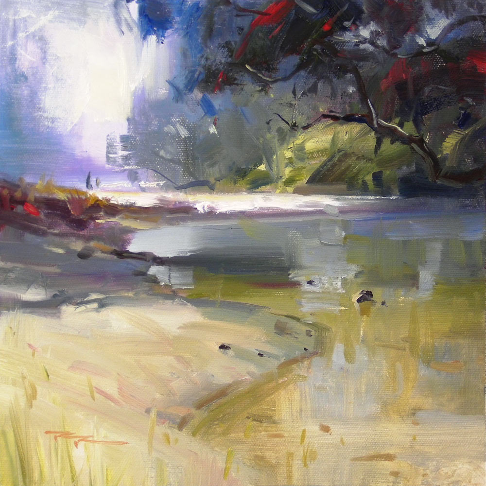
"Waipu Cove" 11x11" Oil on Canvas by Richard Robinson
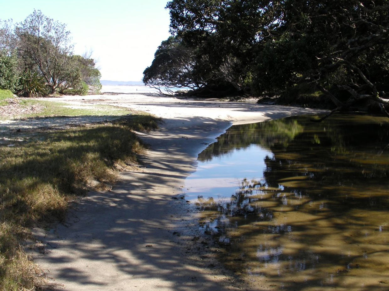
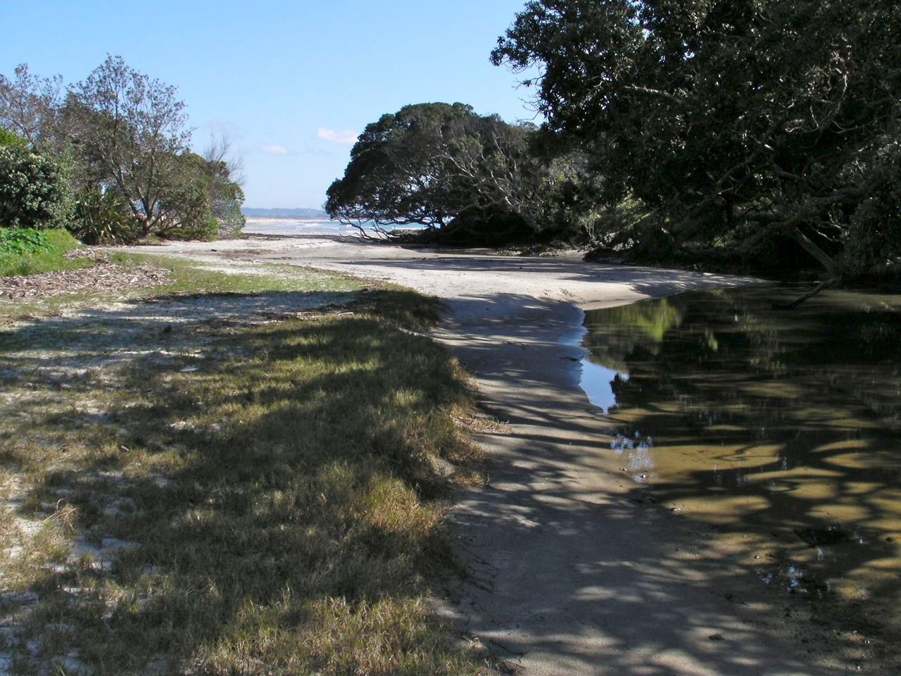
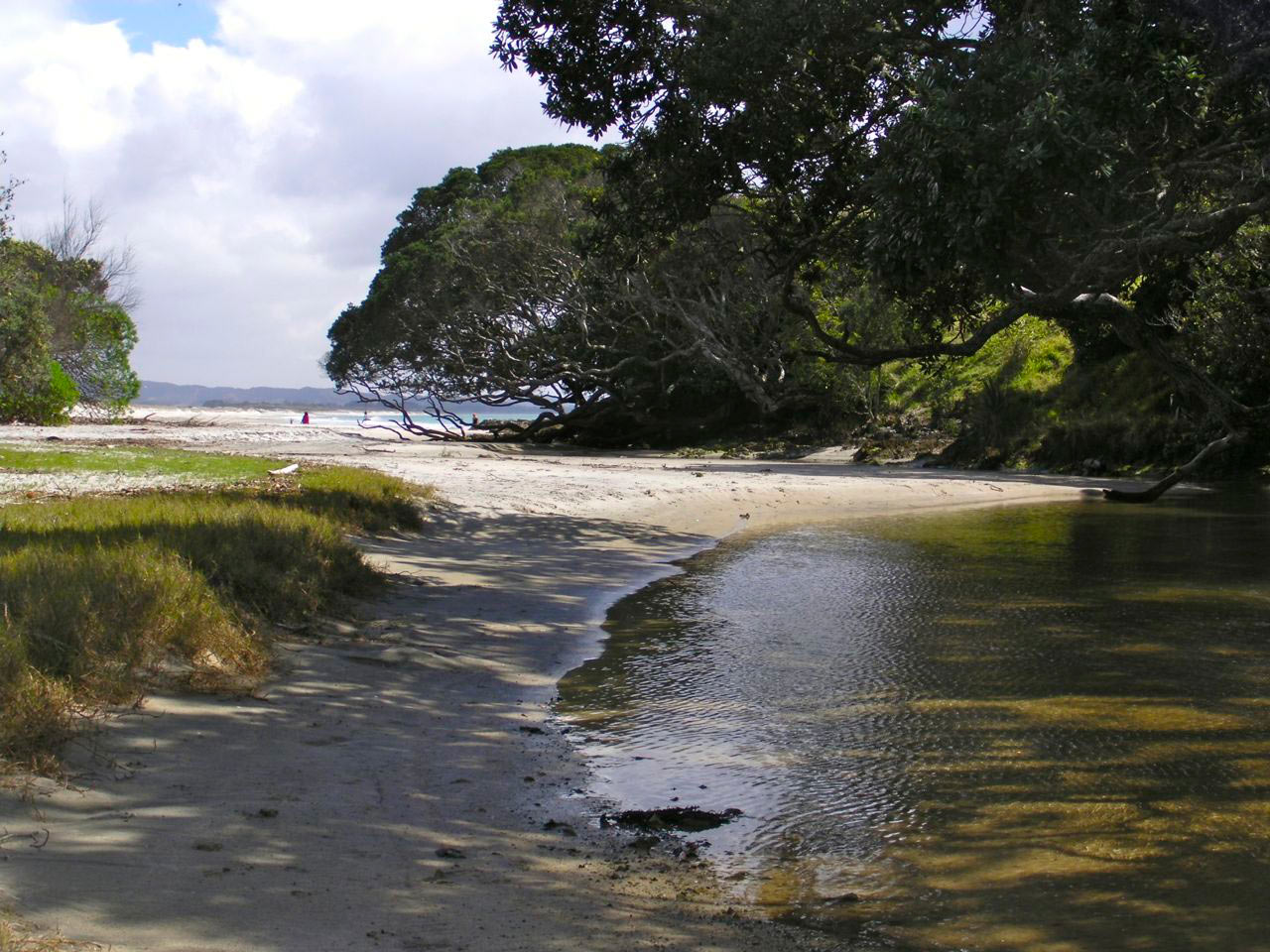
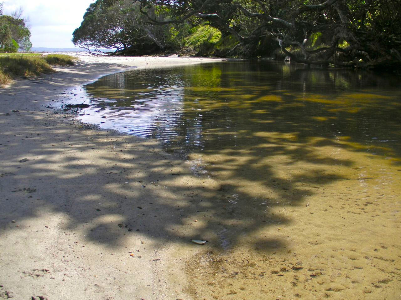
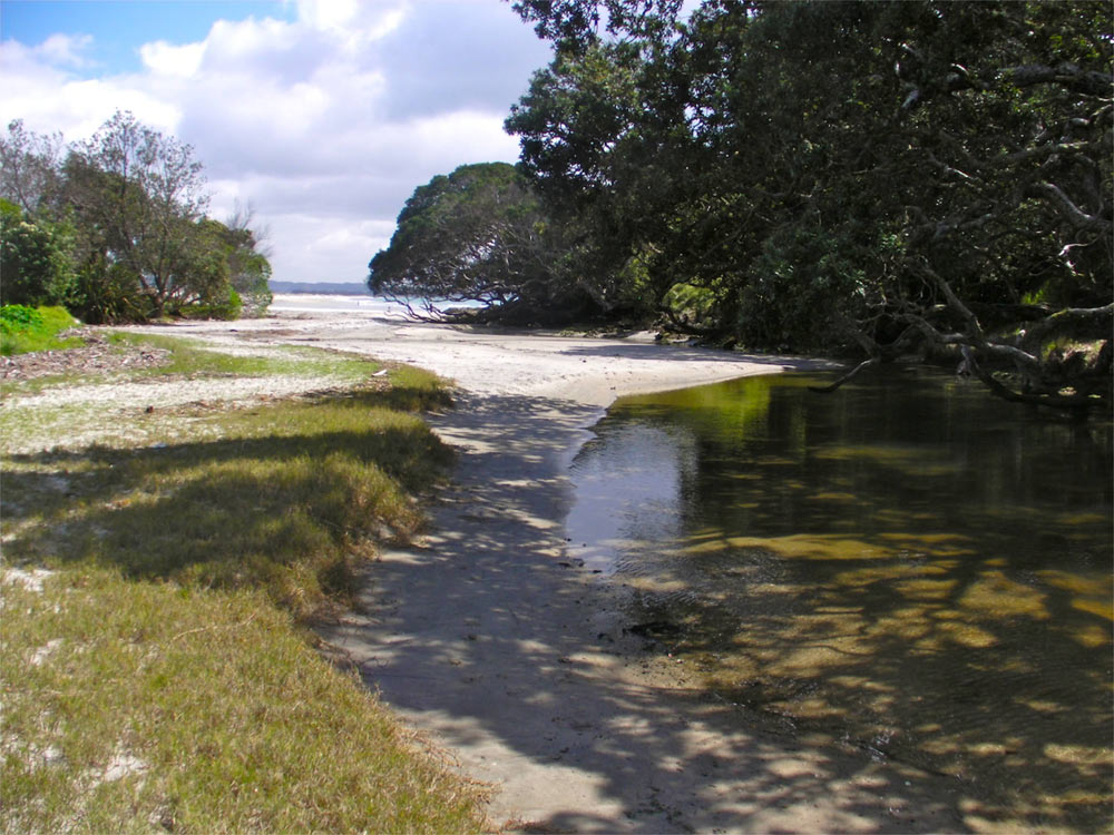
Kia ora from New Zealand! In this workshop we’re loosening the reigns and inviting a bit of beautiful chaos into the studio. No matter the subject, a strong painting is ultimately a lively arrangement of shape, value, colour temperature, edges, and texture. In this lesson we’ll explore how far we can push a realist scene toward abstraction without losing its integrity.
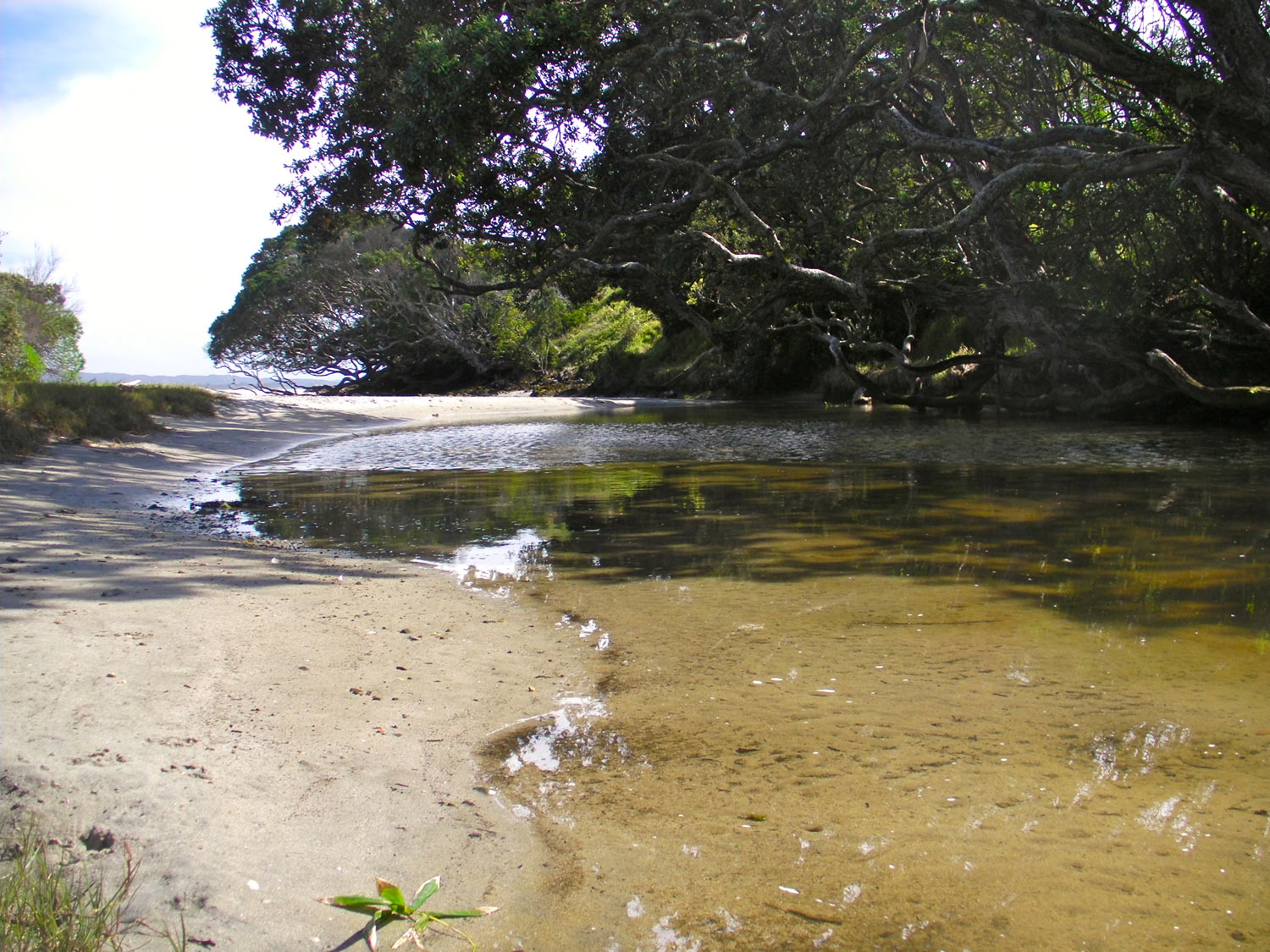
I’ll guide you step by step in the video, and you can either paint along with my scene or use the six reference photos above to design your own composition. Our core aim is to see in large colour masses, simplify early, and then play—really play—with the paint through impasto, glazing, scumbling, knife work, and lost-and-found edges.
We’ll begin with a loose block-in to establish the big shapes and the overall composition. Think of each object as a chunk of coloured play dough—malleable, movable, and open to simplification. I start with a thinned mix (odourless mineral spirits for oils, water for acrylics) to map the silhouette of the main masses, reserving detail for much later. Use a broad brush, keep your wrist relaxed, and let your marks overlap. You’re designing the stage on which the rest of the painting will perform, so aim for an elegant balance of positive and negative shapes and a clear focal pathway. Don’t worry about perfection; clarity and energy are the goal.

Starting the painting
Next we nail the value structure, because values carry the image even when colour gets wild. I group shadows into two or three large families and do the same with the lights, paying close attention to edge quality where forms turn away from the light. Squint to eliminate distraction and compare each value to its neighbour, not to white on your palette. Keep chroma restrained for now; a subdued, slightly cooler shadow mass and a warmer, quieter light mass will create a stable scaffold. You’ll see me check relationships constantly—foreground versus distance, sky versus ground plane—to set depth early and keep the composition readable.

Establishing values
With the structure set, we build colour in generous, confident passages. This is where we begin to “loosen” in earnest. I push colour temperature shifts—cool against warm, transparent against opaque—to create vibration without clutter. Use thicker paint in the light family (a touch of impasto) and thinner, more transparent mixtures in the shadows to keep them breathing. I’ll demonstrate scumbling a lighter, warmer note across a dry mid-tone to suggest light spill, and glazing a transparent cool over a sunlit area to unify passages without losing the underpainting. Watch how these layers interact to create a rich tapestry of edges, from crisp accents at the focal point to soft, atmospheric transitions in the periphery.

Building up colour
Now we develop the scene by refining shapes through subtraction as much as addition. I carve negative shapes with surrounding colour to redesign silhouettes, simplify busy zones, and vary edges for rhythm. A palette knife becomes a great editing tool—pulling a clean plane across an area to reset texture, then reintroducing selective brushwork. This is also the stage to strengthen your composition: repeat key colours in quieter notes to create harmony, stagger accents to lead the eye, and soften secondary contrasts so the focal area sings. Don’t be afraid to wipe, scrape, and repaint—those “mistakes” lay down an undercurrent of texture that makes the final surface more alive.

Developing the scene
We finish with purposeful restraint. I add small value and temperature tweaks to lock in form, place a few crisp calligraphic lines where structure needs clarity, and drop in high-chroma notes only where they will count most. Final touches include softening or sharpening edges to direct attention, glazing to unify passages, and placing a few decisive impasto highlights to catch the light. You’ll learn practical habits—mixing larger puddles for consistency, checking colour against a neutral, using a clean brush to lift paint and restore sparkle, and stepping back often to judge the whole. Embrace the dance between realism and abstraction, and remember: you can always adjust, repaint, or reinvent. Have fun, be bold, and let the paint surprise you—then try these techniques again on your own subject and watch your confidence grow.

Finishing touches
Here are some of the wonderful student paintings from this workshop, along with my critiques.
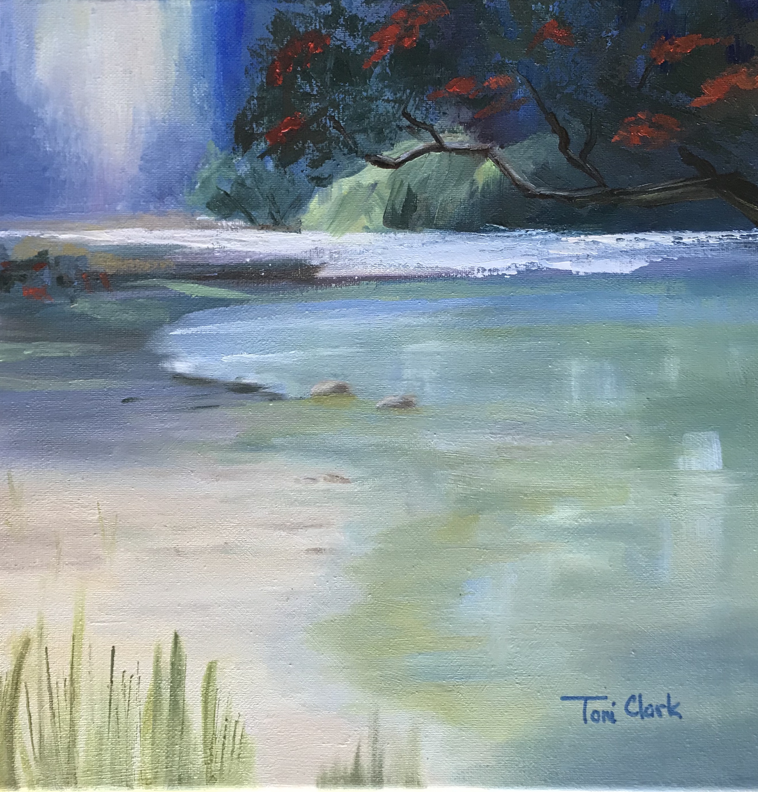
"Waipu Cove." 12x12, Oil on canvas.
Artist: Antonia Clark
Hey Toni, nice work. Really good shadows and reflections. I'd just note that the background and foreground tree need to be separated by value, meaning the background hill etc needs to be a little lighter than the tree. The foreground grasses need to grow at a variety of angles.
You probably feel this already, that the palette knife on the white beach is incongruous with the rest of the painting, which means you needs to tidy it up a bit, or introduce other paintwork like it throughout the painting. Other than that, great!
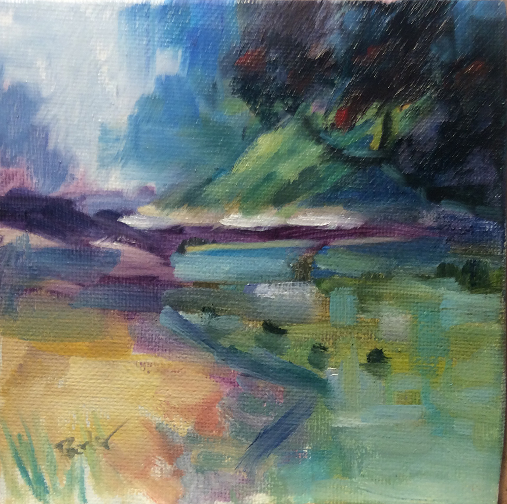
Waipu Cove
Artist: David Parker
Hi David, great energy, colour and brushwork in this little piece - bravo! Just two things would solve this one for me. Lose the 3 dark blobs in the foreground water (They're too similar, and incongruous) and cover and then repaint that foreground waterline stroke with a line that starts thin and gets fatter at the bottom, or something like that - it just needs more finesse, more calligraphy, perhaps 3 lines.
(By the way I can't use photos in the magazine that are out of focus. If you put a better photo in I'll be able to use that - but don't delete this one otherwise you'll lose the critique. Cheers).
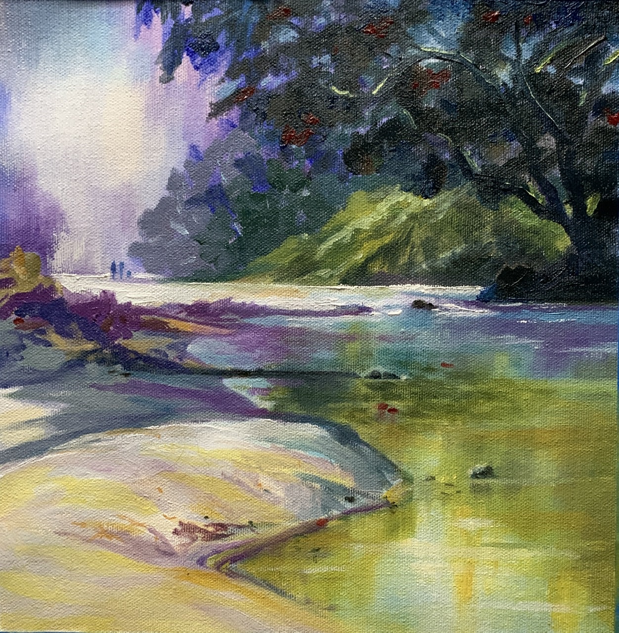
Weekly Class Recommendations- Waipu Cove 10”x10” oil on canvas by Karen Woodhouse (South Australia)
Artist: Karen Woodhouse
Hi Karen, really nice design and shaping of form here - great work. I appreciate the soft glow of the background light too and the colour variety there - nice. Love your spotlight work in the green bank too - beautiful!
It's the colour you've pushed rather that the paint application to lean this towards abstraction, and that's working well to add interest, but I'd like you to try being bolder with the paint - thicker, stronger, faster! Use different tools. That the point of this lesson. Make the shape, break the shape, make and break, make and break. Go nuts! (That said, great painting!)
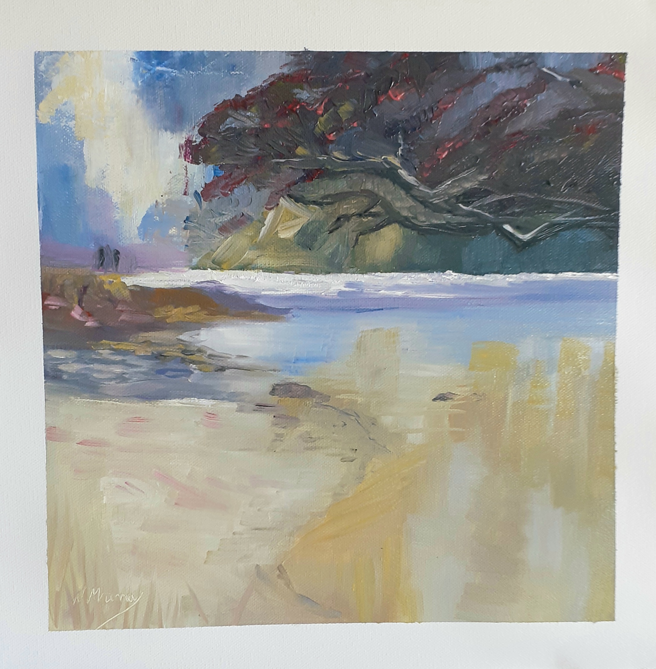
Waipu Cove - my take. Now I know why Van Gogh cut off his ear!
Artist: Nancy Murray
Hi Nancy, there's a lot of good stuff going on in here: exciting brushwork, interesting organic shape design and a fairly harmonious colour scheme. One thing that would help create more depth in this would be to darken the foreground tree so it's clearly separate in value from background hill. Value is the lightness or darkness of a colour.
A great exercise for you to really get the idea of using value in a painting is to repaint this using just black and white. Working from photos often makes colour work difficult, especially in photos like this where there's a dark object against the light because the camera tends to over-darken and desaturate (remove colour from) the darks. That's why it's so good to paint from life as often as possible so that we get a better understanding of light and colour.
Long story short, darken that tree and try working over the water again, but work from dark to light - you've lost some of the darks in there - try squinting at the water resource to see what the big colour shapes are doing. Happy painting!
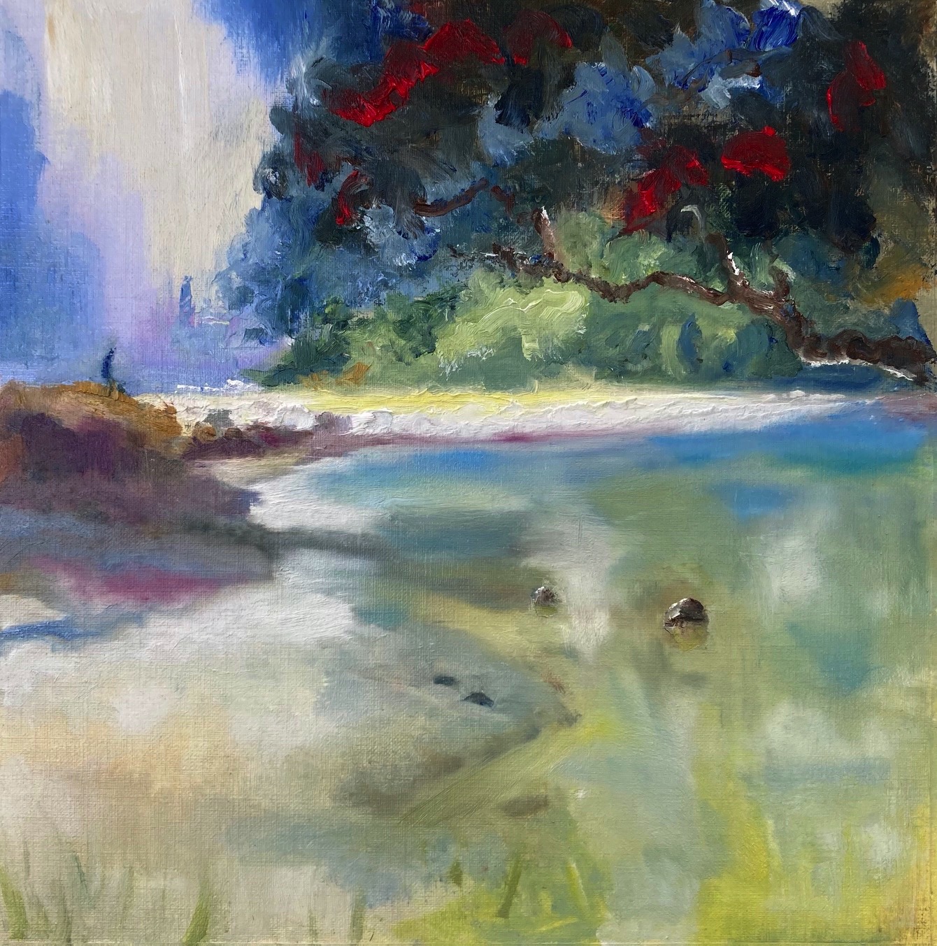
Waipu Cove Study
Artist: Geoffrey Geeson
Hi Geoffrey, strong colour and good drawing and shapes in here. Looks like you went nuts with blending with the soft brush at the end there, but, it's great to try that out a couple times till you find out what it does - generally just takes the excitement out of interesting brushwork.
To be fair, it can help a bit with reflections, clouds and atmosphere, but, yeah it's easy to undo good brushwork with it. You could bring this one back with a few crisp strokes defining the waterline and midground details in the bank. Mind you keep strokes in reflections more vertical and horizontal too - it really helps.
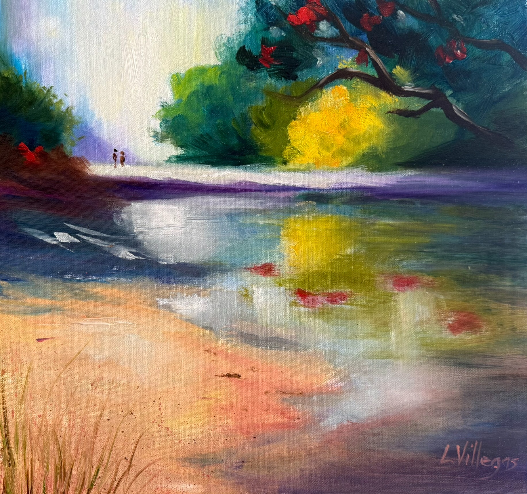
Waipu Cove by Louise Villegas. Oil 12 x 12. Another challenge to paint loosely!
Artist: Louise Villegas
Hi Louise, thanks for your painting. The vibrant colour, strong contrast and bold brushwork make this a treat to look at. I like the softness in the light-filled background and your spotlight on the foreground sand. To push the depth, try separating the value families a touch more: lighten the shadow mass in the furthest tree - leaving it so similar to the darks in the foreground serves only to flatten the image.
Similarly you could lighten the darks on the left. Also consider shortening the central sand bar at the right, so that the eye is invited to wander up and around the stream into the distance instead of being stopped by a solid bar.
Try cooling the distant greens slightly with a hint of blue-violet to help them recede. To avoid having your signature get so close to the edge of the painting in future you might try working backwards from the S. Lovely, loose work—keep chasing that light!
Congratulations and thanks to everyone who entered a painting into the workshop. Great work!
Get the full lesson here: https://mypaintingclub.com/lessons/98-Painting-Workshops-5
- Richard.
Login to your account to post a comment.