Waterfalls captivate us with their dynamic energy and serene beauty, making them a rewarding yet challenging subject for any painter. In this chapter, I guide you through the essentials of capturing the essence of waterfalls on canvas. We'll explore how to convey the movement and translucency of water while maintaining the solidity of the surrounding landscape. One of the key skills you'll develop is the ability to adapt and modify the scene before you. Even if a waterfall appears perfectly composed in nature, you have the artistic freedom to alter it, enhancing or simplifying elements to suit your vision. This flexibility is crucial in creating a painting that is not only a representation of the scene but also a unique expression of your personal style. By the end of this lesson, you'll have a deeper understanding of how to balance detail and abstraction, light and shadow, to bring your waterfall paintings to life. Join me as we delve into this inspiring subject and unlock the secrets to painting successful waterfalls.
This guide accompanies the full video lesson. The lesson includes the complete narrated video, the printable PDF chapter, and personalised critique support.
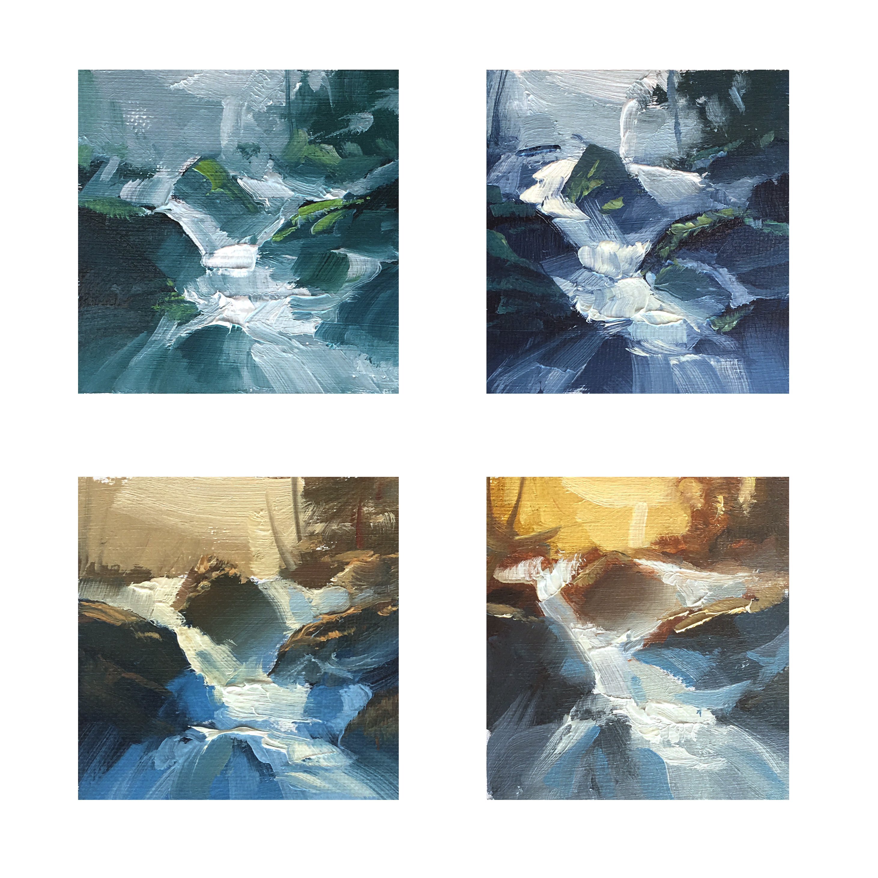
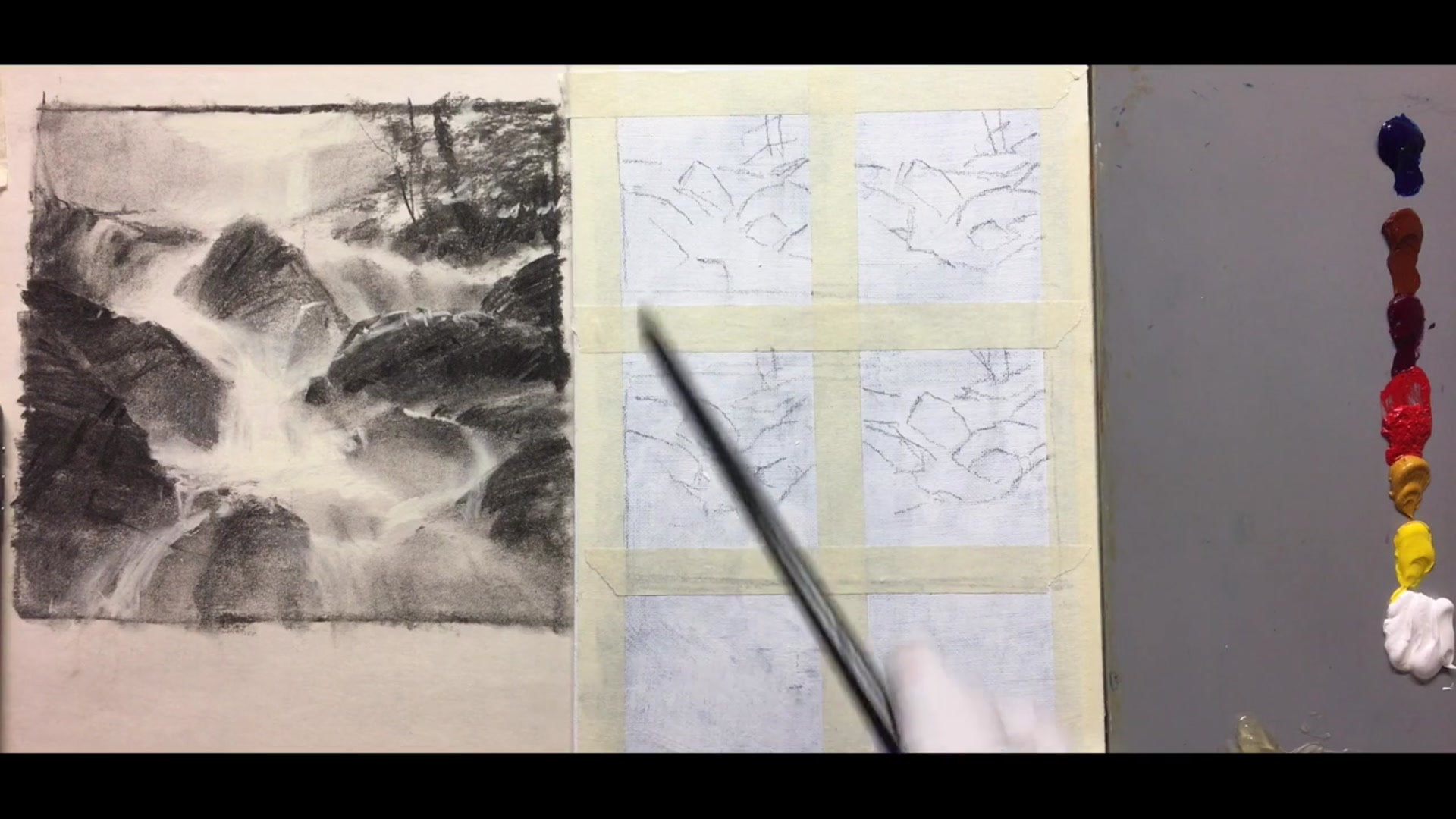
Lay out your oil colors and prepare four small thumbnails. Use a fairly large brush for these thumbnails, focusing on color rather than detail.
Monochrome Green Scheme
Mix a dark green using blue and yellow ochre. Apply your darkest darks first, then lighten with yellow or white. To subdue the green, add a touch of red to push it towards grey.
Analogous Blue and Green Scheme
Start with blue and add Quinacridone violet to shift the greenish phthalo blue towards red, resembling ultramarine blue. Tone it down with red and yellow for darks, then lighten as needed.
Complementary Orange and Blue Scheme
Create a complementary scheme with intense blue and subdued orange. Use separate brushes for each color to avoid muddiness. Increase the saturation of the orange for a brighter effect.
Evaluate and Adjust
Photograph your thumbnails and adjust color levels using photo editing software. Experiment with saturation, contrast, and tint to explore different options.
Pro tipUse separate brushes for different colors to prevent muddiness in your complementary color schemes.
Embark on your waterfall painting journey with the freedom to reshape the scene to suit your artistic vision. Begin by exploring compositional opportunities with charcoal, focusing on dynamic shapes and avoiding static horizontals. Use your creativity to design varied rock angles and incorporate diagonals to convey motion, ensuring your composition is both engaging and balanced.
As you progress, pay attention to edges and tonal studies. Combine sharp and soft edges to create contrast between rocks and water, and use charcoal for tonal exploration. Transition to paint with a focus on three values to establish a bold effect, and experiment with random design techniques to create natural rock formations. Choose a color scheme that enhances the mood of your painting, whether through monochrome simplicity or dynamic complementary colors.
Finally, bring your painting to life by capturing the light transitions and water movement. Use loose brushwork to maintain flexibility, and balance your color palette with warm and cool tones. Add final details like foam and reflected light on rocks, ensuring your painting captures the dynamic beauty of waterfalls. Remember, each brushstroke is an opportunity to express the unique energy and tranquility of the scene.
Points to remember
Feel free to adjust the composition of natural scenes to suit your artistic vision.
Incorporate diagonals in your composition to convey the motion of waterfalls.
Vary the angles of your rocks to avoid repetitive shapes and create a more dynamic design.
Use charcoal to explore tonal design and edge variety before starting with paints.
Design using three values to achieve a bold effect early on.
Use a complementary color scheme to add excitement and dynamism to your painting.
Use separate brushes for different colors to prevent muddiness in your complementary color schemes.
Begin with loose brushwork to keep the painting flexible and prevent it from becoming too tight.