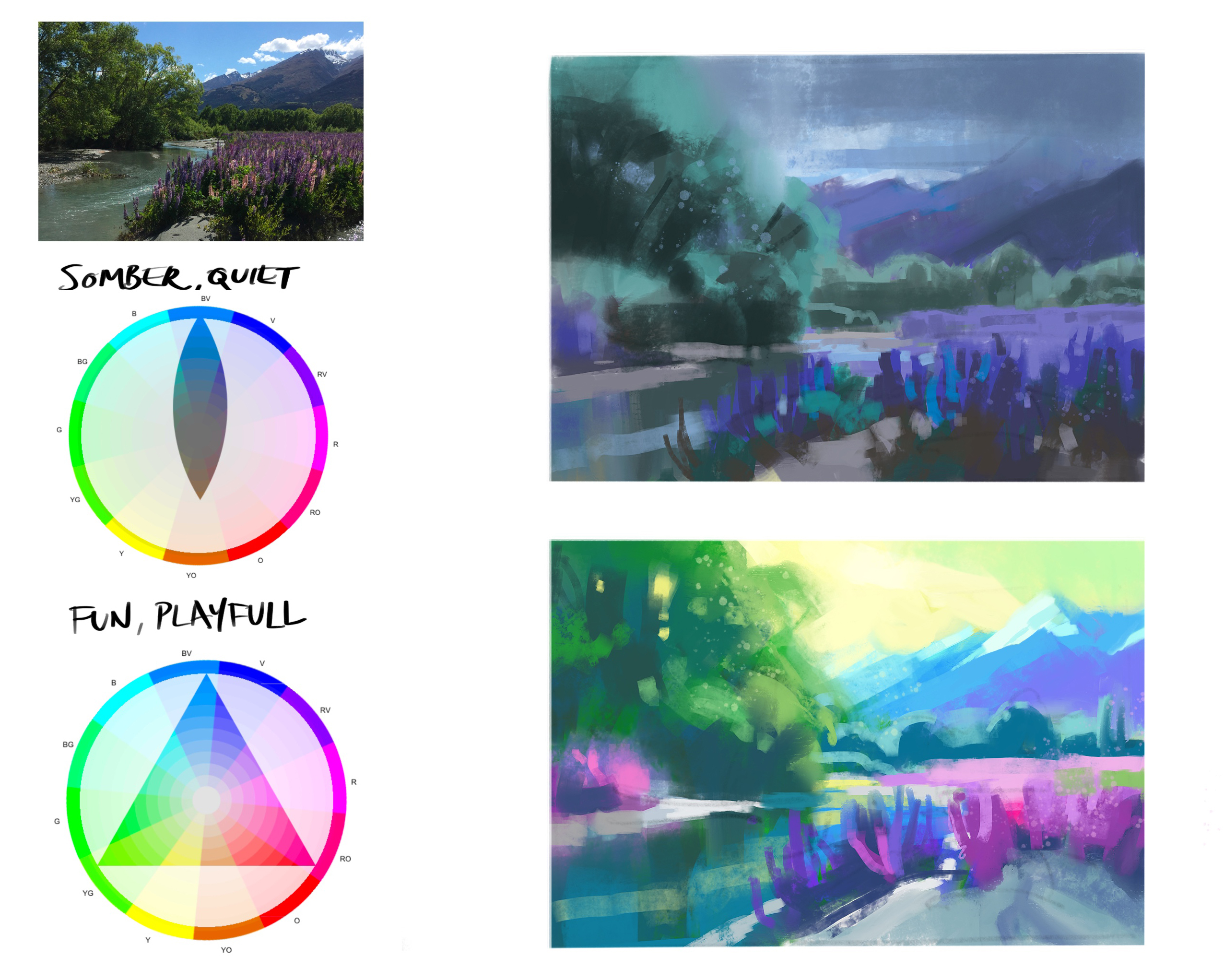
In this chapter, I invite you to explore the fascinating world of color moods in painting. Imagine the power of deciding the mood of your painting and then using color to convey that emotion to your audience. Just like Hollywood uses color grading to evoke emotions in films, you can do the same with your art. We'll start by choosing a mood for your scene and experimenting with digital tools to approximate that feeling. Using the gamut mask tool, we'll create a color scheme and mix color strings based on it. As you paint, you'll see how these colors transform your work, creating a somber or vibrant mood as desired. I discovered that by adjusting my color mixtures, I could deepen the emotional impact even further. This process opens up endless possibilities for expressing emotion through your paintings. You'll have all the tools you need to start this exciting journey. Remember, there's no single correct color scheme—experiment and let your subject guide you. Enjoy the creative freedom this brings to your art.
This guide accompanies the full video lesson. The lesson includes the complete narrated video, the printable PDF chapter, and personalised critique support.
Observe your subject closely to find a color idea that resonates. Let the subject suggest a color scheme naturally, such as a bright red boat inspiring a subdued green background.
Limit Your Palette for Warmth
To create a warmer painting, limit your palette to ultramarine blue, burnt sienna, yellow ochre, and white. This combination can help achieve a lighter, warmer effect.
Use High Saturation for Vibrancy
For scenes that evoke happiness, like a beach setting, opt for high saturation colors. This approach enhances the vibrancy and mood of the painting.
Experiment with Color Ideas
Remember, there is no single correct color scheme. Experiment with different ideas and choose what feels right for your subject and artistic vision.
Pro tipLimit your palette to create a specific mood, such as warmth or vibrancy.
Embark on your painting journey by thoughtfully selecting a color scheme that resonates with your subject. Let the natural hues of your subject guide you, whether it's a vibrant red boat against a serene green backdrop or a lively beach scene bursting with high saturation colors. Remember, the palette you choose sets the mood, so experiment with different combinations until you find the one that aligns with your artistic vision.
As you delve deeper into your painting, consider the emotional impact of hue, value, and saturation. These elements are powerful tools in conveying the mood you wish to express. Use vibrant, high saturation colors for energy and positivity, or opt for subdued, low saturation tones for depth and introspection. Adjust your values to enhance the mood, with high-key values bringing light and positivity, and low-key values adding a somber touch.
Finally, embrace the creative process by experimenting with different subjects and color schemes. Use tools like the Gamut Mask to refine your palette and digital adjustments to visualize your desired mood. Mix your colors with intention, starting with generous amounts to ensure consistency across values. As you apply your colors, let your intuition guide you, and don't shy away from bold choices that reflect your unique artistic expression.
Points to remember
Let your subject suggest a natural color scheme.
Limit your palette to create specific moods.
Combine saturated colors with high-key values for positivity.
Experiment with abstract designs to explore color.
Use digital tools to visualize mood and color schemes.
Employ the Gamut Mask to focus on desired colors.
Start with generous amounts when mixing colors.
Use thicker paint for lighter colors to add texture.