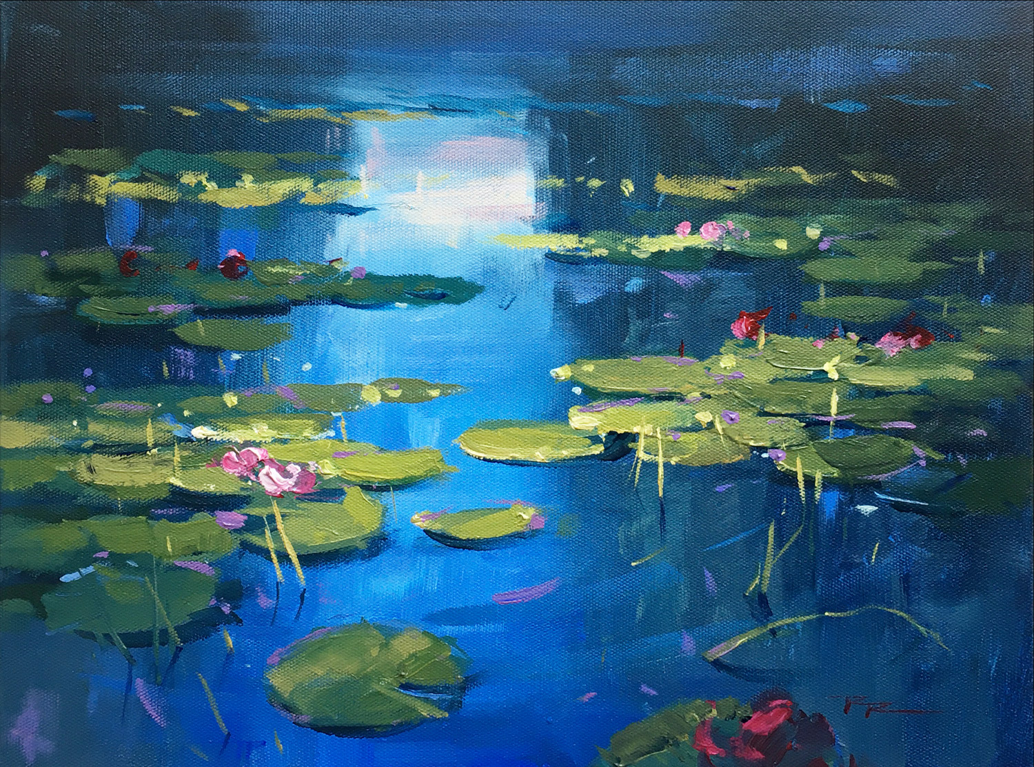
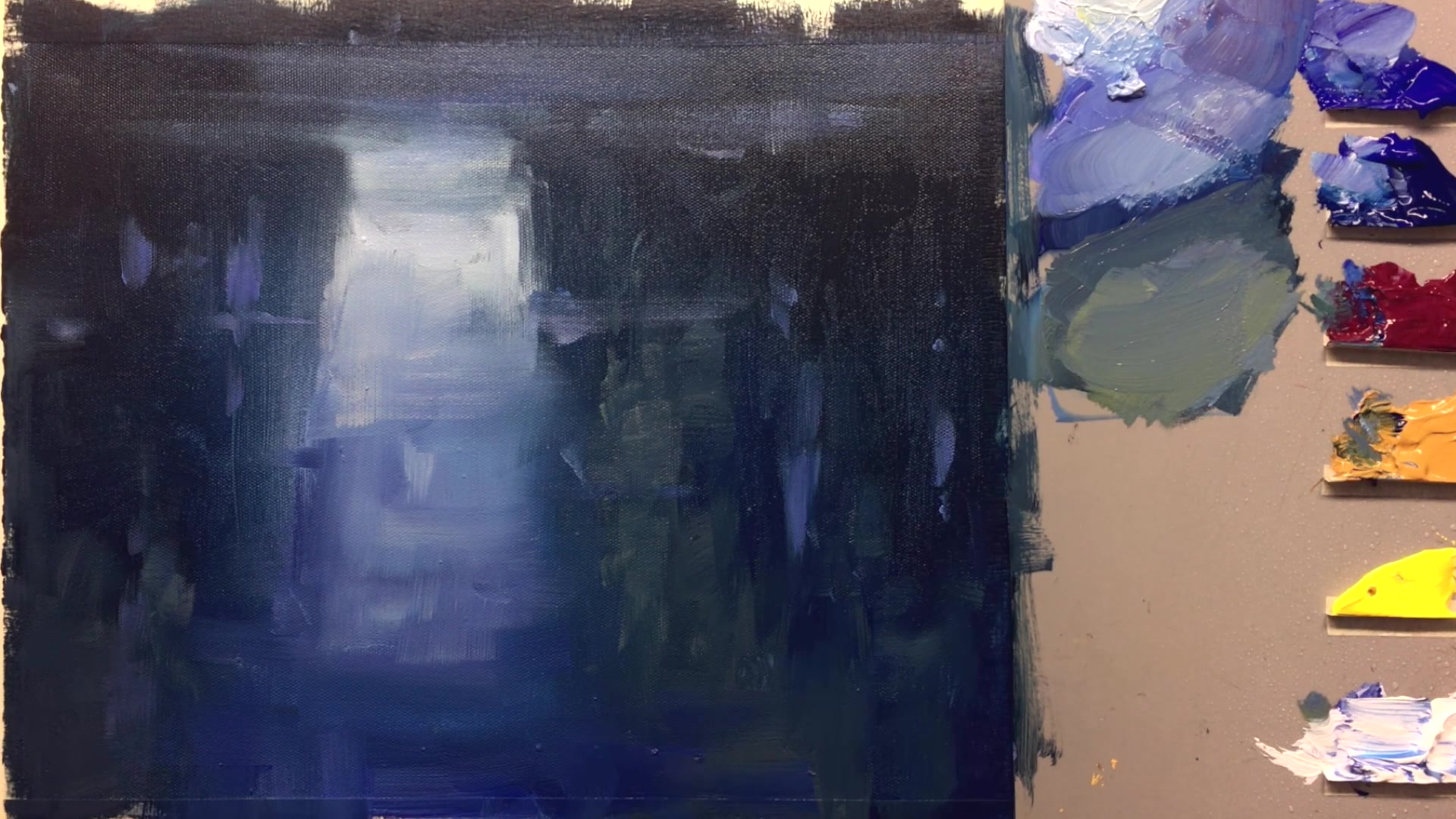
In this chapter, I invite you to immerse yourself in the serene beauty of water lilies, drawing inspiration from the timeless works of Monet. We'll be working on a 12 by 14 inch canvas using acrylics, specifically the Italia Interactive colors, which offer the flexibility of a longer drying time, allowing for painterly wet-into-wet effects that are typically associated with oils. This makes them perfect for capturing the delicate gradations and soft edges of our subject. The colors we'll be using include ultramarine blue, phthalo blue, Bordeaux or alizarin, yellow ochre, arilamide yellow light, and titanium white. These choices will help us achieve the vibrant yet subtle hues of the water lilies and their surroundings. As we progress, you'll learn to create sparkling impasto highlights and explore various brush techniques with long flats, synthetic brushes, and a palette knife. We'll also use a spray bottle for keeping the paints workable and for adding unique effects. This lesson is designed to enhance your skills in good design, accurate drawing, and passionate brushwork, applicable across all mediums. Whether you're using acrylics, oils, or another medium, this scene offers a rewarding exploration of color, light, and reflection.
This guide accompanies the full video lesson. The lesson includes the complete narrated video, the printable PDF chapter, and personalised critique support.
Examine resource photos to find interesting shapes and patterns for your water lilies. Avoid creating uniform patterns like polka dots, as the brain tends to do. For a more organic layout, try tossing coins onto a tray and photographing them from different angles to inspire natural movements.
Darken Water Areas
Use a brush to darken areas in the water, working from dark to light. Mix a dark grey-green by adding red to your green to gray it down. Consider the patterns you want, such as a clump here or an S curve through the scene, to sketch where the water lilies will go.
Consider Perspective
Remember that water lilies get smaller and flatter as they recede into the distance. The degree of change is influenced by your height and viewing angle above the water, so adjust accordingly.
Explore Background Variations
Although this background is dark, explore different backgrounds like Monet's paintings, which feature various skies, clouds, and color moods. This can provide inspiration for your own water lily painting.
Pro tipAvoid creating uniform patterns by using natural references like photos or coin arrangements for organic water lily placement.
Embark on your water lily painting journey by first establishing a clean and vibrant background. This sets the stage for your composition and allows you to capture the natural reflections of trees and sky in the water. Utilize techniques like painting upside down to achieve realistic reflections, inspired by the works of Monet.
As you progress, focus on layering and creating depth with varied brushstrokes and color mixes. Use a combination of vertical and horizontal strokes to mimic the reflective qualities of water, and gradually introduce lighter tones to highlight the effects of sunlight. This will add texture and interest to your painting.
Finally, bring your water lilies to life with thoughtful placement and attention to detail. Use impasto techniques to add dimension to the lily pads and flowers, and ensure your composition maintains a balance of light and dark to evoke a serene atmosphere. Experiment with different styles and techniques to develop your unique artistic voice.
Points to remember
Paint the background first to keep colors clean and simplify the process.
Use vertical and horizontal strokes to create a reflective surface.
Wet your brush before use to prevent paint from drying in the ferrule.
Turn your canvas upside down to enhance the reflection effect.
Avoid creating uniform patterns by using natural references for water lily placement.
Use thick, impasto paint to create a three-dimensional effect on the lily pads.
Apply thick impasto paint for water lilies to create depth and realism.
Mix colors lighter and more vibrant to counteract acrylics drying darker and duller.