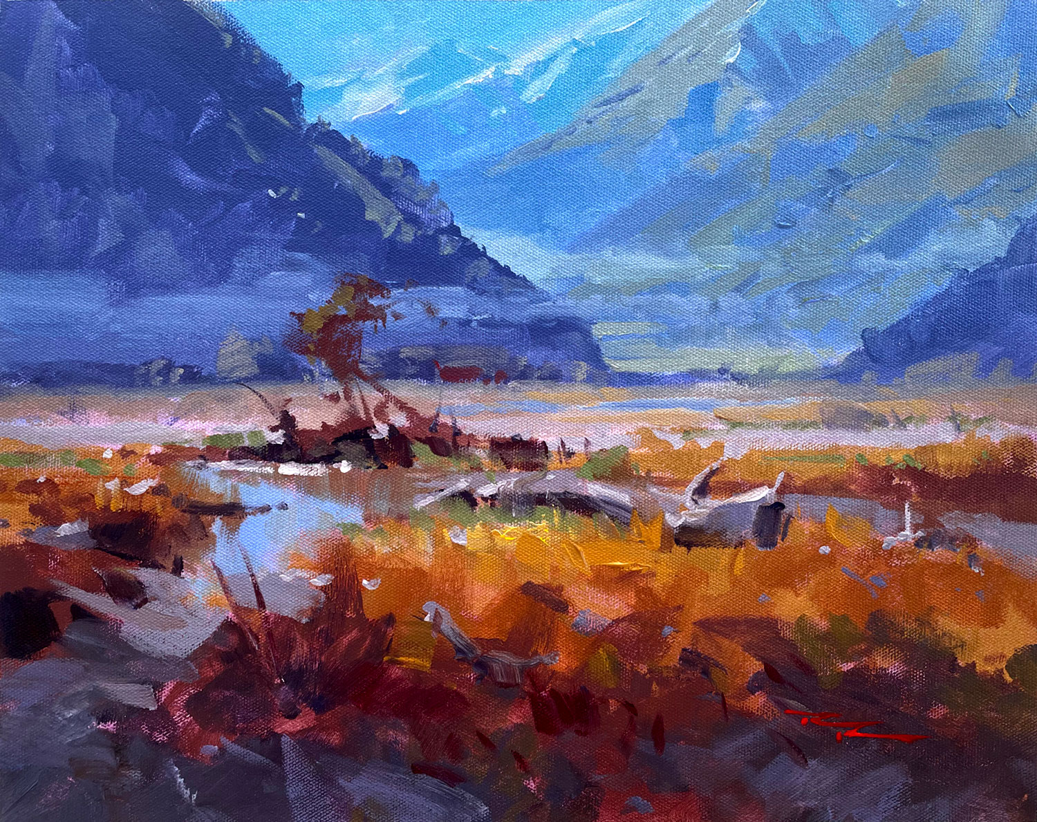
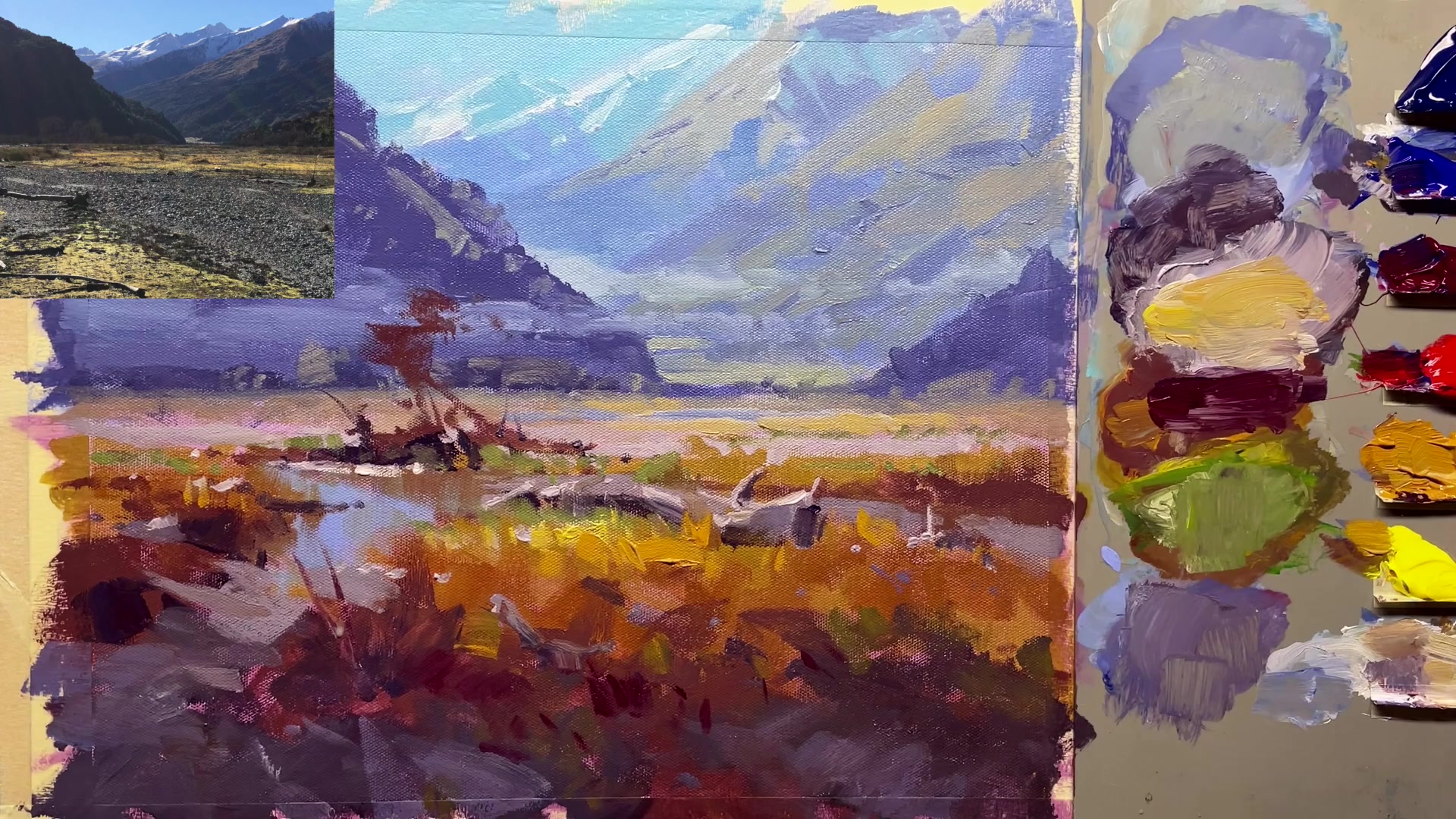
In this chapter, we'll embark on an artistic journey through the breathtaking Golden Valley of New Zealand. Together, we'll explore the nuances of acrylic painting, capturing the essence of an oil painting with every brushstroke. I will guide you meticulously through the process, ensuring you witness every detail, from color mixing to the final touches that bring the scene to life. One of the key elements we'll delve into is the concept of lighting—an often overlooked aspect that can transform your work dramatically. By understanding how to light the entire scene, you'll learn to direct the viewer's eye and evoke the mood you desire. This powerful technique can significantly elevate your painting skills. We'll also cover essential aspects like brushwork, design, texture, and those crisp finishing details that make your painting pop. As we paint this stunning scene, you'll discover the striking contrast between the blues of the mountains and the warm yellowy oranges of the foreground, a central theme that adds vibrancy and depth. So, grab your brushes and join me in bringing this beautiful landscape to life, one stroke at a time.
This guide accompanies the full video lesson. The lesson includes the complete narrated video, the printable PDF chapter, and personalised critique support.
Embark on your painting journey by embracing the vibrant contrast between the blues of the mountains and the warm yellows of the foreground. This striking contrast will guide your theme and set the tone for your Golden Valley masterpiece. Begin by preparing your materials and selecting a limited palette and brush set to maintain consistency and ease throughout the process.
As you progress, focus on building your composition from the background forward, layering colors to create depth and perspective. Use techniques such as scrubbing and blending to achieve smooth transitions, and be mindful of maintaining clean brushes to ensure vibrant colors. Pay attention to the placement of major lines and masses to create dynamic space divisions and avoid symmetry.
In the final stages, enhance your painting with atmospheric effects and fine details. Use subtle mist and snow highlights to add interest and realism, and ensure your shadows and highlights maintain the depth and contrast necessary for a captivating scene. Remember, each brushstroke contributes to the overall harmony and balance of your painting, so take your time to refine and perfect your artwork.
Points to remember
Focus on the first element you love about a scene to guide your painting's theme.
Use a mid-grey palette to better judge the values of your colors.
Wet your brush before starting to prevent acrylic paint from drying in the ferrule.
Avoid placing major lines on the halfway mark to create more interesting space divisions.
When using acrylics, start from the back and work your way forward for the best layering results.
Brush the color past where you want it to finish for a seamless transition.
Squint at your painting to ensure the lights and darks are close together, matching the subtle differences in the reference.
Use subdued greens to maintain depth and avoid bright colors that stand out too much.