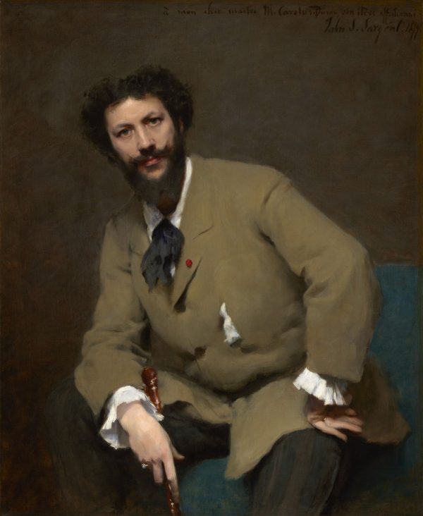
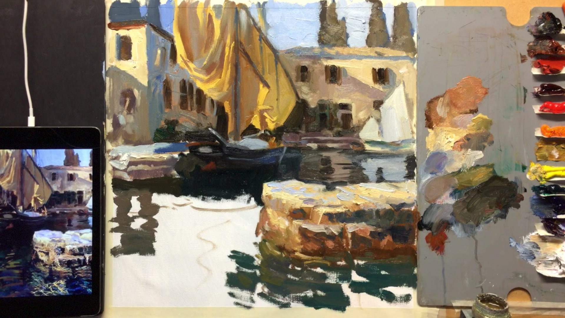
In this chapter, we delve into the world of John Singer Sargent, one of my favorite artists and a master of both portrait and landscape painting. Sargent's journey began in Florence, Italy, where he was born in 1856 to American expatriates. His early exposure to Europe's rich artistic heritage shaped his incredible talent, which he honed at the Ecole des Beaux-Arts in Paris. By the age of 18, he was already creating remarkable works. Sargent's reputation as the finest portrait artist of his era was well-earned, yet in his later years, he turned his focus to landscapes, often incorporating figures into these scenes. One such painting, created in the idyllic setting of San Virgilio on Lake Garda, Italy, stands out as a personal favorite of mine. Painted in 1913, just before the outbreak of war in Europe, this piece captures a serene and timeless beauty. In this lesson, we'll explore Sargent's techniques by recreating this masterpiece. You'll learn how to prepare your canvas, sketch the composition, and capture the essence of Sargent's style. Let's embark on this journey together and see what we can learn from Sargent's genius.
This guide accompanies the full video lesson. The lesson includes the complete narrated video, the printable PDF chapter, and personalised critique support.
Extend the painting downward to create space for the water reflection. Plot the general shape of the reflection, starting vertically from the sound and extending outward. This sets the foundation for adding color and detail.
Add Darker Reflection Colors
Mix a slightly darker and greener color for the reflection. Use a radial pattern to mimic the effect of waves hitting a wall and bouncing back. This adds depth and realism to the water.
Incorporate Sky Reflections
Transition into dark greens and blues to represent the sky reflecting on the water. Mix green, black, and a touch of white for the darker areas. This creates a natural blend of colors in the reflection.
Create Ripple Effects
Use a lighter blue by mixing ultramarine, a little white, and a touch of violet. Apply this slightly lighter color within the darker shapes to create a ripple effect. Ensure the shapes are larger in the foreground and become smaller and thinner as they recede into the distance.
Pro tipMake reflection shapes larger in the front and smaller as they go back to create depth.
Begin your painting journey by preparing a smooth canvas, which will enhance the visibility of your brush strokes. Start with a neutral grey tone to provide a balanced backdrop for your composition. Sketch your main elements lightly with charcoal, setting the stage for your painting with careful attention to the placement of key features.
Embrace Sargent's style by using long, fluid brush strokes and selecting larger brushes than you might initially consider. This approach allows you to cover the canvas efficiently and capture the elegance of Sargent's calligraphic brushwork. Choose a modern palette inspired by Sargent's colors, but focus on the hues that best capture the essence of your scene.
As you progress, work with generous amounts of paint to allow for rich color flow. Pay attention to the interplay of light and shadow, starting with mid-tones and gradually working towards the extremes. Use glazing techniques to add depth and interest, and embrace unconventional compositions to capture a moment in time. Throughout, learn from Sargent's mastery by adjusting colors and values to achieve the desired effect.
Points to remember
Use a smooth canvas to enhance brush stroke visibility.
Focus on creating long, fluid strokes to emulate Sargent's style.
Use larger brushes than you think necessary to cover the canvas efficiently.
Don't feel obligated to use every color on your palette; select those that best capture the essence of your scene.
Mix equal parts titanium white and zinc white with a touch of oil to create a versatile permalba white substitute.
Use a generous amount of paint to enhance color flow and richness.
Start with mid-tones and gradually work towards the darkest darks and lightest lights to maintain color vibrancy and avoid false accents.
Use small flicks of the brush to create dynamic textures instead of a solid line.