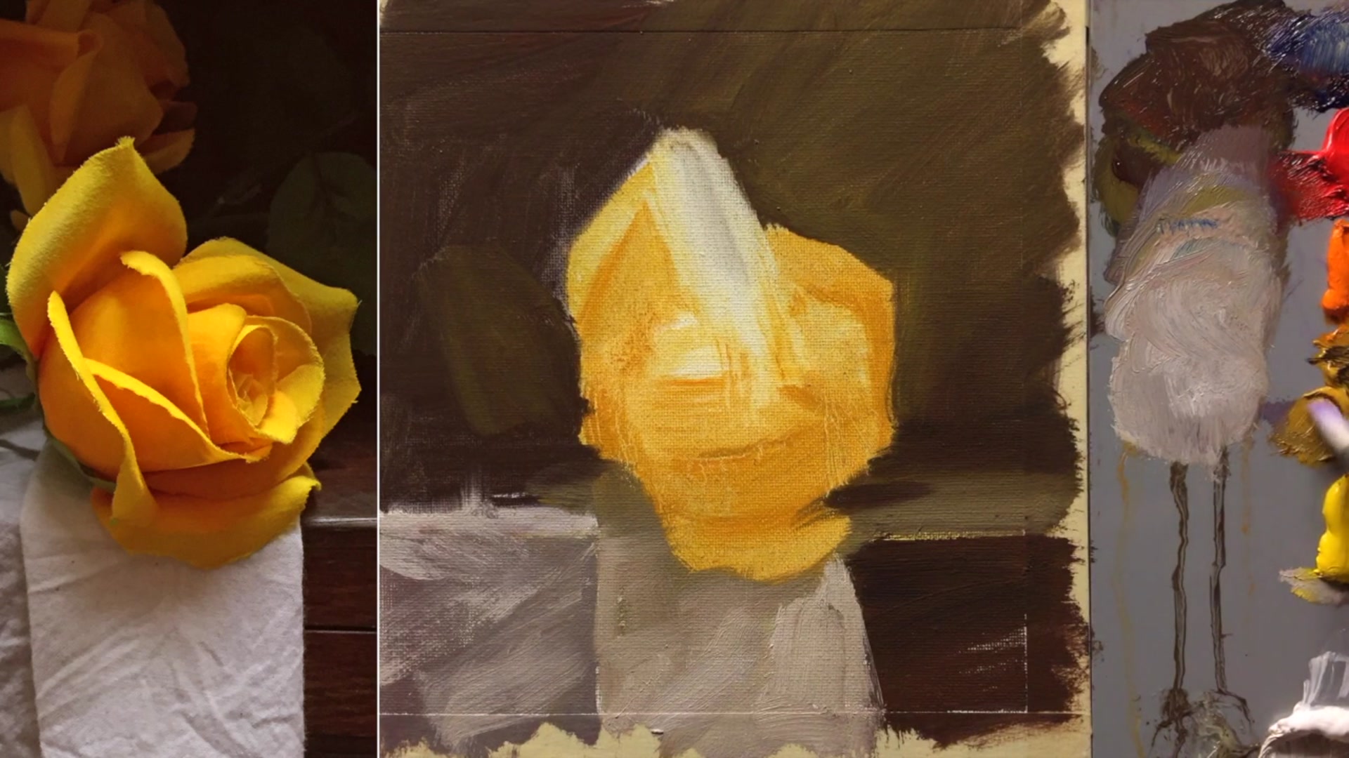
In this chapter, we'll embark on a delightful journey into floral painting, beginning with the elegant simplicity of a single yellow rose. This subject offers a perfect starting point for beginners, allowing us to focus on capturing the subtle beauty and structure of a flower without the complexity of a full bouquet. I've set up a straightforward still life arrangement using a cardboard box with adjustable lighting, demonstrating how even artificial flowers can serve as excellent models when real ones aren't available. By positioning your painting setup right next to the box, you can easily compare colors and ensure accuracy in your work. The key is to simplify your light source, which helps in understanding and painting the forms more clearly. This chapter will guide you through creating a manageable composition, encouraging you to crop your scene to just one rose, making the painting process both enjoyable and rewarding. As we progress through this and the next lessons, you'll gain confidence and skill in floral painting, setting a solid foundation for more complex compositions in the future.
This guide accompanies the full video lesson. The lesson includes the complete narrated video, the printable PDF chapter, and personalised critique support.
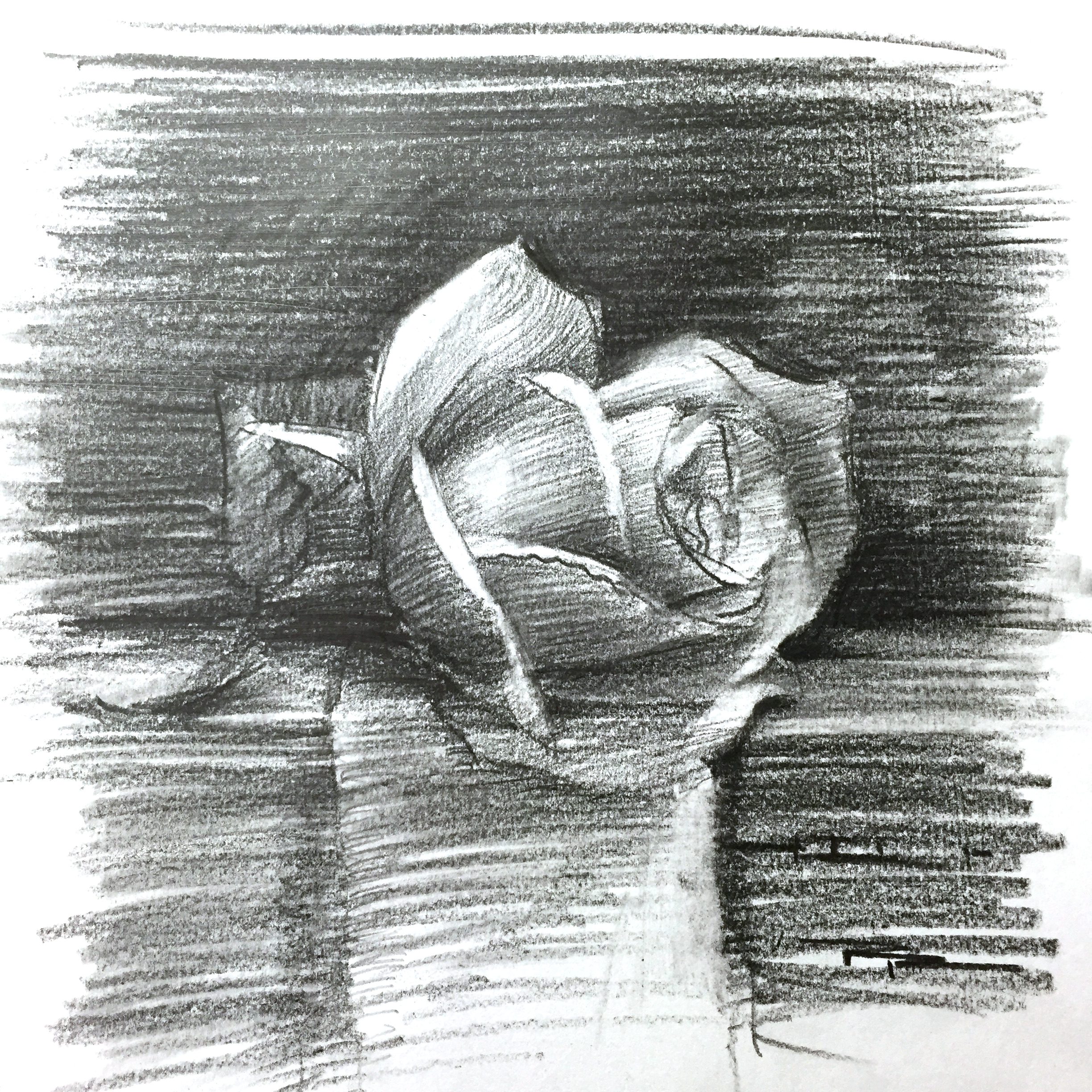
"Sketch for The Yellow Rose" 8 x 8" Pencil on Paper by Richard Robinson.
Step 8Adding Color Variations
Apply Yellow Ochre
Use yellow ochre with a painting medium to add color to the rose. Once the color is on the brush, look for other areas on the rose where this color can be applied. Use as few brush strokes as possible to maintain clean, vibrant color.
Introduce Darker Tones
As you move to darker areas of the rose, mix in some orange and a little red. If the area is not dark enough, add more red, orange, and a touch of blue to achieve the desired depth.
Create Color Variations
Focus on introducing slight variations in color to enhance the beauty of the rose. These variations, along with changes in shape, texture, and contrast, captivate the viewer's eye.
Pro tipUse minimal brush strokes to keep colors clean and avoid muddiness.
Embark on your painting journey by simplifying your composition to focus on a single rose. This approach allows you to manage complexity and enjoy the process without feeling overwhelmed. Begin by carefully positioning your materials and sketching the rose, paying close attention to the central axis and the placement of petals. Use shading techniques to explore light and shadow, enhancing your understanding of the rose's form.
As you progress, block in the basic shapes and colors using broad strokes. This will help establish the foundation of your painting. Pay attention to the background, using dark tones to make the yellow rose stand out. Introduce color variations to the rose, focusing on temperature differences between light and shadowed areas. This will add depth and interest to your work.
In the final stages, add highlights and refine details, ensuring each brushstroke is deliberate and enhances the overall composition. Soften edges where necessary to create depth and dimension, and remember to keep some areas loose to maintain a sense of realism. Once you're satisfied, add your signature to complete the piece, celebrating the journey of bringing the yellow rose to life on canvas.
Points to remember
Simplify your composition by focusing on a single element.
Visualize the center line and intersections to accurately place petals.
Compare your lights to your lights and your darks to your darks for accurate shading.
Use a crisp synthetic brush for sharp petal shapes and highlights.
Use a big brush for blocking in basic shapes to quickly establish form and color.
Clean your brush frequently to prevent colors from becoming muddy.
Use minimal brush strokes to keep colors clean and avoid muddiness.
Squint at the rose to see it in big blocks of color, simplifying details and focusing on major transitions.