I never imagined I'd be drawn to painting a city street, but San Francisco has a way of changing perspectives. In this chapter, we'll dive into the captivating world of urban landscapes, focusing on the interplay of light and atmosphere that makes street scenes so enchanting. You'll learn how to capture the essence of a bustling street, emphasizing the intriguing shapes and vibrant energy that define it. One of the unique aspects of this lesson is the opportunity to liberate your color palette by starting with a black and white photograph. This approach allows you to focus on value and composition before introducing color, giving you greater creative freedom. We'll also explore how to effectively use online images as references, combining elements from various photos to craft a compelling and cohesive composition. By the end of this chapter, you'll have the skills to transform everyday street scenes into dynamic works of art, filled with light and life. Enjoy the journey of bringing a city street to life on your canvas.
This guide accompanies the full video lesson. The lesson includes the complete narrated video, the printable PDF chapter, and personalised critique support.
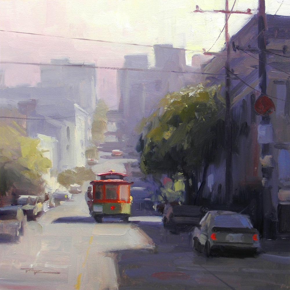
"San Francisco" 14x14" Oil on Canvas by Richard Robinson
Step 14Tree Colors
Adjust Tree Colors
Make the colors on the left tree slightly warmer and lighter. For the right tree, use slightly darker and cooler colors. This contrast will enhance the light and shadow effect in your painting.
Create Warm Light Green
Mix a warm light green for the top of the big tree where the golden light hits. Add a touch of orange to the green to achieve this warm tone. This will reflect the warm light effect on the tree.
Thicken the Paint
As you lighten the paint, increase its thickness. This technique adds texture and depth to the lighter areas of your painting.
Pro tipAdd a touch of orange to green to create a warm light green for areas hit by golden light.
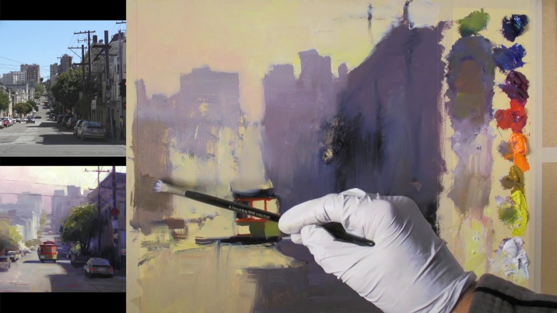
Embark on your painting journey by selecting and merging photo references that capture the essence of your desired scene. Use these references to create a cohesive composition that tells a compelling story. As you prepare your canvas, consider the design elements and ensure your focal point, like a cable car, is positioned to guide the viewer's eye.
With your materials ready, begin sketching the scene, emphasizing perspective and the interplay of light and shadow. Use a warm beige underpainting to help your colors stand out and maintain harmony in your palette. As you paint, focus on creating depth through atmospheric perspective and subtle color variations, particularly in shadowed areas.
As you add final details, refine your composition by balancing light and shadow, ensuring each element contributes to the overall narrative. Use fine brushes for delicate lines and make thoughtful adjustments to enhance the painting's cohesion. Finally, add your signature to mark the completion of your creative process.
Points to remember
Choose and merge photo references to create a cohesive composition.
Check copyright status of reference photos before using them.
Crop reference images to match your canvas size for better alignment.
Emphasize steep angles in your sketch to capture unique perspectives.
Align shadows with perspective lines for realism.
Introduce hue variations in shadows to keep them interesting.
Maintain similar warm tones in light and dark sky areas for harmony.
Use a rigger brush for fine details to avoid making a mess of delicate lines.