Teacher
Richard is a talented full time artist, who loves painting and teaching.
with Richard Robinson
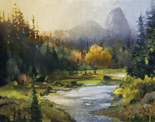
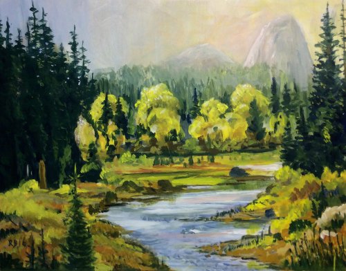
Yosemite National Park. It’s an amazing place, but actually very difficult to paint in! It’s just so big it’s hard to squeeze onto a canvas. It calls for painters to use their artistic licence and move mountains.
Paint this light filled scene with me, learning about misty atmospherics, intense glowing light effects and juicy impasto brushwork. Enjoy!
Whenever you’re ready! The lesson is available online any time, and your access to the lesson never expires.
As long as you need! Your access never expires, so you can come back again and again.
Sorry, no you can’t download the video. This is to avoid piracy. You’ll always be able to view the video on this site though.
Richard is a talented full time artist, who loves painting and teaching.
Hi I’m Richard. I’ve been painting my whole life and back in 2001 I traded my graphic design career for the humble life of a full time artist. I love painting, and as it turns out, I love teaching too.
Nowadays I balance my life between parenting, painting, surfing, travelling and teaching. My work is regularly featured in international art magazines, in galleries in New Zealand and America, on TV and in my Mum’s house.
I give outdoor painting workshops in interesting spots around this beautiful planet of ours and love encouraging people to paint. Two of my favourite artists are John Singer Sargent and Joaquín Sorolla.
My painting website: www.nzpainter.com
I’d love to be your new teacher.

Richard is a master artist with an exceptional skill in identifying and communicating key factors to making successful paintings. I have found his video workshops an excellent resource for improving my own work.
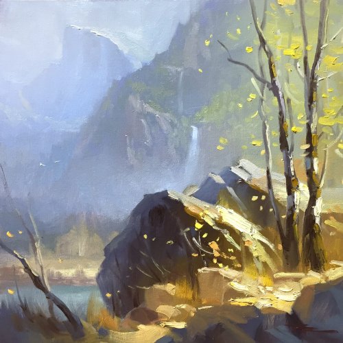
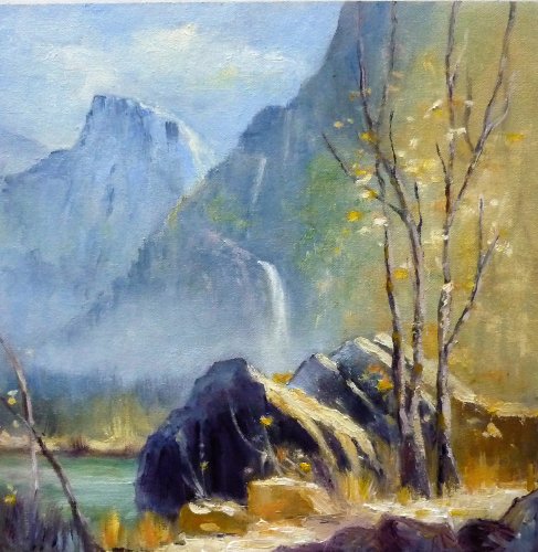
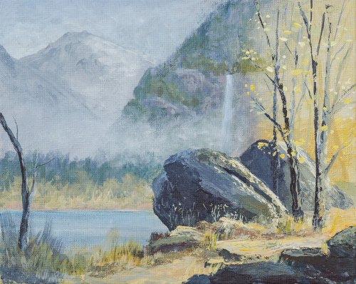
"Half Dome, Yosemite" 11 x 11" Oil on Canvas by Richard Robinson.
This painting is about contrast and light - the warm/cool contrast of foreground vs background and the intense glowing light bouncing of the rocky trail. There's also the contrast in paintwork - thinly applied and soft edged in the background vs sharp impasto brushwork in the foreground. This scene doesn't exist. It nearly exists, but it's actually a montage of elements found at the scene, placed carefully into a more pleasing composition. Sometimes you can't let the truth get in the way of a good story.
'Half Dome' 11x11" Acrylic on Canvas Paper by Kym West
Hi Kym, lots of good work in here. The drawing is good, you've created a lot of depth with your colours and by making the foreground brushwork larger than that in the background, which is beautifully atmospheric. Just two things I would caution you on. The first is the very dark values in the foreground shadows. This is perhaps due to the photography of your painting. If it's not, just compare your darks to mine in the foreground. Yours have gone so dark it's lost a lot of the opportunity for colour in the shadows and this always tends to make a scene look foreboding. The second thing is the tree being too close to the edge of the canvas, like it's just about to leave, unsure whether it should be in the scene or not. Put your main actors in the spotlight, not in the wings.
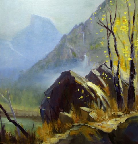
'Half Dome Yosemite' 11x11" Oil on Canvas by Denis King
Hi Denis, this is a very good copy - nearly stroke for stroke! The only noticeable difference worth mentioning is the big blue shadow in the main rock could do with warming up with brown a little because the blue seems a little too strong. Other than that it's pretty much verbatim - great work! I hope you learned a lot copying so closely.
'The other side of Half Dome' 11x14" Acrylic on Paper by Robert Barker - Altered
'The other side of Half Dome' 11x14" Acrylic on Paper by Robert Barker
Hi Robert, I think your other painting of Half Dome was more successful than this one, but I chose this to critique because there are more learning points available. I've photoshopped your image to illustrate a few of those points. Now you can play spot the difference. The biggest changes I made were to do with lighting. The sky in yours suggests the sun is on the right, whereas the mountain and trees suggest light from the left. I also introduced large soft shadows across the foreground and shadows cast onto the land by the large group of trees on the left, in keeping with the altered light source. The sunlight trees in the middle needed some pruning so that one was the star of the show and the others subdued into supporting roles. I brought Half Dome in from the edge and softened the edges there too. One of the right hand banks of the river was altered to avoid repetition. I hope that helps.
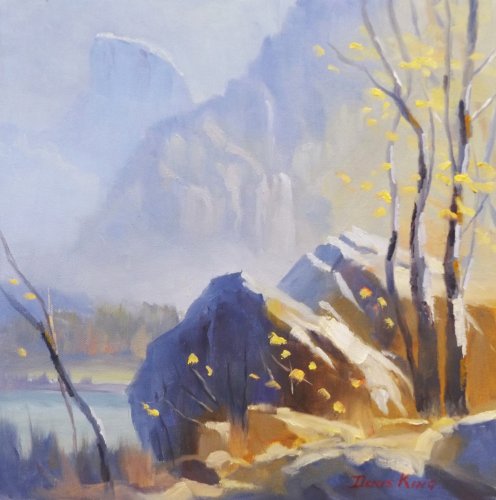
'Half Dome, Yosemite National Park' 11x11" Oil on Canvas by Fay Thomson
Good work, Fay. The drawing is all good, the value structure is good and you've achieved a pretty good glowing light effect in the path and trees. Note that if you had made all the darks around the base of the trees and rocks slightly warmer and lighter, avoiding cool purple colours, then the glowing light effect there would have been even stronger. Your edges, hard and soft are very good all over, but there's just one sneaky sharp edge along the mountain's edge drawing my eye to the top of the canvas. It competes with the foreground tree. Notice in my demo painting how I've softened that edge to avoid that happening? Boy am I picky! A very good job overall.
'Mountain and Lake' 10x8" Acrylic on Canvas by Stephen Street
Nice work Stephen, I like that you felt the freedom to swap Half Dome for Mt Blanc. I also like the impasto paintwork in this highlights on the rocks and trees which looks to be done with a palette knife. Acrylics are notoriously flat unless you use a heavy body acrylic or impasto mediums so it's good to see you've managed with a palette knife to get some chunky paint in the centre of interest and have it contrast with the thinner background areas. Despite that you have managed to treat the branches quite sensitively which is quite tricky once you've pulled out that palette knife. My only real concern for this painting is that you've used a little too much white overall, especially in the background, which has left it looking chalky. Many other students also did that with this painting, so you're not alone and perhaps my own painting could have done with a little less white in the mid values - certainly it's on the edge of becoming chalky so I can see why many students tipped over that edge. It's a fine line between chalky and atmospheric.
Not loving your painting lessons? No worries!
If it’s not the right fit, we’ll give you a full refund within 30 days of purchase - no questions asked.
When you purchase a DVD you also get online access to the same lesson, including any lesson resources like photos, downloadable notes and access to upload your painting to the student gallery.
That's why you need to make a password when you purchase a DVD, so you can access the online content as well. Enjoy!