Teacher
Richard is a talented full time artist, who loves painting and teaching.


A friendly place to learn at your own pace.
with Richard Robinson
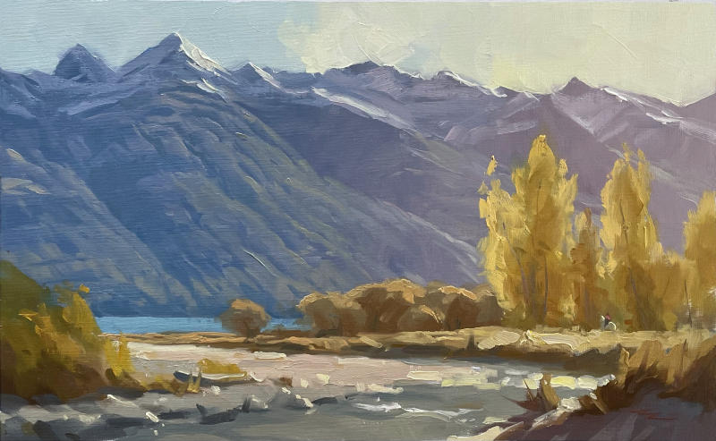
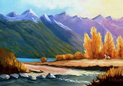
"Bucklerburn" 10.5 x 17" Oil on Linen by Richard Robinson
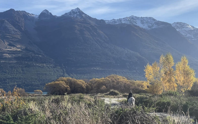
Resource photo of Bucklerburn River in Glenorchy, New Zealand.
The French (and expensive galleries) call this effect ‘Contre-jour’ lighting, or "against the light," which creates a striking and dramatic effect in landscape painting by positioning the primary light source behind the subject.
This backlighting technique results in several distinct visual characteristics:
Silhouettes and Strong Contrast
The subject appears as a dark shape against a luminous background, often losing midtone details while retaining a crisp or softened edge, depending on atmospheric conditions.
Glowing Highlights
The brightest areas often occur along the edges of objects, where light wraps around or diffuses through translucent elements like foliage, mist, or water.
Atmospheric Depth
Backlighting enhances a sense of depth as distant elements become hazy and warm-toned due to the scattering of light, while foreground elements remain in shadow.
Color Shift and Muted Foreground
Shadows in the foreground can take on cool or unexpected hues as they reflect ambient light, while the backlit sky often appears warmer and more vibrant.
Lens Effects and Diffusion
Depending on moisture or dust in the air, contre-jour lighting can introduce a halo effect, sunbursts, or soft diffusion, lending a dreamy or ethereal quality to the scene.
For painters, contre-jour compositions demand careful value control to balance the high contrast, ensuring that the dark areas retain subtle variation and the brightest areas don’t become overly harsh. It’s a powerful tool for creating mood, mystery, and drama in a landscape.
This demo for beginner to advanced painters is in oils but it's fine for acrylics too.
In just over 2 hours and you'll have a beautiful mountain river painting. Enjoy!
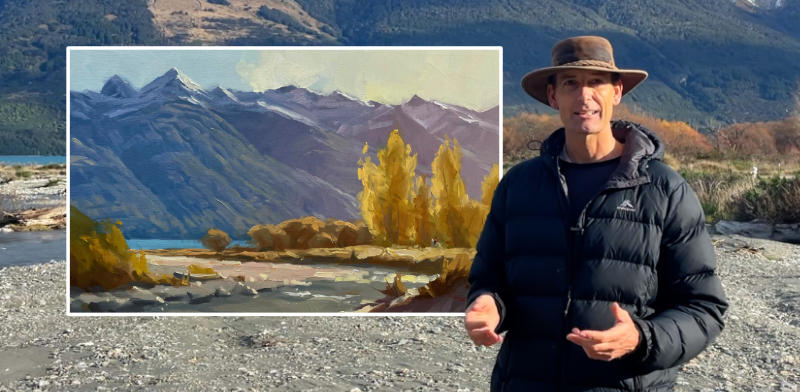
I’ll guide you all the way.
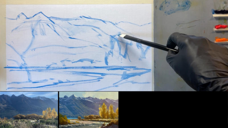
Nature doesn't always present herself in perfect compositions for painters, but this one's pretty close. I've enhanced the trees, shifted the mountains and simplified the stream for an easier lead-in. Having variety and all of your shapes is the key.
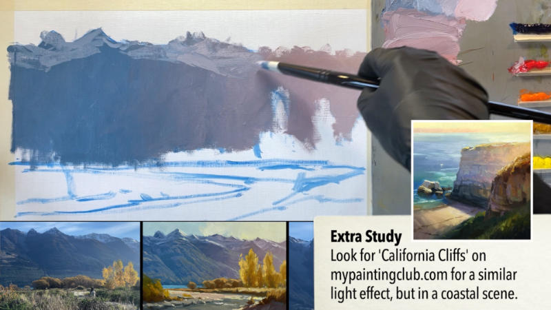
Starting with a purplish grey we just add more and more pink as we get closer to the sun on the right. A little yellow is added at the extreme right as well. Then as we add the snow in shadow we add more pink to it as it moves to the right so that it too is part of that light effect.
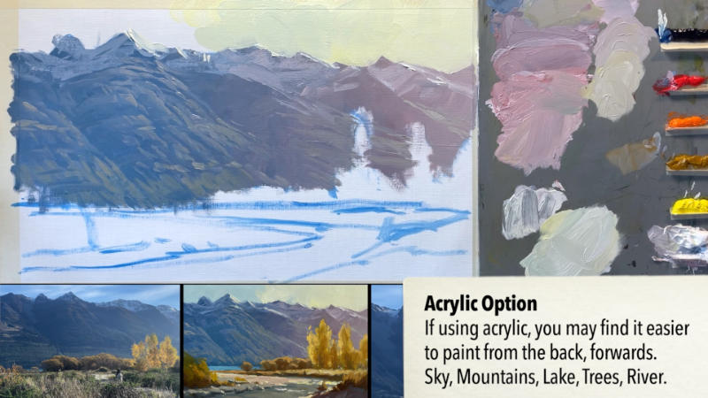
Next we add the lights over the top of the base coat, making sure that all of the colours are a little lighter than that base coat and that they all have more and more pink added to them as we approach the sun. This is where you will really benefit from having mixed those first layer colours methodically and in an orderly fashion, left them on your pallete. We can then use those colours to work from to mix the colours for the lights.
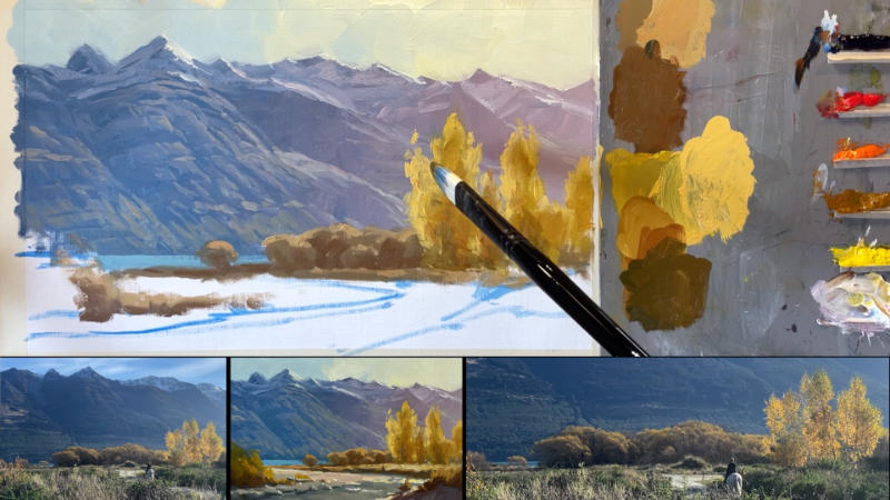
As we add the foreground colours we are careful to not make them too dark, like in the photo, and to add more colour into them in order to create a more colourful, light filled painting. We also need to make the colours here more warm and light on the right hand side and slightly cooler and darker on the left-hand side. This gives the effect of the warm light spilling across the whole scene, but being stronger on the right.
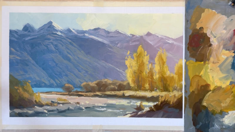
A little thicker paint with more texture is employed in the foreground to help create the illusion of detail and to add depth by contrasting with the smoother background paint. A few crisp details are then added with a fine brush. And Voila!
I'll take you step by step through this whole rich process and you can choose which parts you'd like to try out in your own work.
“We keep moving forward, opening new doors, and doing new things, because we’re curious and curiosity keeps leading us down new paths.”
—Walt Disney
Enjoy!
Whenever you’re ready! The lesson is available online any time, and your access to the lesson never expires.
As long as you need! Your access never expires, so you can come back again and again.
Sorry, no you can’t download the video. This is to avoid piracy. You’ll always be able to view the video on this site though.
Richard is a talented full time artist, who loves painting and teaching.
Hi I’m Richard. I’ve been painting my whole life and back in 2001 I traded my graphic design career for the humble life of a full time artist. I love painting, and as it turns out, I love teaching too.
Nowadays I balance my life between parenting, painting, surfing, travelling and teaching. My work is regularly featured in international art magazines, in galleries in New Zealand and America, on TV and in my Mum’s house.
I give outdoor painting workshops in interesting spots around this beautiful planet of ours and love encouraging people to paint. Two of my favourite artists are John Singer Sargent and Joaquín Sorolla.
My painting website: www.nzpainter.com
I’d love to be your new teacher.

Richard is a master artist with an exceptional skill in identifying and communicating key factors to making successful paintings. I have found his video workshops an excellent resource for improving my own work.
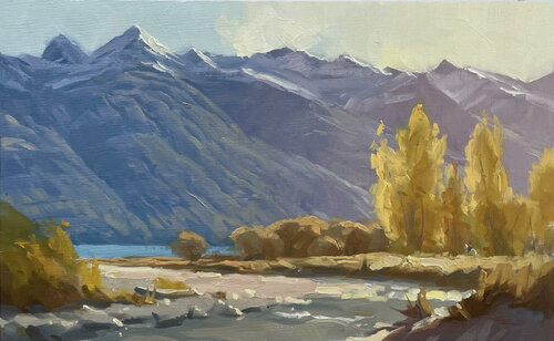
"Bucklerburn" 10.5 x 17" Oil on Linen by Richard Robinson
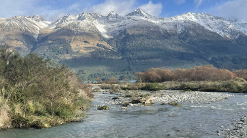
Bucklerburn River, Glenorchy, New Zealand
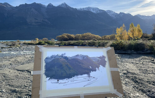
Bucklerburn River, Glenorchy, New Zealand
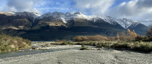
Bucklerburn River, Glenorchy, New Zealand
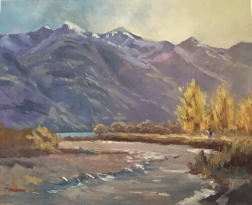
Bucklerburn
Artist: Jenny Foreman
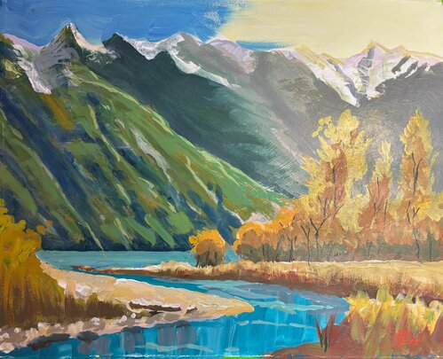
Acrylic painting at "Bucklerburn" in Glenorchy, NZ
Nice one, Eric, full of your lively style once again. Very vibrant colour in this one and interesting organic shapes. Love that energetic brushwork. You did make a glowing light effect too. The price you pay for that punchy colour in the mountains and the strong darks back there unfiltered by atmosphere is a loss of depth in the painting. The same can be said for the dark trunks in the trees, which, however are interesting graphic counterpoints to the larger brushwork around it. So again, it's all about what you want to achieve in your painting and the choices you make to get you there.
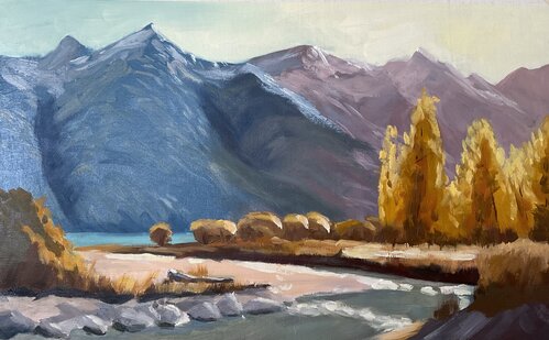
Bucklerburn oil on canvas
Hey Nancy that's really interesting what you've done there. :-) (No I don't mean that in a funny way). When I viewed that from a distance I thought 'Oh that's interesting!' because it looks like you've divided the mountains into 3 separate colour zones from blue to green to pink, which is weird, but interesting! Zooming in larger I can see that it's born from the struggle to create that gradation from left to right towards the sun and it didn't quite work out, mainly because the central green area is too dark. So, yes that could do with another attempt to get that skill nailed down, but meanwhile, on the other side of town, the foreground is great! Strong brushwork, bold contrast and interesting shapes. Nice!
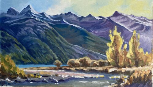
Bucklerburn - 11 x 16 Oil on Linen Canvas Pad. I enjoyed the "Disney" horse story!
Hi Louise, thanks I'm glad you liked the horse story - I think we can all do with a little more disney. I can see you've got a decent helping of it too. Vibrant colours and simplified forms here are creating a happy vibe and storybook feel. You've even got the sparkles in the water! Nice. Hey just one thing I'd caution is to get that horizon line really straight and horizontal, oh and avoid repeating shapes like the rocks in the foreground which makes it look like it's man-made. Let your horse have adventures in wild places. :-)
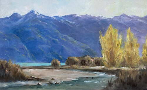
Bucklerburn Oil won Oil Paper
Wow that's an interesting take on this, Geoffrey. With all that high value contrast and sharply defined form it's got a gaphic feel to it that's still organic. A beautiful cohesive style! Nicely done.
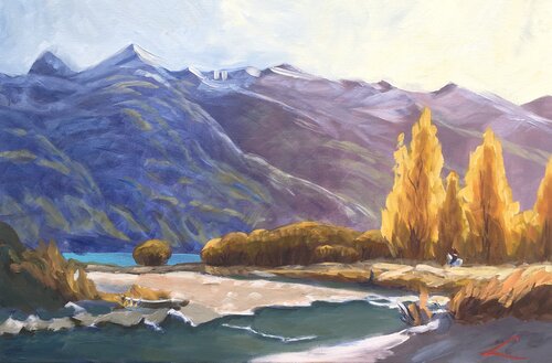
"Bucklerburn" Oils on canvas 10 1/2" x 17"
Nice one, Fay! Those poplars are really glowing with light, a nice colour contrast against the slightly more purple mountains. Note that if you’d used slightly lighter warmer greys in the darkest darks of the smaller trees in the mid ground they too would have more of a warmer glow about them. By using the same darkest dark there as in the foreground darks you’ve shortened that space between the foreground and the mid ground. Nice organic brushwork in those areas. Also nice building of form in the mountains, particularly in the snow. Some of those darker greens are darker than the blue grey base colour and that needs to be avoided as that colour blue grey should be the darkest value in the mountains.
Mountain river, oil, canvas, 40 cm x 60 cm
Beautiful work, Elena. You’ve managed that gradual transition to warmer stronger light across the whole painting and managed to keep your brushwork expressive and bold at the same time. We can really sense the warmth in that light effect which was the whole point of this painting. Just two things I’d like you to look at. The value of the greens on the mountains could be a little lighter and also more greyed. Lighter so that all the greens there are consistently lighter than the blue grey base layer, which is intended to be the darkest dark there. Greyer so that the mountain sits further back in the scene and doesn’t argue with the foreground greens. Next just have a look at the sharp shapes you’ve made along the river’s edge and in the white water there. You’ve oversimplified those shapes and it looks less natural because of that. Always avoid our tendency to oversimplify and make patterns. Great job!
 sale
sale
Not loving your painting lessons? No worries!
If it’s not the right fit, we’ll give you a full refund within 30 days of purchase - no questions asked.
When you purchase a DVD you also get online access to the same lesson, including any lesson resources like photos, downloadable notes and access to upload your painting to the student gallery.
That's why you need to make a password when you purchase a DVD, so you can access the online content as well. Enjoy!