Teacher
Richard is a talented full time artist, who loves painting and teaching.

with Richard Robinson
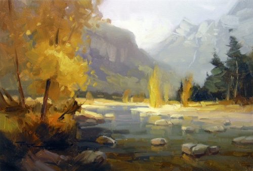
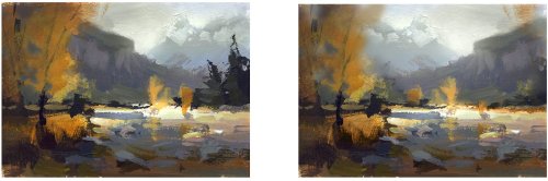
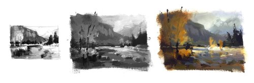
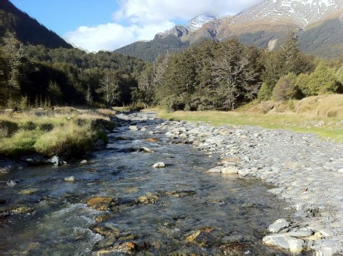
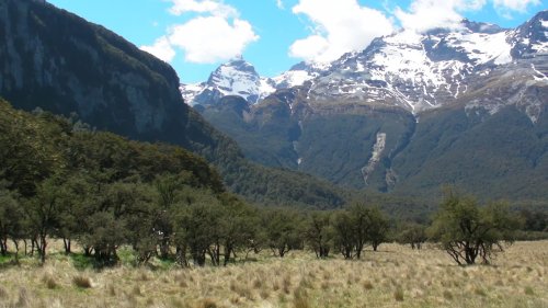
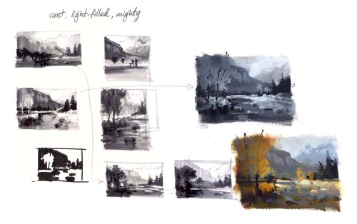
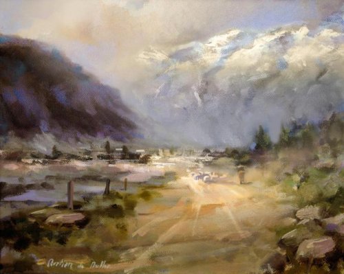
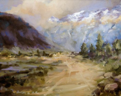
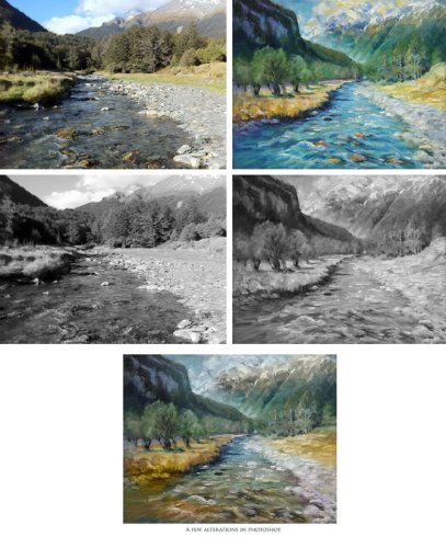
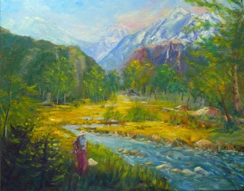
Learn how to apply atmospheric perspective and the spotlight effect in this beautiful mountain scene. Follow along step by step or use the resource photo to create something more your own.
Whenever you’re ready! The lesson is available online any time, and your access to the lesson never expires.
As long as you need! Your access never expires, so you can come back again and again.
Sorry, no you can’t download the video. This is to avoid piracy. You’ll always be able to view the video on this site though.
Richard is a talented full time artist, who loves painting and teaching.
Hi I’m Richard. I’ve been painting my whole life and back in 2001 I traded my graphic design career for the humble life of a full time artist. I love painting, and as it turns out, I love teaching too.
Nowadays I balance my life between parenting, painting, surfing, travelling and teaching. My work is regularly featured in international art magazines, in galleries in New Zealand and America, on TV and in my Mum’s house.
I give outdoor painting workshops in interesting spots around this beautiful planet of ours and love encouraging people to paint. Two of my favourite artists are John Singer Sargent and Joaquín Sorolla.
My painting website: www.nzpainter.com
I’d love to be your new teacher.

Richard is a master artist with an exceptional skill in identifying and communicating key factors to making successful paintings. I have found his video workshops an excellent resource for improving my own work.
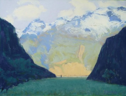
"Chinamans Bluff" by Richard Robinson 14 x 8" Oil on Canvas
"Chinamans Bluff" by Richard Robinson 14 x 8" Oil on Canvas
"Chinamans Bluff Plein Air" by Susie Gregory 11x14 oil on stretched canvas
The background mountains seem to be creeping forward. Here's what it looks like lightening the values there just a little... ... immediately gives a better sensation of light and distance in the background. I really like your idea for the painting and actually one of my notan studies was very similar to this. Something else you could look at here is the treatment of your trees - they look a bit formless to me like jelly or molten rocks. I know it's tricky giving them obvious form because they're in the shadow so you need to rely more on the outline shape of the tree, the deeper shadows underneath and sky colour reflecting off the upper foliage edges to give us some more subtle visual clues. Also the mirrored shapes of the trees either side of John look a little too manmade - one or both could do with changing. The clouds could do with some softer edges too. Other than those few things I really like this one - nice composition, colours and brushwork.
"Chinaman's Bluff" by Susie Gregory 16x20" oil on stretched canvas
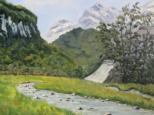
Design You've stuck very close to photo which is fairly decently cropped already, though there are two things I would personally like to see changed. The first is that I always try to avoid running strong lines off at the corners of the canvas - I don't particularly know why I'm afraid, but it always seems a little too eye catching too me, but to be fair the top left corner is the best corner to do this in for Western readers if you have to do it. Personally I would raise or lower the line of that mountain on order to miss that corner. The second thing is the light on the scene. This beautiful curving river leads your eye into the trees and mountains beyond, but I find in your painting the light does not reach a crescendo in that crucial focal area. Instead you've darkened the main copse of trees there and left the ones on the far right lighter which splits the attention between the left and right sides instead of coalescing in the middle. I understand you were delineating one set of trees from another using light and dark which is great, but in this case I personally would have painted that light the other way around. You've also seemingly placed a shadow over the foreground water which is a great way to lead in, but you haven't carried that shadow over onto the rocks which in turn creates a fairly high contrast area which draws the eye instead of pushing the eye onwards which is the usual purpose of a shadowed foreground. That could be changed pretty quickly with a dark glaze if you wanted to. Color The color overall is pretty good with nice warm/cool variations. I personally would have liked to see a clear distinction between midground and background, which is an element of composition as much as color. To do that you would lighten and cool the mountains. I often find graying the blue sky a little helps to add depth too. The river seems to have gone a little too dark, creating a bit of a hole in the painting. Have a closer look at the multitude of colors present in the river in the photo. (There are even more on site!) It's getting there, but I don't quite get a convincing sense of the color of the light on the scene, which means some lights are too cool and some too warm. The grasses on the left for instance could be warmer. I always find it harder getting that right when working from photos. Brushwork I love the energy in your brushwork - the overall feel is lively and interesting. I also very much like that soft glowing edge you've made in the cradle of the mountains which I think would be even more appealing if the mountains were lightened and subdued some more. You have a nice balance of hard and soft edges, although some of those are not in the right place - like the halftone edge of the grasses on the left for instance which could be softer as could the sharp shadows under the far right trees and I would like to see a few sharper edges further up river to draw the eye. Realism From a distance it all looks pretty convincing. On closer inspection some of the drawing seems to have been compromised in the flurry of brushstrokes. The grassy bank on the right has dropped a little which raises the perceived viewpoint a little and may be contributing the slight confusion over the size of objects on that side of the river. (picky eh!?) Some of the key river rocks could have been drawn better and you've missed out most of their reflections which all do help to assert the reality of the water. You've done a valiant job of reestablishing some value structure in the overexposed clouds, but they could possibly be mistaken for snowy mountains due to their crisp shapes. I would have liked to have seen a few key elements treated with a little finer rendering which often makes more sense of all the other loose brushwork - the light and shadow upstream, a few crisp rocks in the midground and the grasses on the left. Overall I think it's a pleasing painting which could benefit from some refinements. Nice work.
"Chinamans Bluff" by Emmanuelle Mertian de Muller 12x10" - oil on canvas - Altered
"Chinamans Bluff" by Emmanuelle Mertian de Muller 12x10" - oil on canvas
Design notan I really like the design. When it's simplified to it's basic dark/light design I can more easily see why - large dynamic shapes leading me into the painting. You've taken the concept of the curving river and turned it into what could be a grassy plain or a dirt track and the color design of warm against cool works very well and is immediately attractive to my eye even when viewed at a very small size which is always my test of a good design - if it looks good on a postage stamp, it'll look great on a wall. Color As I said the warm/cool thing is great and you've also varied the hues within those major groups enough to keep them interesting. The light blue in the mountains suggest smoke or mist to me and possibly could stand with some warming up just a little, as could the snow in sunlight to keep it in the same light as those warm clouds. I could imagine a slightly stronger spotlight effect further down the valley too. There are just a few odd flicks of dark green which seem to float out of place at the base of the mountains. Brushwork Lovely brushwork - very confident. I'm enjoying those strokes leading into the painting - they're a really beautiful feature of this painting in my opinion. Realism Overall it's really pretty good in terms of giving a convincing illusion of space. There is one major thing that pokes in my eye and that's the size of the trees on the right. Although I do like the size of them compositionally, there doesn't seem any way to reconcile their size with the size of the trees on the left and that puts the entire foreground into question - is it a broad plain of tussock or a dirt track? If you look at the image in a mirror for a second you'll get a new perspective on this because you're used to it now. To my eye those trees need some pruning and the track could do with some other elements to give it better scale, like some fence posts and some mustering sheep for instance. I've picked on the things I personally would change which are pretty minor because overall I think its a really nice painting and I wouldn't mind it on my wall at all.
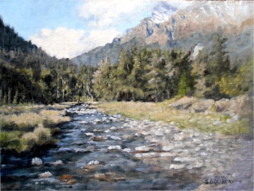
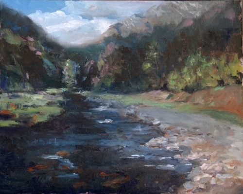
"Chinaman's Bluff" by Stuart J. Gourlay Oil on linen panel 12 x 16"
VERY nice Stuart, love the impressionistic brushwork - gives it a shimmering sense of light when combined with all your subtle grays. Also really enjoying your use of soft and hard edges - gives a very subtle call to the center of interest upstream. Can't really fault this one except the mountain pushing against the top edge, which you've subdued well with cloud, but my eye still wants a bit more space there! :-( but, that's a pretty minor thing and easily fixed if you were so inclined. Nice Job! One thing I might say is that I tend to look for opportunities to push color a little (or a lot) in one area of the painting, while subduing it in others, I guess in an attempt to capture that special moment in nature when everything coalesces into the 'perfect' lighting conditions for a certain scene. It looks like you've put a very subtle shadow across the foreground which is nice and something I would do but then I would tend to push the colors a little in the rest of the foreground. By pushing I mean raising their chroma/saturation a little and often the value. Right now, to my eyes, you have a very nice scene, capably painted and captured, and the location is very special but the lighting is just your everyday lighting. More and more I'm looking for lighting conditions that are very brief and special and make people stop in their tracks and say 'Oh!, that's NICE!' That's the goal anyway. You're at that point where you can reach for that sort of thing too. Playing with chroma is one small aspect of playing with the lighting and of course there is more to learn about that than we've got time on earth for, but it's an exciting goal to aim for.
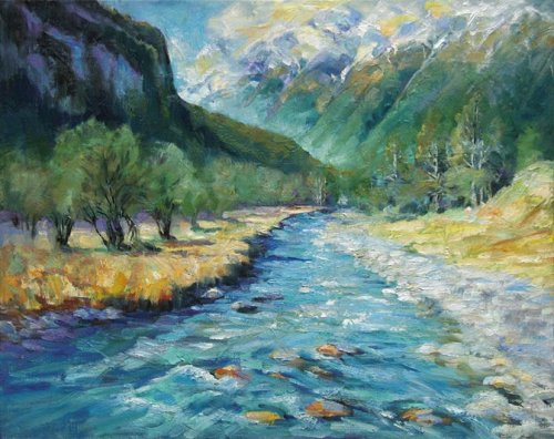
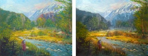
"Chinamans Bluff-A River Goes By" by Denise Maxwell Oil on Stretched Canvas 20"X16"
Design I love the fact that you've taken elements from two photos and joined them to make a more interesting composition. Great to see you using your artists license. Reducing the size of the trees has made the mountains seem grander and you've also made the mountains more interesting by exaggerating their sculpted forms and making them steeper. The tree shape in the foreground is unique and interesting (as trees are) and you've used the reducing repetition of that element nicely to help create depth while wisely simplifying its detail at the same time. The bank on the right seems a little shapeless to me and could do with more suggestion of structure. Other than that I think the design is quite strong. Colour I like that you have played with the color, making it more saturated, however there's a case to be made for contrasting colour against non color, which is something I often have to force myself to think about while painting because I'm so drawn to making everything 'happy colours' - nice and BRIGHT! The problem with saturated color everywhere in a landscape painting is that it tends to work against depth as colours naturally tend to get more subdued in the distance so that's what we're used to seeing. Putting strong colour in the background pushes it towards us. So I would have grayed down the colours in the mountains and midground a little whilst letting the foreground colours remain saturated. Doing that also gives the stronger colours a chance to look even more powerful contrasted with the grayer background colours. The bigger colour issue here is the blue colour of the stream though. Making it all the same blue like that makes it appear like there's blue paint in it. Have a look at the resource photo again to see what the actual colour was. As the water comes closer to us we can look through the surface and see more of the greeny/brown bottom colours showing through the reflection of the sky. Your blue is also a bit too light - if you compare the grayscale images of your painting and the resource photo you'll see that clearly. The foreground rocks in the river appear to be too warm - from a distance they look conspicuously like goldfish. That's also due to all that blue around them though. The yellow in the clouds is too dark in value - needs more white and if you're going to warm up the cloud colours there you will also need to do the same with the snow. Brushwork Your brushwork is varied and expressive. Good to see you didn't go crazy with the small brush when you put in the few details there - good work! I would have liked to see a few key brushstrokes in the foreground grasses, water and rocks be a little bolder and thicker paint. Realism The colour is really the major factor holding this painting back from achieving some really solid realism. The drawing is good except for a few rocks that could do with some attention and the changes you've made to the landscape all fit together nicely in perspective so well done there too.
Chinamans Bluff Painting Spot by Hazel Persson Oils on stretched canvas 16 X 20
Design Very nice idea and design Hazel! I like the placement of the figure and the meandering stream leading you in. I think your big tree is a little too close to the right edge of the painting for such a major player. Color The big problem for me in this painting is too much bright green! The greens in the distance need to be subdued (grayed a little) and some larger muted shadows added to give them more convincing form. Where is the light coming from? That's the big question when you're trying to paint form. I would also warm the greens in the foreground to help add depth and variation. The warm cliff face in the distance is jumping forward spoiling the illusion of depth and might look better subdued into cool grays. Doing that and lightening it a little also helps to avoid that valley being so symmetrical. I find a slightly grayer sky is often preferable to a clear blue sky in a painting which seems to jump forward a little. Nice to see you playing with adding warm pinks into your clouds there but remember that color light should also apply to the snow at the same height. Brushwork You're a bit of a dabber Hazel! This shows to me a lack of confidence which can be gained only with practice unfortunately, but also by making yourself use larger brushes and a palette knife. It's also a good idea to practice painting individual elements on scrap paper/canvas before you apply them to your painting, focusing on painting the simple shadow and light shapes with the least possible fuss. With that said, you do however have a nice variety of hard and soft edges and different types of paint application which makes for an interesting paint surface. Realism The perspective of the stream and the rocks in it is a little off, making the river run uphill and down. The straight lines of the stream edge are also a little too man made - needs some bigger variation in there. Overall I think with the exception of those bright greens (but that's a personal dislike of mine) it's a pleasing painting with a nice feeling to it and a lot of promise to be even better.
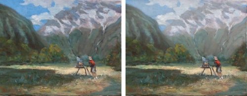
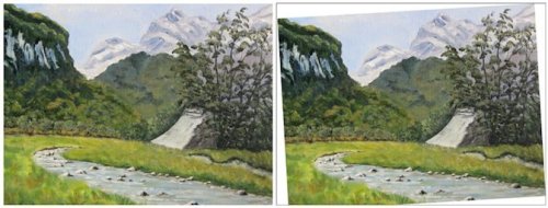
Design I like the weighting and placement of your objects and the interesting organic shapes your have given to everything in your painting with really breathes life into it. HOWEVER, were you painting on a sloping easel? The whole painting seems oddly tilted to the right. Let's see how it look when we straighten in up… Better yeah? The changes that has wrought in the design are beneficial too - the mountain peak is not quite so squeezed against the top of the canvas and the cliff exits further away from the corner as does the river. Colour The painting is made up almost entirely of green and cool grey with a commendable attempt at a warmer variation in the green which has unfortunately not done enough to temper the vibrant green or to add enough colour variation into the scene. Although you have darkened the green on the cliff and hill it is still very high chroma like the foreground grass whereas at that distance it should be a considerably more subdued gray green. You clearly have the skill to do that because you have managed it for the green in the background mountain, but again, not enough, so it brings everything forward, flattening the picture surface. So in short, you should think about applying more atmospheric perspective to the colours in your scene and more warm/cool variation. Brushwork Your brushwork has a lively feel to it but I believe you could benefit from the experience of doing this painting again with a larger brush and more paint in order to get some larger gestural marks happening. It's much easier the second time around. Practicing in just black and white helps a lot with brushwork too - just removing the problem of colour lets you focus more on other things. It's nice to see you switching to a fine brush to get some smaller details in, but remember most of that can be done with a larger brush too given some practice. Realism Disregarding the tilting of the painting you have managed a fair degree of realism. Your trees are well defined appropriate sizes and your drawing is quite astute. There are a few things worth changing to help though. The first thing that strikes me is the skateboard ramp that someone has rudely built in the middle of this beautiful place. Sorry to poke fun, because yes it does look like that in the photo, but our job is to improve things to look right in a painting, so breaking that smooth shape down a bit could help a lot I think. The second thing that could change is the light area behind the main tree. It's discordant with the rest of the mountain. You made a good decision to simplify the background behind that tree, but failed to reconcile that area with the mountain. The last thing I'll pick on is the very light value in the bluff walls on the left. This is a really common problem - painting light objects in shadow too light - it's our brains tricking us again. Bad brain, bad. Make these darker and suddenly that whole bluff will look a lot more realistic, I promise. (Try a mid gray to start with.) I personally think looking at the way you have approached this one painting that you hold a lot of promise as a painter Ngaire, so keep at it!
60.00USD
$45.00USD
$55.00USD
Not loving your painting lessons? No worries!
If it’s not the right fit, we’ll give you a full refund within 30 days of purchase - no questions asked.
When you purchase a DVD you also get online access to the same lesson, including any lesson resources like photos, downloadable notes and access to upload your painting to the student gallery.
That's why you need to make a password when you purchase a DVD, so you can access the online content as well. Enjoy!