Teacher
Richard is a talented full time artist, who loves painting and teaching.

with Richard Robinson
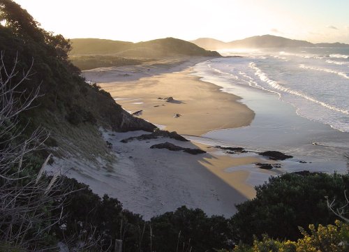
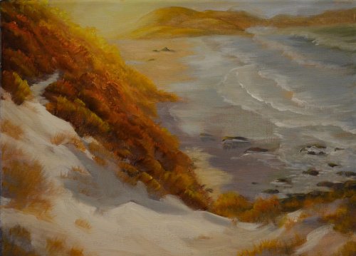
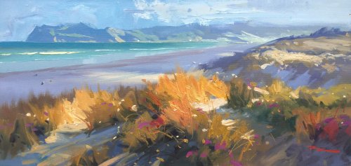
This is one of my favorite painting spots, and a great place to slide down sand dunes. Follow me step by step as I show you the techniques I use to paint this inspiring sunset beach scene.
Painting a large glowing light effect, atmospherics and making beautiful brushwork are all demonstrated in the video. Enjoy!
Whenever you’re ready! The lesson is available online any time, and your access to the lesson never expires.
As long as you need! Your access never expires, so you can come back again and again.
Sorry, no you can’t download the video. This is to avoid piracy. You’ll always be able to view the video on this site though.
Richard is a talented full time artist, who loves painting and teaching.
Hi I’m Richard. I’ve been painting my whole life and back in 2001 I traded my graphic design career for the humble life of a full time artist. I love painting, and as it turns out, I love teaching too.
Nowadays I balance my life between parenting, painting, surfing, travelling and teaching. My work is regularly featured in international art magazines, in galleries in New Zealand and America, on TV and in my Mum’s house.
I give outdoor painting workshops in interesting spots around this beautiful planet of ours and love encouraging people to paint. Two of my favourite artists are John Singer Sargent and Joaquín Sorolla.
My painting website: www.nzpainter.com
I’d love to be your new teacher.

Richard is a master artist with an exceptional skill in identifying and communicating key factors to making successful paintings. I have found his video workshops an excellent resource for improving my own work.
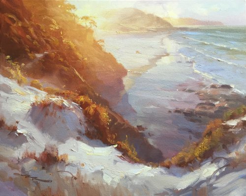
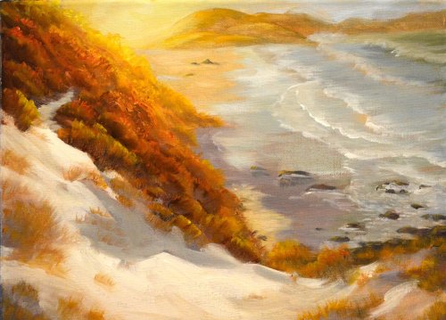
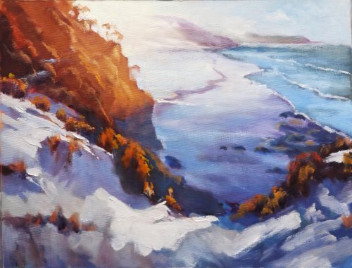
"Sunset Beach" 15.5 x 20" Oil on Canvas by Richard Robinson.
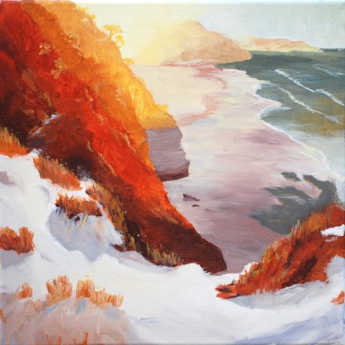
"The Beach 2" 11x14" Acrylic on canvas by Susan Burke - Altered
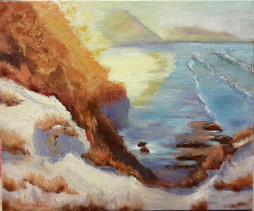
"Sunset Beach" 16 x 12" Oil on Canvas by Denis King
Hi Denis, there's a lot working really well in this painting with just a wee adjustment needed to turn it into a real cracker. Your drawing is spot on, your shapes are nicely designed and the values are mostly perfect AND the brushwork is beautifully succinct. However... all that beautiful warmth in the hillside is not apparent enough in the background, which is looking chalky with too much white. When painting the hills back there start with a warm colour first like a light gray yellow ochre, then go from there, injecting warmth into the sky too and reflecting it in the beach and shallow water. THEN you'll have a complete glowing effect. Beware those light diagonal sand shapes in the foreground that are creating a pattern of similar shapes. I would love to see this painting with those few changes made as I think it'll be outstanding. Great work Denis.
"Sunset Beach" Oil on canvas 25x30cm by Marisa Comana Pessina
Not too shabby Marisa! Nice glowing effect there. Hey see those purplish shadows on the beach? They're not really fitting in with the warm colours surrounding them. The darker area of brown at the base is not helping either. Take another look at my painting to compare. The hills in the distance are a good colour though you've outlined one a little with purple which spoils the effect. Beware straight edged hills too! You've achieved a good variety of grass shapes in the foreground which is always tricky since we have a tendency to clone similar shapes in our paintings. The stark edge where the foreground sand meets the dark hill could be softened by breaking the edge with some stray grasses. Hope that helps. Overall you've achieved a nice effect.
"First Glimpse" 16 x 16" Oil on Canvas by Kadee Hughes
Hi Kadee, welcome to the group. Quite a striking painting you've made here with the contrast between the vibrant red and the gray greens in the ocean. I like the way you've compressed the image into a square format which has made the hills appear even steeper. You've grasped the idea of the glowing effect and the next step is to be a little more subtle with the colours. The yellows, oranges and reds could do with a little more gray in them, which you can do by adding the colour's complement, which is opposite it on the colour wheel. In general, our first paintings tend to be very bright and colourful and over time our colour sense develops greater subtlety. We can not only comprehend more subtle colour shifts in nature but we begin to be able to paint them. Yay! Just takes time. Anyway, your drawing is very good, the grays are pretty good but the lights in your foreground sand could do with some variation. The distant hills should be the same value or darker than the ocean, not lighter. The cast shadow from the yellow section of the hill on the beach should not end with a dark line. Also, just have a look at the resource photo and see how close the colour of the hill is to the colour of the shadow. Very similar really. Actually a lot of the colour problems in this painting could be solved by more carefully comparing one colour to another. Use the fuzzy one eye to help compare colours. Close one eye and make the other eye go out of focus so all you see is the big blurry shapes. Then compare colours that are similar. Ask yourself is it lighter or darker? Warmer or cooler? Grayer or more vibrant? That should help. Ok good luck and happy painting!
"Maui Morning" Oil on Canvas 5x7 by Laurena Beirnes
You've got a pretty good glowing effect there Laurena, principally because of the background gradation from warm light to darker cool, and secondly from your effort to make the palm trees in the foreground a little warmer as well. The shadow cutting across the grass and beach is a nice touch too though I would expect the shadow on the beach to drop down slightly lower than shadow on the grass rather than curving upwards. The drawing of this and the curving edge of the distant beach are the two main things holding this painting back. Compare it with the straight edge of the beach in my painting below.
"The Beach 2" 11x14" Acrylic on canvas by Susan Burke
I used a free online image editor to change the levels and lighten the whole image. See the free editor here: http://www.pixlr.com/editor I opened the image, chose Adjustment > Levels and then pulled the right hand slider left to the edge of the curves. This is a common adjustment I make to photos of paintings that have been taken in the shade. I usually use Photoshop to do this but this free online software does the same job. Anyway, you've got a lovely glowing effect happening here with a everything getting lighter and warmer as it approaches the sun. Nice job. You could perhaps have gone even lighter where the sun would be with white and a touch of bright yellow. Your drawing of the cliffs is very good but you could have done a little better in the distance by leveling and straightening the horizon and making the waves reduce in size as they recede from us. Also the most distant hills could do with being a little lighter to help them recede further. Other than that it's very good, especially considering it's painted in acrylics which make it more difficult to achieve soft atmospheric effects due to their quick drying time. Good job.
$15.00USD
$15.00USD
$65.00USD
$45.00USD
Not loving your painting lessons? No worries!
If it’s not the right fit, we’ll give you a full refund within 30 days of purchase - no questions asked.
When you purchase a DVD you also get online access to the same lesson, including any lesson resources like photos, downloadable notes and access to upload your painting to the student gallery.
That's why you need to make a password when you purchase a DVD, so you can access the online content as well. Enjoy!