Teacher
Richard is a talented full time artist, who loves painting and teaching.

with Richard Robinson
In this workshop you’ll learn what broken colour is and how to achieve it in a painting, starting off with a deceptively simple block study from life. In the following workshop we’ll learn how to apply this technique to a more complex painting, but this workshop contains the keys to that learning. Enjoy!
Whenever you’re ready! The lesson is available online any time, and your access to the lesson never expires.
As long as you need! Your access never expires, so you can come back again and again.
Sorry, no you can’t download the video. This is to avoid piracy. You’ll always be able to view the video on this site though.
Richard is a talented full time artist, who loves painting and teaching.
Hi I’m Richard. I’ve been painting my whole life and back in 2001 I traded my graphic design career for the humble life of a full time artist. I love painting, and as it turns out, I love teaching too.
Nowadays I balance my life between parenting, painting, surfing, travelling and teaching. My work is regularly featured in international art magazines, in galleries in New Zealand and America, on TV and in my Mum’s house.
I give outdoor painting workshops in interesting spots around this beautiful planet of ours and love encouraging people to paint. Two of my favourite artists are John Singer Sargent and Joaquín Sorolla.
My painting website: www.nzpainter.com
I’d love to be your new teacher.

Richard is a master artist with an exceptional skill in identifying and communicating key factors to making successful paintings. I have found his video workshops an excellent resource for improving my own work.
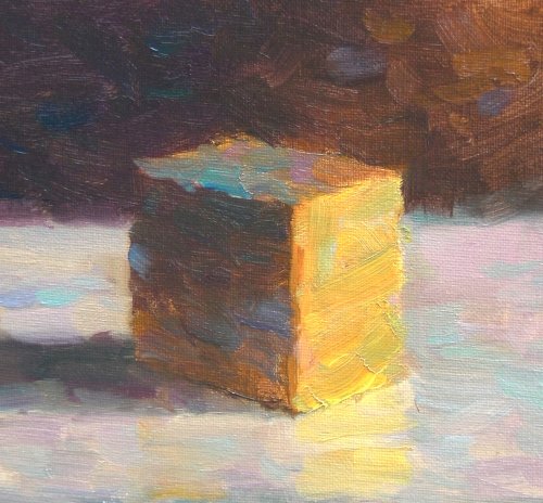
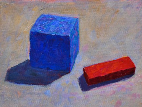
"Block study 2 - broken colour" 8x8" Oil on Canvas by Richard Robinson
In retrospect, the blue on the top has gone too far because it has overtaken the grayed orange on the top which should have dominance. Of course it's all subjective - there's no one right way of doing it, but my heart wants me to stay true to the obvious colour and keep the broken colour as a sub-dominant - the verbrato on the main note, the spice in the meal.
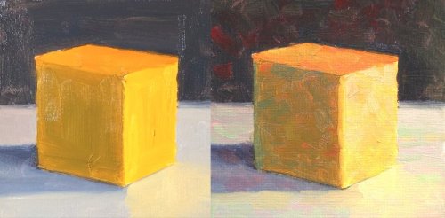
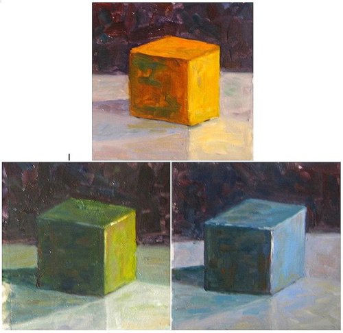
"Block Study, before and after broken colour" 7x7" each. Oil on Canvas by Richard Robinson
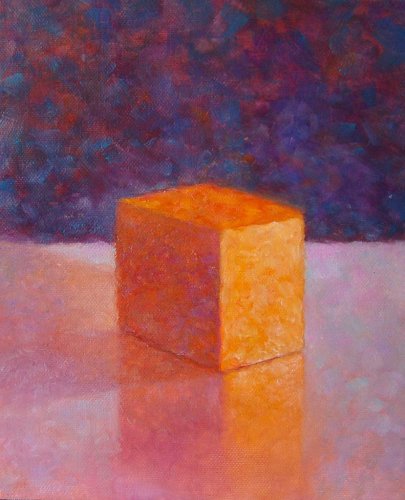
"Broken Color Workshop 31" by Luba Robinson
Nice work Luba. I can see all sorts of interesting colour in there. Beware of making patterns with your brushwork - having more variation in brushstroke size and direction will add more interest to the painting.
"5x7 Acrylic on matt board" Oil on Canvas by Hyun (Jane) Kim
Exciting work Hyun. Tonally this is great and colour is very powerful against the dark background. Kind of a shame it's in acrylic because some of the dry brush and overpainting inherent to acrylics is detracting from what is mostly beautifully fluid brushwork. The small flicks of broken colour are interesting but the pink on the frin and the light blue in the top right are too light and therefor breaking the illusion of form of the cube. Nice work in the spotlight effect and the glowing colour off the top.
"Block Study" 4x6" Acrylic on Canvas by Yngvar Nilsen
Good work Yngvar. Tonally this is very good except the grey table top could have looked more interesting with a subtle tonal gradation from right to left in keeping with the light source. The ochre colour in the background seems to be muddying the colour there at the top - perhaps a different colour choice would have worked better there. Little gaps through to the canvas spoil the illusion in a few places.
"Workshop 31 three color study" Oil on Panel 6x6" Each by Xiao Li
Great to see you trying it with different coloured blocks Xiao. Tonally these studies are very well observed- you've got that nailed down. Your broken colour is pretty subtle. I encourage you to try increasing the colour contrast further, really pushing the broken colour idea. When you push it beyond what looks good to you you will have found the limit that you can work within in the future. Good work.
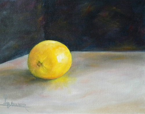
"Broken Color Study" 8x10" Oil on Canvas by Lisa Bower
Lisa that's a good looking lemon but there's not a lot of obvious broken colour going on here. This is ready to put some in. Note that you can lose the edge of the lemon more in some places (often in the shadow side) and you can extend some orange into the background from the light side of the lemon to give the appearance of glowing light. Good work spotting the yellow reflection in the table top. Now that you have a fairly good grasp of painting realistically like this it's your opportunity to step outside your comfort zone and really play with this broken colour idea - or any other idea for that matter. Have fun!
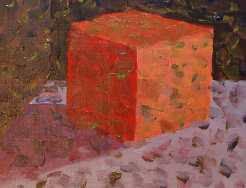
"My red cube final step" Oil on Canvas by Jocelyn Arsenault
"Jocelyn, You must, must ..find colors and values that relate to your step 1 ....this is crucial to depicting the planes of the block. This statement is for everyone doing this workshop ....Broken color is not about painting indiscriminate spots of color/value. The broken color MUST relate to the values and colors that make up each plane of the block. The light side of the cube MUST depict .....LIGHT! To do that, you must choose colors and values that relate to .....LIGHT. The dark side of the cube must depict ...THE ABSENCE OF LIGHT ..therefore, the absence of warm colors. In this red block, the dark side of the block would be painted first with a COOL red ..because it is not receiving light. The light side begins with a WARM red ..because light is warm. The broken color effect then must RELATE to these planes ...not fight each other." - Michael Severin. I agree with all that, except that of course sometimes the light will be cool; on a cloudy day or through a window not facing the sun, which gives us cool lights and warm shadows. But anyway the first problem is the choice of colours in the initial blockin as Michael said, where if you have a warm light source you should use your warmest red or red/orange for the light side and a cool red like alizarine crimson (which leans towards blue) for the shadow side. The problem with the broken colour is mainly the value of it - not bad at all in the shadows where it tends to match the values there, but it should be lighter in the light areas in order to match values there. Adding green into the warmred/orange light side is always going to be tricky since green is the compliment and will tend to gray the red/orange down, so you'd be better to stick with yellows, oranges and possibly a little violet for that side, but again, they need to be the same value.
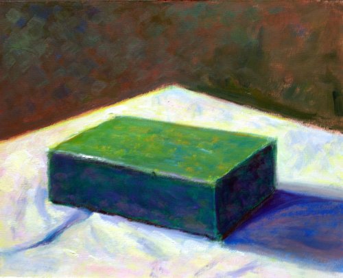
"Green Block Study" Oil on Canvas by Michael Severin
Great work Michael. By adding warm yellows to the lights and cool violet and blue to the shadow areas you've created a convincing warm light effect. Nicely done.
Not loving your painting lessons? No worries!
If it’s not the right fit, we’ll give you a full refund within 30 days of purchase - no questions asked.
When you purchase a DVD you also get online access to the same lesson, including any lesson resources like photos, downloadable notes and access to upload your painting to the student gallery.
That's why you need to make a password when you purchase a DVD, so you can access the online content as well. Enjoy!