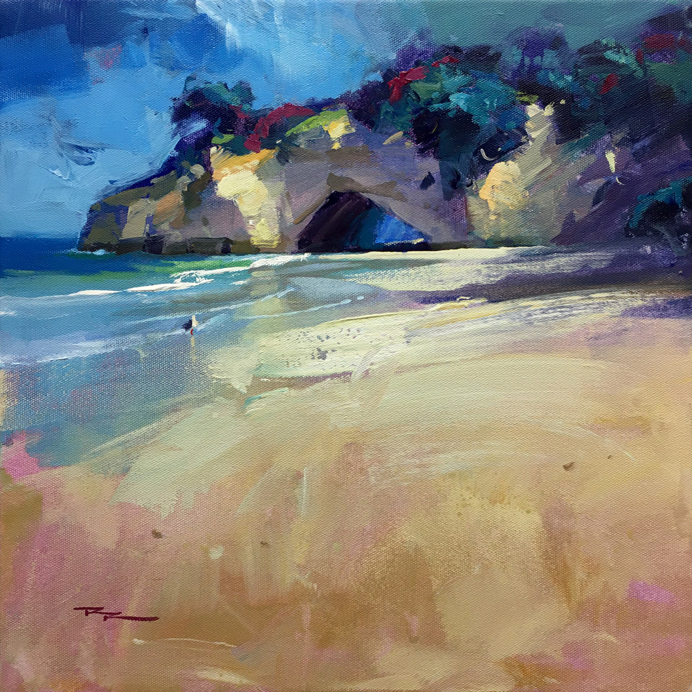
Easy to say, hard to do. Let Richard Robinson show you the the 5 keys to achieving a fresh painterly look without sacrificing realism.
This lesson is a pre-recorded livestream which includes student questions and answers so you'll find this very engaging to watch and learn from. Paint along stroke by stroke, pause and replay whenever you like. Grab your favorite beverage and a cookie and enjoy the experience of a live workshop!

Cathedral Cove, Acrylic on Canvas 15x15" by Richard Robinson

Grots at the sea, acrylic with oil glazing, canvas, 40 cm x 40 cm
Artist: Elena Sokolova
Beautiful painterly work Elena! Great to see you playing with the different thicknesses of paint, some thin, some impasto, then some glazing of oils over the top. Suggest you try some using a palette knife or credit card to get some really interesting texture in the foreground. The strokes you've currently got there are a little uniform so I'm not quite feeling the energy there that there potentially could be. Good strong colour and nice to see some careful consideration of the drawing of form in the cliff as well. Great!
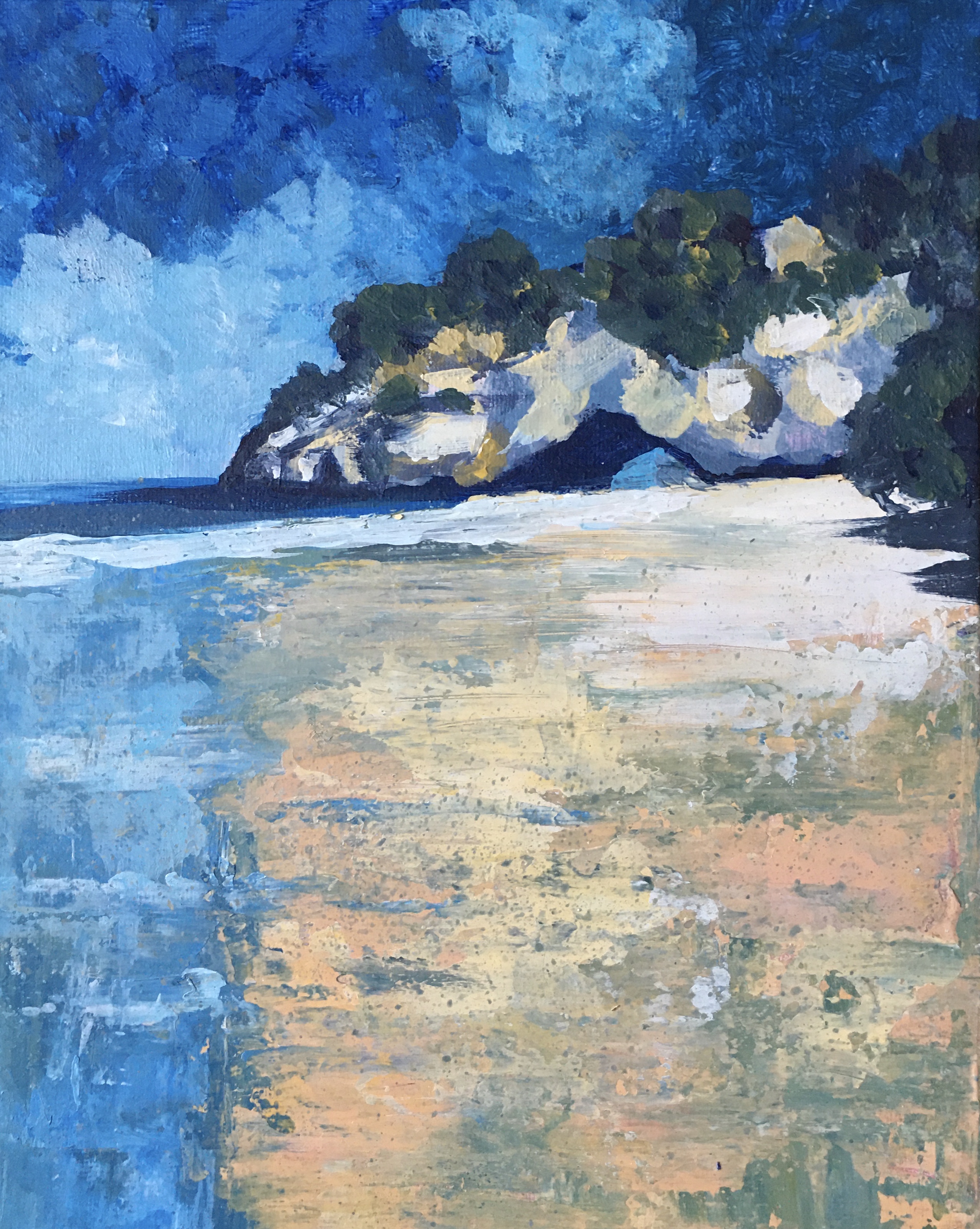
Cathedral Cove
Artist: Barbara Magor
Well THERE'S some interesting texture! Great to see you took the challenge to heart, Barbara and really went to town using different tools and great globs of paint to give us all some generous texture to admire. The treatment of the foreground has lost a little realism but gained in abstraction and pure interest. Would love to see more of this from you!
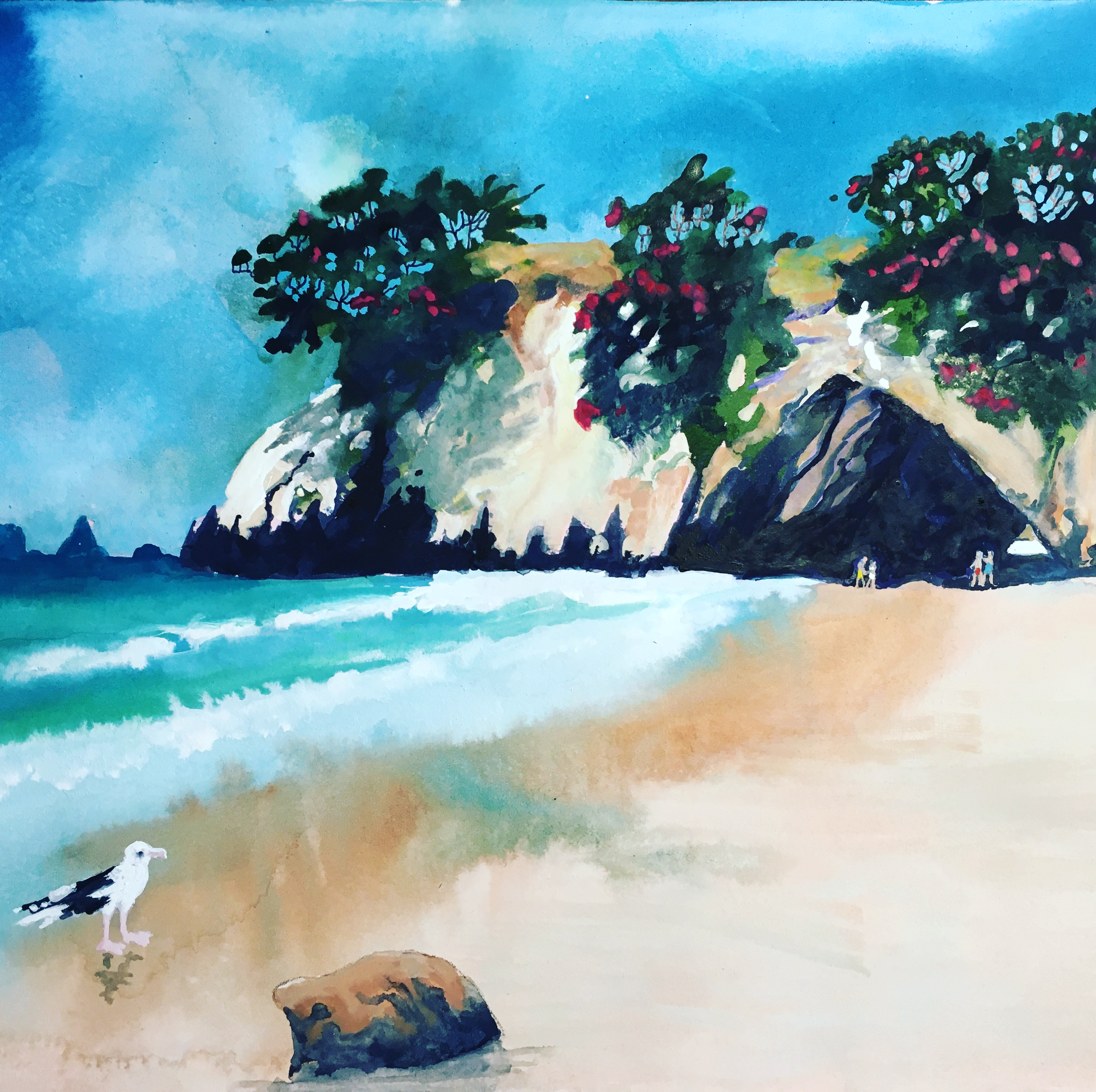
Cathedral Cove, watercolour & Gauche by Eric Hillmer, Toronto, ON, Canada.
Artist: Eric Hillmer
Nice to see your different take on this, Eric. All that intricate detail in the cliff looks great set off against the simple washes in the sky and foreground. As for placing the gull and rock right against the edge of the painting, that's generally a no-no as it draws the eye to the edge rather than circulating through the main focal areas. But hey, you only have to look at one of Degas' paintings to realise that compositional rules are made to be broken. What I might suggest is to add a little more textural interest into the foreground. Also, how about a cast shadow for the gull and a sharper cast shadow for the rock? A soft shadow as you have it suggests diffuse light, whereas you have strong direct light on the cliff casting dark sharp shadows. Just some thoughts. Really interesting!
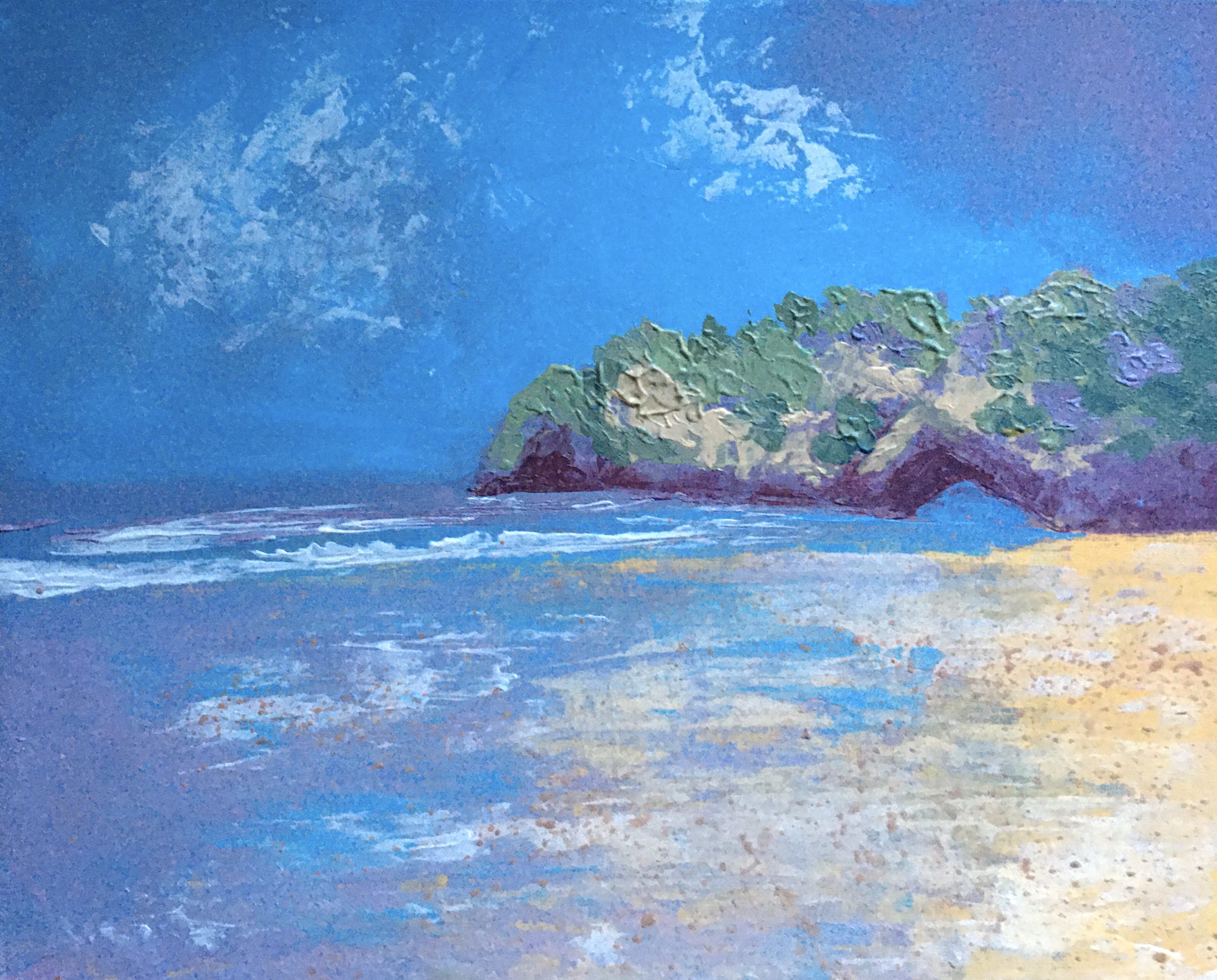
Cathedral Cove-semi abstract version
Artist: Barbara Magor
This one's gone even more abstract and textural - interesting! The drawing of the base of the cliff has gone a bit wonky. Was that intentional? Remember that going more gestural and abstract doesn't mean you have to lose control of the drawing. It's hard to maintain, but in my opinion well worth the extra effort to create a painting that's strong on both abstract aesthetics and technical drawing skill. You've sure got some beautiful textures working there. Great to see.
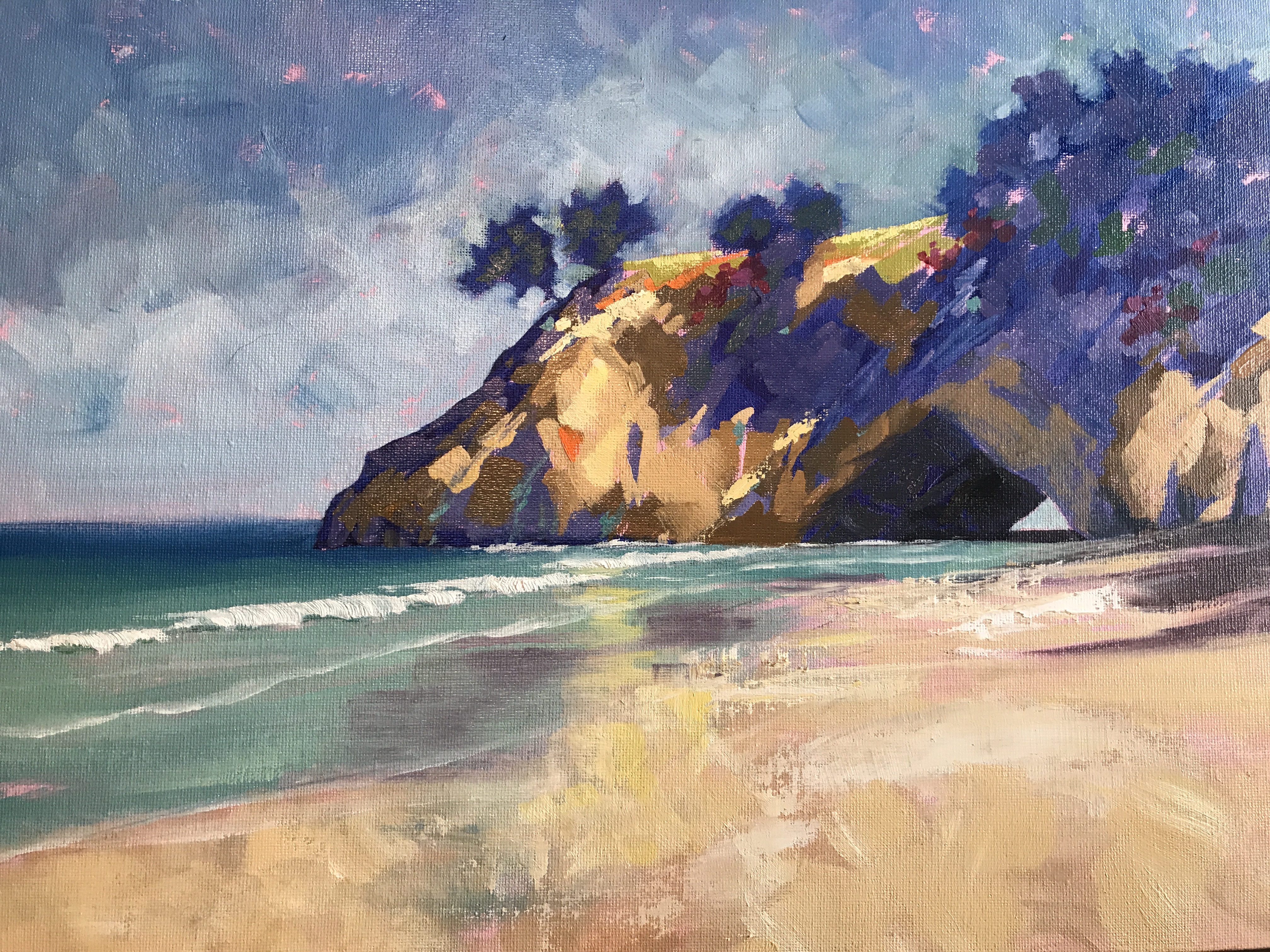
Wish you were here
Artist: Lindsay Shaw
Hi Lindsay, first of all, I love the chunky feel of your varied brushwork in the cliff - just gorgeous. Good to see you exploring the impasto texture in the foreground, although it's a shame that degree of freedom didn't spill out into the treatment in the water as well - got a little tight there, also in the sky which could benefit from a few larger more gestural strokes. You're walking the line between tight and loose in this painting and with a little more courage could break through into a really exciting gestural piece. Really very nice. I encourage you to keep pushing.
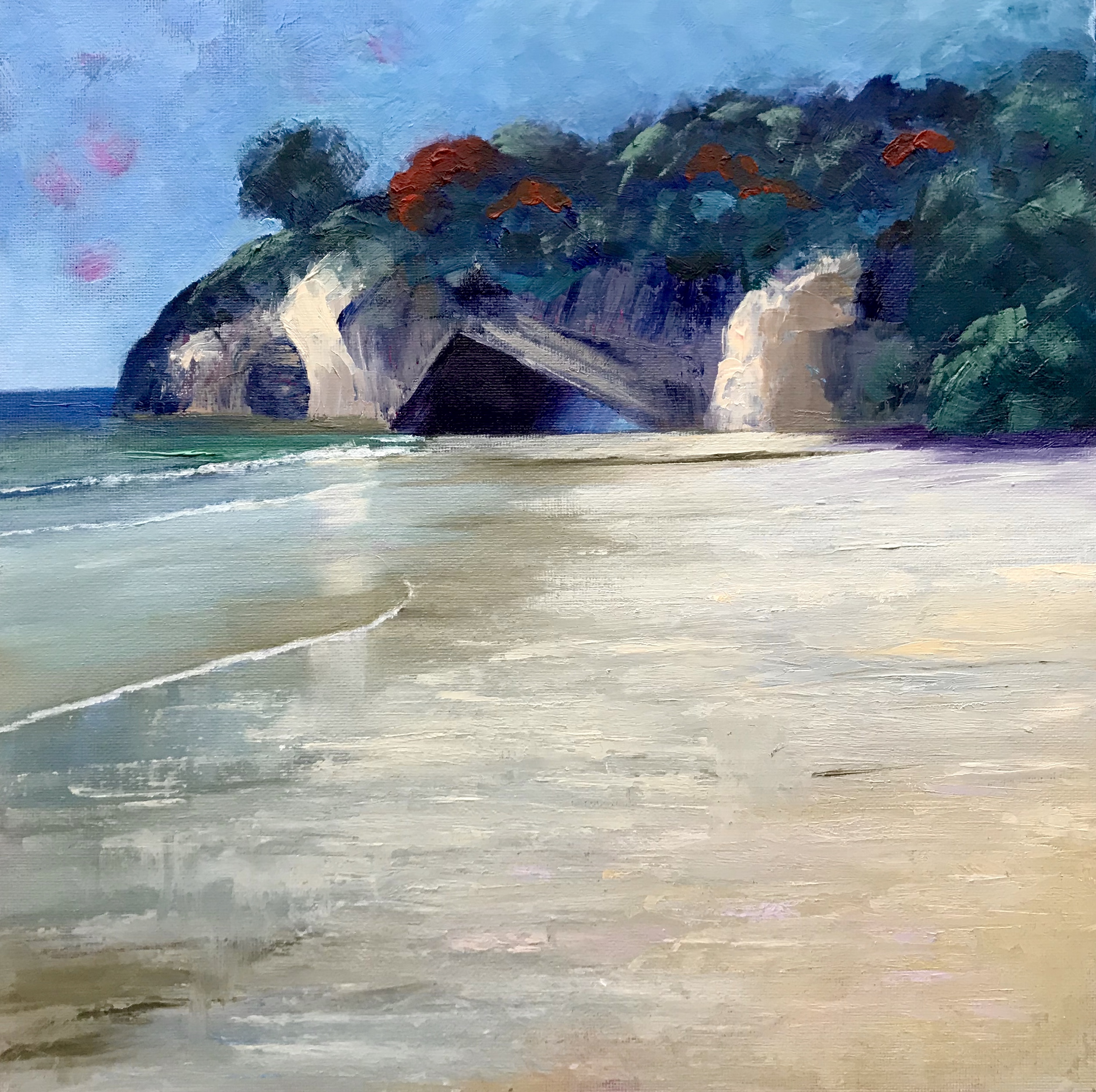
Cathedral Cove. Oil on canvas board, 12" x 12"
Artist: Antonia Clark
Antonia, great effort - pushing yourself to make gestural marks and impasto effects when you're clearly clearly a quite controlled painter. You've made some repetitive patterns within your gestural marks, and when you do that it detracts from the feeling of freedom that is generally the intentional of such marks. Making patterns can be a difficult habit to break, but it's worth the struggle. Before each stroke, think about how you might make it different from your previous stroke. Think of all the aspects of a mark you can change, like thickness, speed, size, pressure and shape, and then make a decision to change. Also try switching your painting hand or grip ever so often. Enjoy!
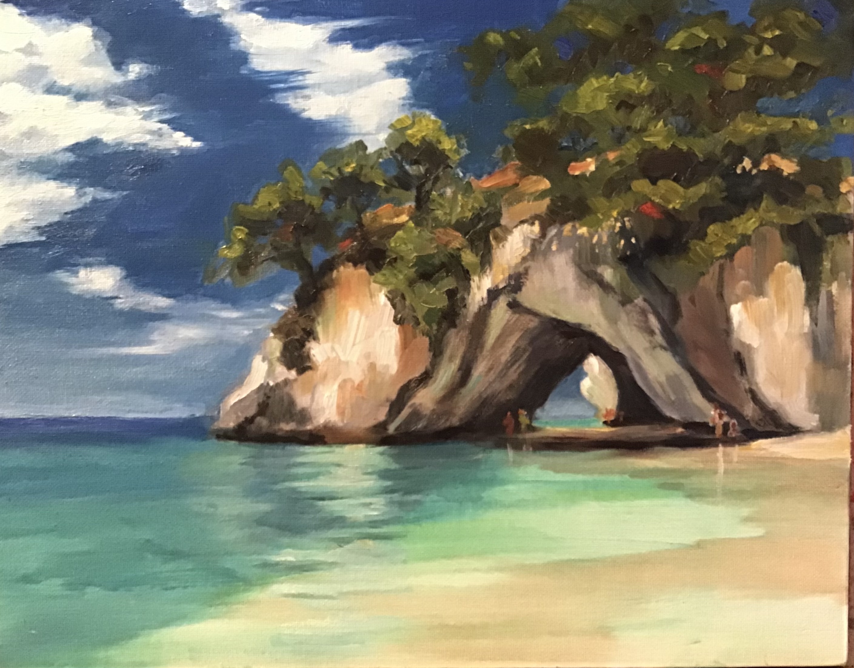
Cathedral Cove, 11x14, oil on canvas panel
Artist: Reenie Mccallum Hey Reenie, this is beautiful! LOVE the strong sense of warm sunlight you've created with all that bounced light into the shadows of the cliff. Dreamy! Ooh the little detail of the cliff seen through the archway is tantalising! Great subtle colour work in the water showing the banding at different depths and also the reflections of the cliff and figures. Nice. Can't think of anything that would improve on your great work except to see your signature on it and hung in a nice frame. Congratulations!
1. Make 'expressive brushwork' your goal for the painting. Write it boldly on a piece of paper and stick it to your easel above your canvas. Intention is everything.
2. Lay out at least twice as much paint on your palette than you think is necessary. Painterly paintings need PAINT!
3. Use bigger brushes that usual. Also try out other tools like palette knives, credit card, roller, sponge, spray bottle, scratcher, scraper, pourer, toothbrush. Anything the makes interesting marks.
4. Consider the brushwork in the focal areas carefully and don't neglect the drawing of key shapes. How can you achieve the shape and texture you want with the tools you have? Experiment and don't be afraid to scrape off and try again. In the non-focal areas go as nuts as you like with the brushwork. Enjoy!
5. Have fun! Be fearless. Don't worry about wasting materials. It's not possible to waste them. Painting supplies are made to be enjoyed.
Login to your account to post a comment.