Let Richard Robinson show you the the keys to achieving a fresh painterly look without sacrificing realism.
This lesson is a pre-recorded livestream which includes student questions and answers so you'll find this very engaging to watch and learn from. Paint along stroke by stroke, pause and replay whenever you like. Grab your favorite beverage and a cookie and enjoy the experience of a live workshop!
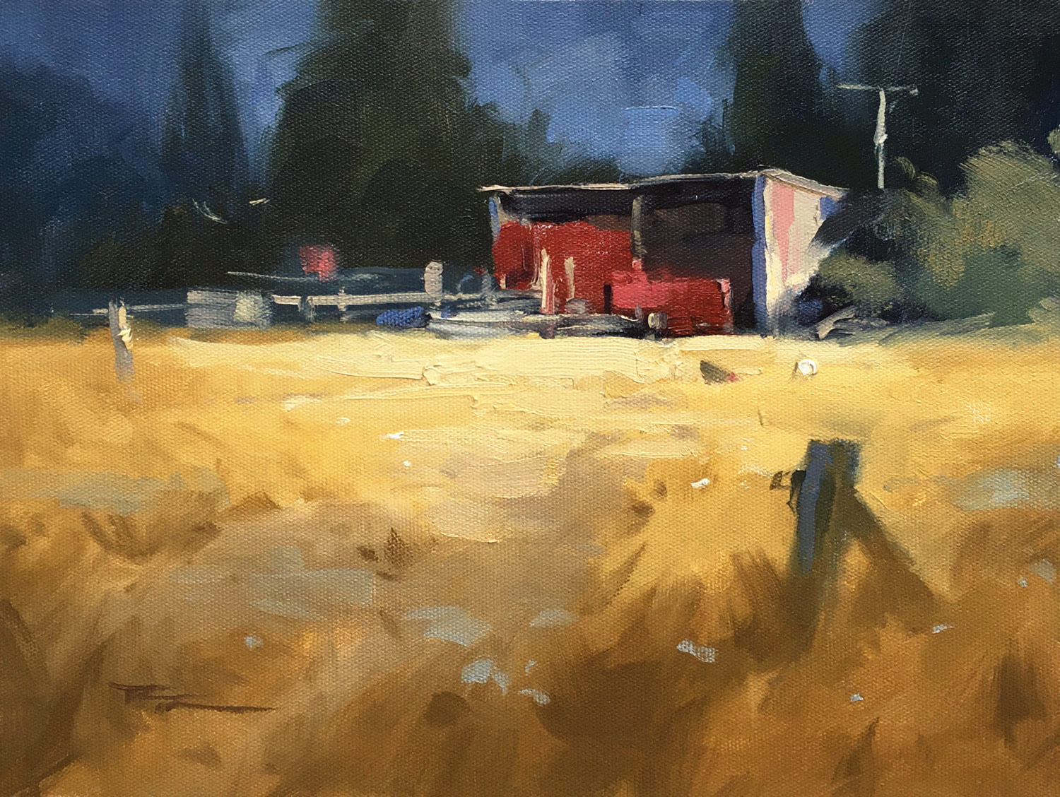
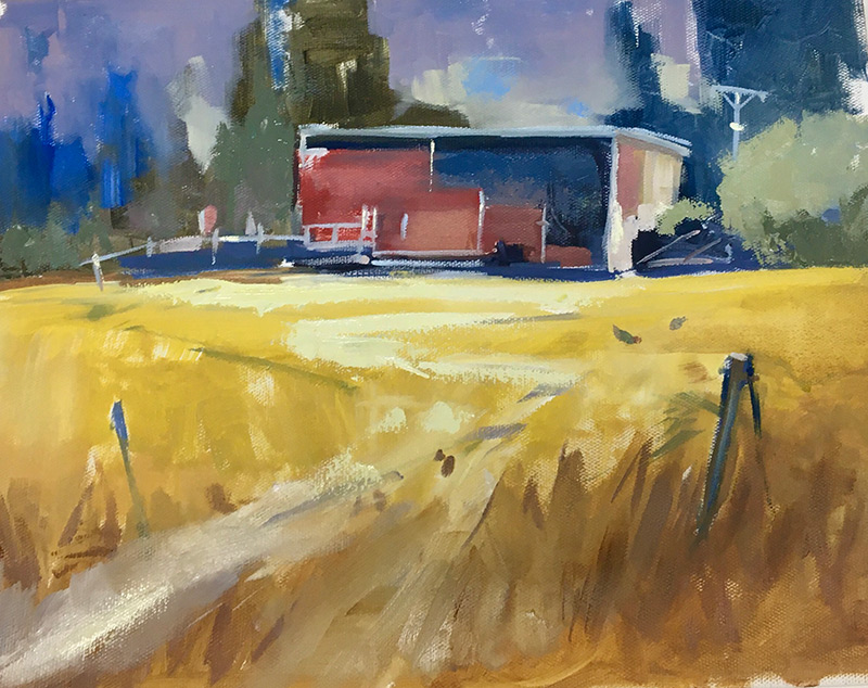
Rustic Farm Shed 10x12" Oil on Canvas by Richard Robinson
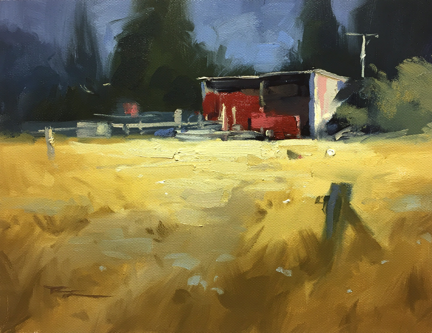
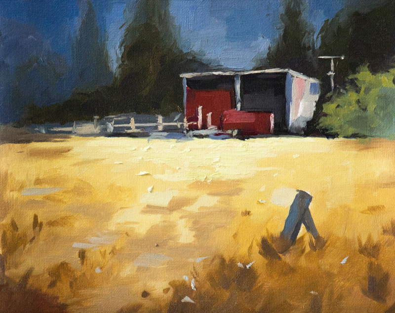
 Resource Photo
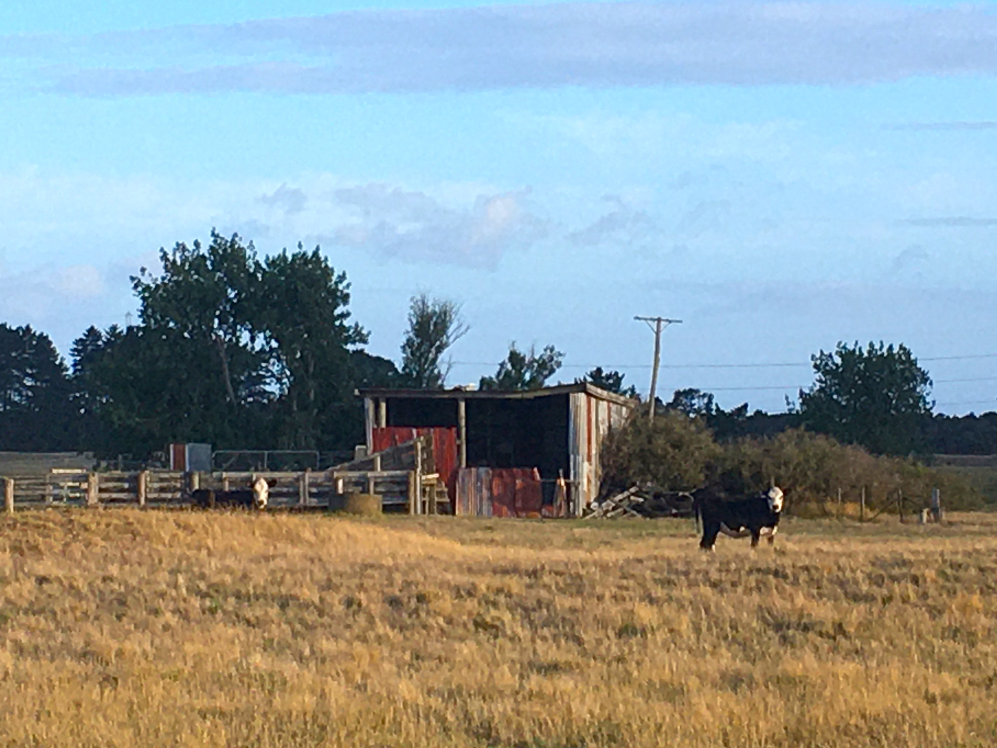
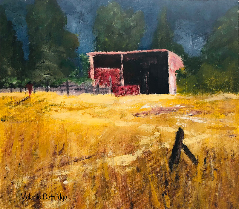
Artist: Melanie Bettridge
Good job Melanie. Very strong colour and good value range from dark to light making this quite a punchy image. I'm not sure if this is oils or acrylics because it has a lot of drybrush effects like acrylics generally gives, but it also has come impasto work as well. Either way, if you were trying to achieve the softer fluid look of wet in wet painting rather than drybrush, the key could lie in your choice of canvas. A smoother canvas with a good primer will absorb less paint than a thicker weave with less primer, making it easier to paint smoothly since there's more paint left of the surface with each stroke. One student I had once accidentally painted on the rough unprimed back of the canvas and it was an uphill struggle getting paint to cover the canvas. (Till I turned the canvas over).
Anyway, drybrush may have been your goal. One thing that would help the realism of your shed is to focus on getting the variety of colour in the lit surfaces. At present it's mostly all light pink, though a closer look at my demo painting and the photo will reveal blue-grey halftones throughout.
Your small fenceposts could do with some more attention too. Hope that helps.
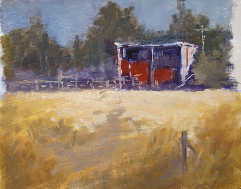
Artist: Rebecca Lockyear
Love the block style, Rebecca! Would like to do some more of that myself. Really good variety of shapes - big flat shapes contrasted with small crisp details. Nicely done! I wouldn't change a thing except to just fill in a few holes where the canvas is showing through and make the shed more ramshackle by bowing the roof a little.
Great!
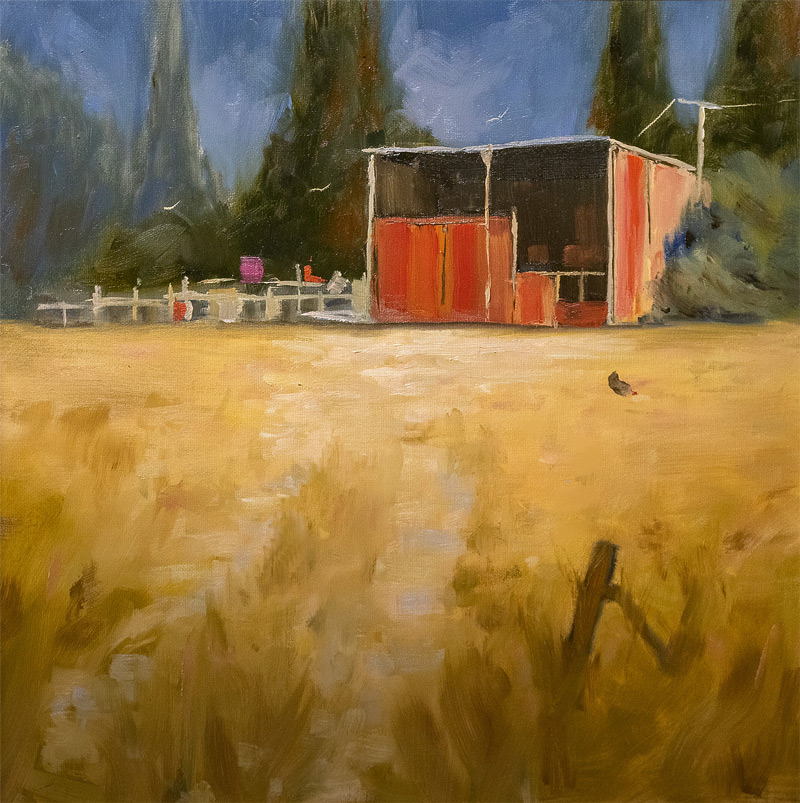
Artist: Tiffany King. 9x12 Oil on Canvas.
Beautiful work, Tiffany! The colour and values are very strong and you've kept your colour pure throughout. I love the vibrant edge work you've treated your distant trees too - shimmering with energy. I wouldn't change a thing, except to add some chickens for a little more interest. Nice!
Artist: Thelma Woodward
Hey Thelma, love the impressionistic feel of this! All those little brushstrokes are making this painting sing with vitality. The area behind the fences has got a little muddy with that mid grey - could do with some bushes in shadow or something there. Also the light patch in from of the shed could be transitioned more softly into the foreground shadow to give a better sense of light and shade. That light area has also gone a bit flat because it needs a few thin horizontal shapes within it to help define its surface quality. Overall, great job!
Artist: Robert Ardill
Hi Robert, good effort here. You really nailed that soft shadow transition from foreground to midground and that's forcing the eye into the centre of interest. Great to see you trying out the square format. Good subtle work showing the inside of the shed. Would like to see its poles thickened a bit and use some grey blue in there to delineate the shadow sides of the poles etc. Having it all the same colour is flattening it out. Your furthest tree on the left needs a lick of paint to stop the canvas showing through. Also you could try again with the fences. Looks like you started out with a regularly spaced fence and then though better of it, adding some thicker bits. Thing is, everyone knows what a fence looks like and it's your job as an artist to make something more lyrical out of it. Think of musical notes in a jazz piece - different weightings, different spacings, different timbres. You're getting the idea, but it's not quite there yet. Enjoy!
Login to your account to post a comment.