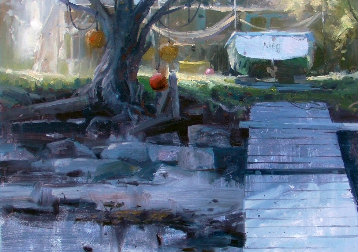
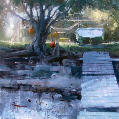
I thought I’d try designing a painting in 3 values, mostly because the scene seemed to suggest that anyway, so I figured it’d be interesting to see what happened. The best thing I learned from it was that, especially for larger paintings where you spend lots of time mixing colours, it’s really helpful to pre-mix 3 values of greys, warm and cool.
Note that the 3 premixed values do not extend to black or white. ie. my darkest dark is not as dark as black and my lightest light is not as light as white. I leave room for those extreme values to allow for light and dark accents in the final stage of the painting.
Looks interesting? Give it a go! Have fun!
Happy Painting,
![]()
Richard.
Login to your account to post a comment.