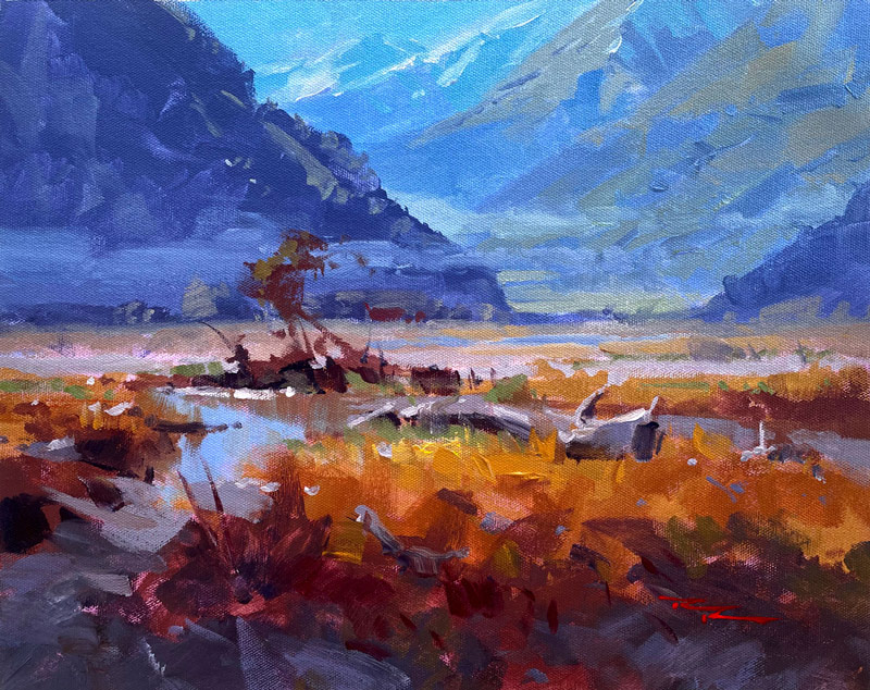
Follow me one brushstroke at a time as I take you through the process of creating an acrylic painting which has all the hallmarks of an oil painting. Learn to create large movements of light, convincing depth, soft edged brushwork and sparkling impasto highlights.
Good design, accurate drawing, passionate brushwork and a variety of fun techniques are all demonstrated in the video. Enjoy!
Oils are fine for this lesson too.
Get the Full lesson here: https://mypaintingclub.com/lessons/218-Golden-Valley

Golden Valley 13x15" Acrylic on Canvas by Richard Robinson
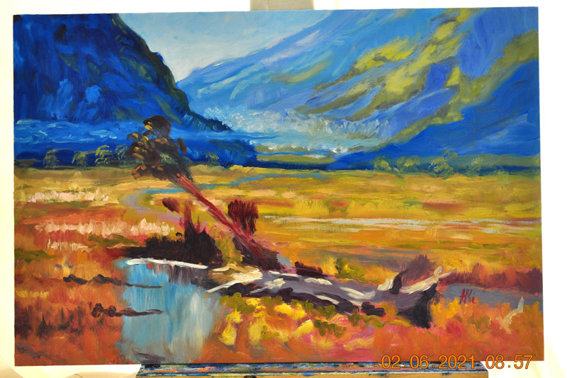
Golden Valley by HKi Kujtim Haderxhanaj
Hi Kujtim, great effort here. You've certainly got a dramatic colour contrast between warms and cools and it's good to see all your expressive brushstrokes. Nice. Two things you could look at to improve this. Firstly the greens in the mountain are standing out too much.
They need to be subdued with blue to push them away into the distance. The same applies to the greens and oranges you have on the riverbed close to the mountains. That's actually a few kilometres away so those colours need to be subdued with a blue grey to avoid them jumping forward. Keep it up!
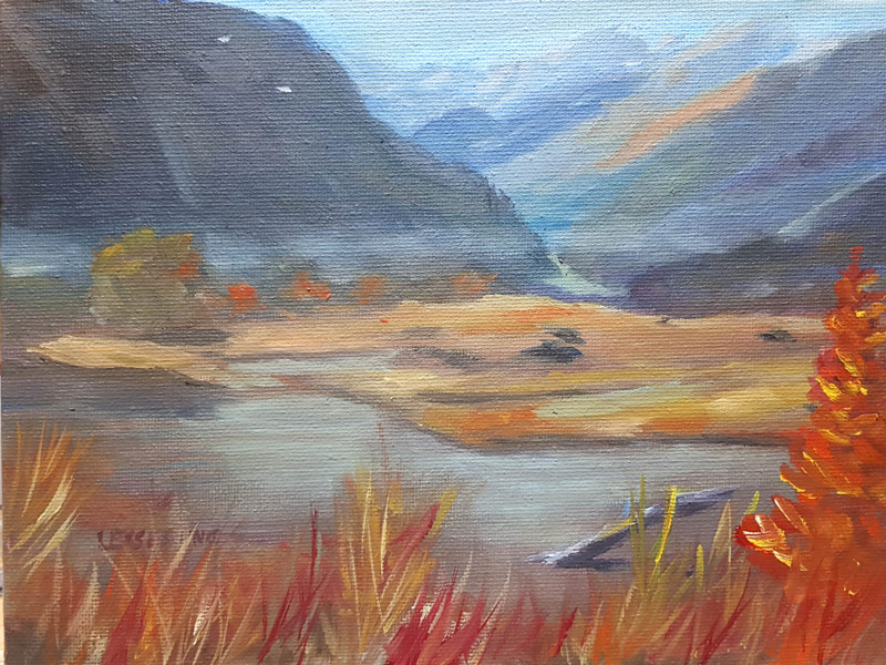
Autumn in the mountains Oil in board 18x24cm by Anne-Dore Leisering
Good effort Anne-Dore. Your colour scheme is much more grey and with low contrast between lights and darks. Doing that creates the appearance of a grey day. I wonder if you chose that or just just happened. Sunny days tend to have more vibrant colour and more contrast between lights and darks.
You've managed to create the illusion of a good amount of distance into the mountains and the undulating valley floor is interesting. I see you've tried to stop the eye sliding off the bottom right by adding the orange tree there which was a decent enough idea but the strong colour and guesswork description only serves to keep the eye in the bottom right corner, so that's not ideal. The painting would be better off without it. Keep up the good work!
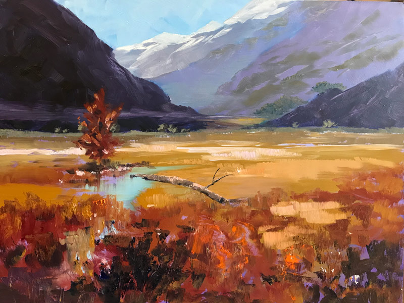
Summer valley by Lindsay Shaw
Great work Lindsay. Strong colour and contrast. Decent drawing, though I'd like a little more info in the distant mountains seeing as that's where we're leading the eye too. The purple and grey-green combo isn't working so well, mainly because the grey-green is darker than the purple. It should be lighter since it's actually the sunlit tops of the foliage. Lovely interesting impasto foreground. The log needs a reflection where it touches the water. Good stuff!
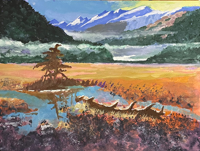
"Rees Valley" watercolour & gouache, Eric Hillmer, Toronto, ON Canada
Nice one Eric. Good drawing. I'd like to see larger brushwork in the foreground and less grey. Hard to get that back in watercolour I know. Good to see you playing with the colour in the sky. Looks good. Need some colour variety in the foreground tree and trunk because they're looking a bit flat. Also look at where the grasses should be reflecting in the water. A little more detail in the central plain, a few subtle shadows of bushes will help that somewhat flat area a little.
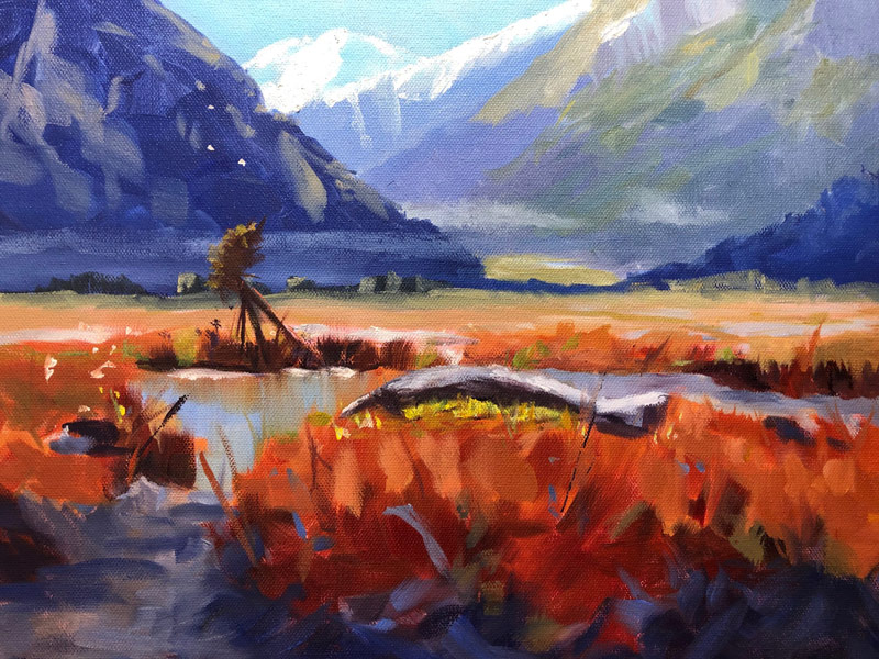
Golden Valley by Nancy Newton
Good job Nancy. Great colour, drawing and brushwork. Your little tree looks a bit odd like it's made from fence posts, but then, so does mine. :-)
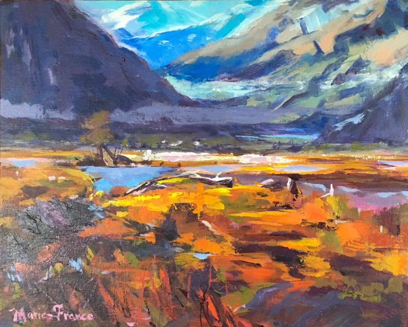
Golden Valley demo painting study by Marie-France L'Ecuyer
Very rich work, Marie. A pleasure to look at with so much going on. A landscape made from paint! Beautiful. Wouldn't change a thing.
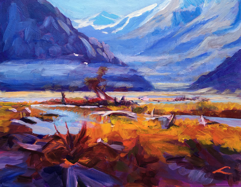
Bright valley, acrylic with oil glazing, canvas, 40 cm x 50 cm by Elena Sokolova
Great work Elena. I've got nothing to add. Nicely done.
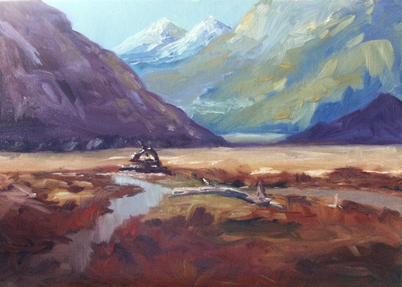
Golden Valley lesson 12x15 Oil by Jill Frazier
Good painterly work Jill. Loving that brushwork! Just not sure what's going on with your little tree. Needs some work.
Happy Painting!
Richard Robinson
Login to your account to post a comment.