
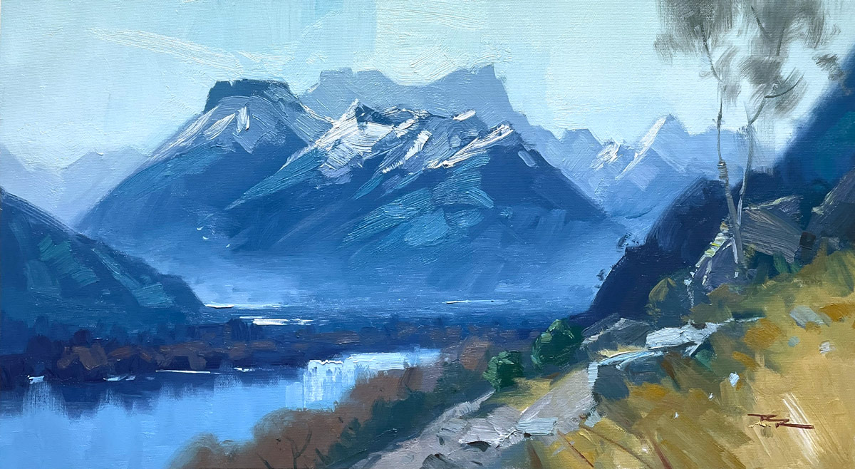
"Mount Earnslaw" 12x24" Oil on Canvas by Richard Robinson.
Get the video lesson here: https://mypaintingclub.com/lessons/221-Mount-Earnslaw
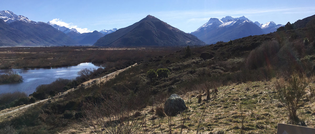
It's all too easy to be trapped into feeling that you shouldn't change your subject at all. It's nature! Who are YOU to mess with it? Frankly, nature doesn't care if you shift her around on the canvas to show her best side, and neither does anyone else. Go nuts! In this painting I put all my favourite parts of this grand panorama into one coherent composition.
My one caveat is that the more you change, the easier it is to get something wrong that breaks the illusion of the reality of the scene. It’s a classic case of learning the rules before you can break them. Not sure what you got wrong but it just feels weird? Look at your painting in a mirror or flip the photo of it in your smartphone. That helps a lot.
Compositional problems in paintings are the hardest to fix, so it’s a great idea to do a drawing first and look at that in a mirror before you start if you have any doubts at all about your ability to move mountains.
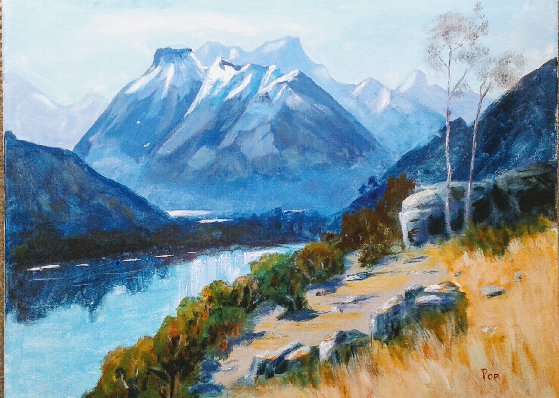
My Earnslaw by Evelyn Tuhi-Herewini, acrylic
Great work Evelyn! Can't say I'd want to change this in any way except to make the trees smaller as they recede into the distance. Nice to see you using the acrylics in some places like watercolours to achieve soft edges and a variety of paint texture. Nice!
Mountain landscape, oil, canvas, 30 cm x 60 cm by Elena Sokolova
Good job Elena. Great colour work, variety of edges and eloquent brushwork. Beautiful!
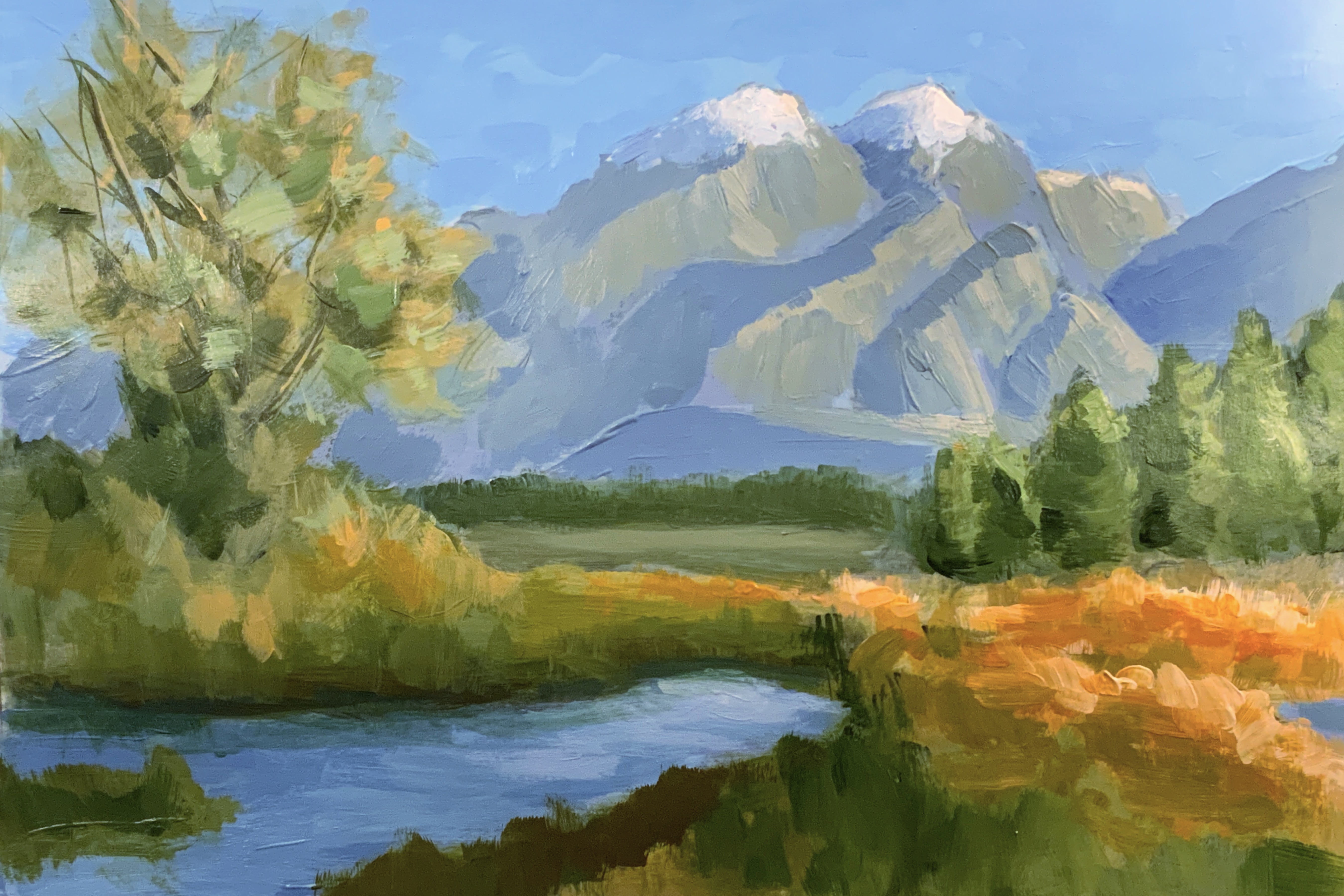
Final by Jay Sullivan
Hi Jay, you mentioned you struggled with this one after stage 3. The colouring and brushwork are great. I'd just draw your attention to a few things:
1. Try to avoid repeating shapes side by side. It lacks variety and a natural feel. You've repeated shapes in the trees on the right and in the mountains.
2. Consider distance and atmospheric perspective throughout the various depths of the painting. Note that your line of green trees in the centre are the same green as the trees in the mid ground, whereas they should be more blue grey because of the distance.
3. Lead the eye. The central area is a barrier to travelling to the mountains. By laying thin strips of water here you'll lead the eye into the background.
4. I would add more shadow to the left side of the large tree to give it more depth and prune that thick long branch.
Hope that helps!
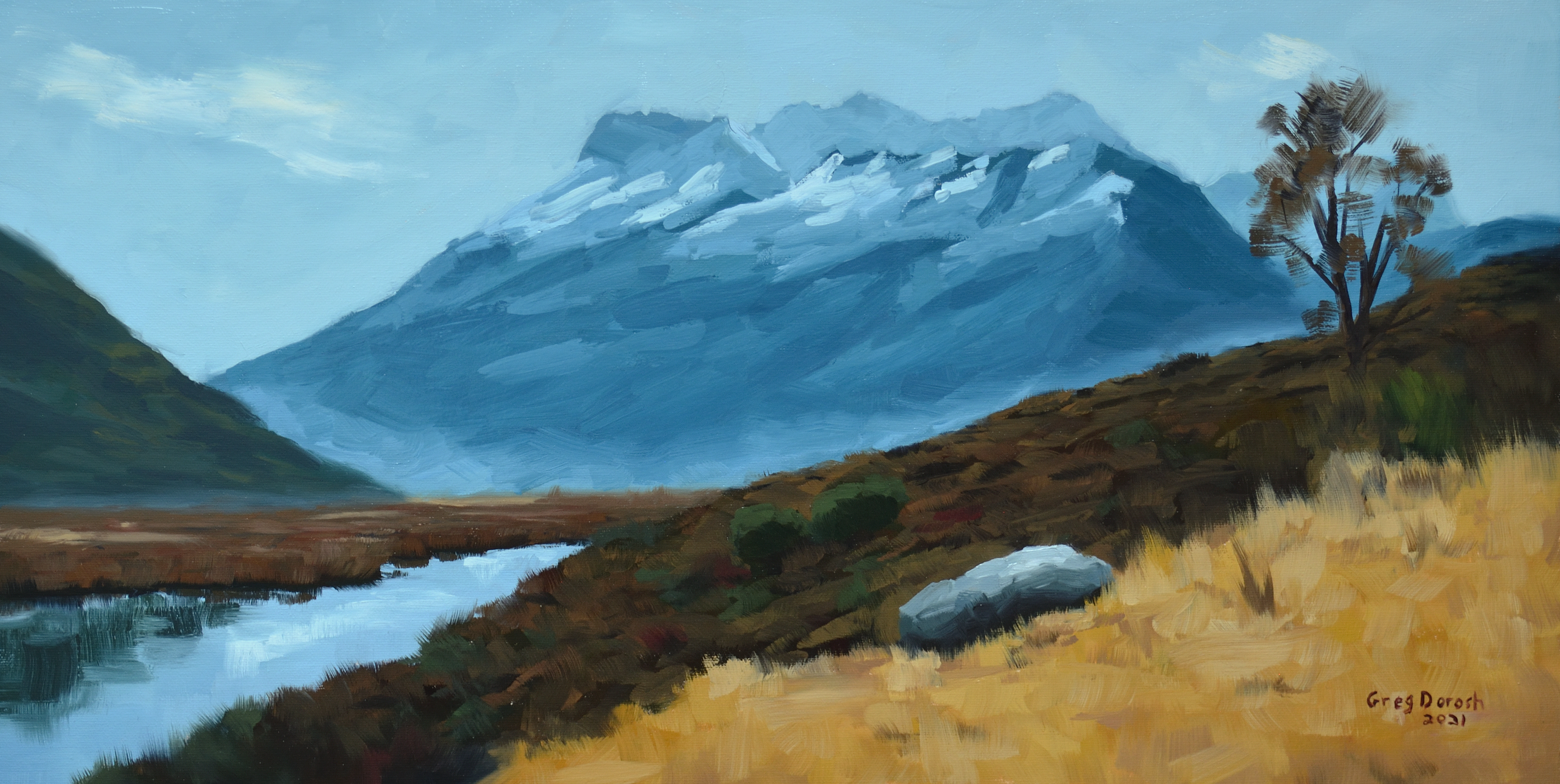
Mount Earnslaw - Oil on canvas by Greg Dorosh
Really nice fluid brushwork Greg, not over-painted at all. Solid colour work too. I would only comment that you've lost some opportunities for variety and interest by oversimplifying the foreground grasses and mid ground bushes. By breaking that up a little with more shape and colour variety you'll be giving people more to enjoy in the painting.
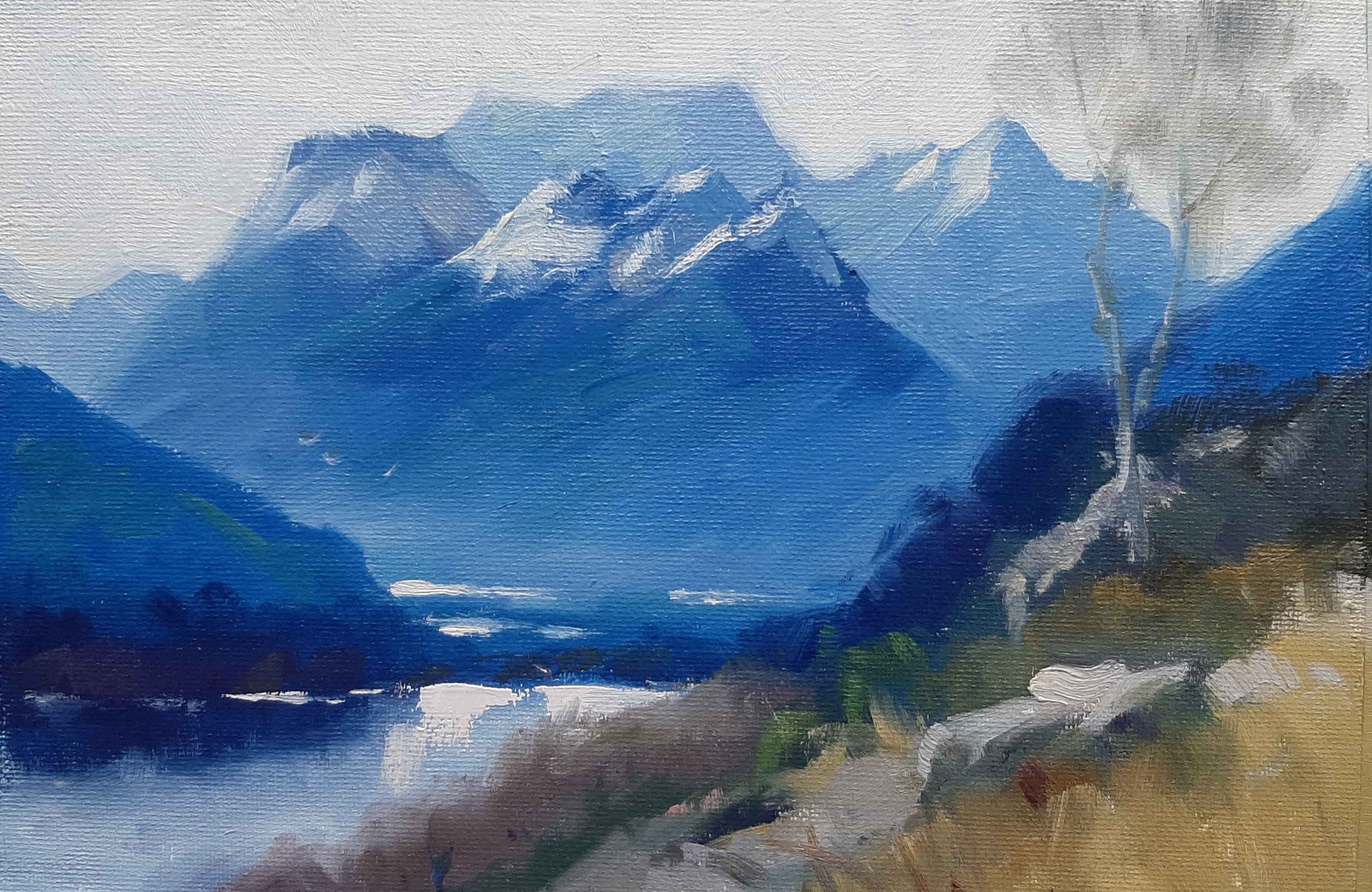
Mt Earnslaw by Polly Becker
Beautifully done little painting here Polly - like a jewel. Very rich colour, great variety of lost and found edges and superb drawing and elegant brushwork. Great!
Get the video lesson here: https://mypaintingclub.com/lessons/221-Mount-Earnslaw
Login to your account to post a comment.