Ahh Mountains! The hills are alive you know!? But they're not monsters, they just need a little taming. How to get those brutes onto a canvas!? Here's my 5 top tips.
The first thing beginners get wrong with mountains is the shapes - the drawing. Repeating triangles is not the way to go! Each mountain has a unique shape and character - make note of it and exagerate the differences, even when they are few. Every great mountain painter has at some point exaggerated the steepness and height of a mountain. It's dramatic and it works.
Vast distances reveal strong atmospheric perspective, where the colours of the mountains become more and more like the colour of the sky. Warm colours gradually turn cool in the distance and contrast between colours also decreases. Getting those subtle colour relationships just right is the key to creating depth. I show you how in the video lesson.
Adding mist or dust in the air at the base of the mountains helps to define each layer of depth better so it's easier to read from a distance. It also adds more colour variety and a hint of romance and mystery.
Keeping the paintwork relatively flat compared to a thicker, bolder treatment in the foreground increases the sense of depth and scale in the painting. I'll show you the special brush I use to achieve this.
Focusing light on key parts of the mountains and fading out light and detail around that area helps to add a greater sense of scale and also more drama and interest to the painting.
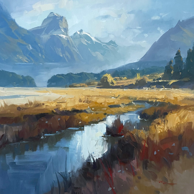
"Paradise Valley" 19x20" Oil on Linen by Richard Robinson
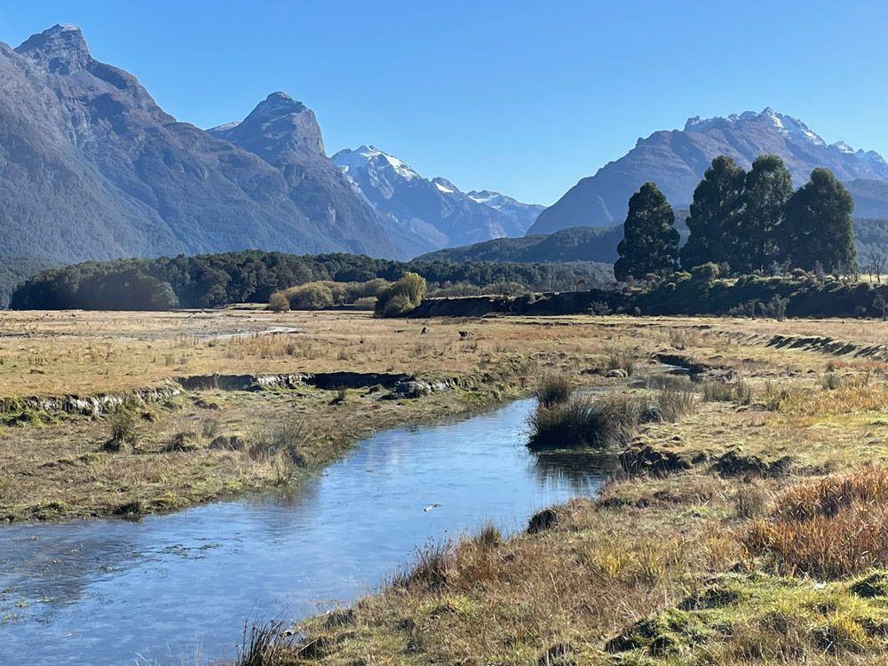 Paradise Valley, New Zealand
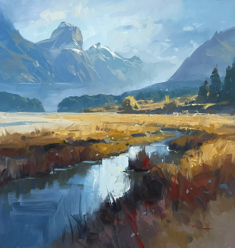
M. Graham & Co. Oil Paints
Alizarine Crimson
Phthalo Blue
Ultramarine Blue
Burnt Sienna
Cadmium Red
Cadmium Orange
Yellow Ochre
Cadmium Yellow Light
Titanium White
Painting medium
M. Graham & Co. Walnut Alkyd Medium or Walnut Oil
Solvent
Gamsol
Canvas
Fredrix ultrasmooth canvas.
You could use a canvas panel or anything you prefer.
Brushes
Rosemary & Co. Richard Robinson Brush Set
Palette knife
Paper towels
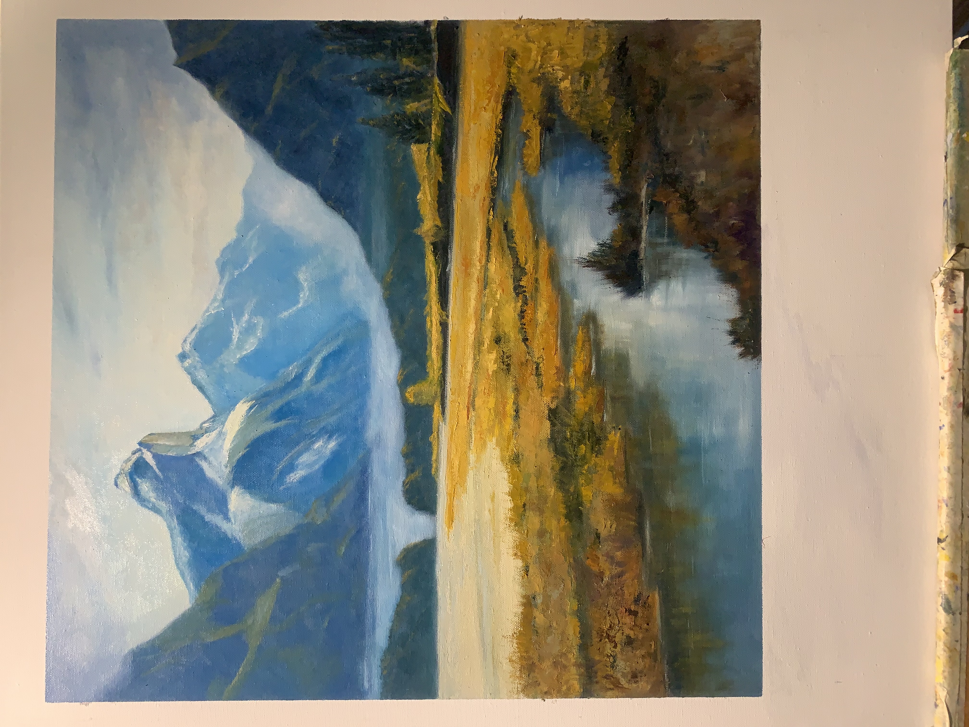
19x20” oil on canvas panel by Mark Price
Wow that's nice work, Mark. Your colours are good, creating a nice recession in the mountains, strong warms in the foreground and a good subtle gradation through the sky.
I like the extra detail you put into the trees on the right which really helps with the sense of scale and the same goes for the little details and textures you have built-up in the foreground.
My only suggestion would be that some of the clumps of grass in the foreground seem to lack form, meaning they just need a stronger shadow side to offset their light side, with the light coming from the upper right. Great job.
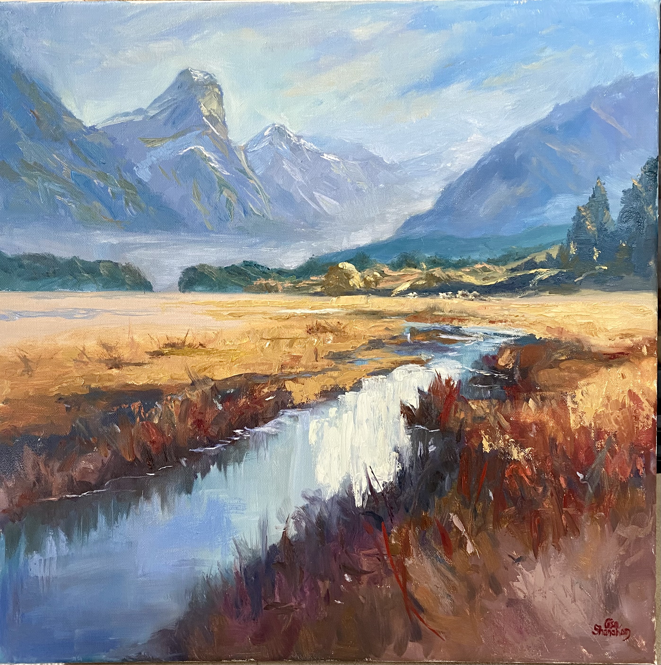
Artist: Lisa Shanahan
Ooh that's really beautiful painterly work there, Lisa. Your thick brushwork has a real flow and lyricism about it. Juicy! Perhaps you could push that even further in your next painting? Good to see you throwing in a little bit of pallet knife work in there as well to get a variety of texture.
Your colour work is very good - strong warms in the foreground contrasted by cool greys in the background. My one concern is that the greens on the mountains are a touch too dark, making them seem out of place. If you convert the photo of your painting into greyscale in your phone or computer you will see that the greens are a little darker than the cool grey they are painted on. In fact they should be I little lighter than that base grey colour they are on since they are in the light. Hope that helps. Beautiful painting!
Paradise Valley - oil on canvas
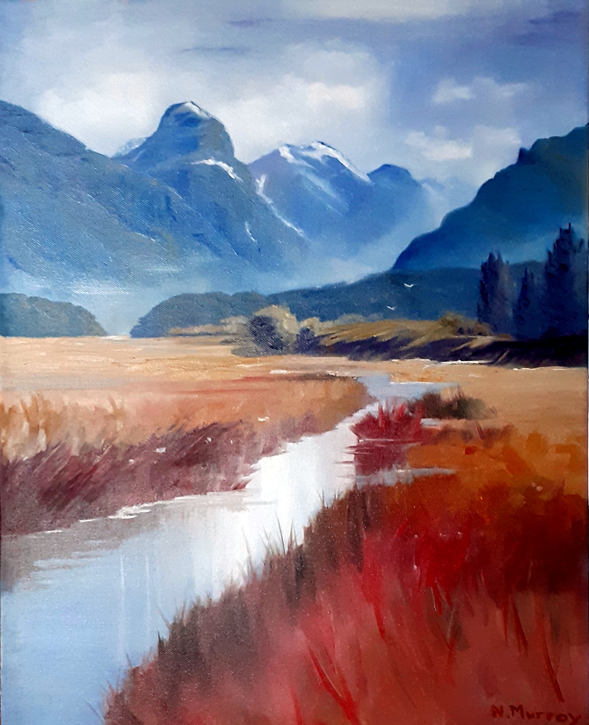
Artist: Nancy Murray
That’s some lovely work there Nancy! Great to see you really paying attention to shape design but still managing to have interesting colour variety within the large shapes. Looks like you really pushed the red in the foreground which is quite enticing to look at and really contrasts well with your strong blues in the background.
It's also great to see you contrasting soft and lost inches with sharp edges and also large simple shapes with some quite fine detail. That kind of variety in a painting makes it a joy to look at.
You're just missing a few reflections of the grasses in the middle along the left-hand bank, which seem to be tall enough to warrant a reflection. You could also have deepened the colour in the water in the foreground to add more contrast there against the warms. Great work.
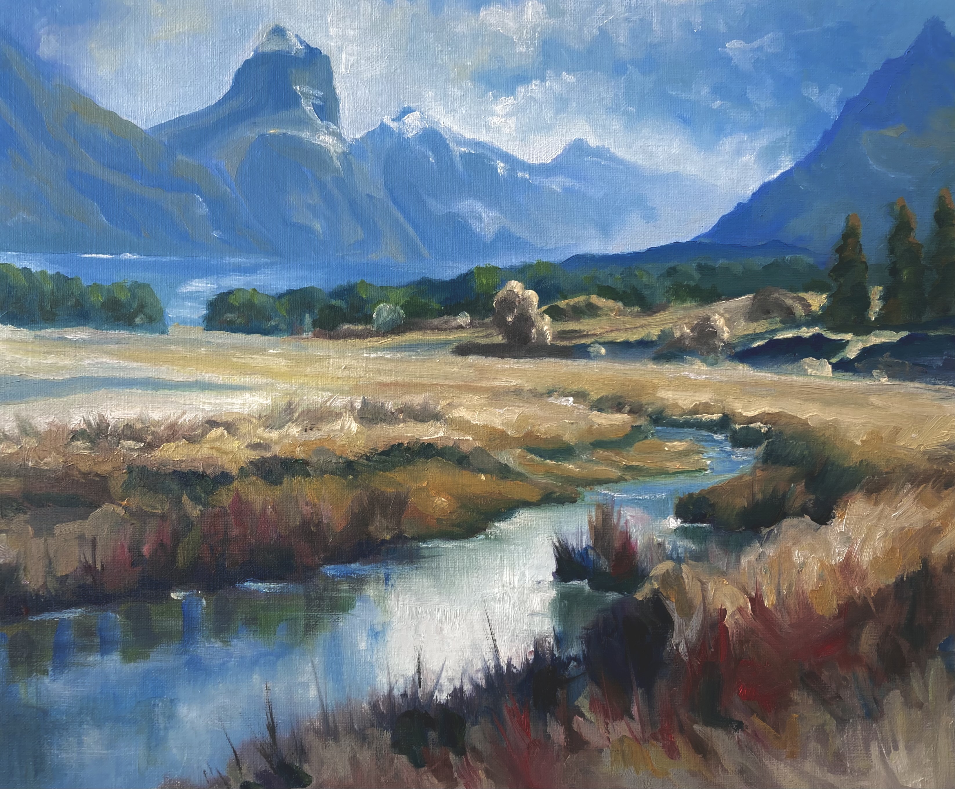
Artist: Geoffrey Geeson
Well that's a little cracker, Geoffrey! Nice to see it done so well on a small scale and horizontal format. Some really nice brushwork in here – quite fluid and not overworked. I like that you added a little more diagonal in the centre plane
because it plays off well against the diagonal stream in the foreground – the whole thing is a big zigzag and quite dynamic.
Your colours are great too – quite punchy, and I especially like the intense blue you have in the distant hills and mountains on the right hand side, although I would've trim that mountain down or run it right off the top of the canvas rather than left it as a point up there that directs the eye to that corner.
Oh and the green reflections you have of the grasses seem to be a little too green. Probably be better a little browner than that. Beautiful painting. Sign it and frame it!
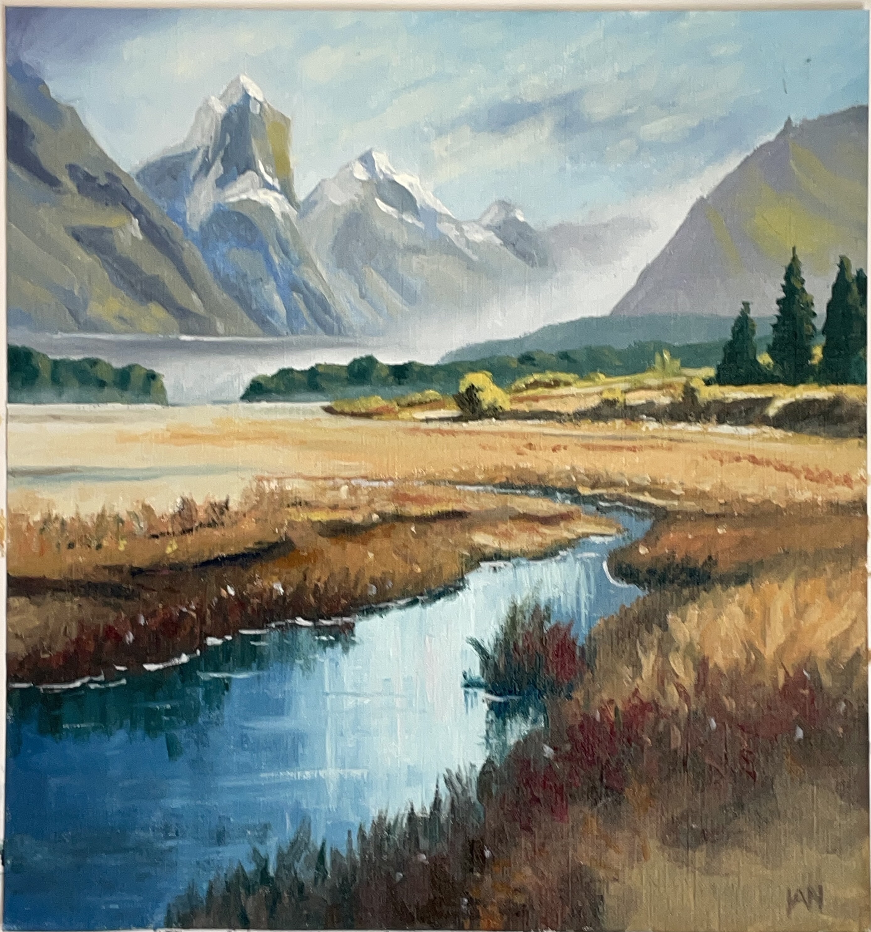
Artist: Ian States
Beautiful work, Ian! A very crisp style with fluid organic shapes – a pleasure to look at. I love the contrast of big brushwork in the foreground with a more simplified approach in the background.
There's just one thing I would caution you on and that's the vibrancy of your greens in the background. There are some patches there which are just jumping out because they don't have enough grey-blue in them and that spoils the sense of depth there.
Other than that, top marks brother!
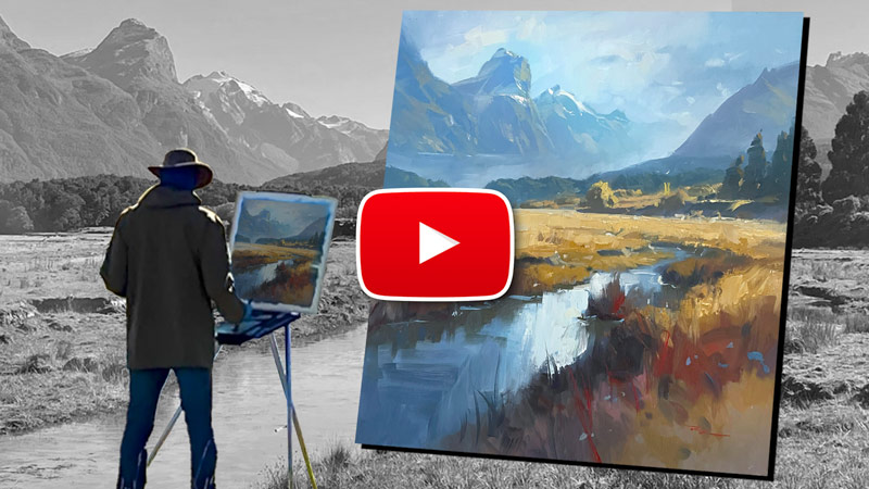
Follow me one brushstroke at a time as I take you through the full process of creating this expressive painting of the Paradise Valley in New Zealand. Learn how to design around a central lighting idea and discover the power of a simple palette and a painterly approach. Enjoy!
ALL skill levels from beginner to advanced.
Oils or Acrylics.
https://mypaintingclub.com/lessons/236-Paradise-Valley
Thanks to everyone who was part of the monthly workshop!
(Monthly workshops are available to all Premium Members - $20/month)
Login to your account to post a comment.