Painting Critiques for the Walk to the Beach Workshop
February 21, 2024
By Richard Robinson
Painting a Walk to the Beach
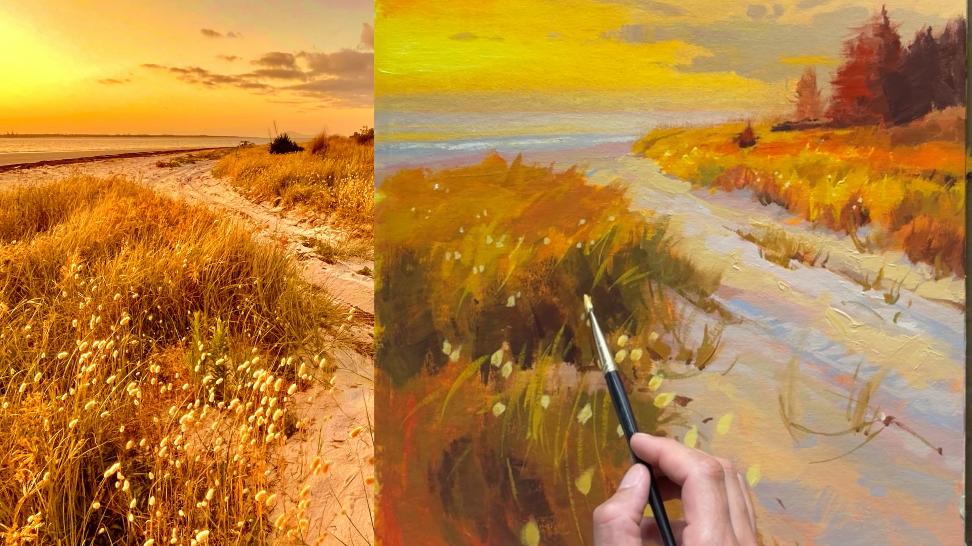
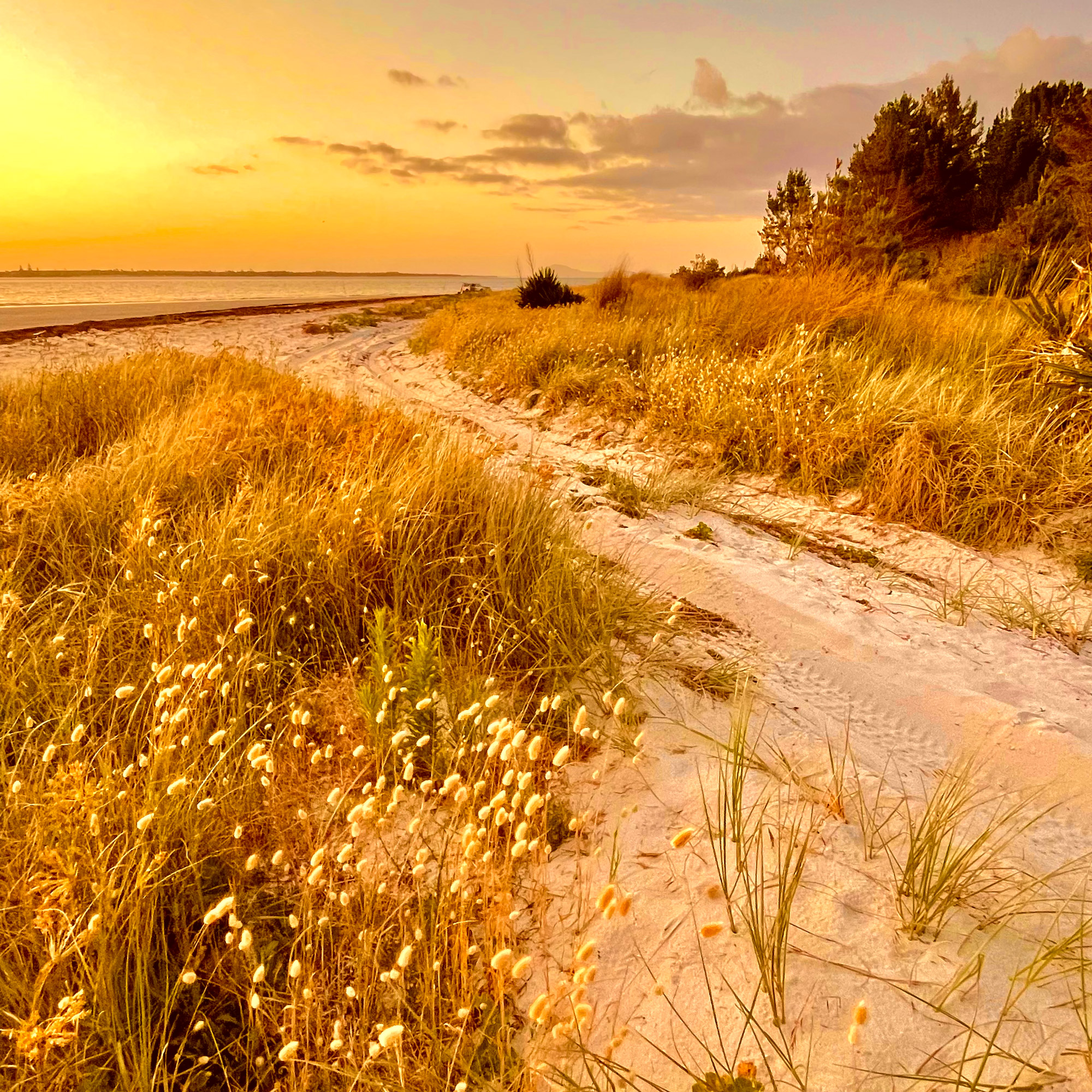
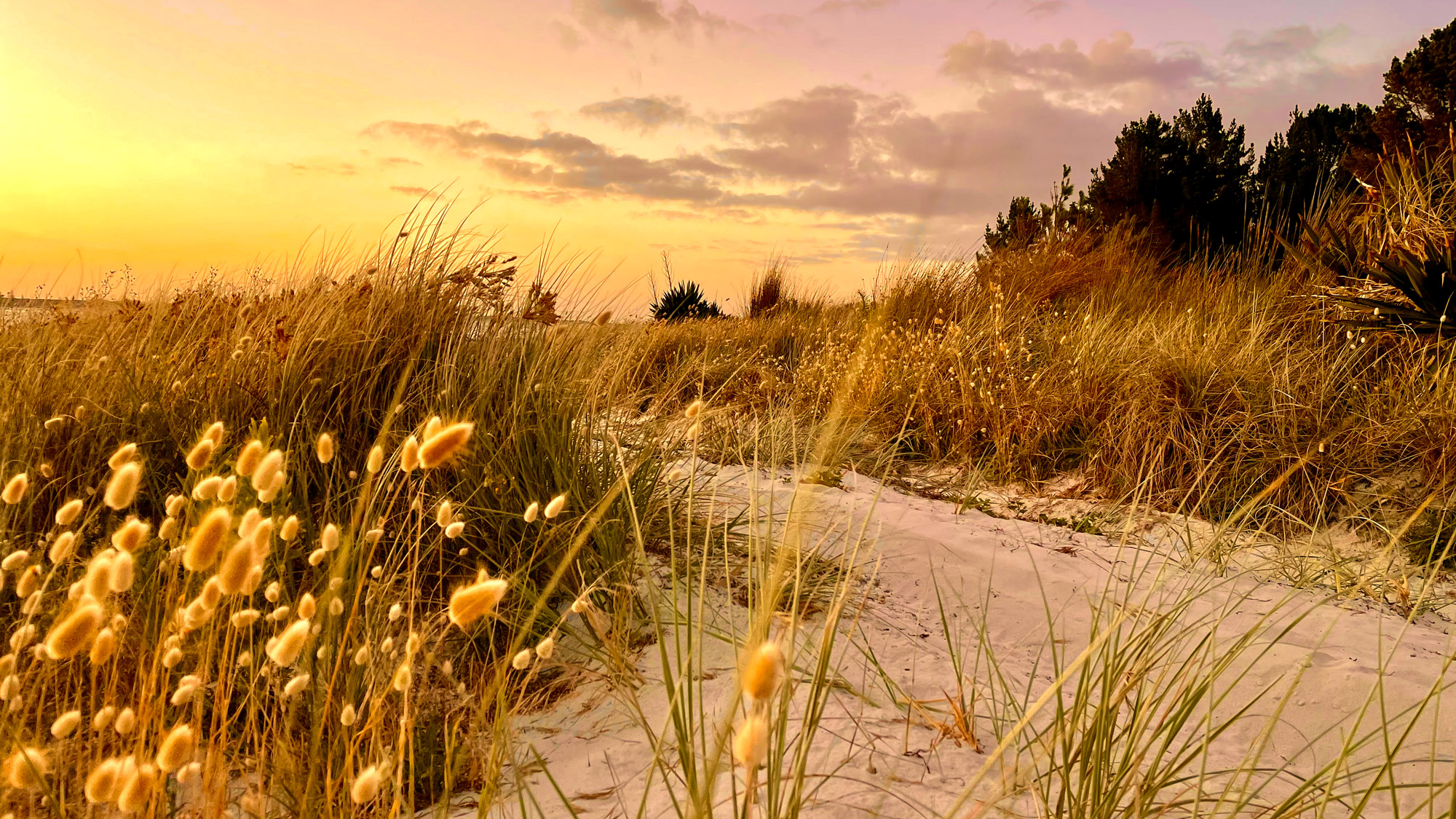
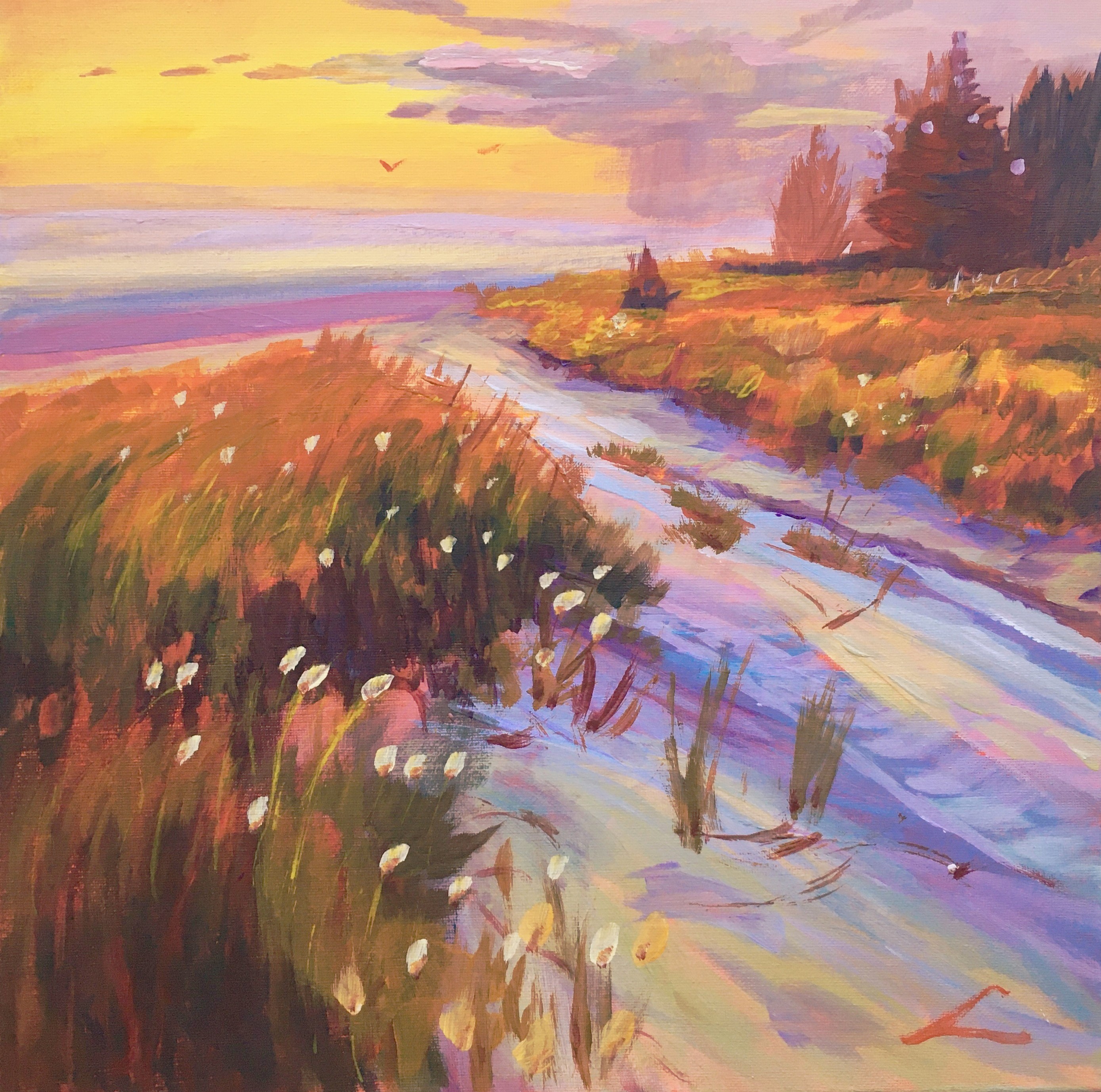
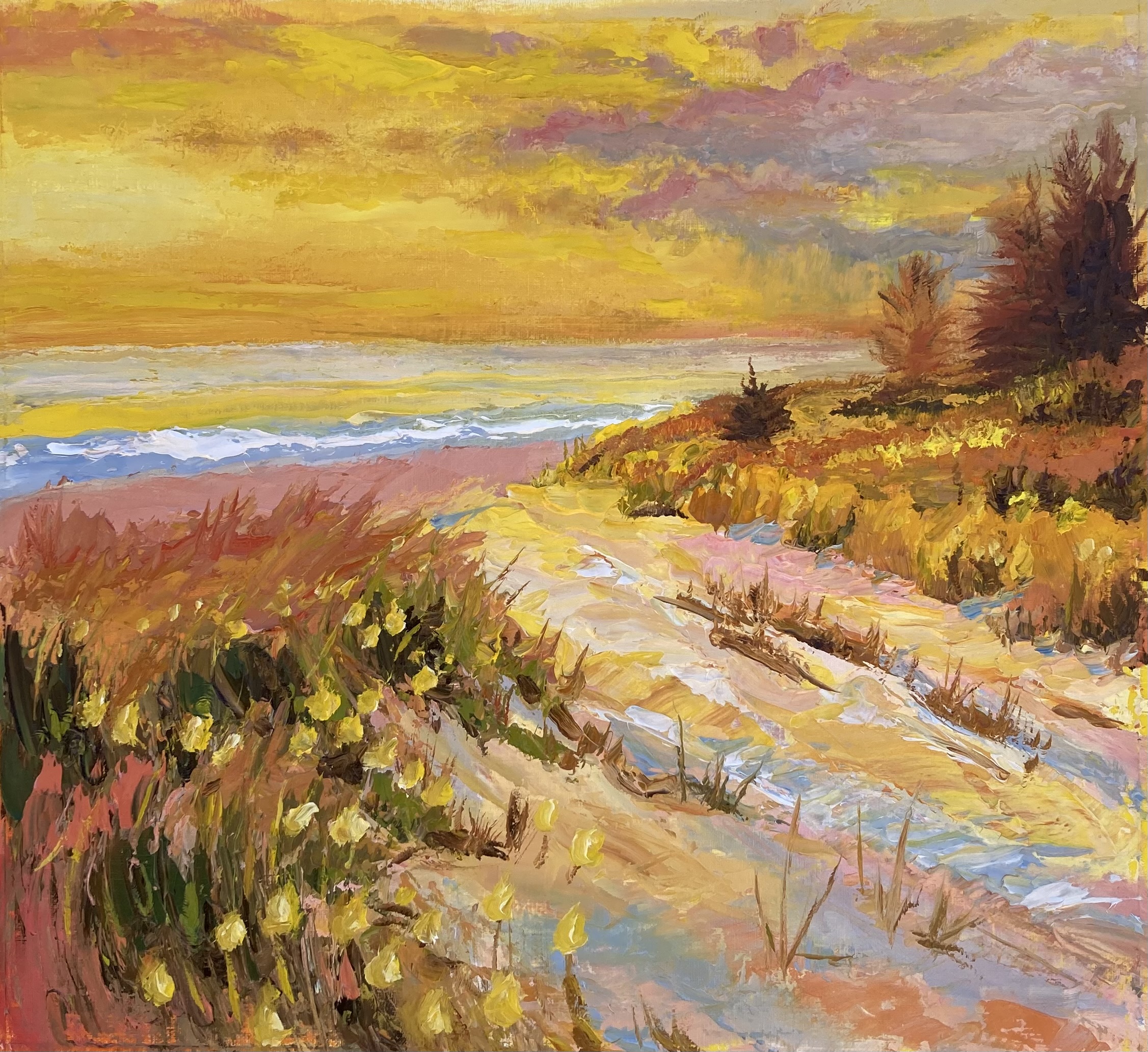
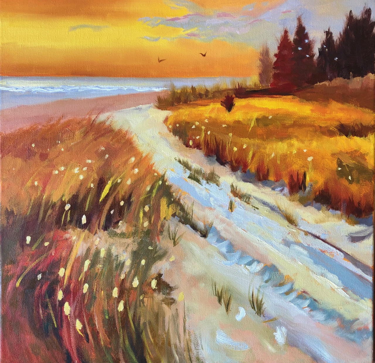
Rangiputa Beach in New Zealand
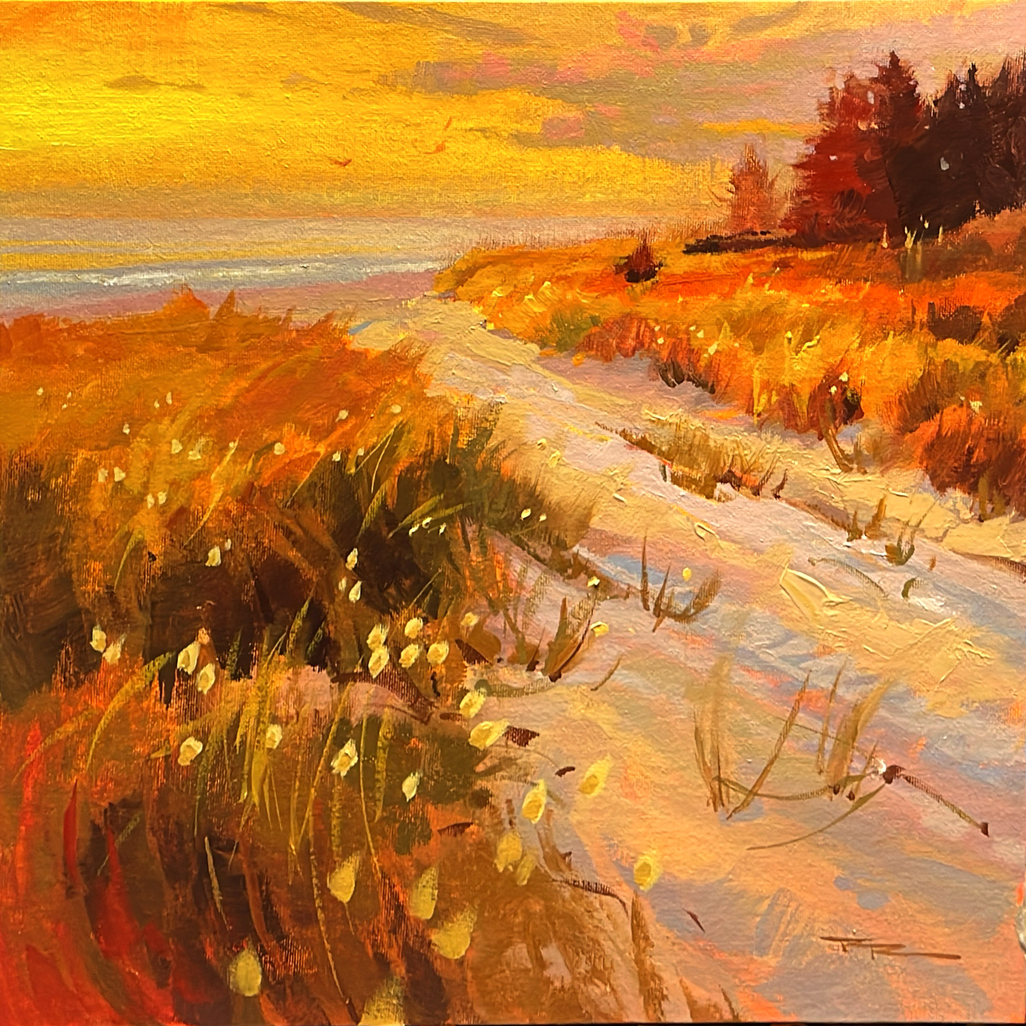
Rangiputa 15x15" Acrylic on Canvas by Richard Robinson
Some paintings seem to glow with an inner warmth. How do they DO that?
Turns out it's not rocket science. All you need to do is remove all cool colours from your palette and use a grey instead of blue.
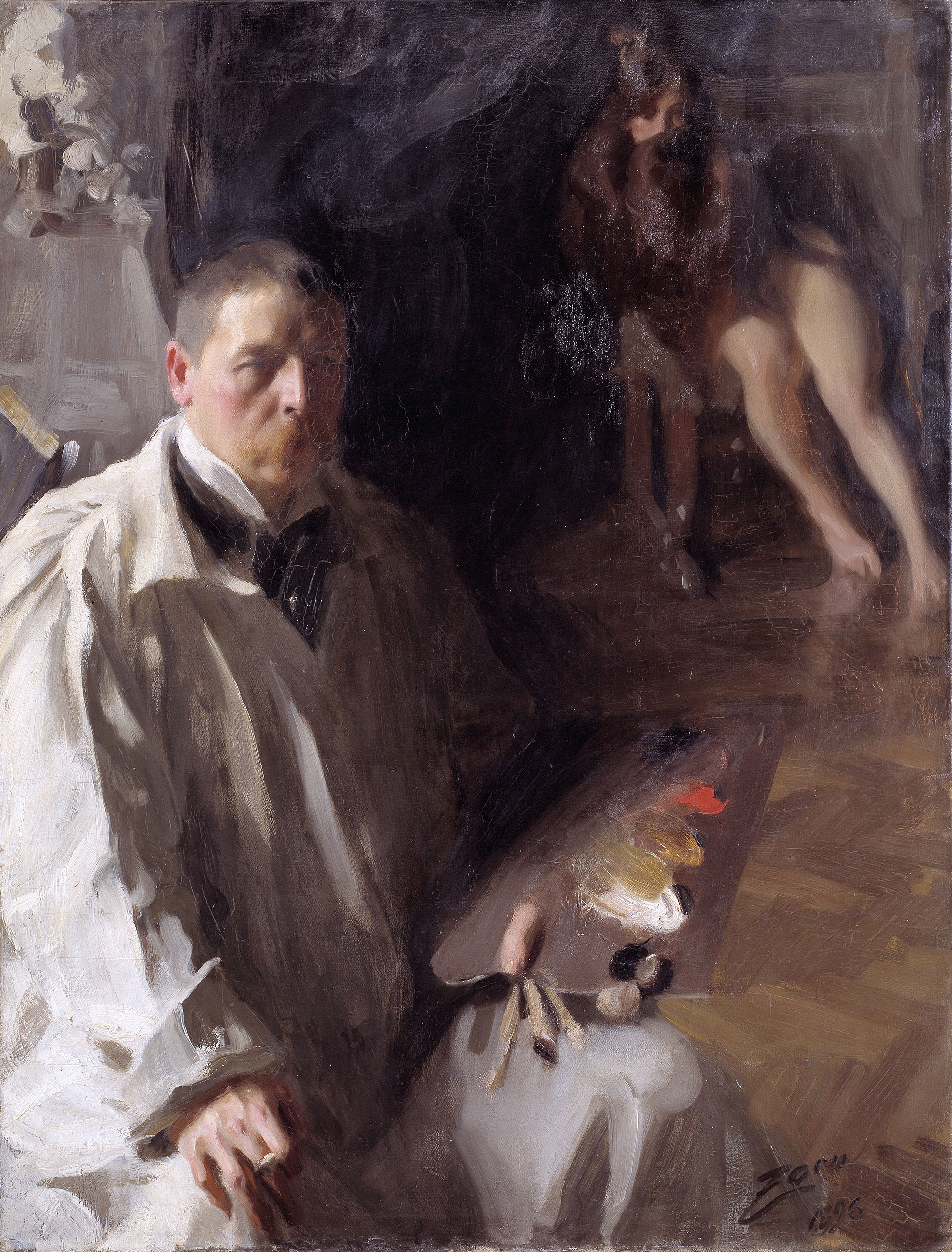
Swedish portrait painter Anders Zorn (18 February 1860 – 22 August 1920) is known to have used just such a reduced palette to achieve his warm paintings. These colours are Vermilion, Ivory Black, Flake White and Yellow Ochre. Today you could use titanium white and cadmium red instead.
Self portrait by Anders Zorn showing his simple palette.
Student Critiques
Vibrant beach sunset, acrylics, canvas, 39 cm x 39 cm
Artist: Elena Sokolova That's beautiful work Elena and I love that you have pushed the colours, adding more purple to the shadows which looks really vibrant against the warm grasses and yellow glow in the sky. Congratulations!
“Rangiputa” 15x15” oil on primed panel , Mark Price
Artist: Mark Price Nice job, Mark! You really knuckled down and defined your shapes well. The drawing is great, there's an interesting variety of brushwork and the colour is all good. Very polished.
A walk to the beach.Oil Elmari van Zyl
Artist: Elmari Van Zyl Lovely work, Elmari. The whole painting looks very organic and wind-swept, with a casual charm. I would just like to see a smoother transition from warm to cool in the sky. The rest of the painting is great.
Tranquil beach sunset
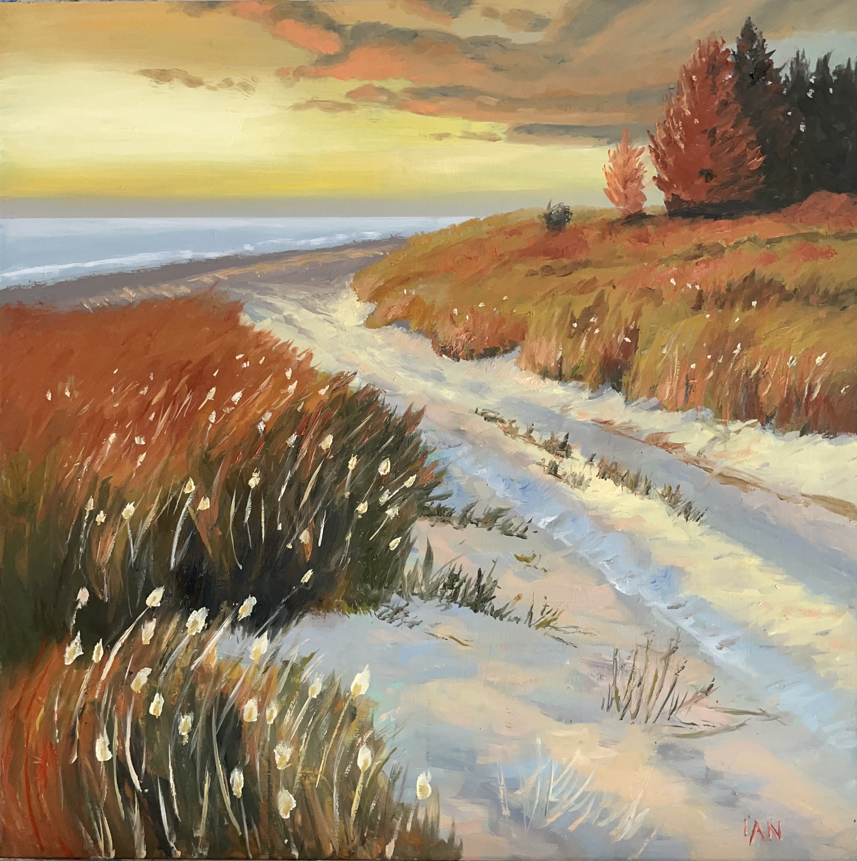
Artist: Ian States Great colour and brush work and this one Ian. Great job.
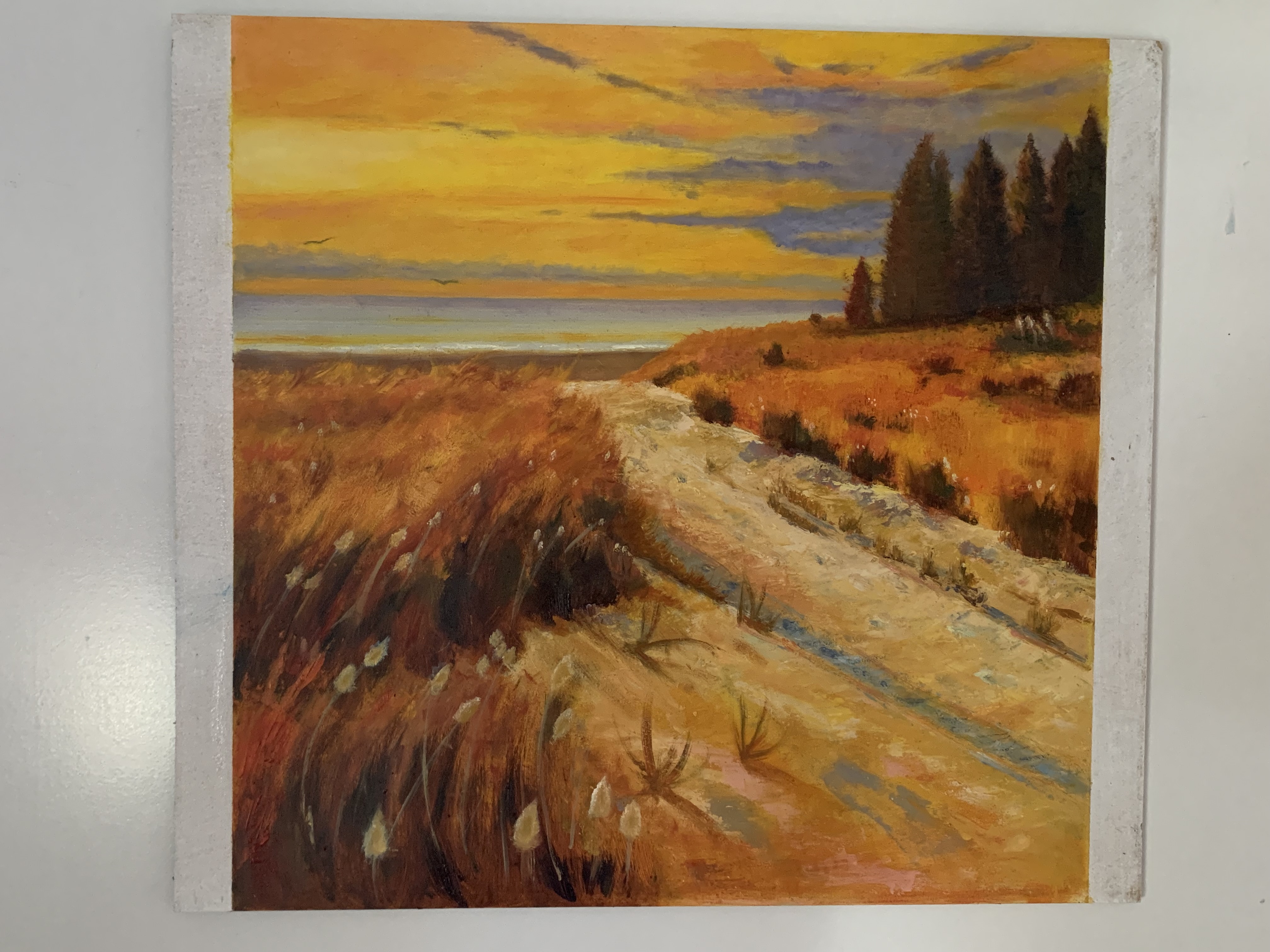
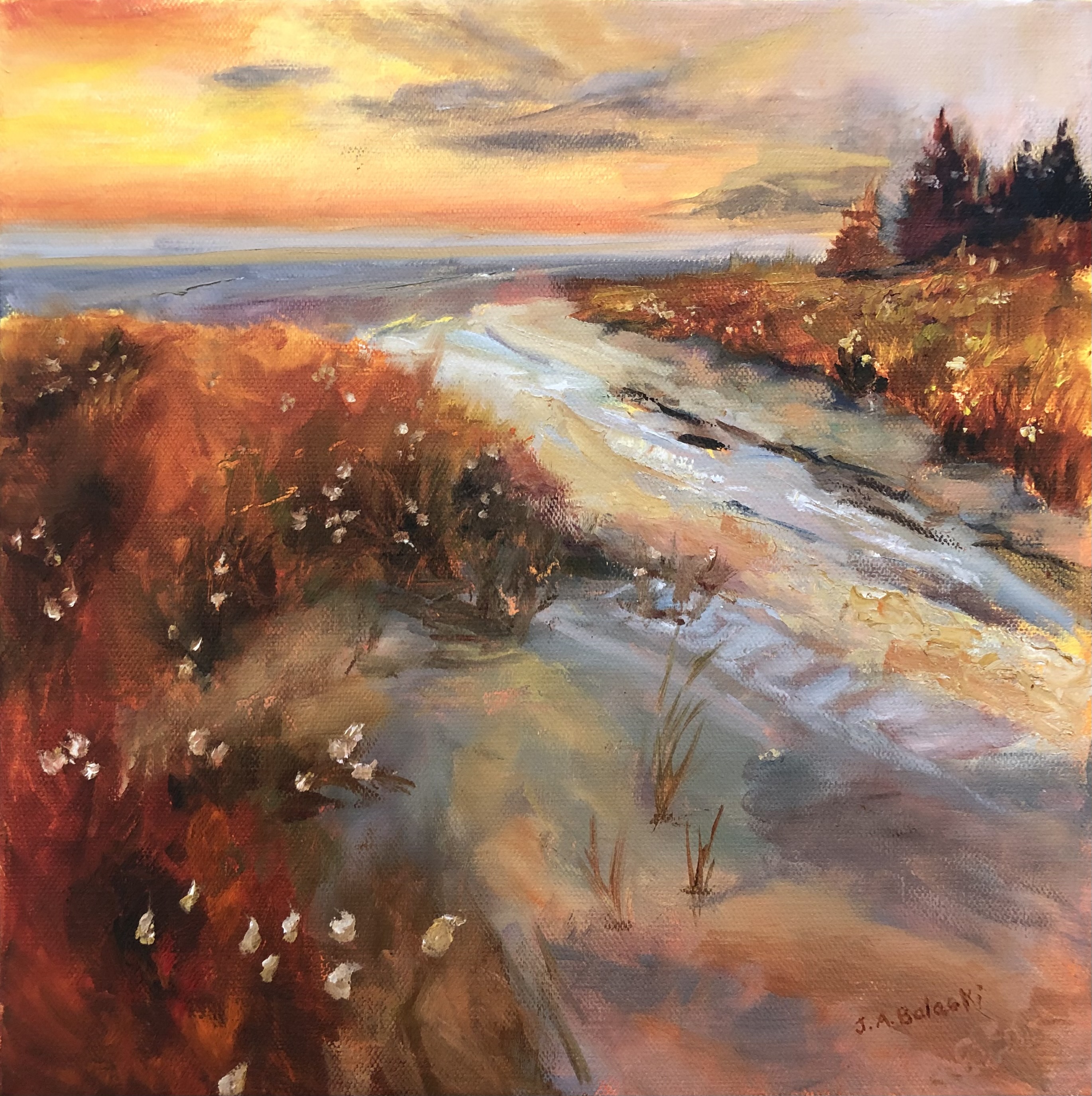
“Rangiputa” Study of Richard Robinson’s painting
Artist: Joanna Balaski Hi Joanna, there's a lot going well in this painting including the drawing, the placement of the major shapes and the interesting variety of brushwork from large washy areas to small impasto highlights and fine details. Nicely done.
It's just a shame you were a little heavy-handed with the black or very dark grey that you are using and it's overpowered most of the shadow colours and the lower third of the painting. Compare the dark areas and your painting with those and mine and you will see that the darkest dark, close to black, as used rather sparingly on mine. When you have too much darkness in a landscape painting like this it seems to suck the colour out of it.
Also, when the warms and dark cool greys in the foreground sand are smooshed together you get a muddy grey that seems out of place, rather than a selection of slightly different greys painted in a patchwork fashion that sit nicely side by side.
It's easy to get lost when grey colours are so similar side by side, which is when you need to take a harder look at your resource image or scene in front of you and figure out those subtle differences. I ask myself 2 questions in this order: 'Is it lighter or darker? Is it warmer or cooler?'
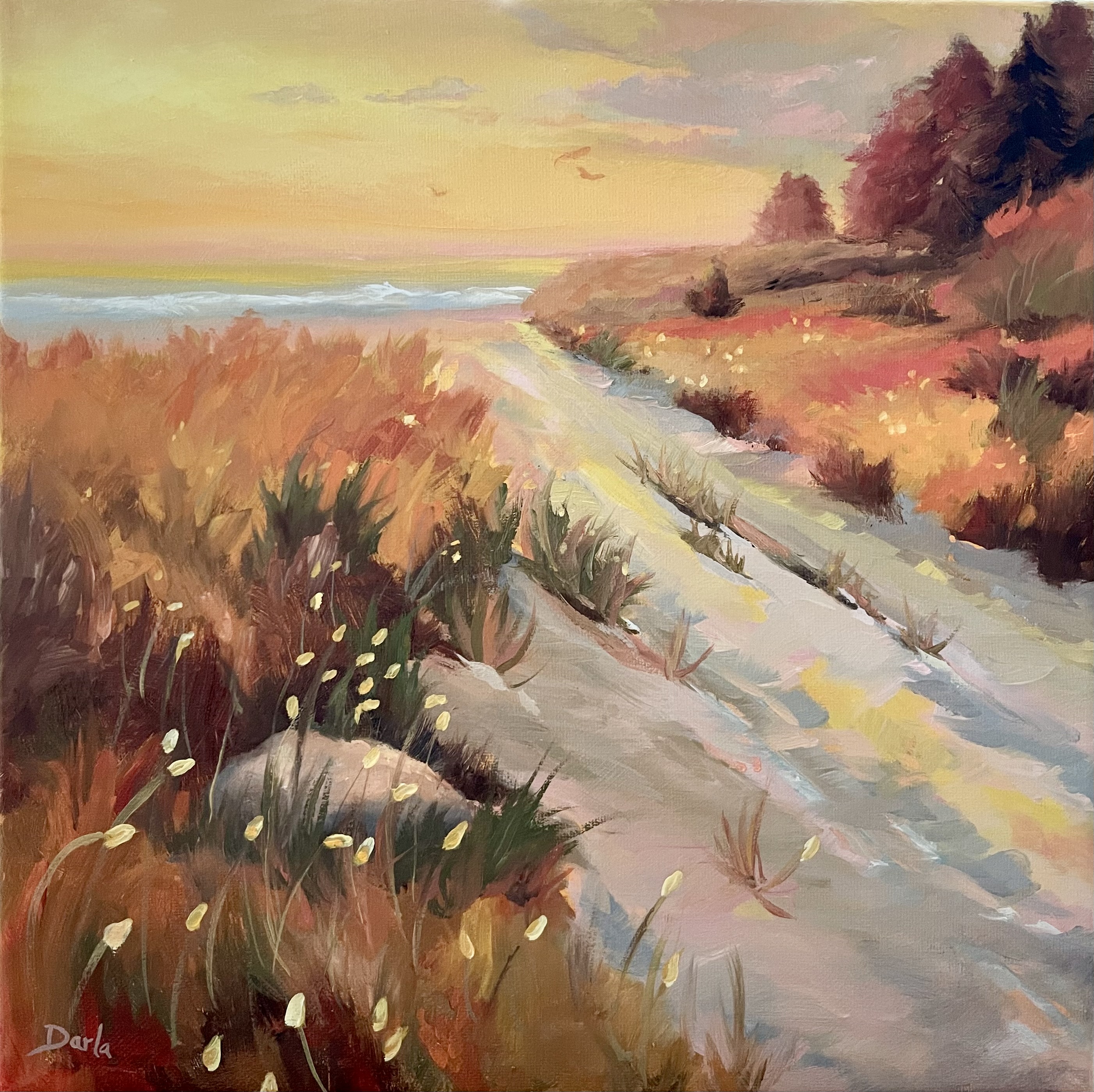
Darla Calhoon-Rice 12 x 12 in Oil on canvas
Artist: Darla Calhoon Beautifully painted, Darla. I love the subtle variations you have throughout the colour blocks, the softness of the whole painting, the subtlety of the colour in the sky and your thoughtful brushwork. Great job!
Walk to Beach in Oils Palette Knife
Artist: Geoffrey Geeson Hey Geoffrey, that's really interesting to see it done in a chunkier style - really adds a lot of life to it. Beautiful! I would just like to see the trees drawn a little more carefully and some of the muddiness in the sky to be cleared up.
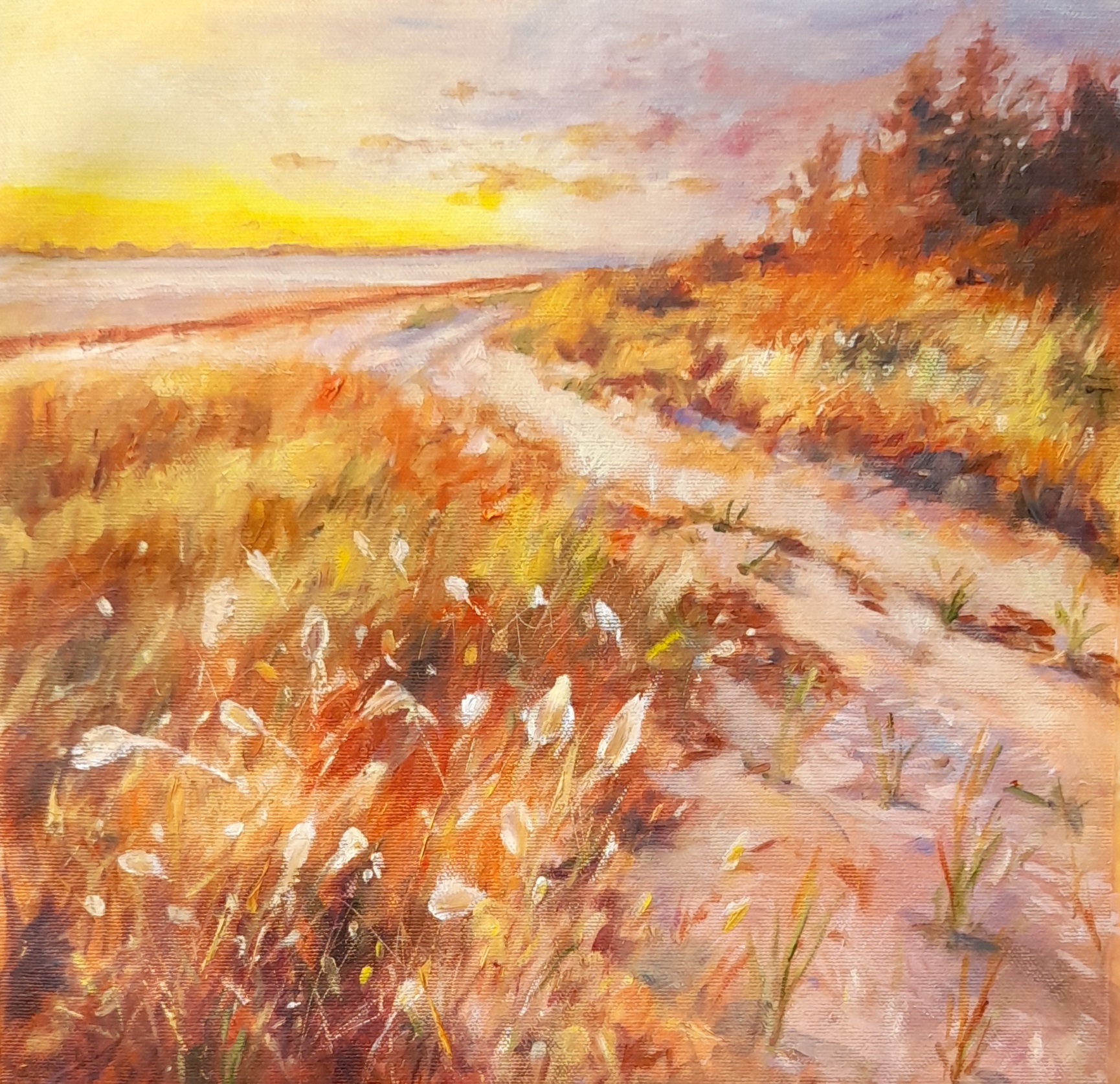
A Walk to the Beach 14x14 Oil on Canvas
Artist: Nancy Newton Beautiful work there Nancy! I love the softness that the oils have given this painting compared to the sharper roughness given by my acrylics. It's also interesting to see the more dynamic contrast you have given it with lighter cooler sand and darker darks. That's lost a little of the warmth in the sand but the contrast between the cool sand and the warm grasses is really eye-catching.
That's all good in the foreground but in the ocean and clouds I would recommend you add more warmth so that these background elements can stay in the background a little better.
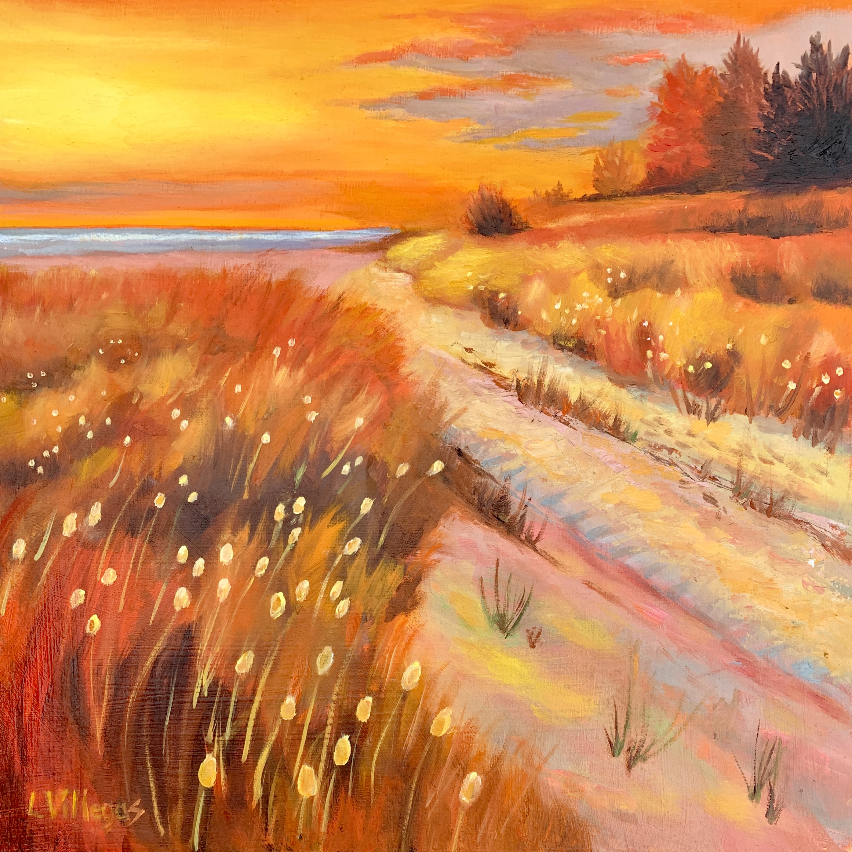
A Walk to the Beach 12 x 12 Oil on Wood Panel
Artist: Louise Villegas Hi Louise, nice job here. Really vibrant colours and a pervading softness to the whole painting. My only concern is the light grey clouds behind the trees – this colour seems out of place because it is too cool compared to its neighbours. Better to make that a warmer grey.
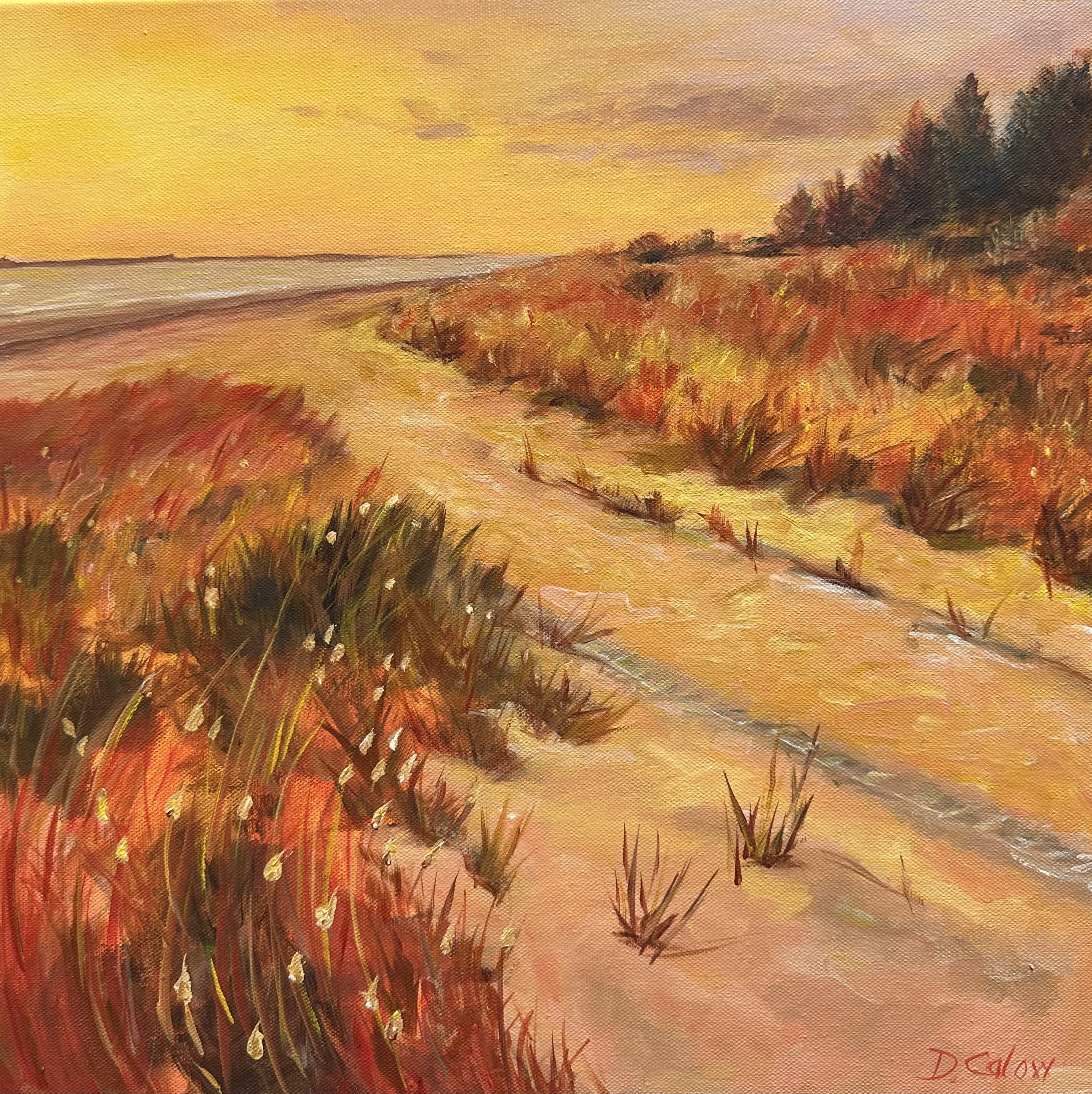
A walk to the beach. Acrylic on canvas
Artist: Deborah Calow
Great work, Deborah. You've done a particularly good job of the glow of the sun in the sky and overall the colours are very good. Your brushwork is varied and interesting. My only suggestion would be to always be careful to make you a horizon level and straight.
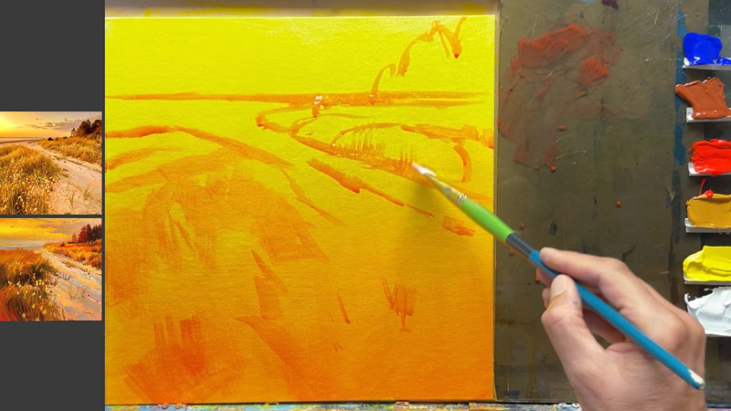
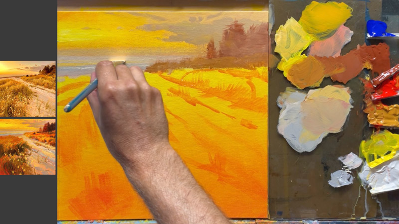
This demo is in acrylics but it's fine for oils too.
I'll take you step by step through this whole process. Just a couple of hours and you'll have a beautiful sunset beach painting.
Go the gradated base layer
Helps more than you know.
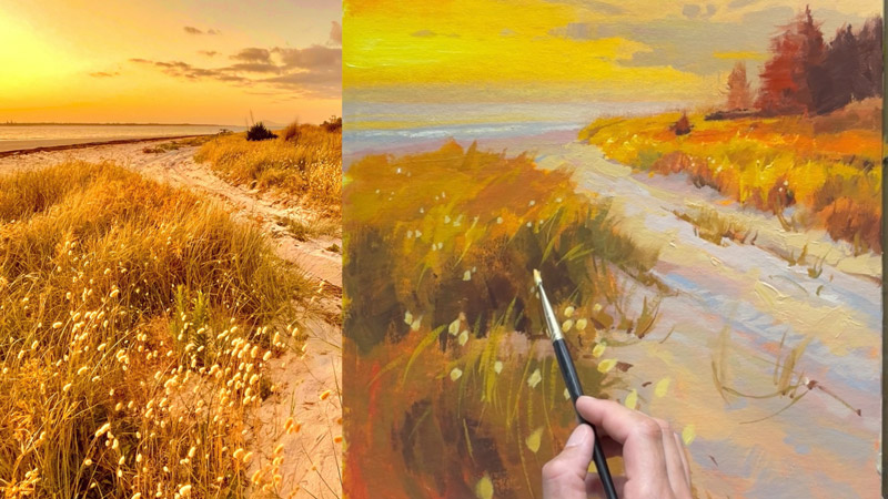
Making the sky glow
It's a beautiful thing.
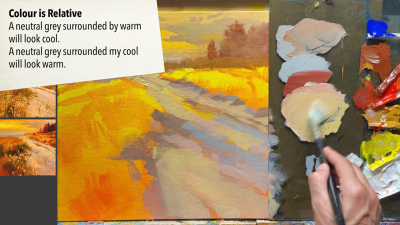
Colour's not what you think it is.
This is a white sand beach, but there's not even a dab of pure white in sight.
Bazillions of blades of grass, made simple.
Learning to trust the process. Clump, clump, swish.
I'll take you step by step through this whole rich process and you can choose which parts you'd like to try out in your own work.
“We keep moving forward, opening new doors, and doing new things, because we’re curious and curiosity keeps leading us down new paths.”
Login to your account to post a comment.