
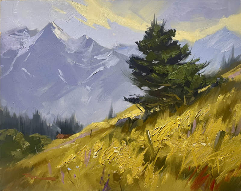
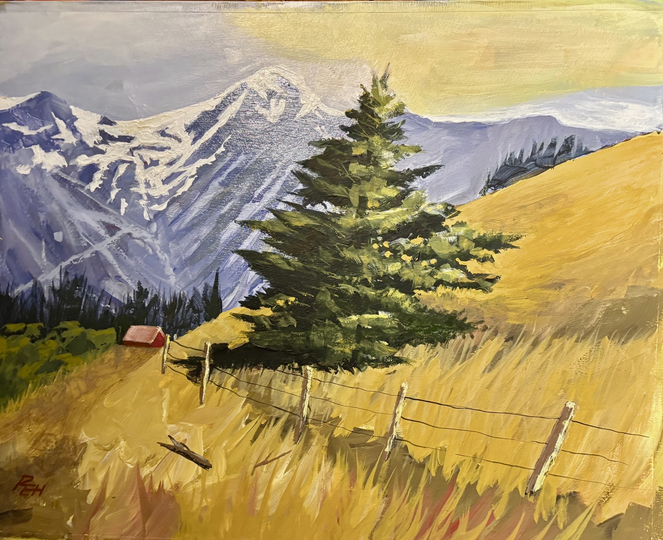
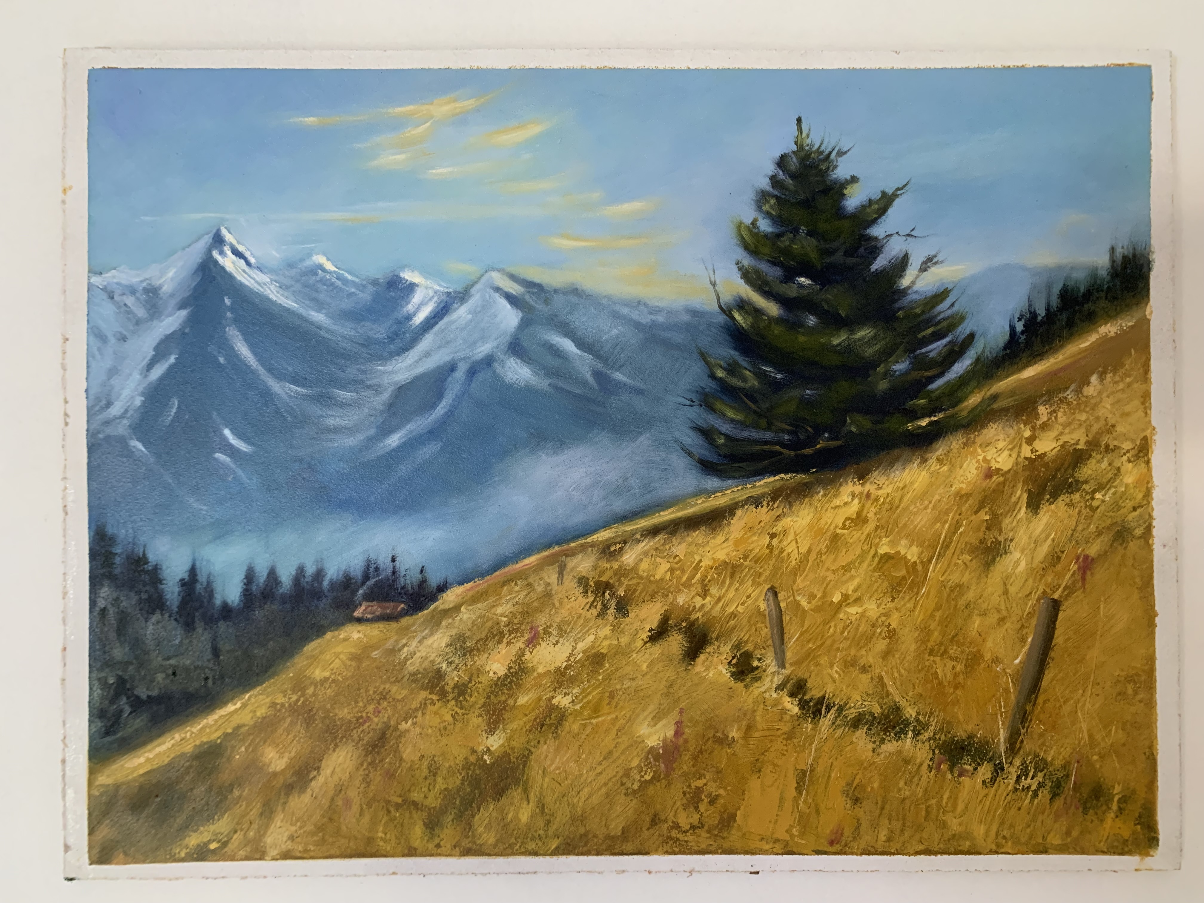
"The Dancing Pine, Lake Ohau" 11x14" Oil on Board by Richard Robinson
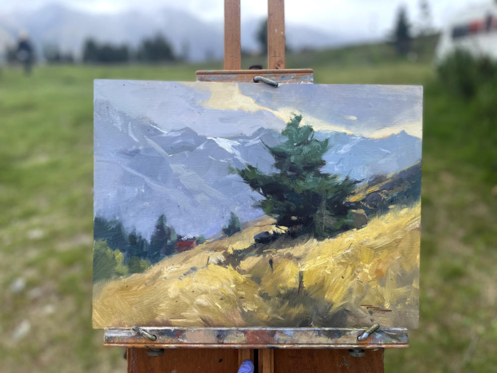
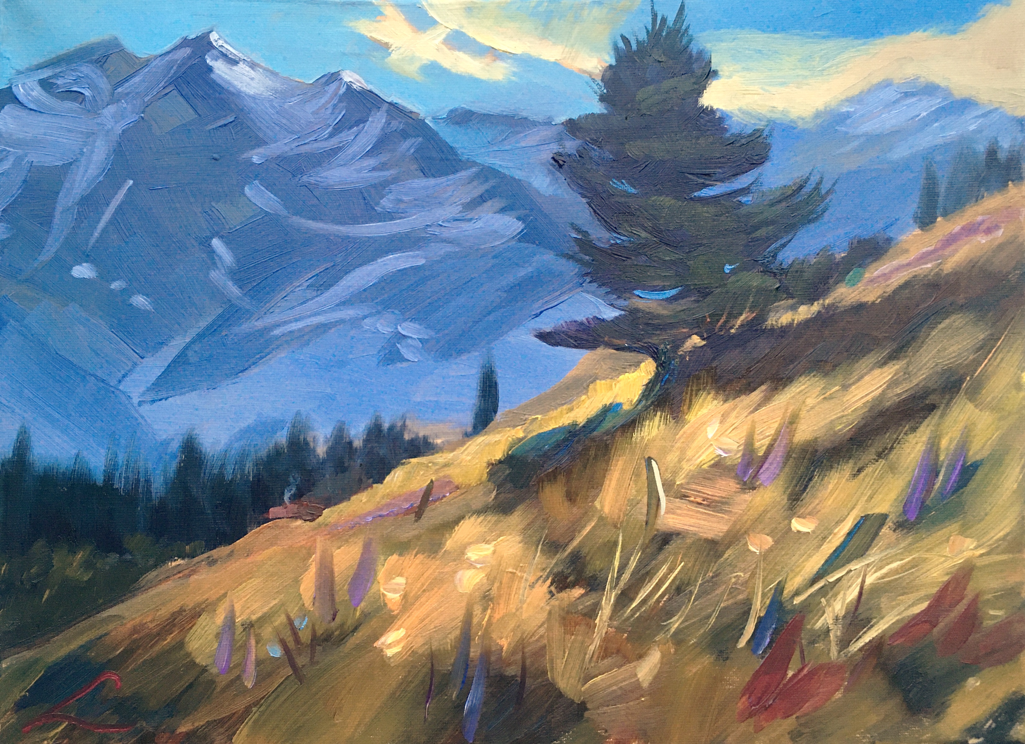
"The Dancing Pine, Plein Air, Lake Ohau" 11x14" Oil on Board
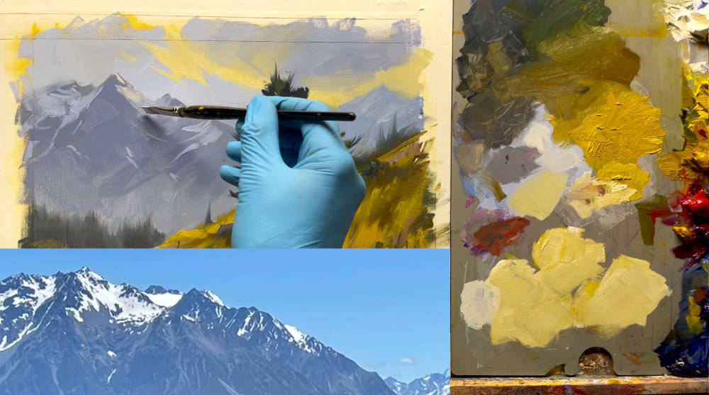
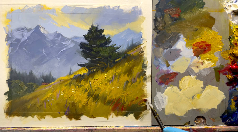
Sometimes that's about colour, but what you may not have noticed is harmonious shape repetition which can be just as powerful.
This demo is in oils but it's fine for acrylics too.
I'll take you step by step through this whole process. Just a couple of hours and you'll have a beautiful mountain painting.
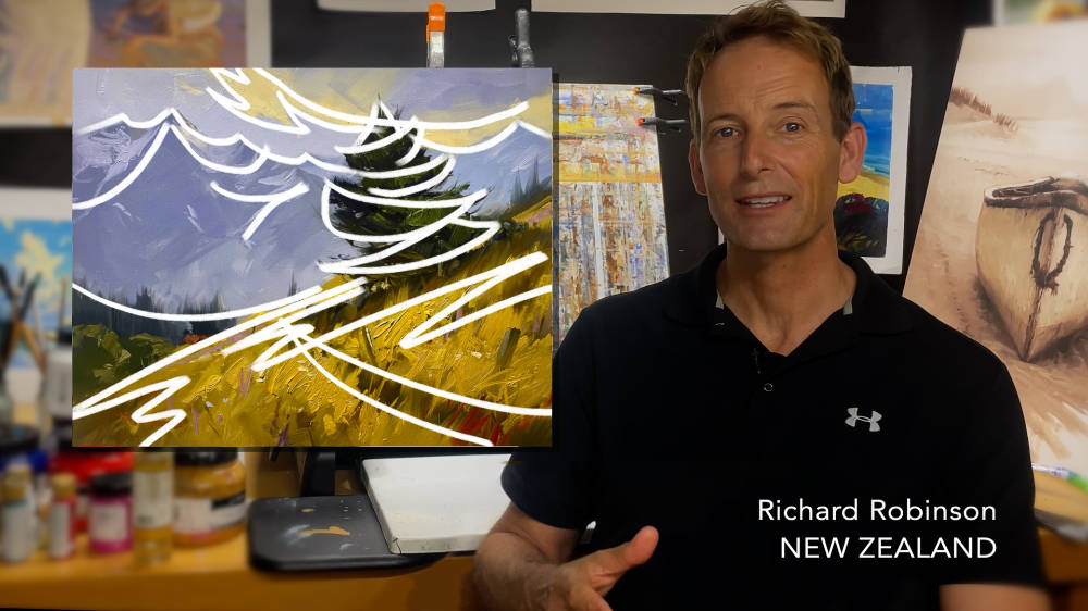
I’ll guide you all the way.
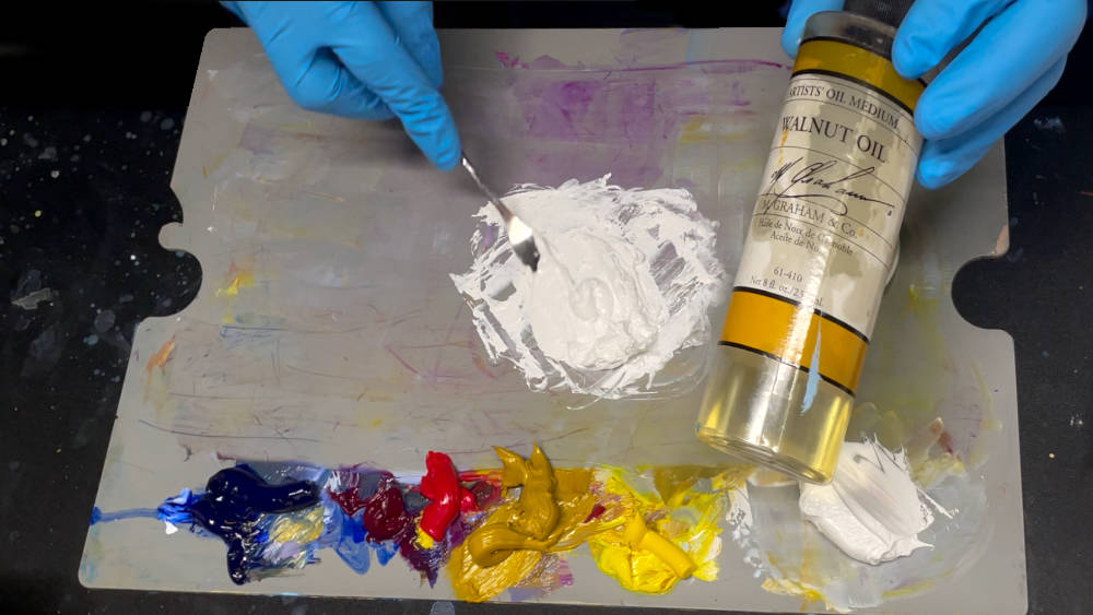
Make sure that each colour on your palette has the same thickness. That way they'll brush out onto the canvas easier, making painting more fun and less struggle. They'll also mix together easier. Simply mix more painting medium (walnut oil in this case) into the thicker paints with your palette knife until they're the consistency you want. I like a warm margarine feel.
In this painting the tree has a wonderful swishy shape to it. I wanted everything in the painting to work in concert with that, to have a similar feel to it. So you'll find swishy shapes everywhere throughout the painting. This helps unite the painting, just as a tune repeated by various instruments in the orchestra can bring the music together as one. Give it a try!
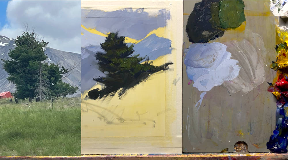
Trees and every other thing you might paint, have character. They have an ‘it-ness’ about them. You’ll find that each object has a specific character about it, and a broader character that is indicative of its species or category.
For example the branches of a pine tree tend leave the trunk at a certain angle, but a specific pine tree will have its own way of expressing that tendency. It’s your job as a painter to recognise this character and try to capture it, and even exaggerate it for effect.
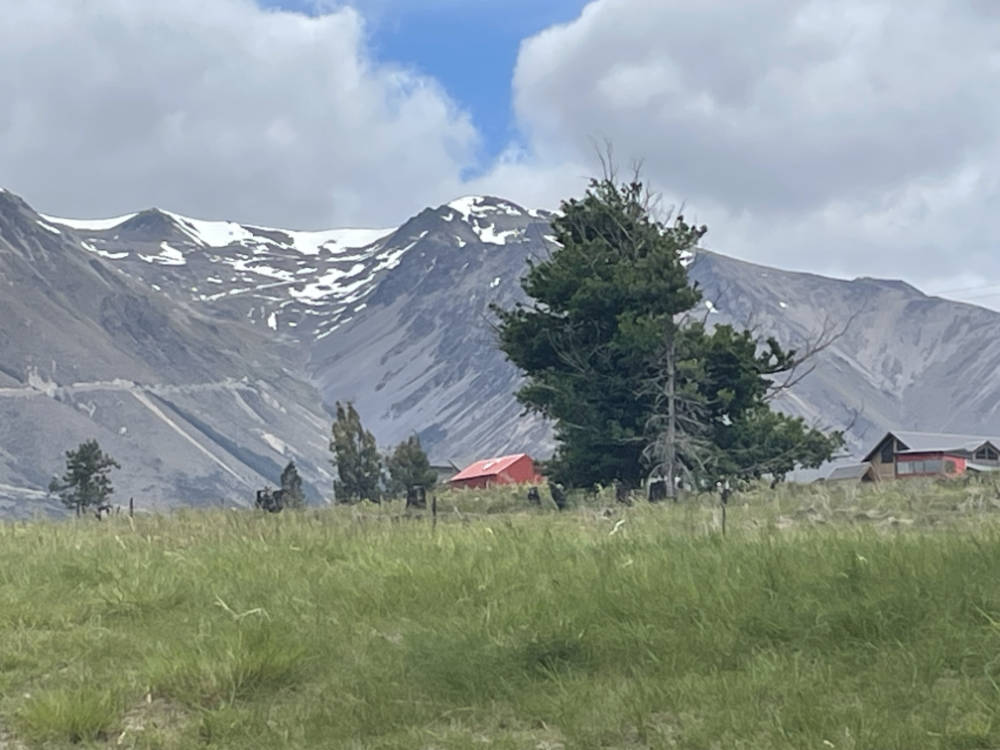
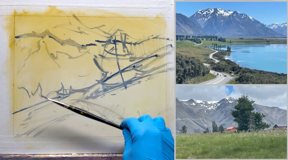
Your artist's licence can shift very heavy loads. These are not the same mountains. These were just down the road. They were more interesting so I used them instead.
The lighting was changed too. I left them more in shadow so they would steal the spotlight from the tree as much. Once you know how to paint things in shadow and light, you can move that spotlight wherever you like in your painting. Enjoy!
A fence post, a red cabin, some lupin, a few warm accents, and we're done. Those finishing touches can make or break your painting. They say it takes two people to paint a painting - one person to paint it and one person to tell them when to stop.
I'll take you step by step through this whole rich process and you can choose which parts you'd like to try out in your own work.
“We keep moving forward, opening new doors, and doing new things, because we’re curious and curiosity keeps leading us down new paths.”
—Walt Disney
Enjoy!
M. Graham & Co. Oil Paints
Titanium White
Cadmium Yellow Light
Yellow Ochre
Cadmium Red Mid
Quinacridone Violet
Ultramarine Blue
Painting medium
M. Graham & Co. Walnut Oil or Walnut Alkyd Medium
Solvent
Gamsol
Surface
MDF panel primed with 2 coats of acrylic undercoat. Sand lightly between coats.
You could use a canvas panel or anything you prefer.
Brushes
Rosemary & Co. Richard Robinson Brush Set
Palette Knife
Paper Towels
Container for solvent
Container for painting medium
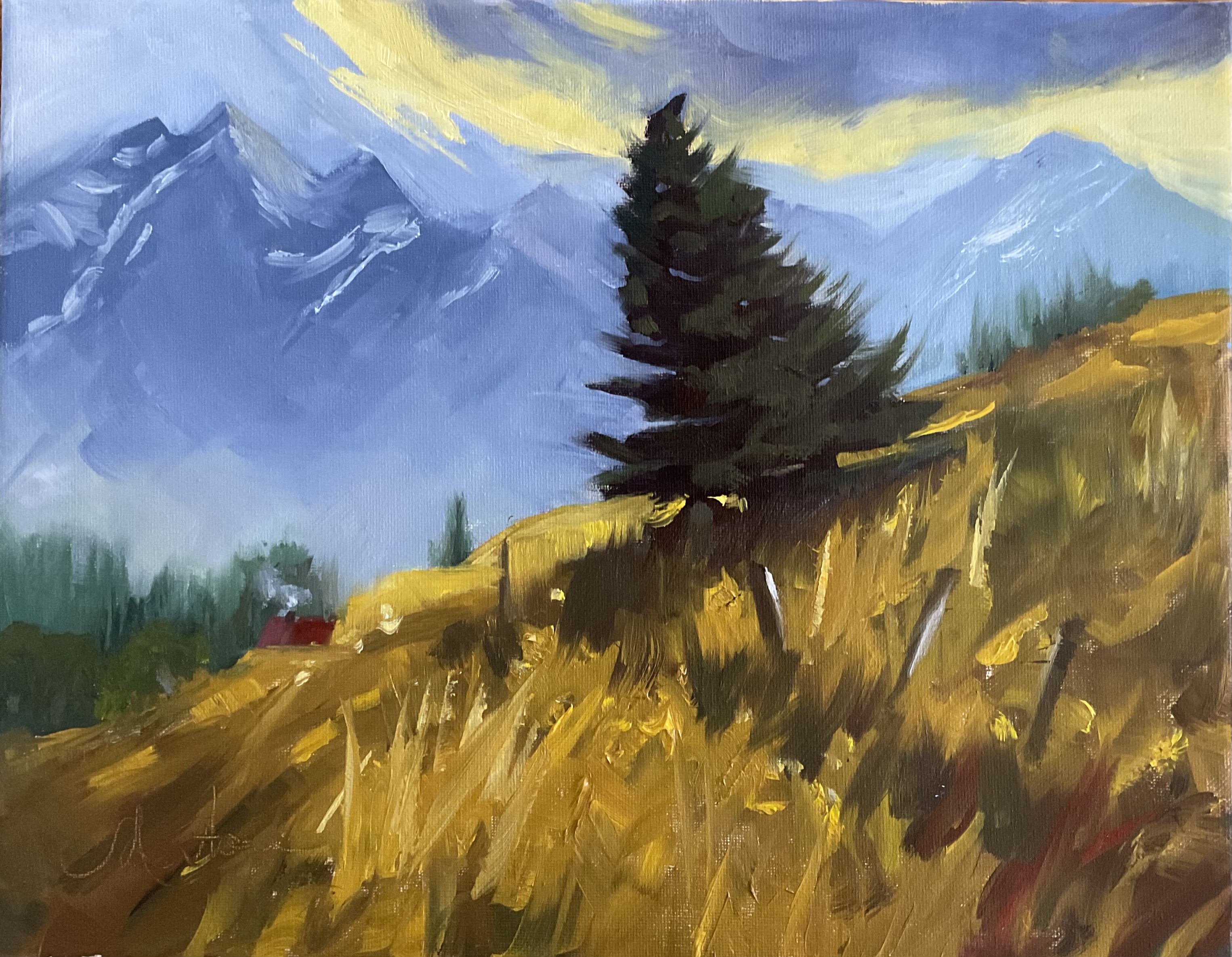
"The Dancing Pine" in acrylics by Eric Hillmer, Toronto, ON, Canada.
Hi Eric, great to see you having fun with paint in this one with nice wet-in-wet sections, particularly in the grass and the tree. There’s a certain fluidity and freedom that happens with wet in wet that, if it’s not overworked, can look really expressive and exciting. It looks like you’ve achieved that in the grasses and trees but in the mountain snow with all of the details there has slowed you down and made you a little too descriptive and literal in your careful portrayal of the snow shapes. It’s difficult to make these areas look complex enough and yet have a certain efficiency of brushwork that makes it look effortless and not overworked.
Mostly, that’s about shape making. What I try to do with all my shapes up there is start with one large interesting shape that has some smaller subsidiary shapes attached to it, like a family of shapes. Approaching it in this way tends to give a more cohesive feel to the mountain rather than having it broken up into lots of separate fragments.
Another problem you have up there is you’ve just got too much white area which is flattening the mountain. This can be solved by considering the angle of the sun, which is from the right if you are to believe your tree, and so your highest peak should be casting shadows down its left-hand side.
Another small note, make sure to soften of the base of fence posts and branches that are emerging from the softness of the grasses. I hope that helps. Keep up the good work!
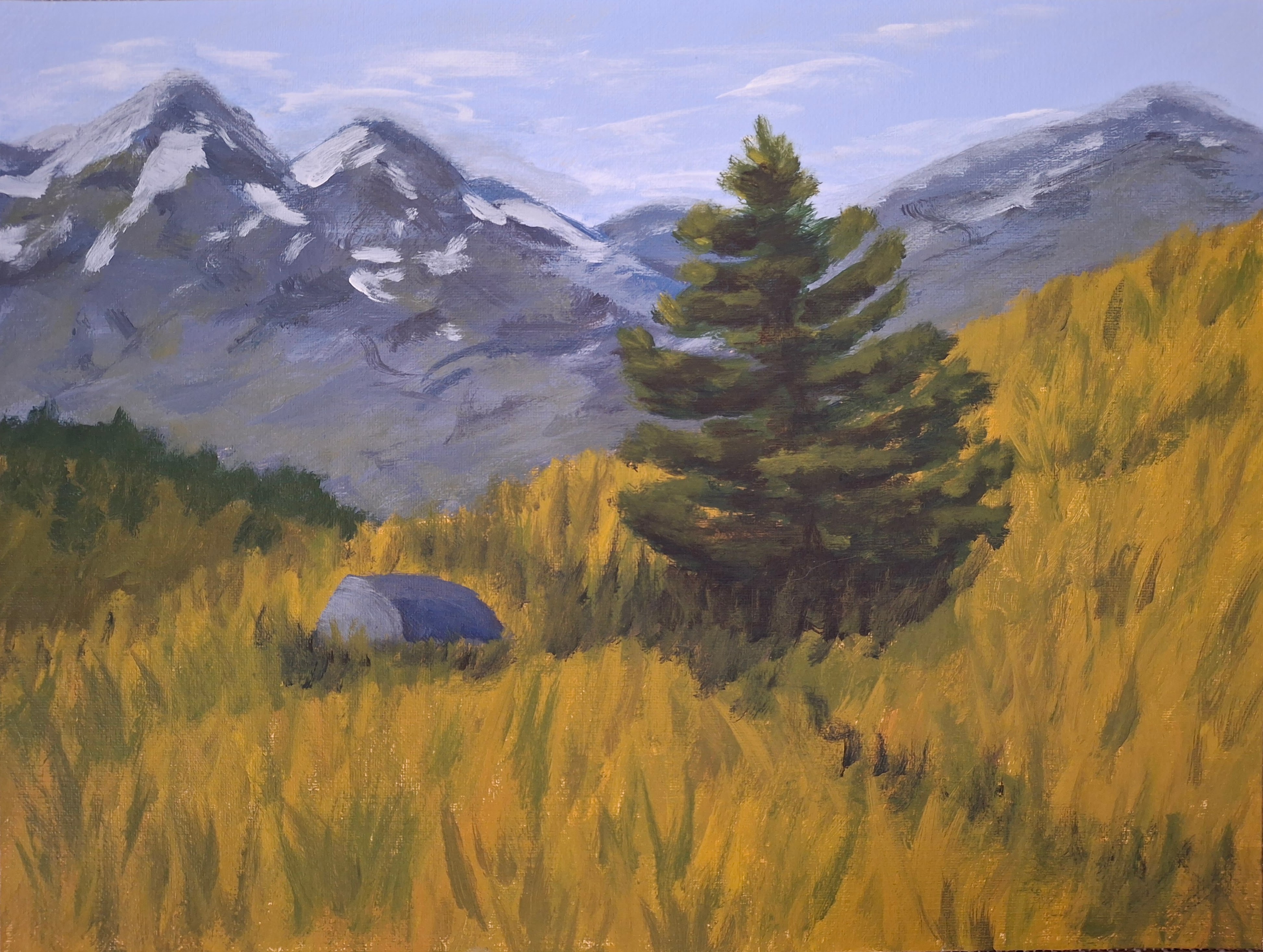
Landscape with a pine, oil, canvas, 30 cm x 40 cm by Elena Sokolova
Beautiful colourful and expressive work, Elena. I love your fluid brushwork and the extra colours you have dashed into the foreground grasses. Great job!
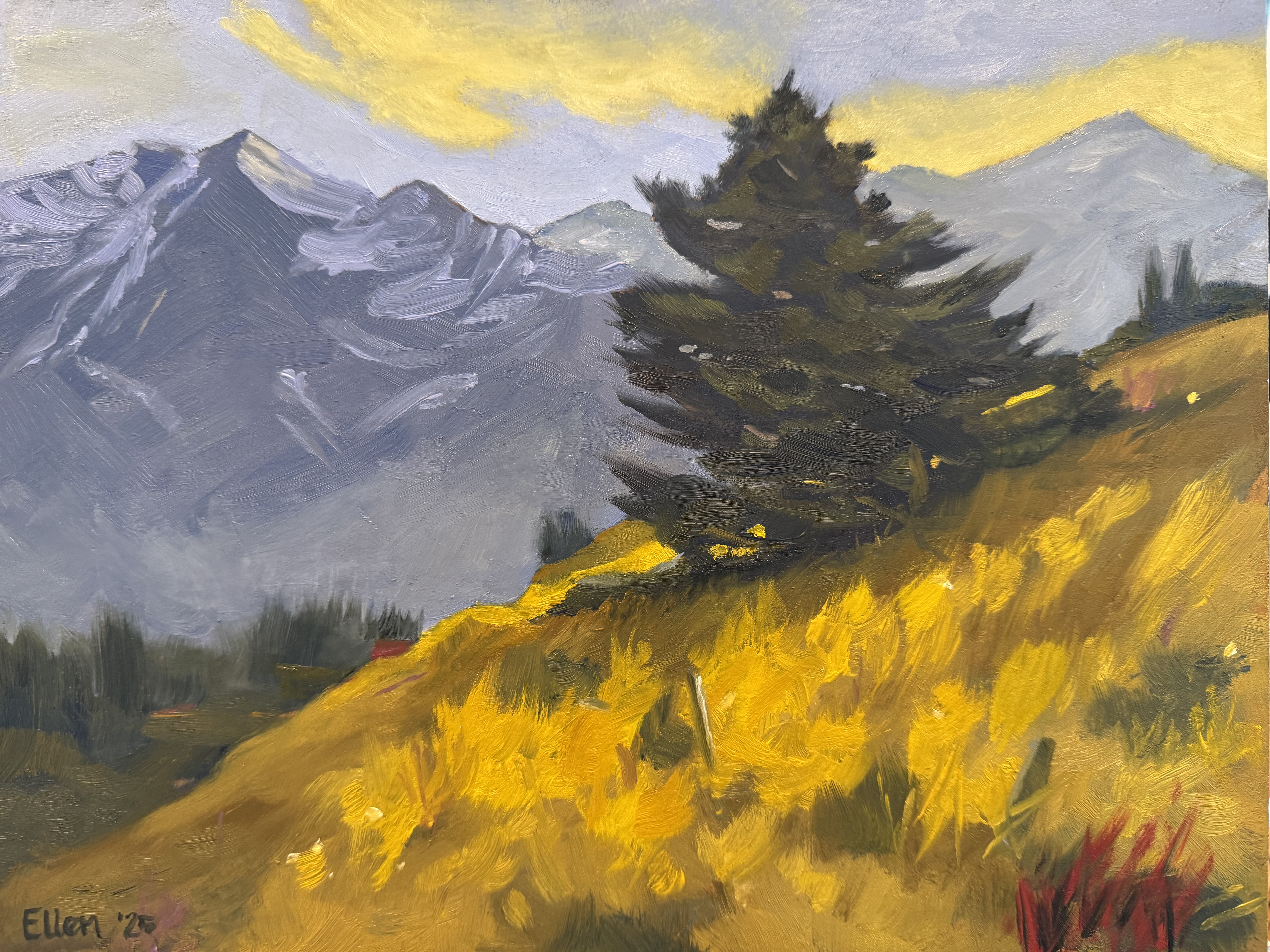 Ellen’s dance by Ellen Sockolov
Great to see your nice clear shapes in here, Ellen, including the thoughtful way you built the light and shadow shapes in the grasses and placed the path in there without it being too obvious. Your brushwork is fluid expressive without getting confused or muddied. A very nice job.
Lake Ohau pine , 12x25” oil on panel by Mark Price
Great swishing snow shapes in the mountain and clouds there, Mark, echoing those in the tree, which was one of the learning points of this lesson, so that’s nice to see. I do feel that if the tree was a little less symmetrical then it would have more unique character. I love the thick impasto paint in the grasses and how that contrasts with the smooth background. See the dark edge that’s outlining the edge of the hill right in the middle? It'd be better to dissolve that or break it with a tree because outlines always tend to flatten shapes painting, spoiling the illusion of depth. Just a little tweaking. Great job, mate!
The Dancing Pine 11x14 oil on canvas by Nancy Newton
Lovely vibrant colour in here and expressive brush work that really brings this painting to life, Nancy. I would just caution you against the tree so symmetrical and Christmas tree-ish although, you do have curve on it. When we make shapes too obvious paintings, looking too much like the symbols we have in our heads for those things, then it removes a chance for variety and interest. Aside from that, very nice!
The Dancing Pine after Richard Robinson, 11x14 acrylic by Rachel Chard
Some nice work here, Rachel. It’s just lacking a little contrast. If you apply lights in the foreground grasses lighter than what you have there now it’ll give the appearance of stronger light rather than an overcast look. Adding that light mainly in the area around the tree will also give this whole area nice spotlight effect. Enjoy!
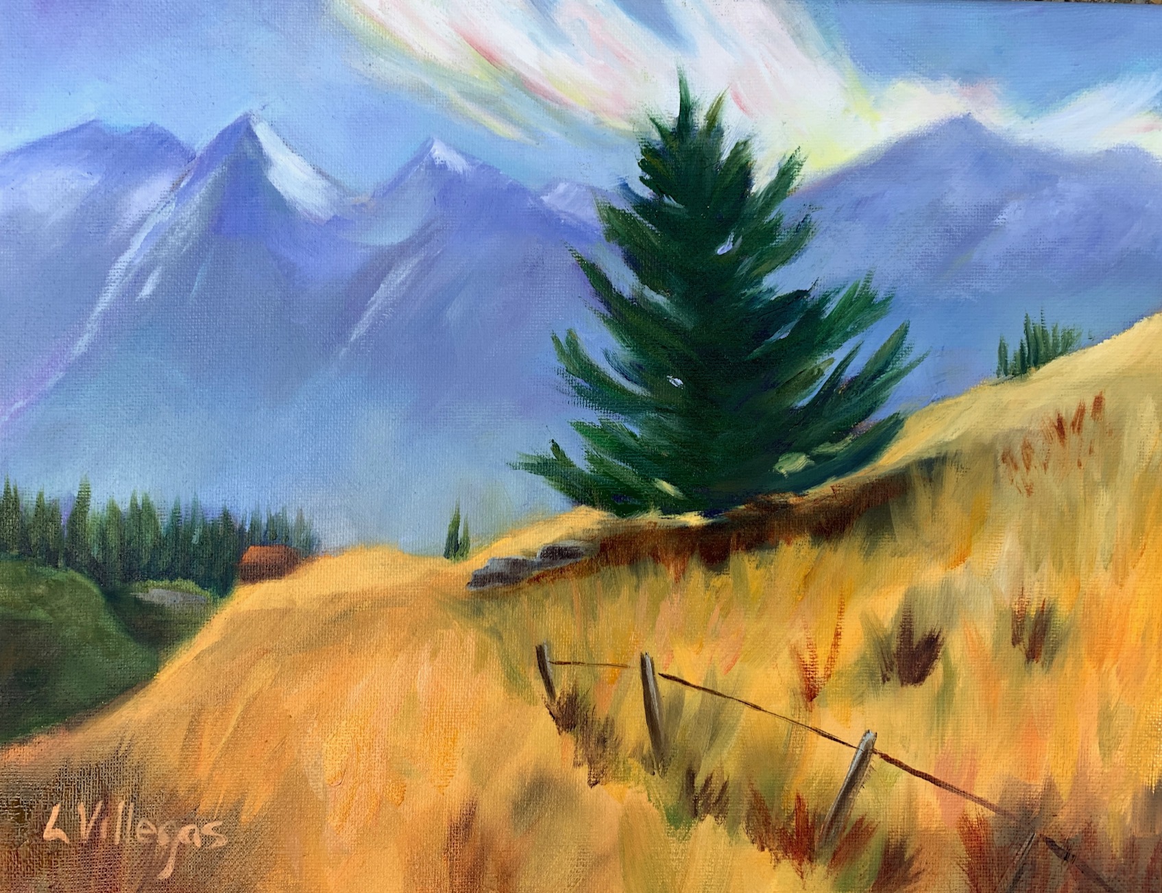
Oil on 11 x 14 Canvas by Louise Villegas
A lovely, lively painting, Louise. It’s interesting the colour variety you placed in the clouds and mountain and I would have liked to have seen a little more of this in the foreground as well. There are two things I would like you to look at further, one being the light on the tree, which is not very evident since there is no clear difference between shadow and light shapes there. It also needs to be firmly attached to the ground by merging the shadow shape of the tree with the cast shadow on the ground. The second thing is the wire strung between the fence posts.
I always find this a little jarring, (and excuse me if I start ranting here) with everything else painted so freely, then the sharp little detail superimposed over the top, which is unnecessary to convey the idea of a fence and only serves to draw the eye away from the stars of the show which are the tree and the mountain. You wouldn’t really see the wire at this distance anyway, so why include it at all?
One could argue that it’s leading the eye to the centre, but we already have the path and posts to do that without the need of crisply painted straight lines. If you’re going to paint straight lines, why not a railroad track, a highway, or a skyscraper? Straight lines in the landscape are a harsh human imposition. Aaaand, now I will hop down off my little soapbox.
Get the full 1hr 45min online video painting lesson here: https://mypaintingclub.com/lessons/258-The-Dancing-Pine
Login to your account to post a comment.