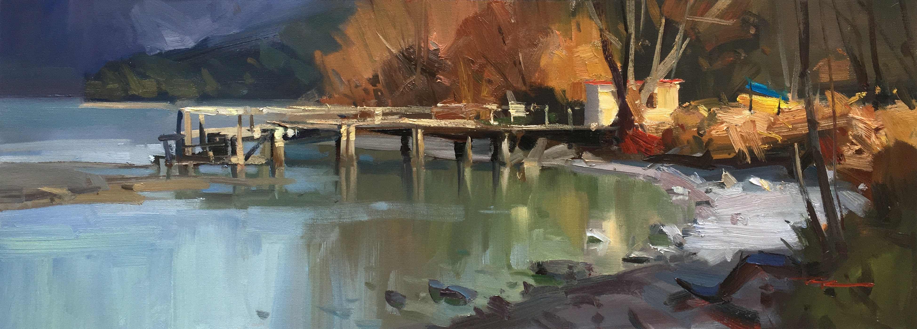
Take a walk with me to beautiful Kinloch on the edge of Lake Wakatipu in the South Island of New Zealand.
This is a great little scene full of interest and variety. Look to see where cool colours contrast with warm, where hard edges contrast with soft, where large shapes contrast with small shapes, and where smooth colour contrasts with texture.
If you can remember to find each of these differences and enhance them in every scene you paint, you’ll be making paintings with much more variety. Variety, or in other words, contrast, is what holds people’s attention to a painting. In this lesson, we focus on doing just that.
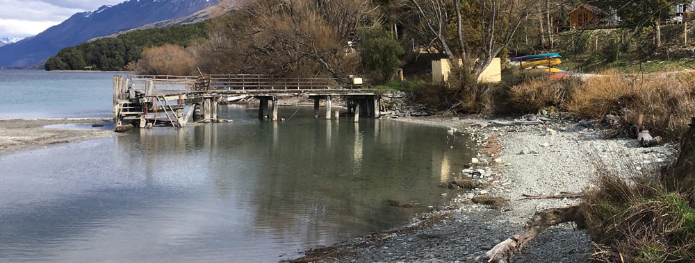
Kinloch, New Zealand
 "Kinloch" 12x24" Oil on Canvas by Richard Robinson
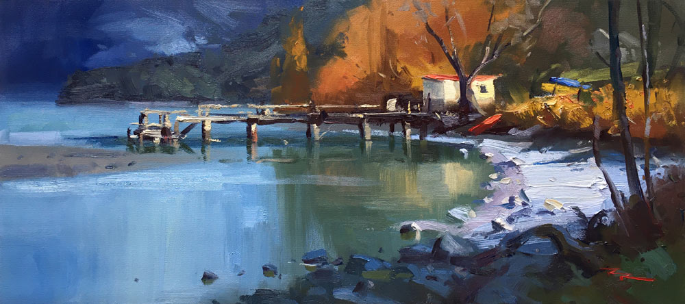
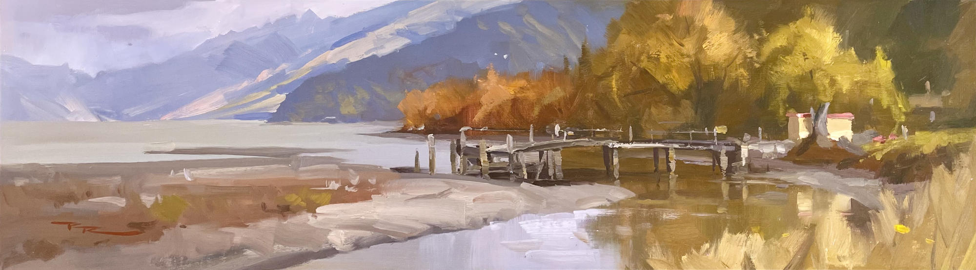 "Kinloch, Autumn" 8x28" Oil on Linen by Richard Robinson
Get the Full lesson here: https://mypaintingclub.com/lessons/196-A-Walk-to-the-Lake-2
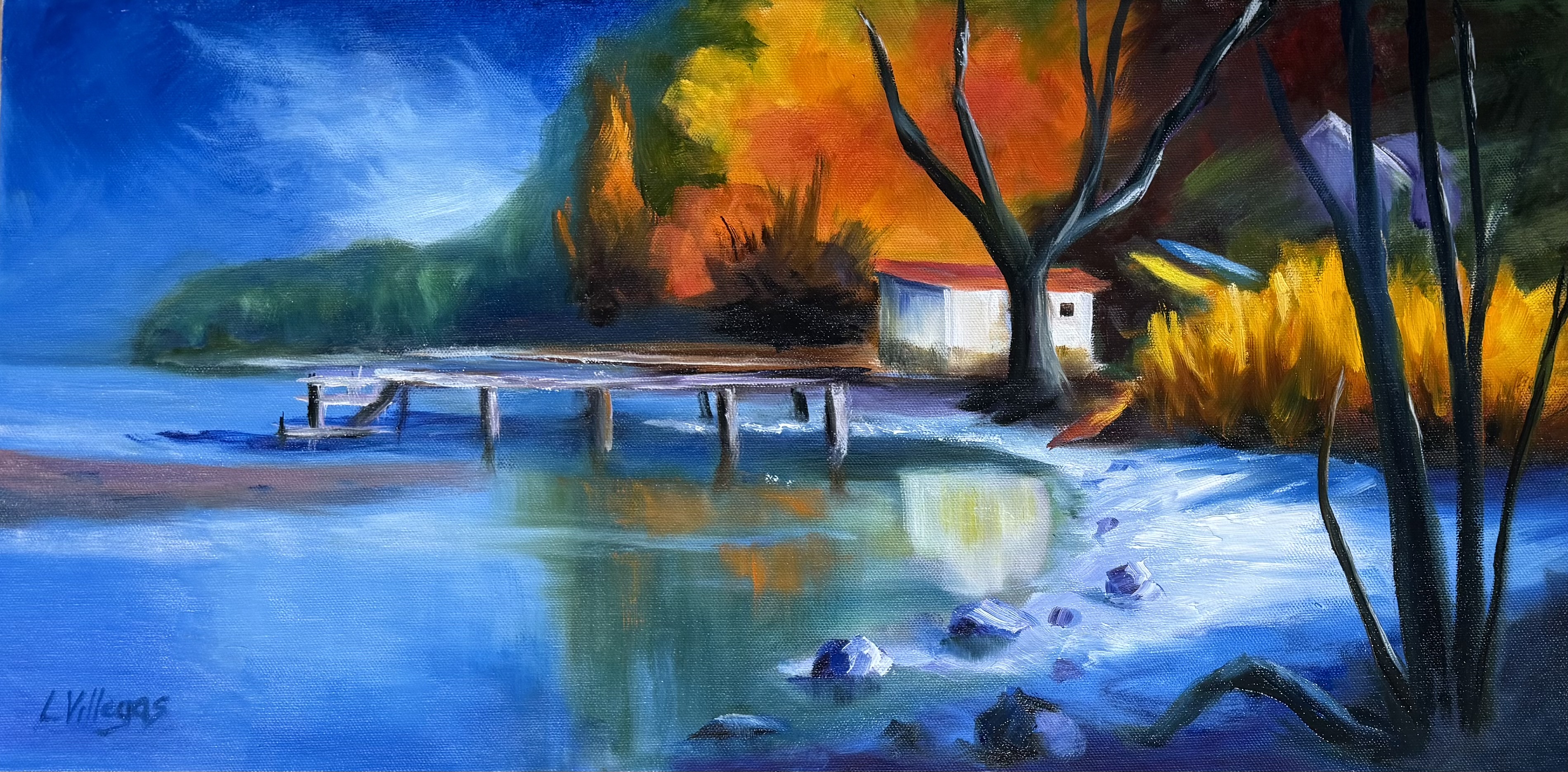
Walk to the Lake - Oil 12 x 24.
Artist: Louise Villegas
Hi Louise, nice work! Very punchy colour and lively brushwork. One drawing issue - be very sure about where the poles for the jetty touch the water. These should be lined up on a straight horizontal line. That’s easy to fix here by glazing over some of the pole bottoms with a blue/green, to make them look like reflections.

"Laura's Lake" by Agnese Iskrova
Hi Agnese, thanks for uploading your painting. It’s tricky squeezing this long scene into a shorter canvas, but you’ve made that work in the design.
Let me draw your attention to a few things I think will help you with your next painting.
1. Horizons should be straight and level.
2. Shadows on light objects (like the beach here) are darker than you think. (Squint and compare darks to darks in your scene).
3. Use contrast to direct the eye. The jetty is the star of the show in this painting, so highlighting it more against the dark background makes sense to make it stand out.
Keep painting!
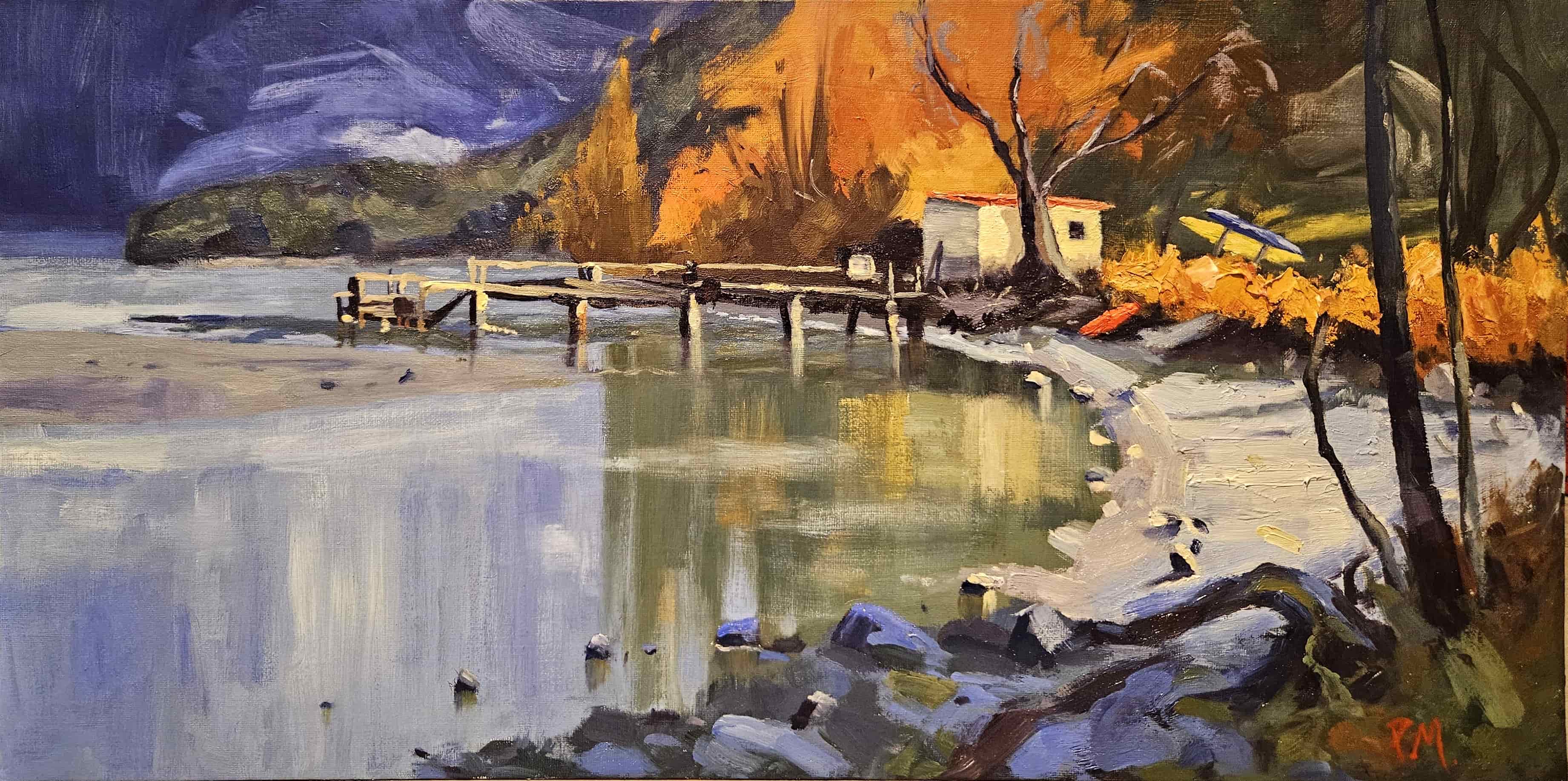
"A walk to the lake 2", 12''x24'' by Peirre Manzi
Wow, that’s an exciting painting style you’ve got there, Pierre. There’s so much variety, the canvas is really singing with life! Nicely done. I can’t see anything to improve on.
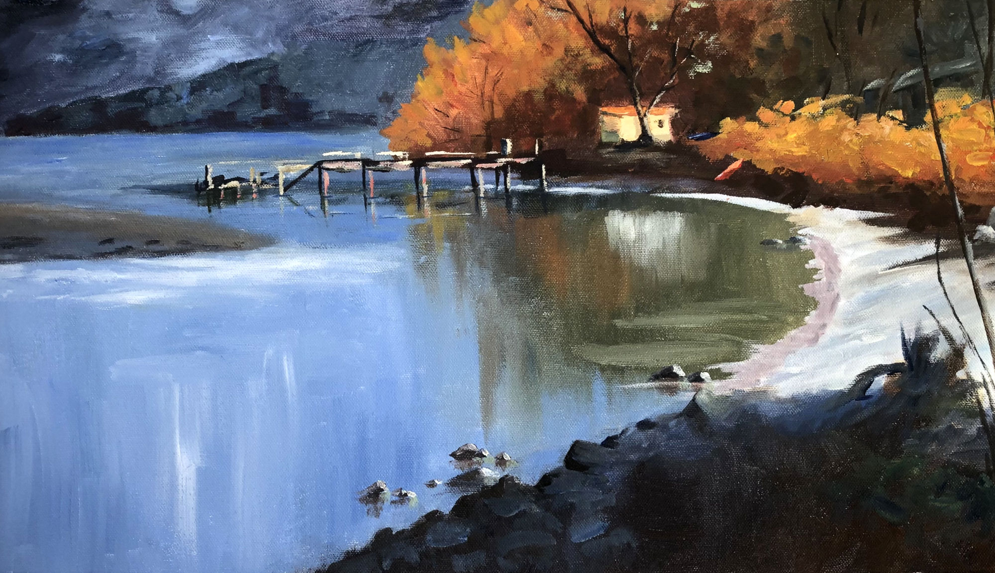
Artist: Estelle Gerrett
Solid work here, Estelle. Good drawing, vibrant colour and exciting brushwork. The one big thing I’d like you to look at is just how much colour can be put into the darks. My painting has fairly subdued colour in the darks to start with, but you’ve gone darker with yours, to the point that it looks a little foreboding.
Now take that photo of your painting and digitally alter it so that the darks are lighter, and increase the vibrancy, so it magnifies the colour in the darks. See how that feels.
The lights will likely be lightened too much as you do that, but just focus on the darks for now. You’ll notice if you paint with more colour in your darks, that the whole painting will seem livelier. Enjoy!
Here's a painting where I've lightened the darks more, to give you an idea:
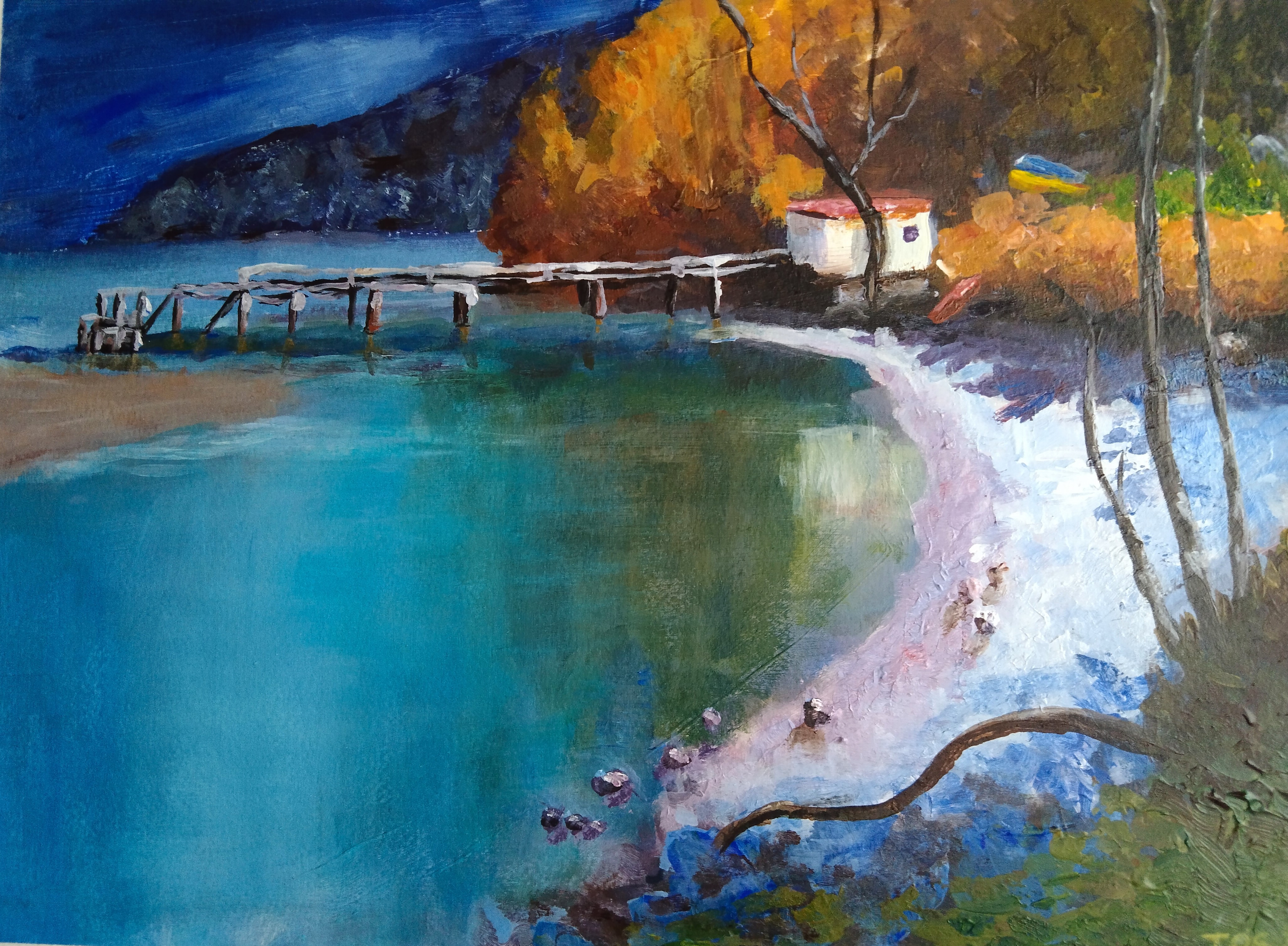
"Walk to the Lake, Acrylic" by Tony O Sullivan
Hey Tony, nice colourful work with good attention to detail, contrasting with large shapes.
The only thing I’d tweak is to have the dock be flat. Just hold a ruler along where the poles touch the water. This should be horizontal.
Looking forward to seeing your next one!
Congratulations and thanks to everyone who entered a painting into the monthly workshop. Great work!
Stuck indoors with time on your hands? Take a walk with me to a beautiful lake in New Zealand. Along the way you'll discover the joy of painting in a colourful impressionistic style using large brushes and loads of paint.
Follow me step by step as I show you the techniques I use to paint this light filled scene. Designing an inviting scene, painting with freedom, and a variety of fun techniques are all demonstrated in the video. Enjoy!
Learn About
- Edge control
- The importance of variety
- Expressive brushwork
- Following a simple process
- Much more!
Get the Full lesson here: https://mypaintingclub.com/lessons/196-A-Walk-to-the-Lake-2
All the best,
Richard.
Login to your account to post a comment.