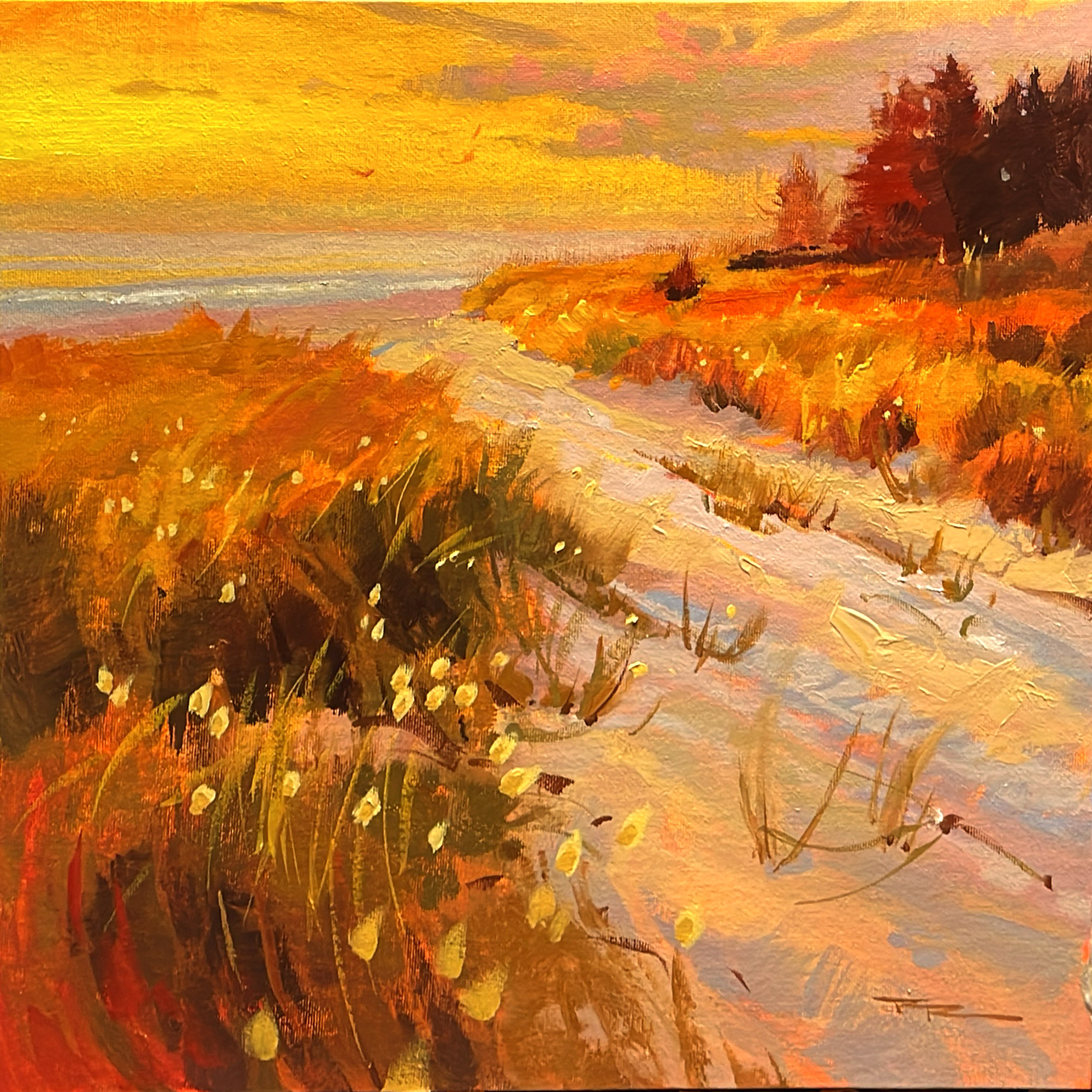
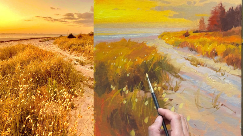
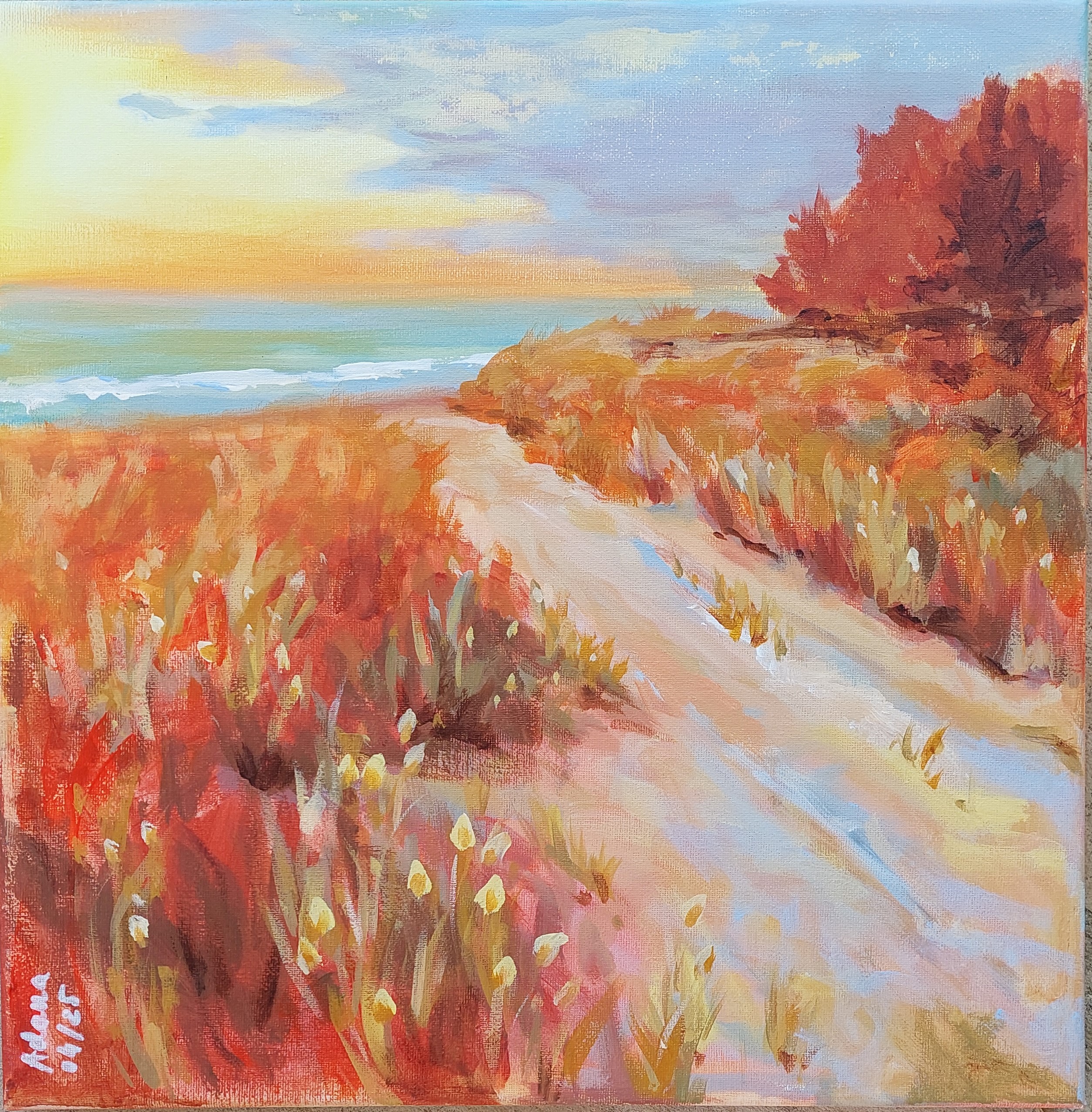
Rangiputa 15x15" Acrylic on Canvas by Richard Robinson
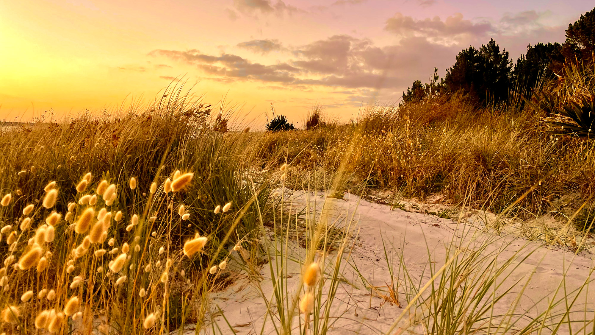
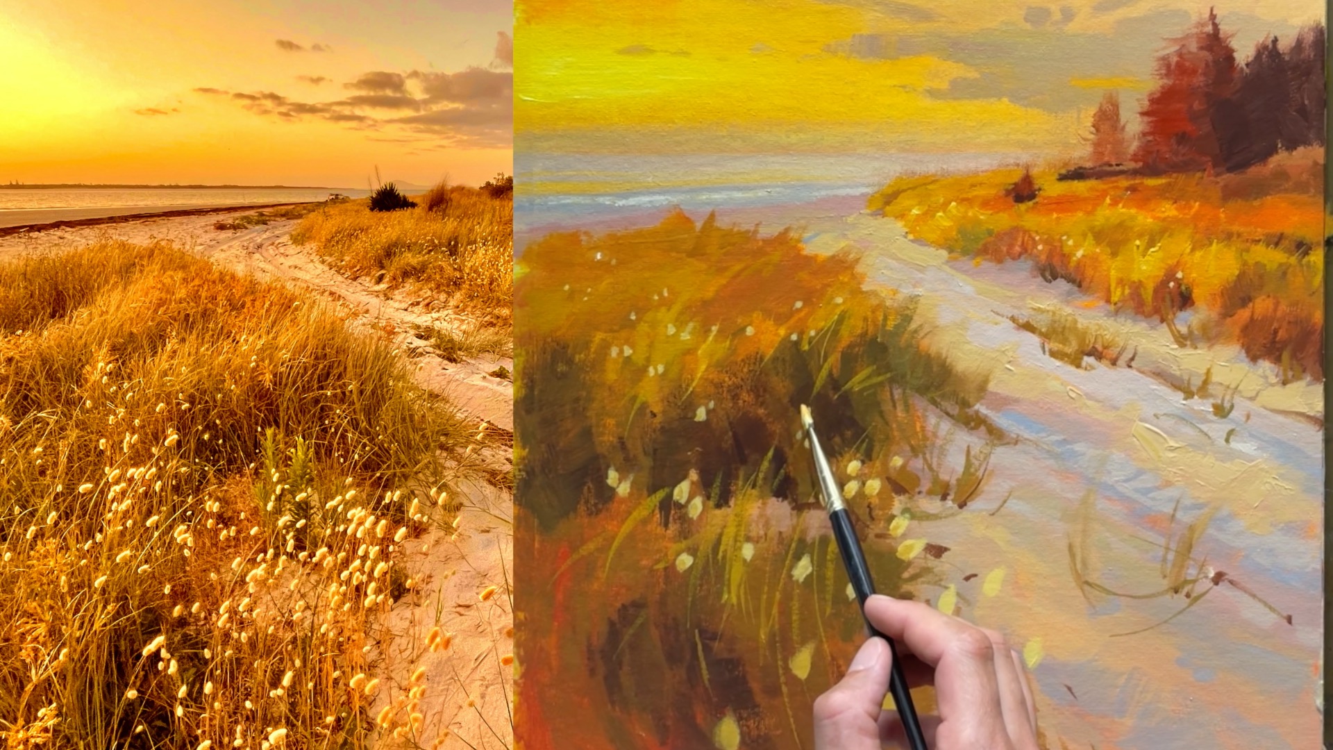
Rangiputa, New Zealand
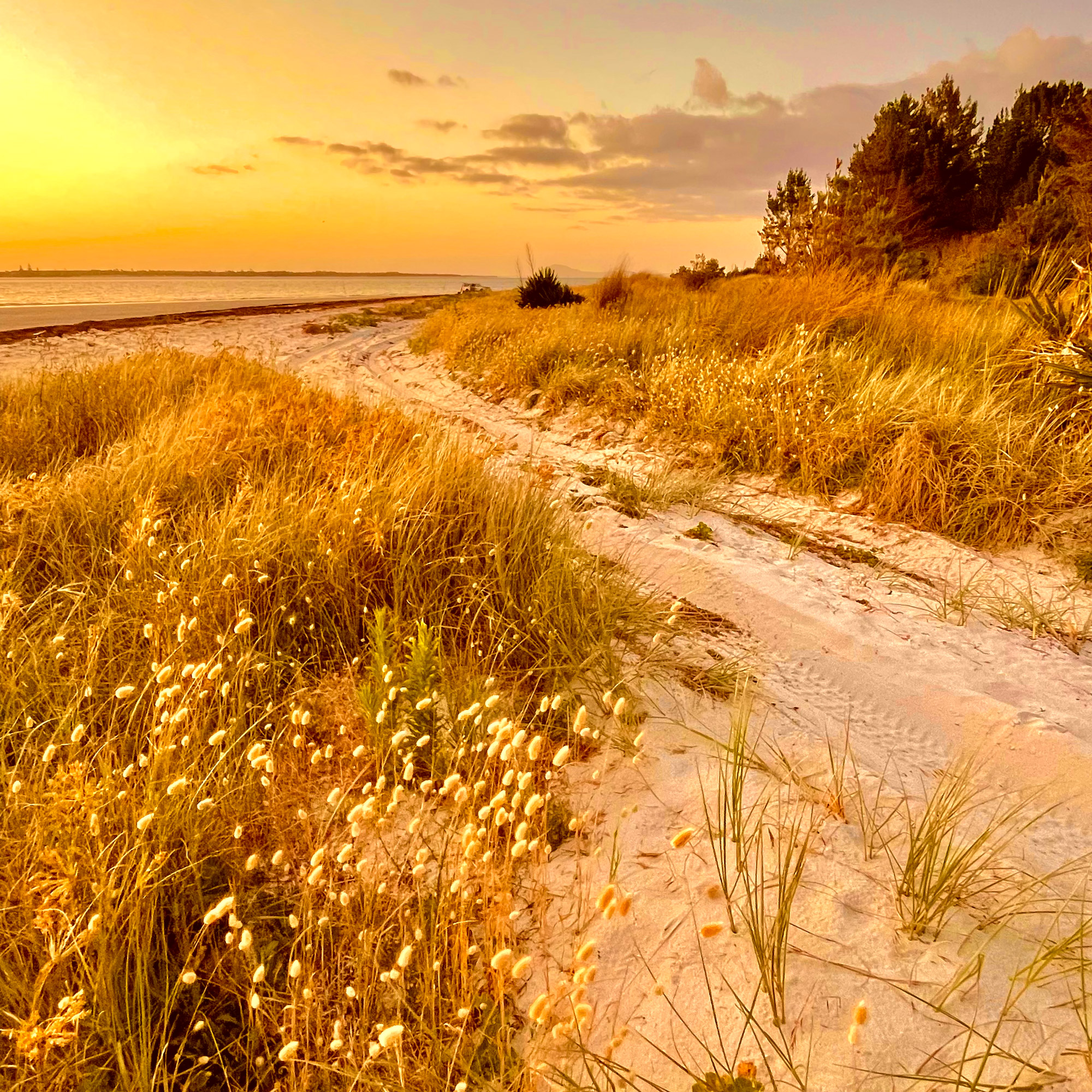
Rangiputa, New Zealand
Some paintings seem to glow with an inner warmth.
How do they DO that?
Turns out it's not rocket science, but it does take a little planning. Learn how!
This demo is in acrylics but it's fine for oils too.
I'll take you step by step through this whole process. Just a couple of hours and you'll have a beautiful sunset beach painting.
Just 7 steps
I’ll guide you all the way.
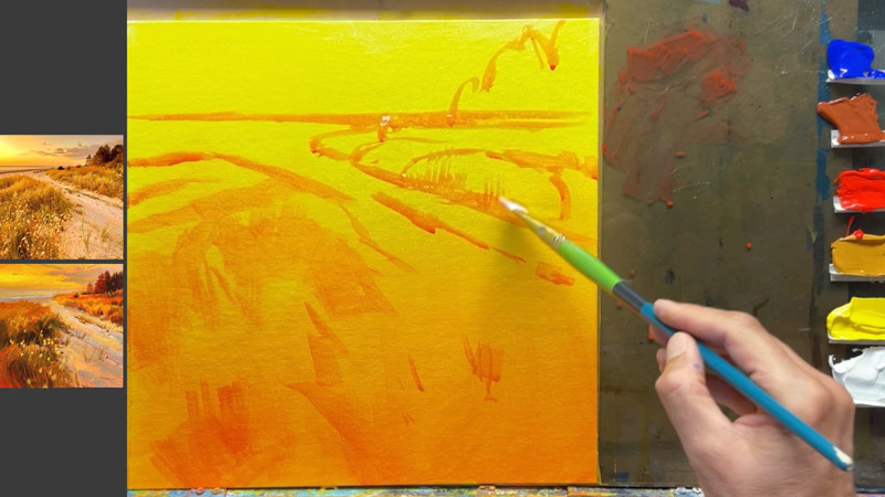
The gradated base layer
If you want warmth it pays to start out that way. The gradation helps the effect of light emanating from the sky.
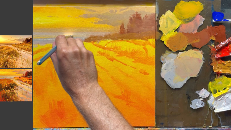
Making the sky glow
The key here is to make the sky get slightly cooler and darker as it moves away from the sun. For clouds, focus on big shapes and then add little details to provide a sense of scale.
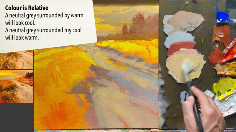
Colour's not what you think it is.
This is a white sand beach, but there's not even a dab of pure white in sight. To help with creating the overall warmth we avoid using cool colours ILIKE blue or green as much as possible. You could even try removing blue from your palette altogether and use a neutral grey instead.
Bazillions of blades of grass, made simple.
Learning to trust the process. Clump, clump, swish. Squint at your scene and find the big shapes. Paint those with softness, then add details over top.
“We keep moving forward, opening new doors, and doing new things, because we’re curious and curiosity keeps leading us down new paths.”
—Walt Disney
Enjoy!
Here are some of the wonderful student paintings from this workshop, along with my critiques.

A Walk to the Beach 12 x 12 Oil on Wood Panel
Artist: Louise Villegas
Wow some really vibrant colour in here Louise and you've made it so inviting with your trademark soft edges and simplified shapes. One thing I would ILIKE you to consider here is the hue and value contrast between the light grey clouds on the right and sky around them. There's a discord there that can be mended by warming that grey up.
Another small note, the light stalks in the foreground could do with ore variety in thickness, length and angle. We have to stay vigilant against pattern making, and this is one of those areas where it's easy to let that happen. Overall it great work, Louise, and it'll certainly brighten up a room.
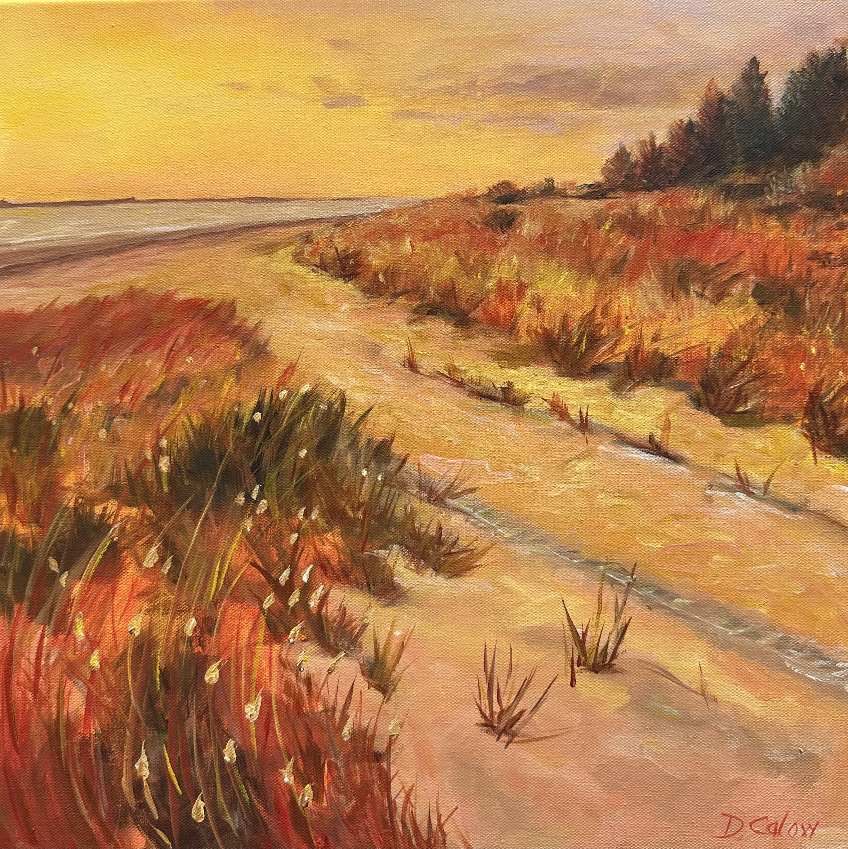
A walk to the beach. Acrylic on canvas
Artist: Deborah Calow
Hey Deborah, you've done well in maintaining the warm light throughout the painting though it could do with a little more neutral grey in the shadow planes to add more variety. I especially love the way you've added texture and detail in the foreground, which pulls the viewer right into the painting.
Beware of adding straight drawn lines in a landscape painting ILIKE the one on your horizon as it smacks of something manmade and draws the attention where it's not warranted - the grasses are really the star of the show. Overall, this is a great piece that shows your strong sense of color and brushwork — keep at it!
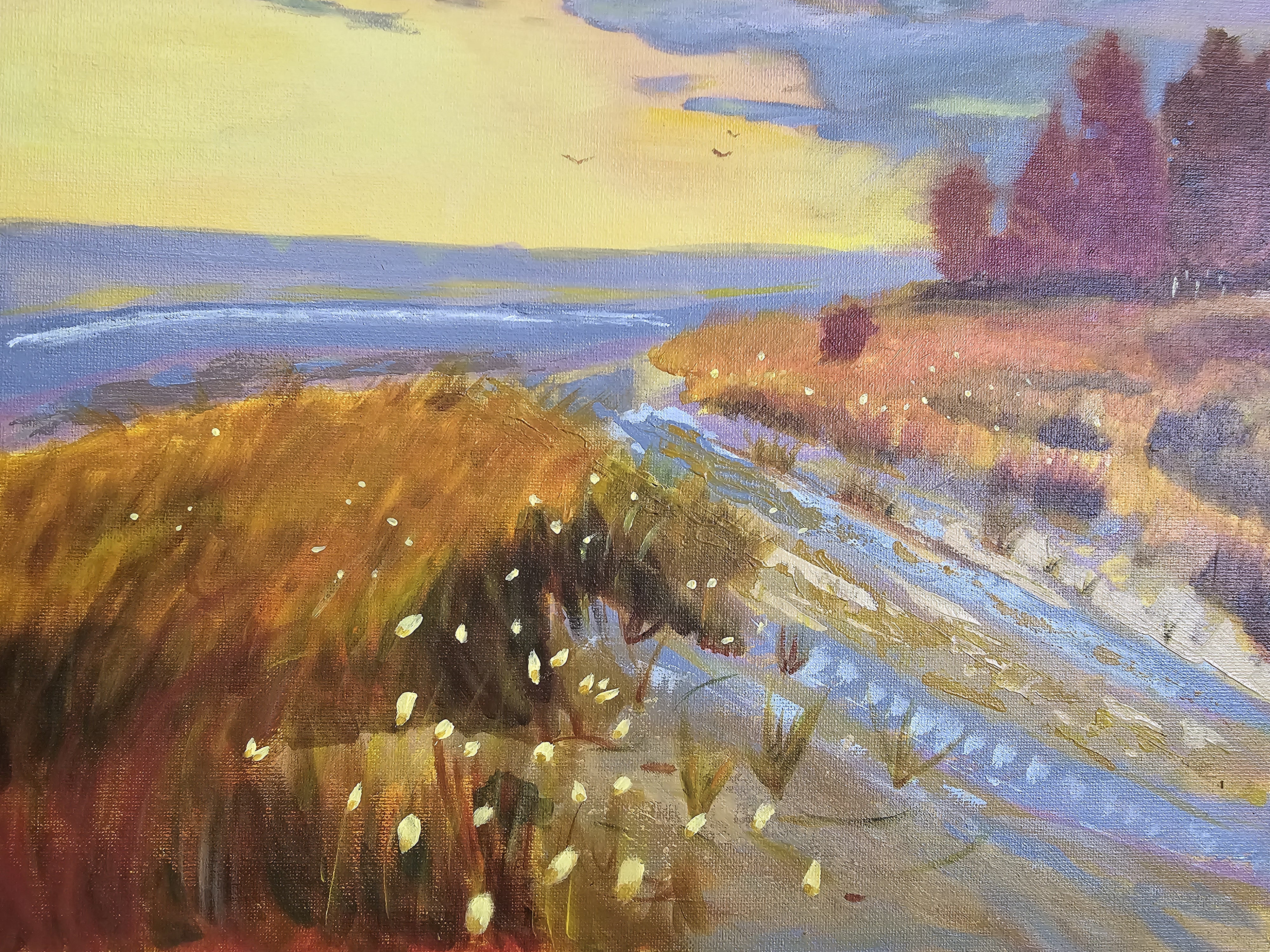
Walk to the beach
Artist: Dawn Grondin
Hi Dawn, nice colour contrasts in here between warms and cools, but that is avoiding the point of the exercise which was to remove those cool colours from your palette in order to create a harmonious warmth overall. Still, you've got a nice transition from dark to light and large to small in the foreground, giving a great sense of depth and movement with your brushwork.
You might want to try using a ruler or masking tape for getting your horizon level and straight, and do be careful to avoid the shine off your painting when photographing it. Hope that helps some. I look forward to seeing your next one.
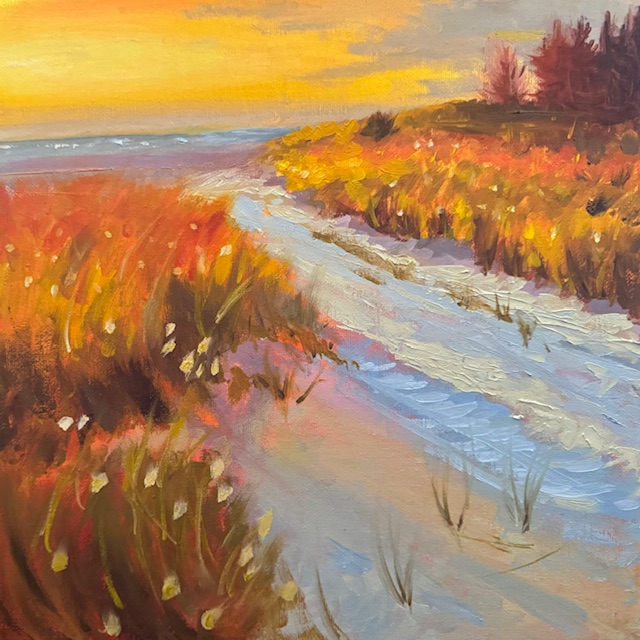
A Walk to the Beach by Tracy Randell, Adelaide South Australia. 12 x 12 oil on canvas board
Artist: Tracy Randell
Great punchy colour, Tracy, and some nice action in the grasses! That's a beautiful smooth sun glow you've got working too. On the whole this is a beautifully atmospheric painting, and you’ve done a wonderful job capturing the warmth of the light through the scene which was the whole point of the exercise.
A Walk to the Beach, after Richard Robinson, acrylic on canvas board
Artist: Rachel Chard
Rachel, you've made a more peaceful and subdued scene here by removing the punchy oranges I tried and simplifying and softening the elements. The warmth of the light has been spread through the painting nicely and that holds it all together. One area you could refine is the value range in the foreground grasses. Adding more shadow tones and highlights would help bring out the texture and make them feel more dynamic.
You might add a little grey/green to the trees to harmonise them with the foreground too. Also, and this may just be the angle of the photo, but make sure your horizon is always level and straight. Overall, this is a delightful painting, and you’re capturing the mood so well—keep building on this great foundation!
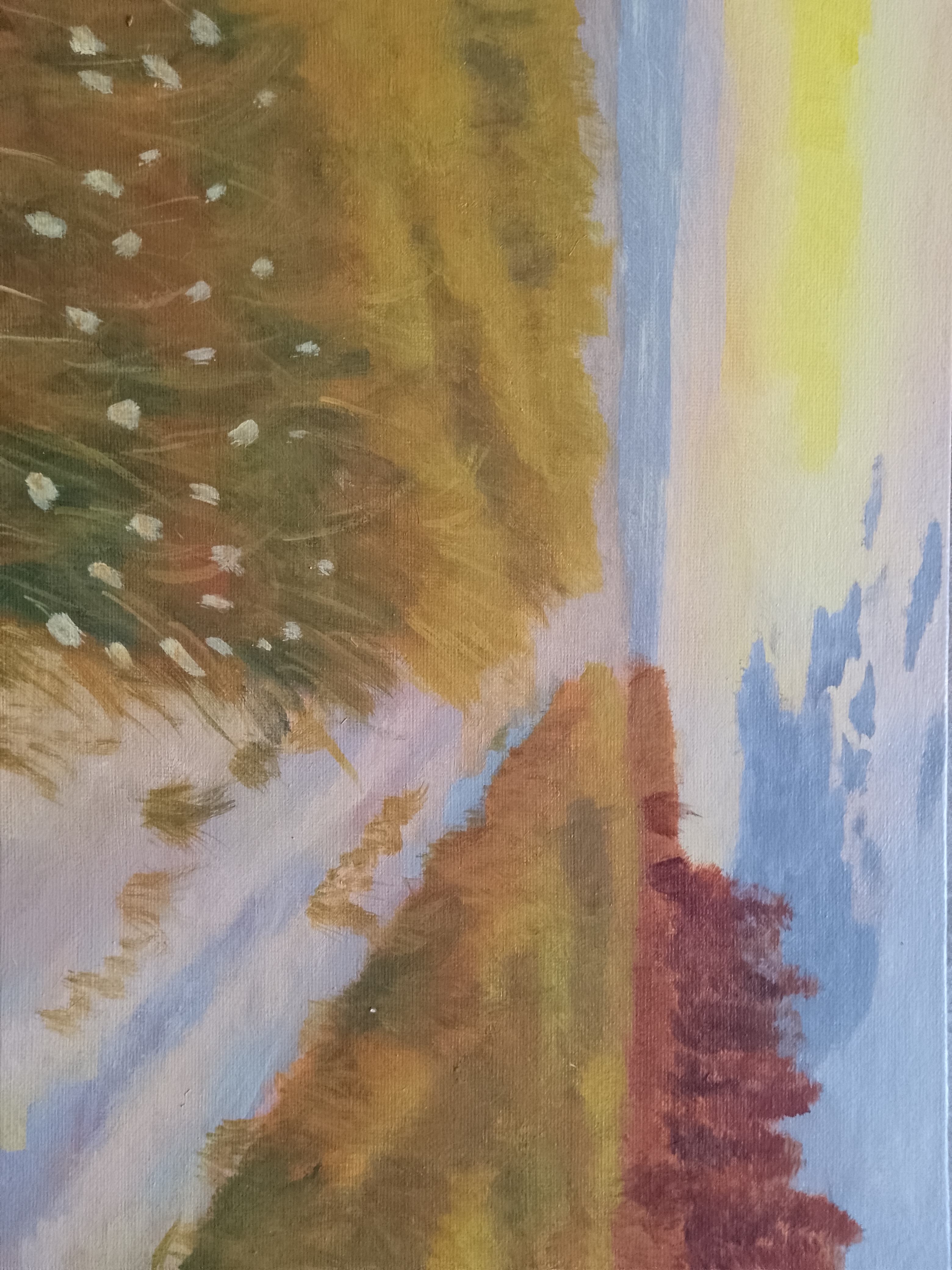
Rangiputa, 40x40 cm stretched canvas, acrylics
Artist: Adana VIRNA
Hi Adarna, this is such a lovely, warm depiction of Rangiputa! The glow of the sunlight spilling over the scene is beautifully captured, and I especially love the way you've infused the grasses with vibrant oranges and reds—it really brings the painting to life. Your brushwork has a lively, playful energy, particularly in the foreground, which adds a sense of movement and texture.
One thing to consider is to darken the clouds a little on the right as they move further away from the sun - that can really enhance the illusion of strong light. Making your dark areas stronger and larger in the foreground can also help with the feeling of strong shadows cast by strong light. Overall, you've created a wonderfully inviting scene—keep it up!
Congratulations and thanks to everyone who entered a painting into the workshop. Great work!
Get the full lesson here: https://mypaintingclub.com/lessons/246-a-Walk-to-the-Beach
- Richard.
Login to your account to post a comment.