
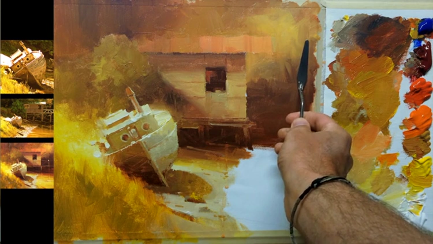
Follow me step by step as I show you the techniques I use to flood a scene with warmth, glowing colour and beautiful textures. This old boat and shed in Canada is the perfect subject to explore these powerful techniques.
Feel free to follow me step by step in painting the same scene or use the photos below or your own resources to design a piece that is more your own. You can paint this any size or shape you like using any medium.
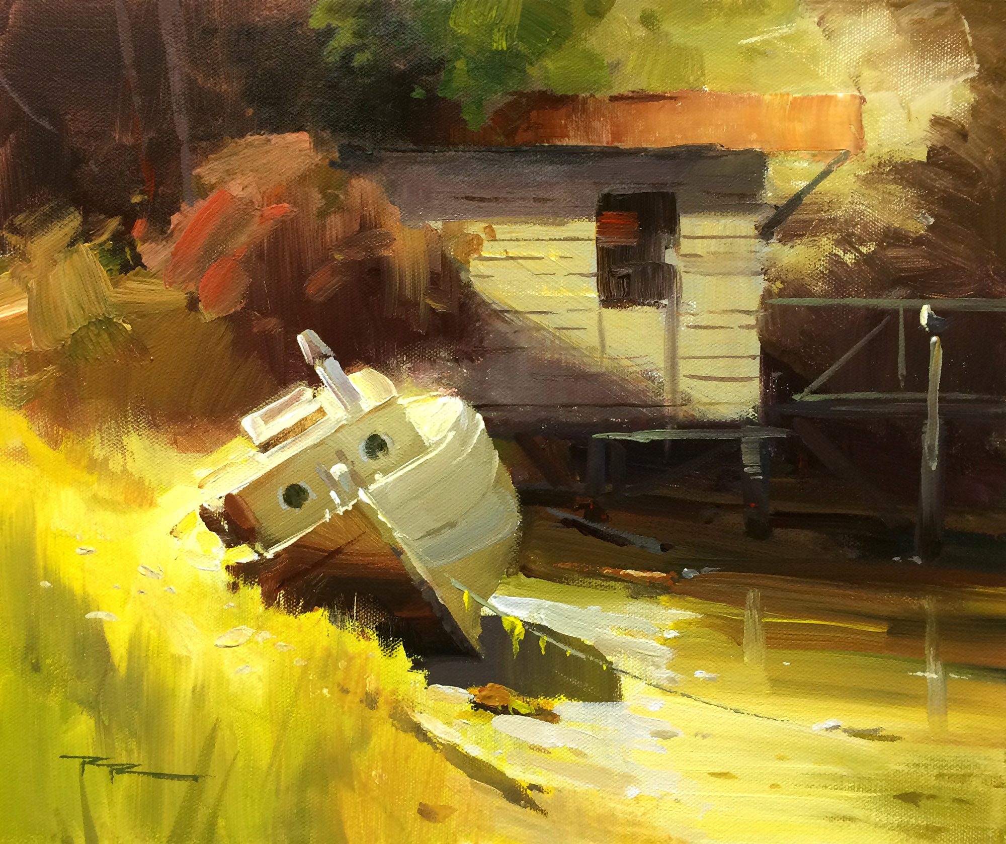
"Whiskey Slough II 13x14" Acrylic on Canvas by Richard Robinson.
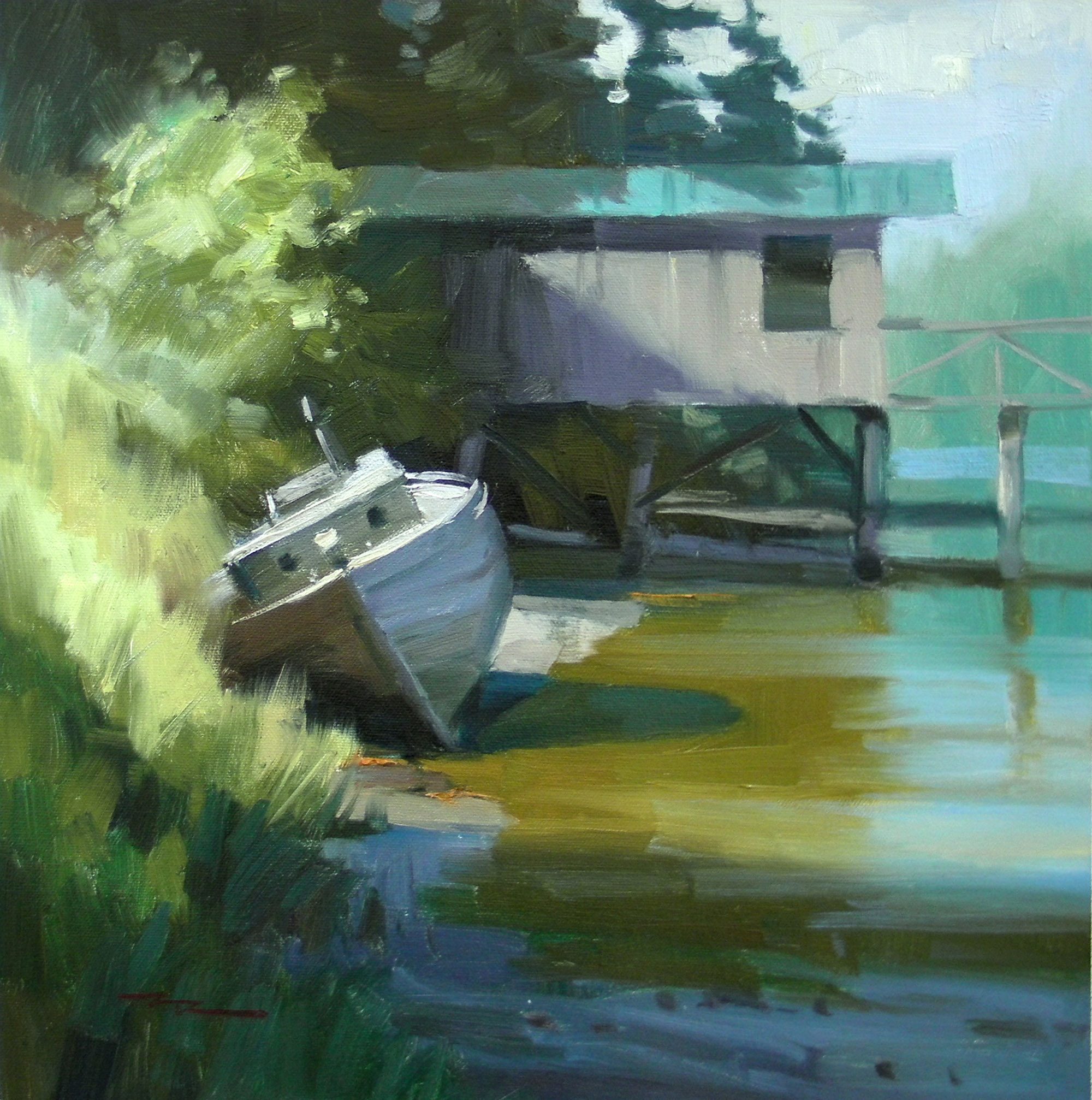
"Whiskey Slough - Plein Air" 14x14" Oil on Canvas by Richard Robinson.
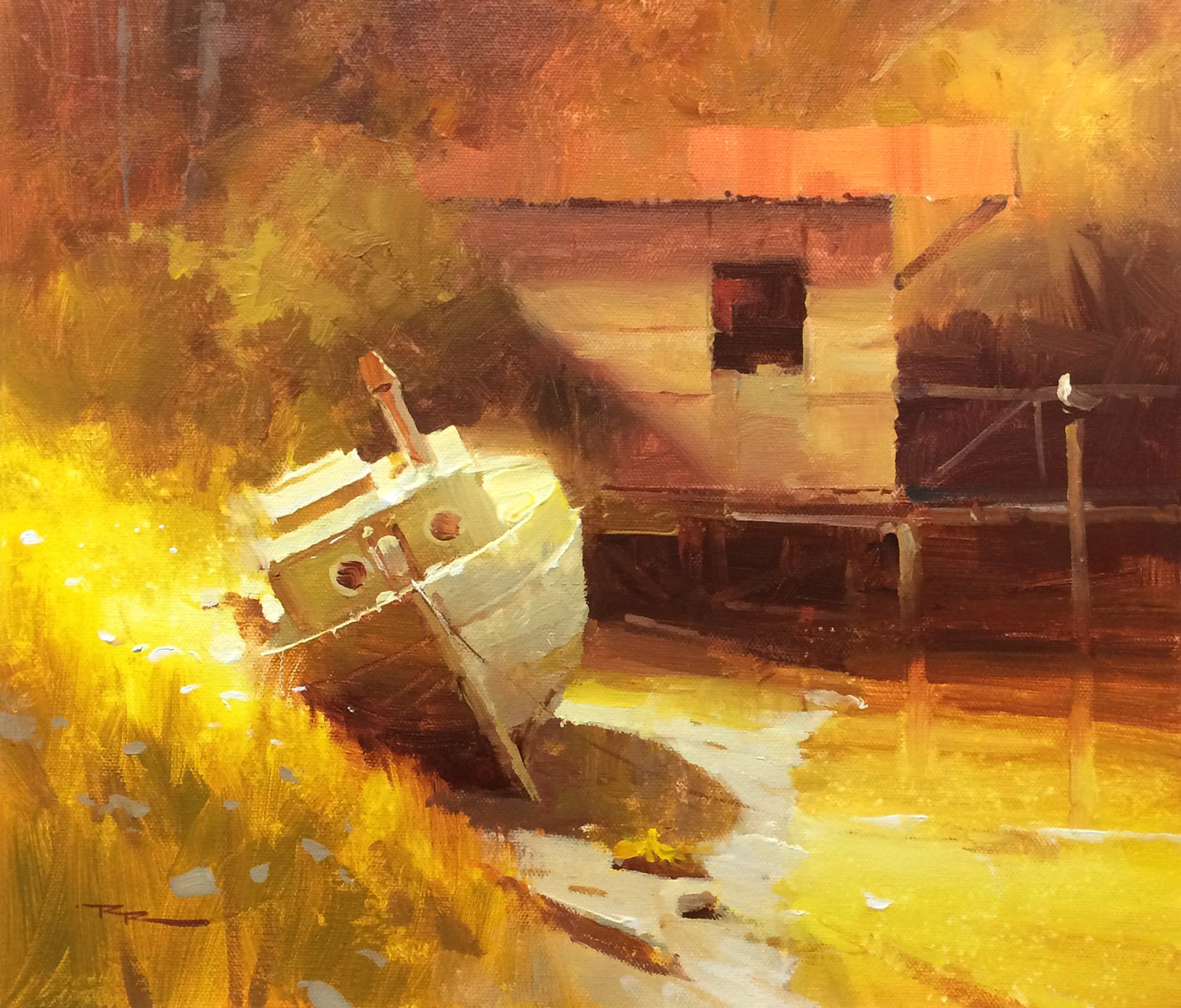
"Whiskey Slough III" 13x14" Acrylic on Canvas by Richard Robinson.
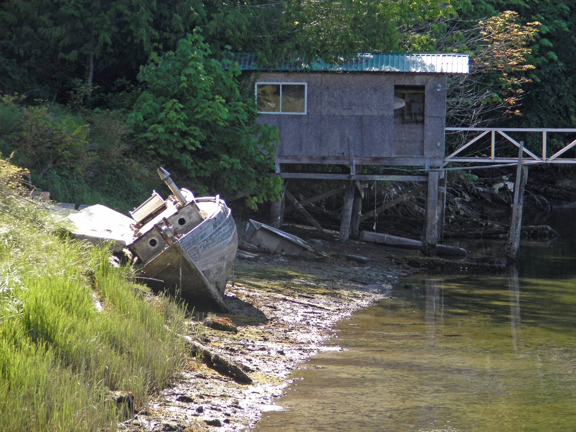
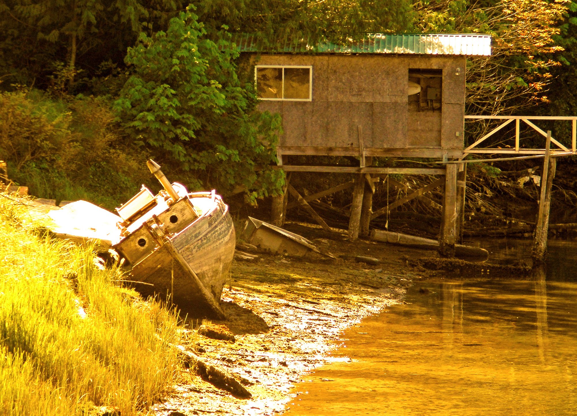
Welcome to Whiskey Slough — a glowing slice of Canadian riverside life with an old boat, a weathered shed, and light that begs to be painted. I couldn't quite believe my luck when I found this scene on an outdoor painting workshop I was given there.
You can see the differences between the Plein Air version and the two different studio versions where I chose to warm up the colours quite a lot.
My main creative goals for this painting were to enhance the glowing light effects (because I love it) and to exaggerate the contrast between soft and sharp edges to create more variety.
Getting started
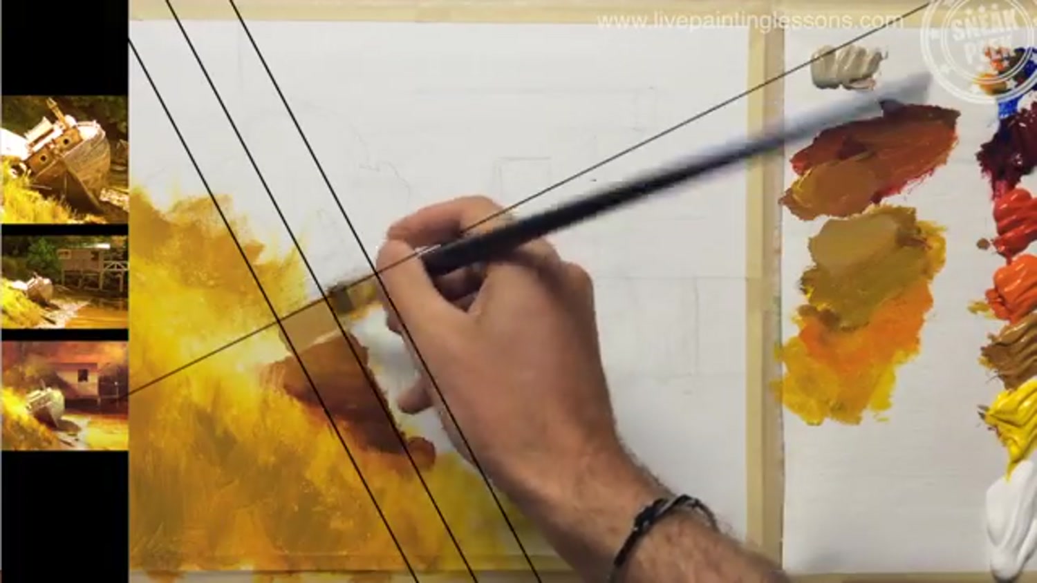
We begin with a simple sketch and energetic block-in, prioritising design over detail. It's worth getting the shape of the boat correct earlier on so you don't have to guess at it later. Boats tend to have interesting curvy shapes that are notoriously hard to get just right, especially looking front on as in this view.
I encourage you to try to see this not as a three-dimensional object but as a jigsaw puzzle of flat shapes. That often helps to overcome drawing difficulties. It's also a good practice to draw a centre line running up the bow, and a line bisecting that at 90° so that you can build the boat around those guidelines.
In this painting because I had already practiced it twice and had a clear plan I simply start painting in the bottom left corner and moved my way around the canvas for each section. This is a practical approach for acrylics too when you are aiming for soft glowing light effects because you want that paint to be wet while you are blending in each section.
Tip: keep your brushwork broad to avoid getting tangled in detail too soon.
The Boat
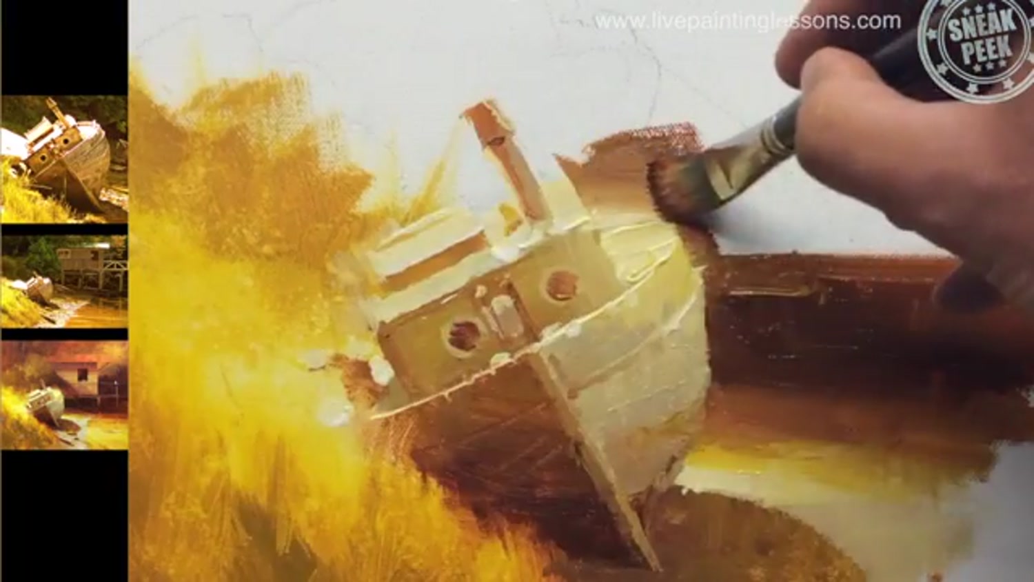
In contrast to the grass, which is a beautiful soft abstract shape, painting the boat is your opportunity to really focus carefully on getting the drawing and crisp edges just right. This is the main focal area so it's well worth taking your time here. A good quality synthetic square/flat brush will help with that.
Tip: Keep your brush clean between value steps to avoid chalkiness or muddy midtones.

Colour Harmony
When I warmed the colours digitally in the photograph, ALL the colours increased in warmth so I'm being careful to maintain that idea throughout the colour mixtures, even accentuating it in the greens in the background. Remember that in a scene we only ever perceive a colour in relation to its neighbours, so what may look like really warm green on your palette may appear much cooler on your canvas when surrounded by warm colours. Testing those colours side by side on the palette is a good way to test it before it goes on the canvas.
We're going to add a diagonal cast shadow and light shape across the side of the shed to create more shape interest back there and echo the diagonals in the foreground. Notice that cast shadows are generally sharper and darker closer to the object that is casting the shadow - the bush in this case. By lowering the contrast in the background we create a nice stage for the high contrast foreground to strut it's stuff.
Tip: Using a neutral mid grey palette will assist you in judging a colour's value.

Edges
Use a mix of soft and hard edges to create visual interest. Our eyes naturally search for sharp edges to identify what we're looking at, making them the perfect tool for directing the viewer's attention around the painting.
Tip: Always soften edges close to the edge of the canvas so you return the viewer's attention within the painting.
Student Critiques
Here are some of the wonderful student paintings from this workshop, along with my critiques.
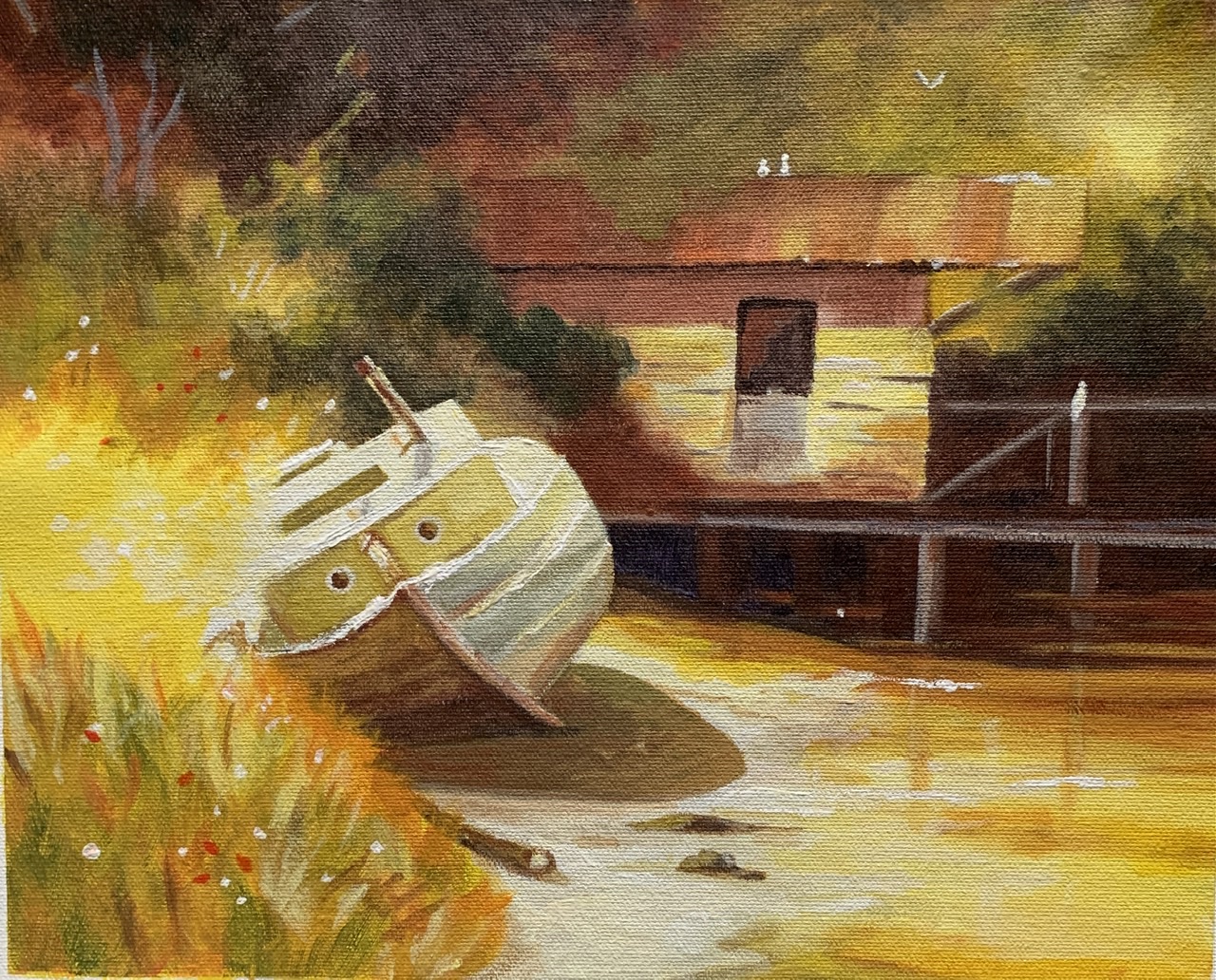
Whiskey Slough 9 1/2”x12” Acrylic on canvas
Artist: Karen Woodhouse (South Australia)
Hi Karen, you’ve got a gorgeous glow running through this—love that sunlit flare on the left dissolving the edge of the boat. I'm impressed with the variety of colour you managed to squeeze into the painting by adding the warm greens and reds - a great addition.
There's good contrast between the soft and hard edges creating a lot of interesting variety overall. For instance your soft aerial haze in the trees helps the boat sit forward as the star. Lovely atmosphere here - keep chasing that glow!
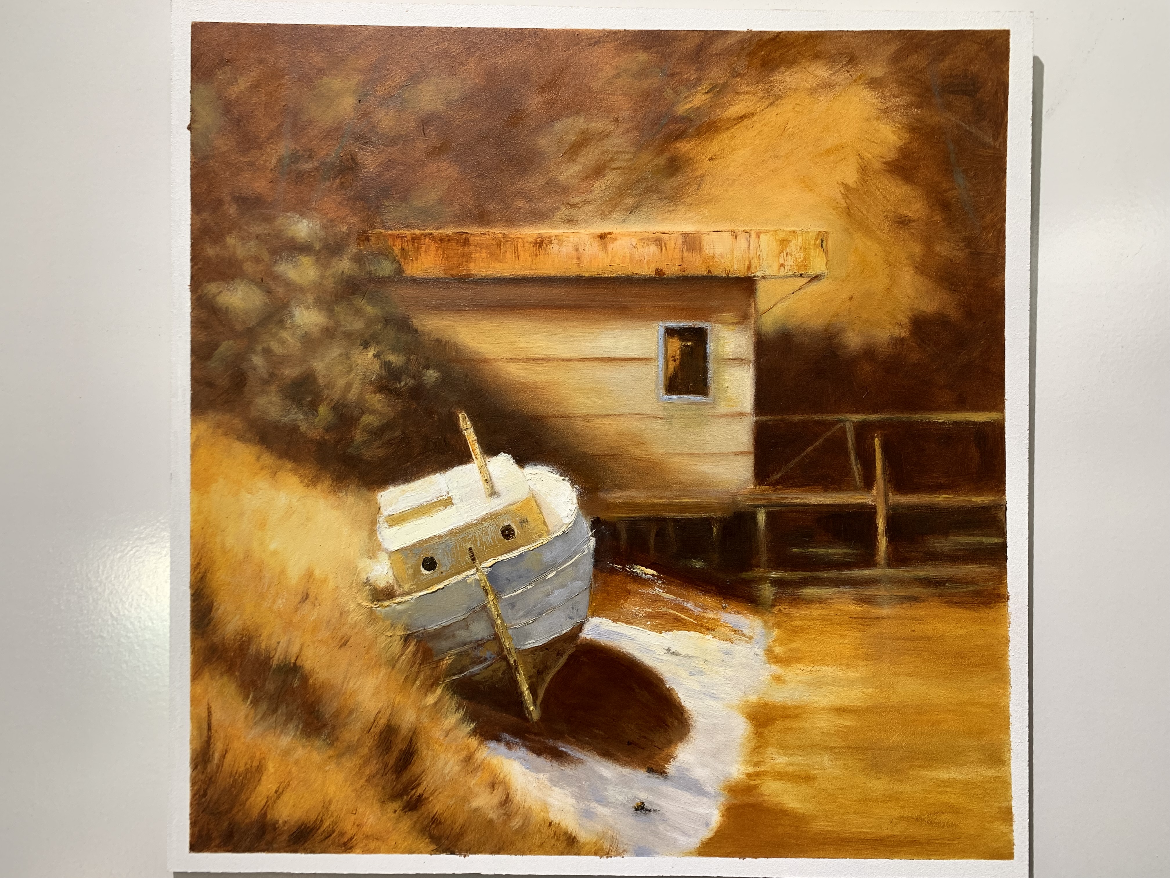
“Whiskey Slough” after Richard Robinson . 24x14" oil on panel.
Artist: Mark Price
Hi Mark, you’ve created a beautiful, cohesive amber mood here—the warm, honeyed palette ties the shed, boat, and bank together wonderfully, and that soft atmospheric background sets the scene nicely. The boat’s form reads well, and I love extra detail you've added into the rusted roof, weathered hull and long grasses - the benefit of good observation and your larger canvas. Beautifully done!
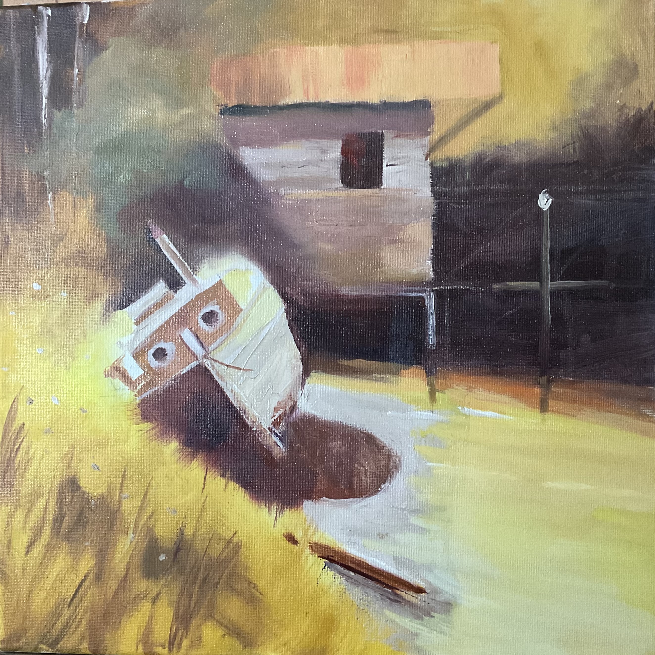
Whiskey Slough
Artist: Nancy Newton
Lovely overall sense of warm, late-day light here, Nancy—the golden atmosphere knits the scene together beautifully. You've kept all the colours within that warm spectrum. The darks in the background could do with lightening a little. Currently they're so dark it doesn't allow for the warm light washing across the scene, so it brings the background forward, spoiling the sense of depth and also making it somewhat foreboding.
The boat is well drawn with strong sharp edges, great for the centre of interest, while You've gone a bit too far with the glowing light off the stern. I'm loving the lively brushwork and good colour sense. Good job.
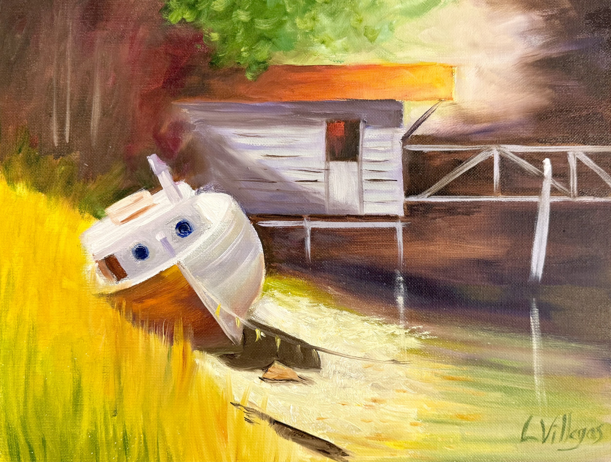
Whiskey Slough by Louise Villegas - 11 x 14 Oil
Artist: Louise Villegas
Hi Louise, I love the warm, sunlit atmosphere you’ve created here by using strong lights and crisp dark shadows. The burst of golden grasses really sings, and those crisp portholes pull the eye. I feel these should be a warm dark instead of a cool dark however, because all the arm light there would not allow a cool within it. Similarly the cool green foliage could be warmed to bring it into harmony with the warm light.
The shed roof’s warm orange glow is a lovely echo to the grasses and adds to the vibrant palette. Try deepening the shadows in the woods behind the boat and shed and darkening the side of the shed and posts a little. Think about how their angle to the sun differs from the boat deck, and so they would be darker, allowing the lighter boat to take more of the attention, rather than fighting for attention with the shed. Beautiful energy and brushwork.
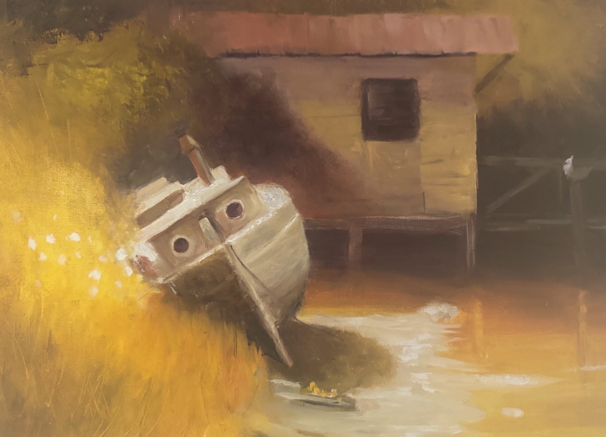
Whiskey Slough -10x14" Oil on Canvas.
Artist: Tracy Randell
Lovely mood here, Tracy - the warm, hazy light wrapping around the shed and the golden grasses gives the whole scene a nostalgic glow, very atmospheric! Your drawing of the boat and shed is also spot on. I can't see anything to improve upon. Nicely done!
Congratulations and thanks to everyone who entered a painting into the workshop. Great work!
Get the full lesson here: https://mypaintingclub.com/lessons/83-Whiskey-Slough
- Richard.
Login to your account to post a comment.