
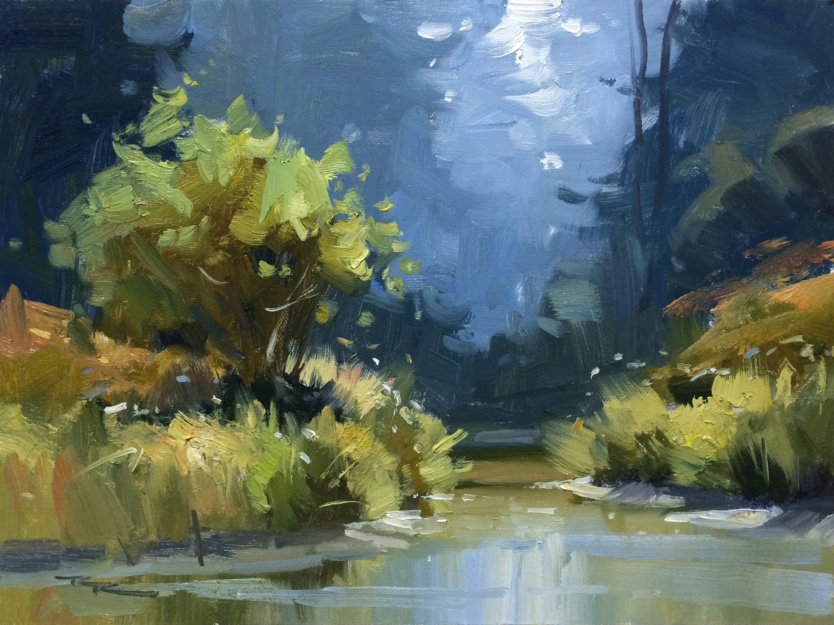
Simplifying a scene
Follow me step by step as I show you the techniques I use to simplify a complex scene and bring out the best of a subject with exciting brushwork. Feel free to follow me step by step in painting the same scene or use the photos below or your own resources to design a piece that is more your own. You can paint this any size or shape you like using any medium. Happy painting!
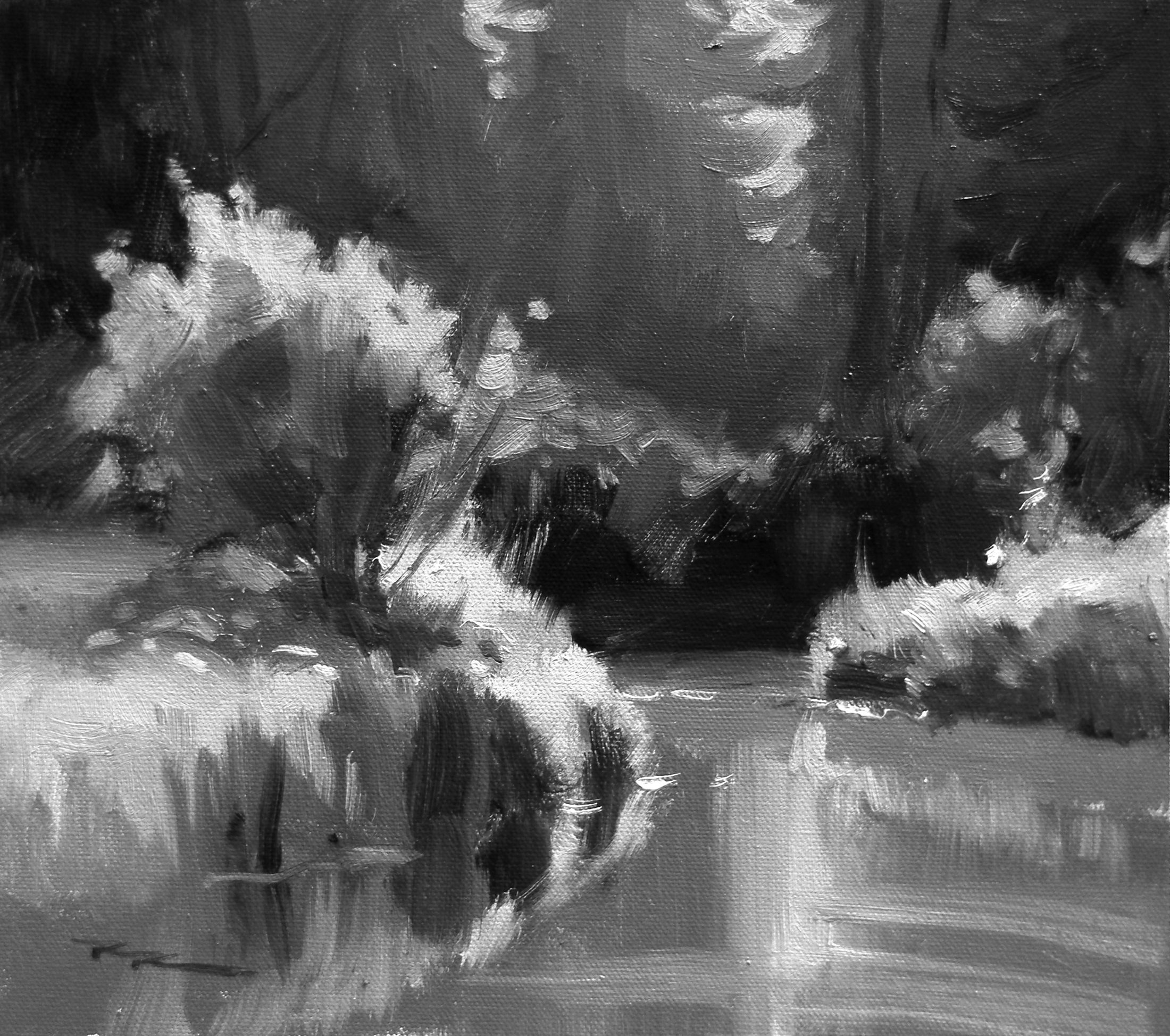
"Canada Creek - Greyscale Study" 11x13" Oil on Canvas by Richard Robinson.
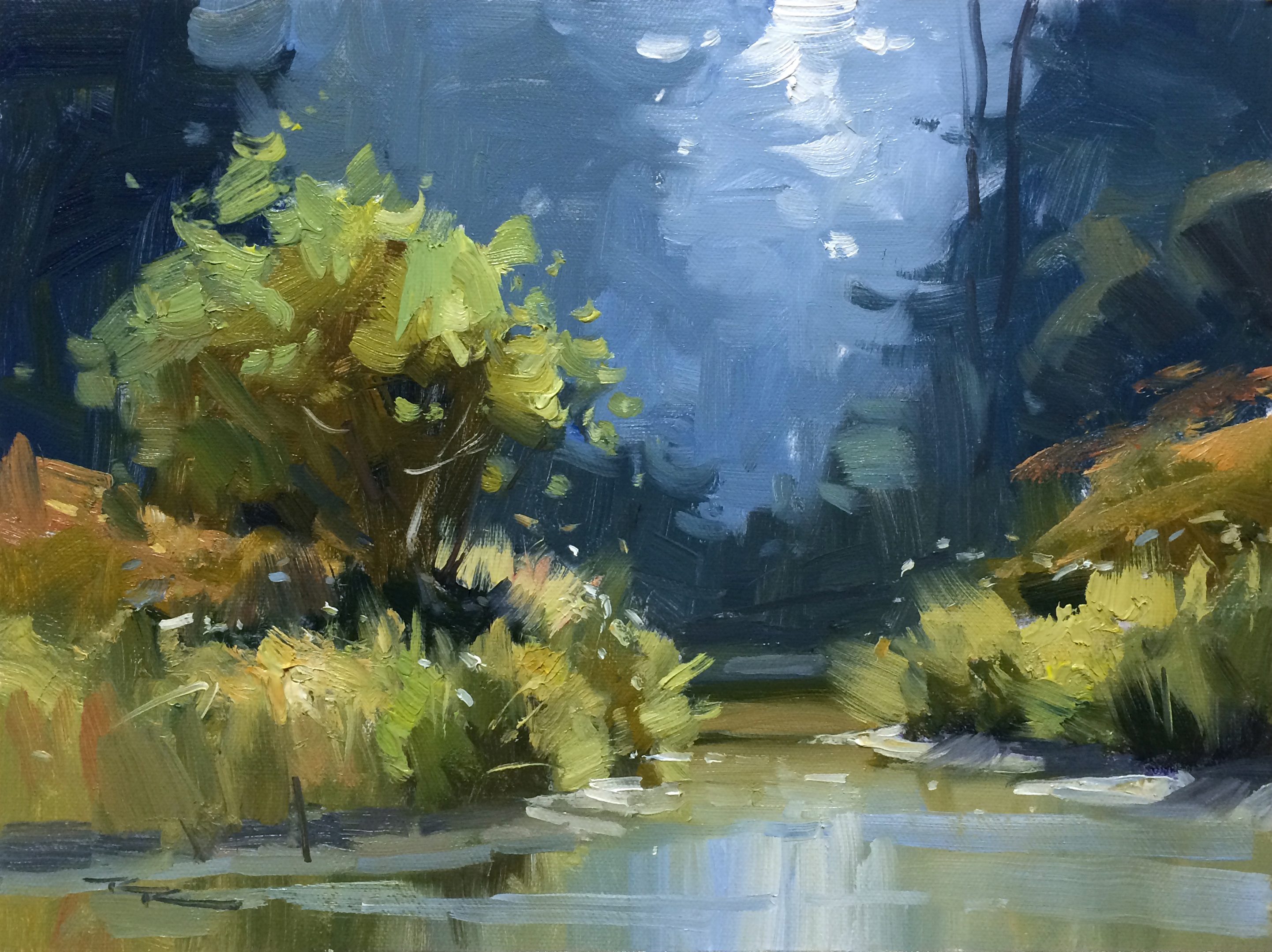
"Up the Creek" 11x14" Oil on Canvas by Richard Robinson.
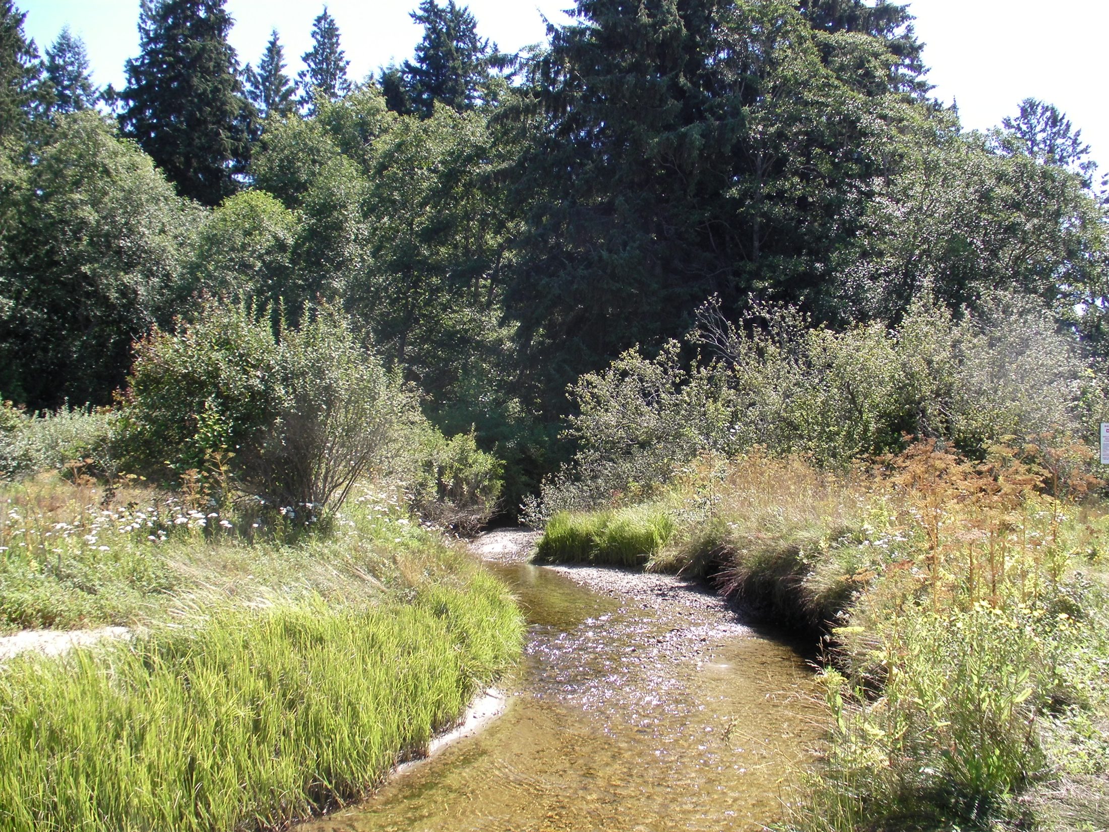
In this “Up the Creek” workshop we’re heading into a wonderfully tangled little waterway—riffled reflections, sun-sparked grasses, and a snaking ribbon of water pulling your eye into the distance. It’s a scene that looks complex at first glance, but that makes it perfect for learning how to simplify. I’ll walk you step by step through my process—blocking in large shapes, locking down values, nudging colour temperature, and sharpening or softening edges—to reveal a confident, lyrical composition. You’re welcome to paint along with me using the same reference, or adapt the ideas to your own creek or river scene in any medium and any size you like.
We begin by breaking the view into a few big, readable shapes: sky, distant trees, creek, and bank. Using a thin, transparent block-in—think lean paint or a light acrylic underpainting—I map the composition with a warm neutral, keeping the brushwork broad and decisive. I’m watching for the main flow line of the creek as a compositional pathway, and I’m careful to group shadow masses rather than chasing little details. A large flat or filbert helps me keep edges varied yet purposeful, already hinting at where I’ll later soften for atmosphere or keep crisp for a focal point.

A limited palette helps create a natural colour harmony.

Establishing dark values
With the drawing set, I mass in the darkest darks first and work my way up through the mid values. I’m squinting constantly, comparing big value relationships, and adjusting edges: soft where foliage dissolves into shade, sharper along the sunlit bank to lead the eye.

Building up colour
Continuing through the mid values in the tree and the grasses, I'm leaving spaces for the large areas of lighter value so that the light paint won't have so much dark paint to compete with. Use vertical strokes only for the water at this point with all soft edges.

Adding the lights
I start to slow down the painting cadence, applying thicker lights with measured calligraphic strokes and finer brushes. Variety of mark-making is key here.

Finishing touches
Add crispness, contrast, texture and more vibrant colour in the focal areas of the tree, grasses and river banks. The thickness of the paint and how you load it onto the brush is important so that you can make decisive strokes.
Student Critiques
Here are some of the wonderful student paintings from this workshop, along with my critiques.
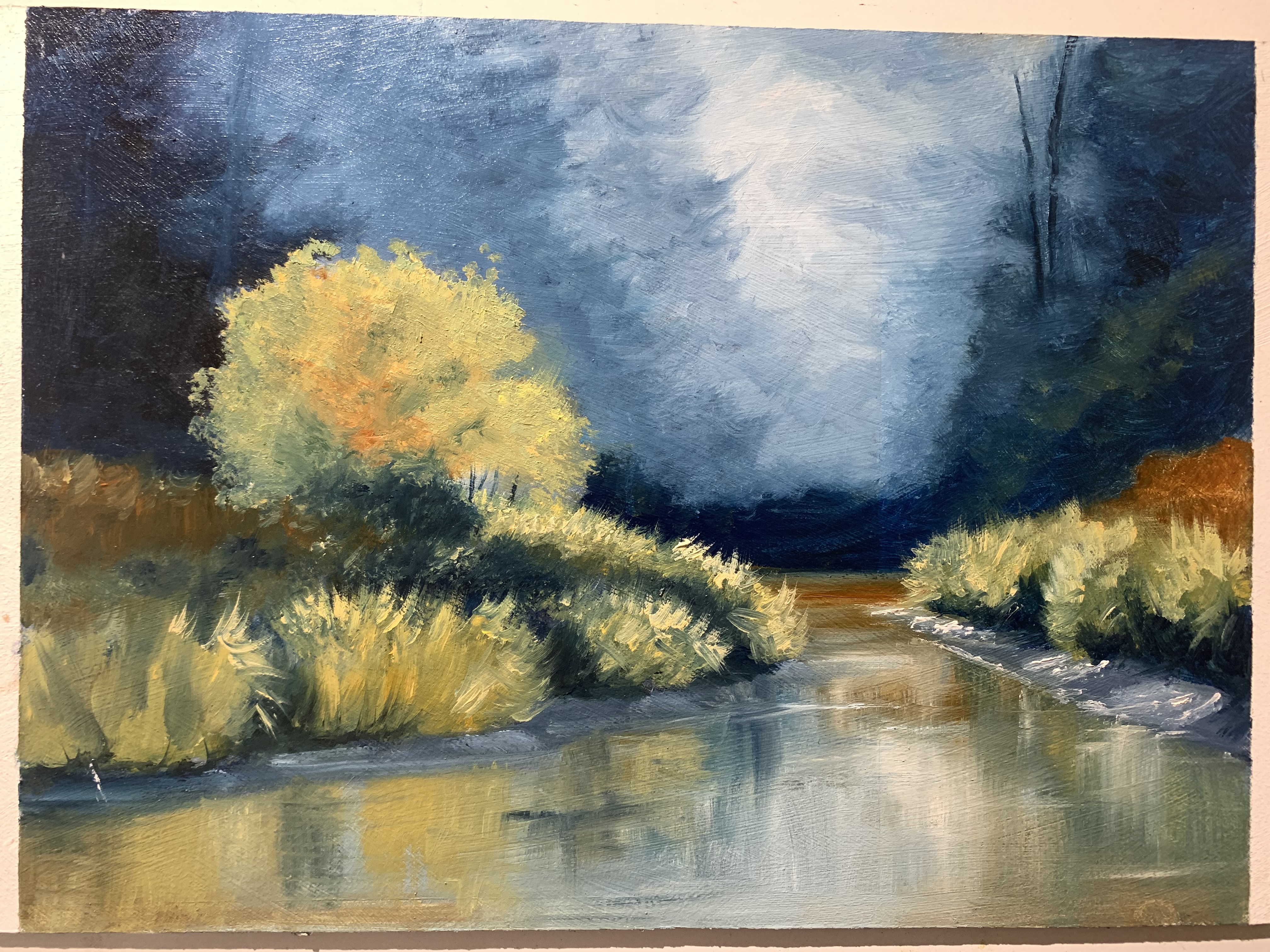
Up the creek, 9x12” oil
Artist: Mark Price
Hey Mark, overall this is working well with good shape design and a strong sense of light and dark building form. Got a few suggestions for you, and it's mainly about halftones:
Add some halftones back into the middle of the tree to give it more form and a sense of backlighting/top lighting. Similarly with the riverbank two grass clumps on the left, and darken their reflections to match.
Be wary of getting too much colour close to black in the darks in the grasses. Bounced light lightens shadows. Your outdoor painting helps you see that better than in photos. Working halftones down into those is going to help.
Subtly varying the colour of your grasses halftones and corresponding highlights will help add more variety and interest.
Great to see you back on the brushes!
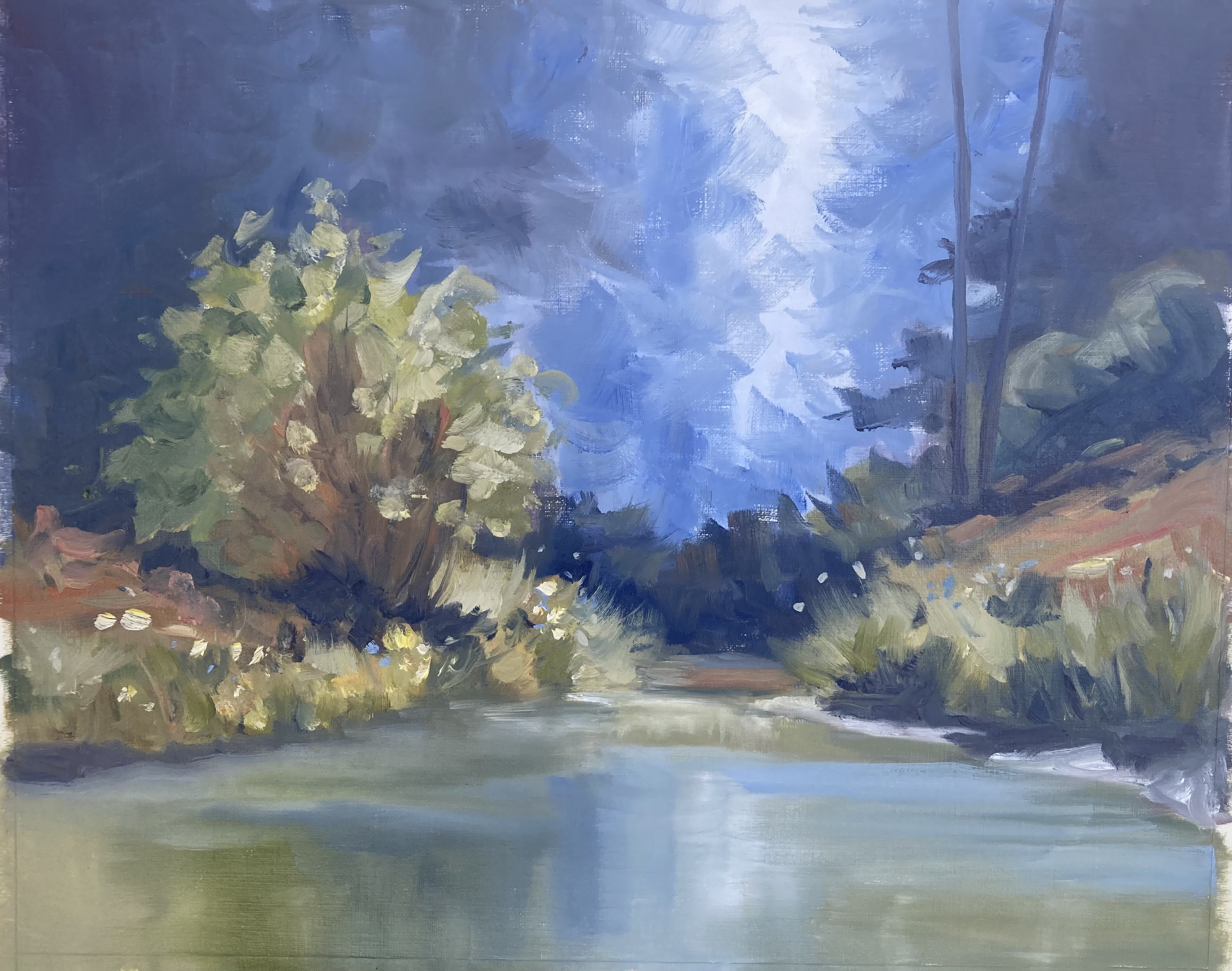
Up the creek, oil on oil paper
Artist: Geoffrey Geeson
Hey Geoff, some really nice brushwork and colour harmony in this one, and the contrast of the smooth water with the textured foliage is great, though you could re-sharpen the left banks edge.
Similarly, the edgework of the distant trees could be refined to add some more realism there. When you've done that, it deserves a signature and a frame I reckon.
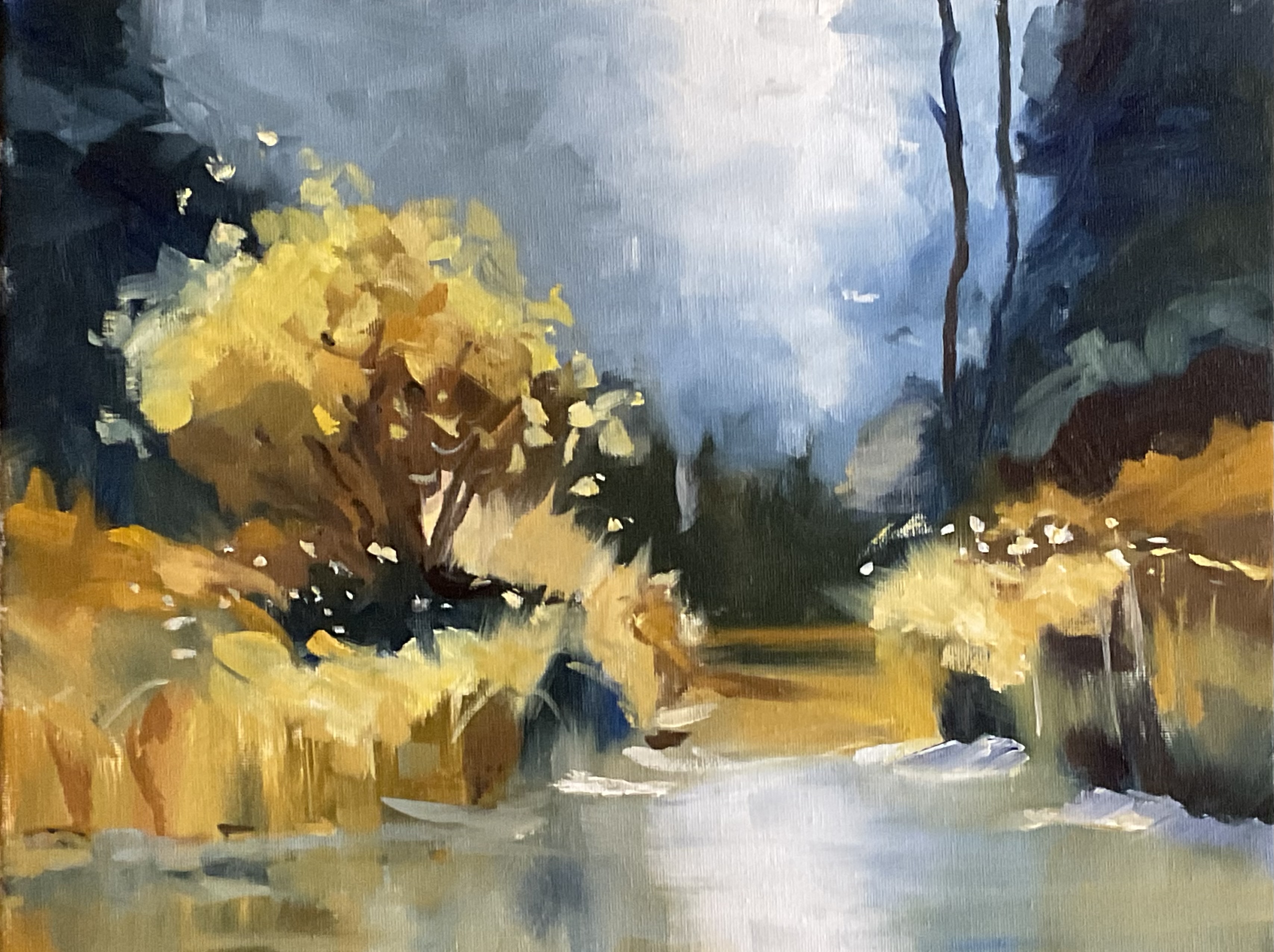
Up the Creek oil 11x14”
Artist: Nancy Newton
Hi Nancy, you've made a lovely sense of light here with a lot of contrast and vibrance vs grey, warm vs cool - very nice! Your brushwork is confident, accurate and expressive, with a good variety of large and small marks.
The whole scene is working well. The only thing I'd tweak is to define the edges of the river bank in light and shadow a little more to really anchor the land to the water. Great work!
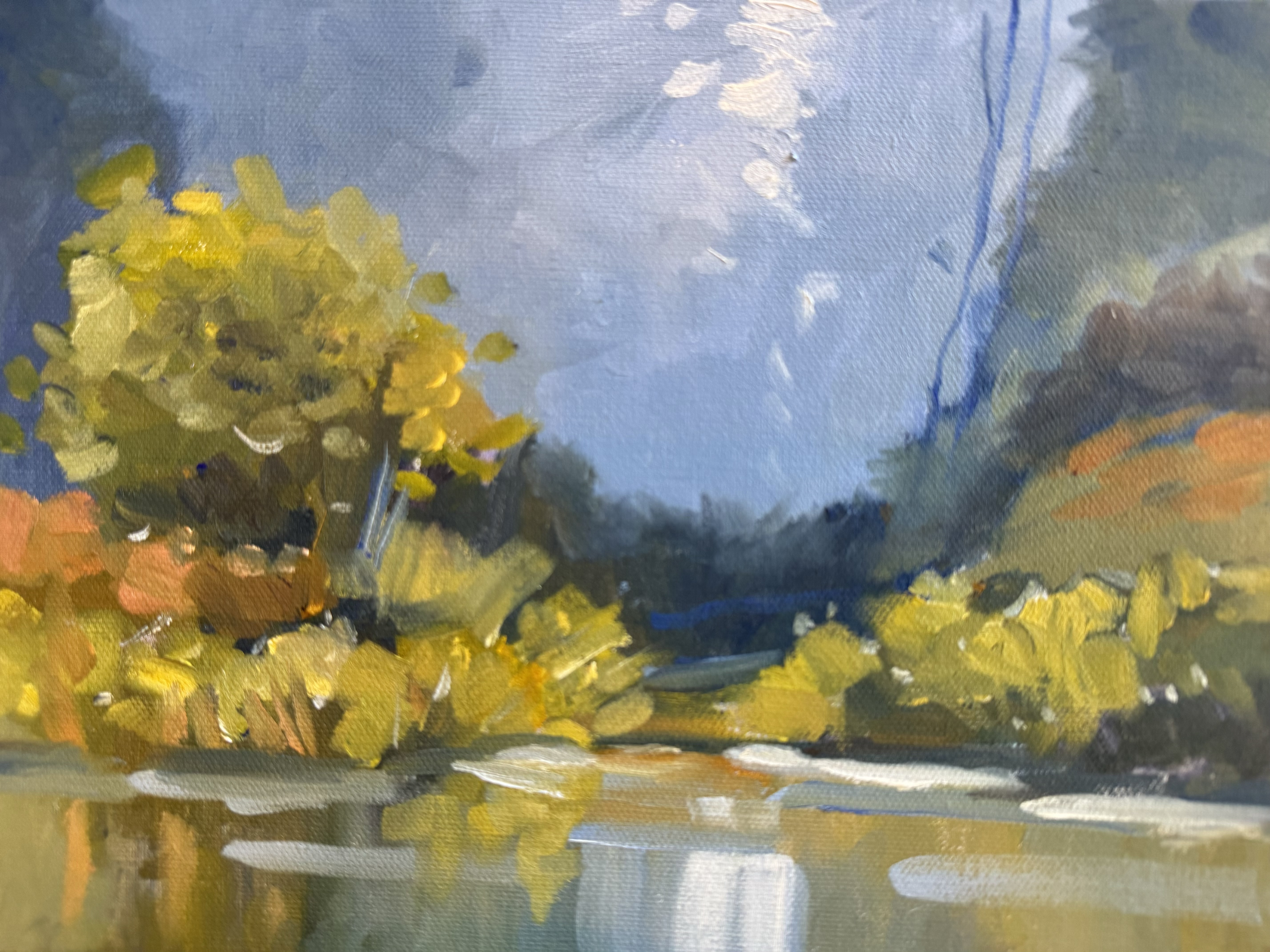
Ellen’s creek
Artist: Ellen Sockolov
Hey Ellen, lovely sparkle in those warm yellow greens against the cool grey backdrop - your foliage notes feel fresh, and the broken edges along the bank read beautifully in the reflection. Lovely brushwork throughout.
I'd suggest darkening the backdrop tree that sits directly behind the foreground tree so that we see the forest step away from us in more distinct value groups, and darkening that area will also allow the lights in the tree in front of it to pop more. See how you have 4 light sandy patches on the bank that are all similar size and spacing?
It'd be good to join up the two on the left to avoid pattern making like this. I’d also suggest combining the two strokes of the central vertical sky reflection into a single glowing shape that's less distinct and light that what you have thee, which is currently drawing a lot of attention. Gorgeous colour harmony - just a couple of tweaks will help.
.jpg)
"Up The Creek"
Artist: Raymond Smith
Hey Raymond, love the bold brushwork in here, your intentional redesign, and the suggestion of a path on the left. Your shapes are nice and organic - not overly simplified and the light reads well especially on the left. On the right the grasses are missing the halftone between the lights and darks.
You've stepped the trees away from us on the right with atmospheric perspective - adding blue and white as they recede, but the sky and distant dark bank are not sharing in that light effect. They also should be lighter and cooler so they recede properly.
You could add white and a tiny bit of yellow to the ultramarine mix you've used in the lower sky, perhaps with a tiny bit of pthalo blue/cyan/cerulean to cool it off. After that you may want to tweak the reflections as well. Speaking of which, the reflections initially went well with soft edges and horizontal strokes, but then the dark vertical scumbling on the right has spoiled it.
If you paint the vertical dark reflections first and then work over and around that with horizontal strokes it'll work out better.
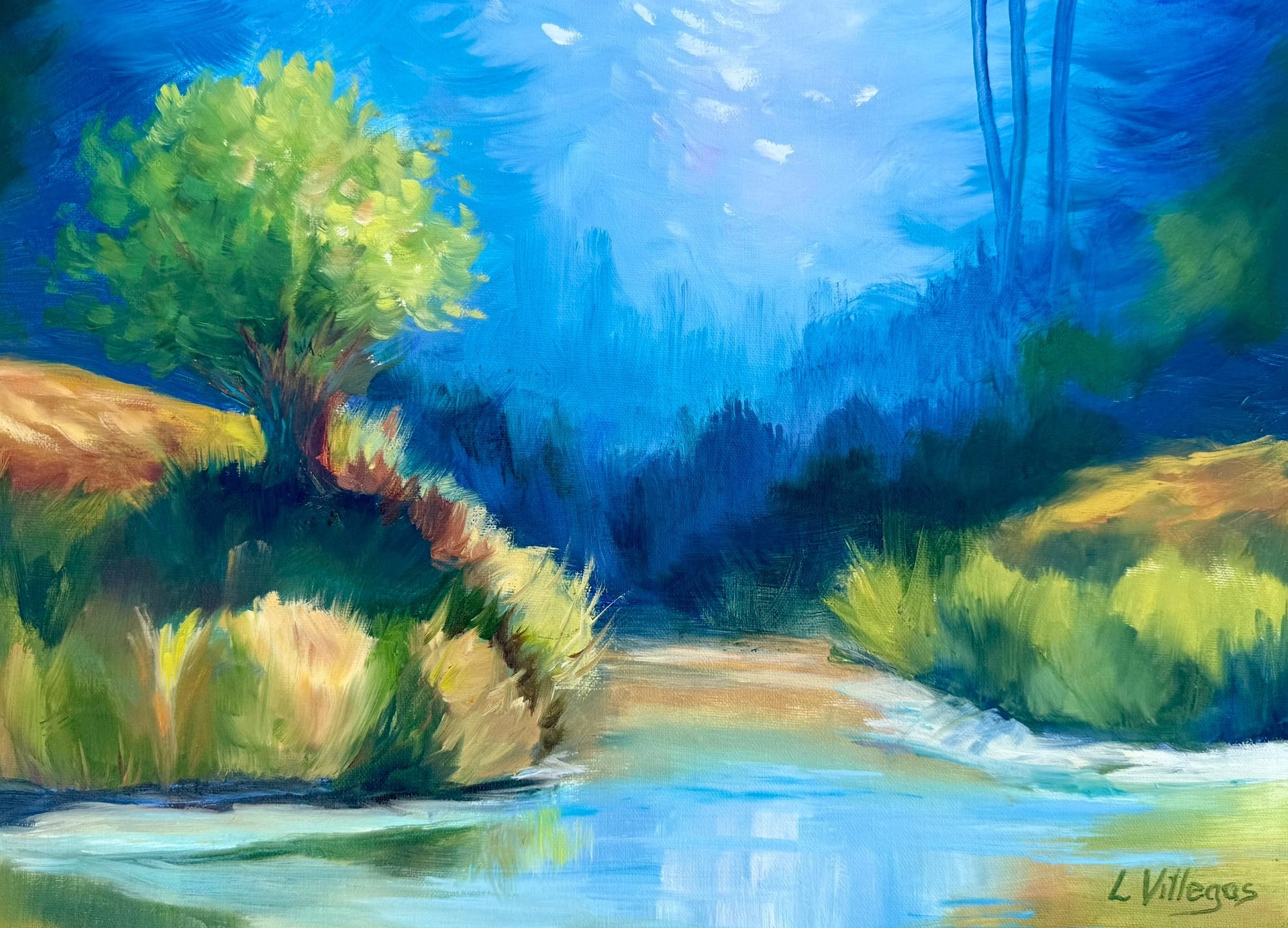
Up the Creek #2 by Louise Villegas 11 x 14 - Second attempt with improved trees
Artist: Louise Villegas
Hi Louise, gorgeous light and colour, and that sunlit tree has lively, expressive foliage - great calligraphy in those leaf shapes. It's good to see you do two different paintings of this, with the first one having more subdued colour.
I also swing between greyed and vibrant colour in my work, finding that after a greyed painting I miss the excitement of vibrant colour, but after a vibrant painting session it can look a bit garish to me and I swerve back to greyed colour again. What I tend to be happiest with overall is paintings that attempt to have both - greys versus vibrancy.
It's much easier to define the focal point in this way, rather than having every colour competing with its neighbour. In this painting, that would mean greying down the blue background a little so that it sits back and let's the tree and grasses do their thing. Also watch again the section about the design of bottom edge of the grasses on the river - how it's better to build it with steps rather than smooth lines.
Those little things add to the realism and interest.
Congratulations and thanks to everyone who entered a painting into the workshop. Great work!
Get the full lesson here: https://mypaintingclub.com/lessons/81-Up-the-Creek
Happy Painting,
Richard.
Login to your account to post a comment.