Teacher
Richard is a talented full time artist, who loves painting and teaching.


A friendly place to learn at your own pace.
with Richard Robinson
Follow me step by step as I show you the techniques I use to simplify a complex scene and bring out the best of a subject with exciting brushwork.
Whenever you’re ready! The lesson is available online any time, and your access to the lesson never expires.
As long as you need! Your access never expires, so you can come back again and again.
Sorry, no you can’t download the video. This is to avoid piracy. You’ll always be able to view the video on this site though.
Richard is a talented full time artist, who loves painting and teaching.
Hi I’m Richard. I’ve been painting my whole life and back in 2001 I traded my graphic design career for the humble life of a full time artist. I love painting, and as it turns out, I love teaching too.
Nowadays I balance my life between parenting, painting, surfing, travelling and teaching. My work is regularly featured in international art magazines, in galleries in New Zealand and America, on TV and in my Mum’s house.
I give outdoor painting workshops in interesting spots around this beautiful planet of ours and love encouraging people to paint. Two of my favourite artists are John Singer Sargent and Joaquín Sorolla.
My painting website: www.nzpainter.com
I’d love to be your new teacher.

Richard is a master artist with an exceptional skill in identifying and communicating key factors to making successful paintings. I have found his video workshops an excellent resource for improving my own work.
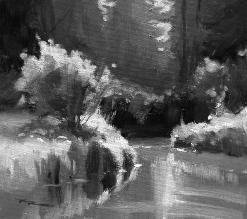
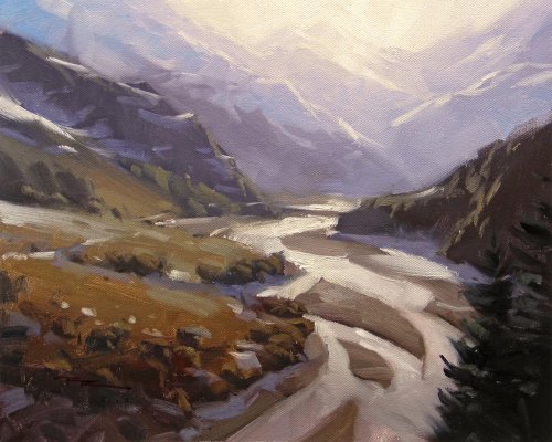
"Canada Creek - Greyscale Study" 11x13" Oil on Canvas by Richard Robinson.
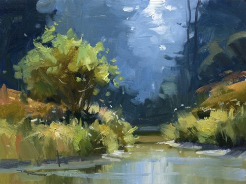
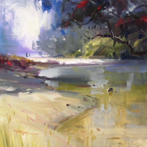
"Up the Creek" 11x14" Oil on Canvas by Richard Robinson.
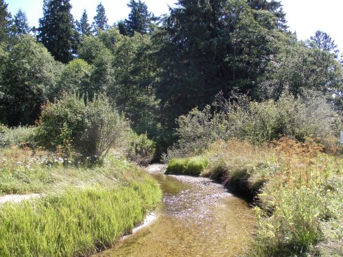
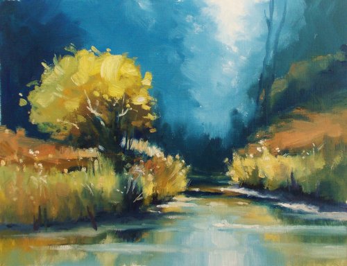
"Workshop 37" 9x12" Oil on Canvas by Janet Buckton
Bold colour, Janet and lovely and warm in the foreground contrasting with the cool background. I get the feeling the background is a little too blue and could do with a touch of grey-green in it to create some connection with the foreground. My painting is a little guilty of that too. Also the darkest dark in the foreground is too blue making it stand out whereas it should recede beneath the mid values and lights. If the left side of the tree was a little darker it would add more roundness to it - at the moment the value is very similar all over and it's causing it to flatten out a little. You've done very well with your edges creating depth by contrasting sharp edges in the foreground with sift edges in the background. Overall you've made a very good copy of the demo painting and I hope it helps inform your other work in some way.
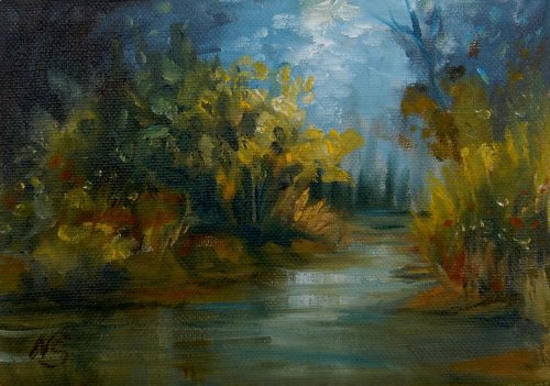
"Dark Passage 2" 5x7" Oil on Canvas by Nancy Sands
Hi Nancy, I do like the design of this a lot but unfortunately it's all got a bit muddy and garbled. Your cool darks have mixed with your warm lights through too much dabbing and not keeping your brush clean enough and reloading with fresh colour. Can I suggest you take another look at the demo video and follow the process more strictly of darks, then mid values, then lights. Also the thickness of the paint is important. If you put too much medium in your darks to start with it makes it hard to paint over and if you put too much medium in your lights they'll tend to mix in with the darks. If you give yourself a bigger canvas you'll have more room to move too. You can do it!
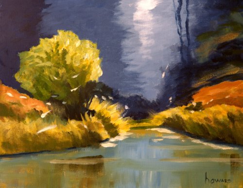
"RR Workshop 37" 11x14" Acrylic on Canvas by Howard Bagley
Hi Howard, this is a great painting with just a few adjustments needed. Your colour is beautiful and the drawing is good, the brushwork is confident and interesting. Three small changes I'd make would be to add some soft edges and small details to the edge of the green tree, make the background shapes a little more tree-ish, and make the white flowers/weeds smaller in the background. That's it. Otherwise, great work!
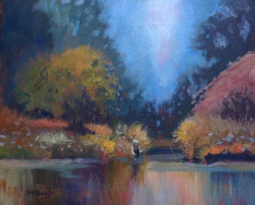
"Anglers Retreat" 8x10" Acrylic on Canvas by Sarah Bottjer
Hi Sarah, there's a real jolly feeling to this piece caused largely by the warm colours in the foreground and the sparking little details throughout. The figure is a nice addition too but unfortunately he's about a third the size he should be compared to the rest of the scene which gives him the appearance of a garden gnome. The value structure of the painting is good, including the depth you've created in the background, though the V shape there is a little too regular an the sky holes are creating more of a lacework pattern than actual tree shapes. That blue sky should also be reflected in the water. By flattening out the base of the river banks you've lost some of the shape interest. A few things to look at but overall a good result.
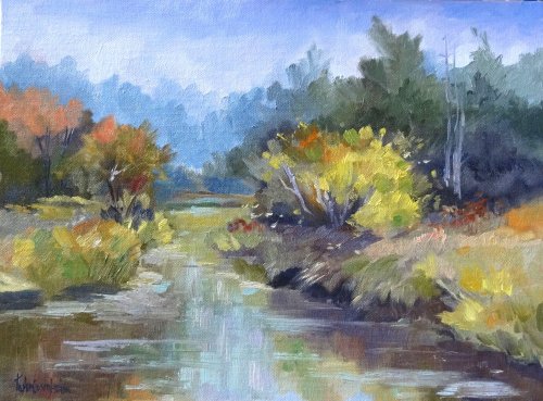
"Looking Down Creek" 12x16" Oil on Canvas by Toska M. Courbron
Hi Toska, good to see you've made this scene more your own by changing things around. The composition is well balanced and your brushwork is bold and purposeful. You've created a lot of depth with your receding blues in the background which is great although I'd expect to see a little more of that blue reflected in the water. Some of your darks are too grey where they should lean more towards the local colour of the object. For example the dark inside the main bush should tend more towards green, as should its cast shadow on green grass. You've made the same mistake in the majority of your shadows and it is a good example of 'muddy' colour, which is in fact the correct value but not the correct hue. 'Muddy colour' is just colour that doesn't fit into it's surroundings. Take more care with your vertical reflection strokes in the water to make them perfectly vertical otherwise it gives the impression of sloping water. Also, with a blue sky I would expect the horizontal strokes over the water to be more blue. Just a few things to think about. Good work.
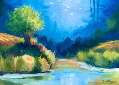
Up the Creek #2 by Louise Villegas 11 x 14 - Second attempt with improved trees
Hi Louise, gorgeous light and colour, and that sunlit tree has lively, expressive foliage - great calligraphy in those leaf shapes. It's good to see you do two different paintings of this, with the first one having more subdued colour. I also swing between greyed and vibrant colour in my work, finding that after a greyed painting I miss the excitement of vibrant colour, but after a vibrant painting session it can look a bit garrish to me and I swerve back to greyed colour again. What I tend to be happiest with overall is paintings that attempt to have both - greys versus vibrancy. It's much easier to define the focal point in this way, rather than having every colour competing with its neighbour. In this painting, that would mean greying down the blue background a little so that it sits back and let's the tree and grasses do their thing. Also watch again the section about the design of bottom edge of the grasses on the river - how it's better to build it with steps rather than smooth lines. Those little things add to the realism and interest.
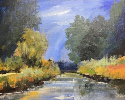
"Up The Creek"
Hey Raymond, love the bold brushwork in here, your intentional redesign, and the suggestion of a path on the left. Your shapes are nice and organic - not overly simplified and the light reads well especially on the left. On the right the grasses are missing the halftone between the lights and darks. You've stepped the trees away from us on the right with atmospheric perspective - adding blue and white as they recede, but the sky and distant dark bank are not sharing in that light effect. They also should be lighter and cooler so they recede properly. You could add white and a tiny bit of yellow to the ultramarine mix you've used in the lower sky, perhaps with a tiny bit of pthalo blue/cyan/cerulean to cool it off. After that you may want to tweak the reflections as well. Speaking of which, the reflections initially went well with soft edges and horizontal strokes, but then the dark vertical scumbling on the right has spoiled it. If you paint the vertical dark reflections first and then work over and around that with horizontal strokes it'll work out better.
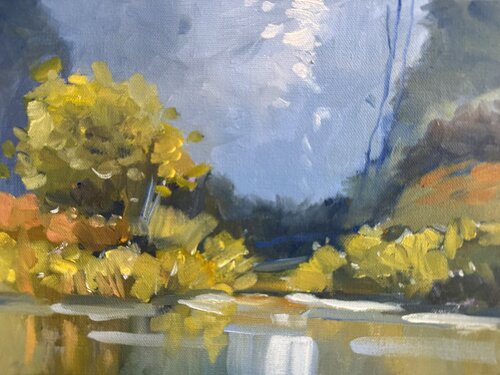
Ellen’s creek
Hey Ellen, lovely sparkle in those warm yellow greens against the cool grey backdrop - your foliage notes feel fresh, and the broken edges along the bank read beautifully in the reflection. Lovely brushwork throughout. I'd suggest darkening the backdrop tree that sits directly behind the foreground tree so that we see the forest step away from us in more distinct value groups, and darkening that area will also allow the lights in the tree in front of it to pop more. See how you have 4 light sandy patches on the bank that are all similar size and spacing? It'd be good to join up the two on the left to avoid pattern making like this. I’d also suggest combining the two strokes of the central vertical sky reflection into a single glowing shape that's less distinct and light that what you have thee, which is currently drawing a lot of attention. Gorgeous colour harmony - just a couple of tweaks will help.
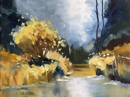
Up the Creek oil 11x14”
Hi Nancy, you've made a lovely sense of light here with a lot of contrast and vibrance vs grey, warm vs cool - very nice! Your brushwork is confident, accurate and expressive, with a good variety of large and small marks. The whole scene is working well. The only thing I'd tweak is to define the edges of the river bank in light and shadow a little more to really anchor the land to the water. Great work!
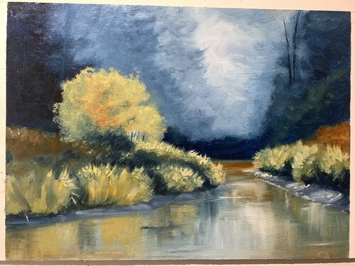
Up the creek , 9x12” oil , mark Price
Hey Mark, overall this is working well with good shape design and a strong sense of light and dark building form. Got a few of suggestions for you and it's mainly about halftones: 1. Add some halftones back into the middle of the tree to give it more form and a sense of backlighting/top lighting. Similarly with the riverbank two grass clumps on the left, and darken their reflections to match. 2. Be wary of getting too match colour close to black in the darks in the grasses. Bounced light lightens shadows. Your outdoor painting helps you see that better than in photos. Working halftones down into those is going to help. 3. Subtly varying the colour of your grasses halftones and corresponding highlights will help add more variety and interest. Great to see you back on the brushes!
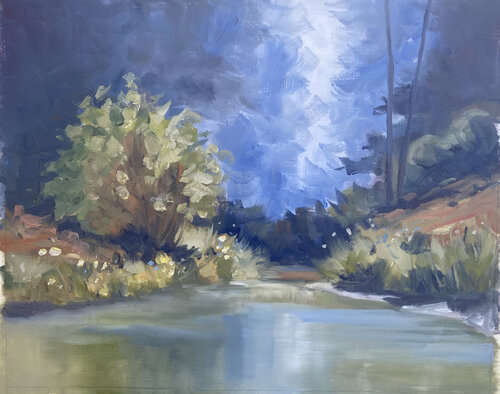
up the creek oil on oil paper
Hey Geoff, some really nice brushwork and colour harmony in this one, and the contrast of the smooth water with the textured foliage is great, though you could re-sharpen the left banks edge. Similarly the edgework of the distant trees could be refined to add some more realism there. When you've done that, it deserves a signature and a frame I reckon.
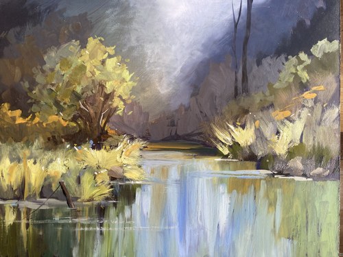
River Reflections by Lindsay Shaw
Great work Lindsay. You've thought about modelling with light and shade a lot and that's paid off. Nice to see a big contrast in soft and hard edges, although I feel you've missed that opportunity in the water, which has a lot of hard edges in those vertical strokes. If you soften those off the water will look more water-ish and the textured grasses will have a cleaner stage to dance on.
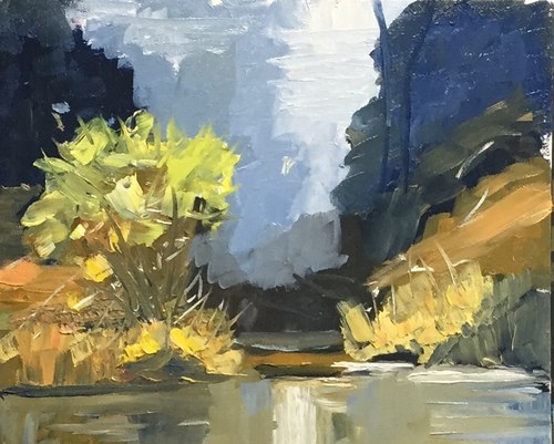
Up the Creek
Nice bold work Richard. Makes me think of Richard Claremont's work in Australia. Plenty of juicy thick paint! Your lights in the foreground foliage have been muddied a little by mixing them in with the darks. To avoid that I usually try to keep the lights separate from the darks by painting the darks first, then a midtone working out from that, and then the lights working into the midtones. It's when the lights hit the darks that things get muddy.
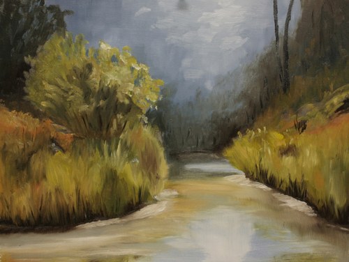
16X20 oil on mahogany plywood by Frank Brooks
Hey not bad at all Frank! Very Monet in fact. All those little brush strokes have a nice fluid rhythm to them. Perhaps the lights in the sky could stand with being vertical strokes though - they kind of break the flow you've got going on. A little more tree shape interest back there wouldn't hurt either. Overall very nice though. Sign that puppy!
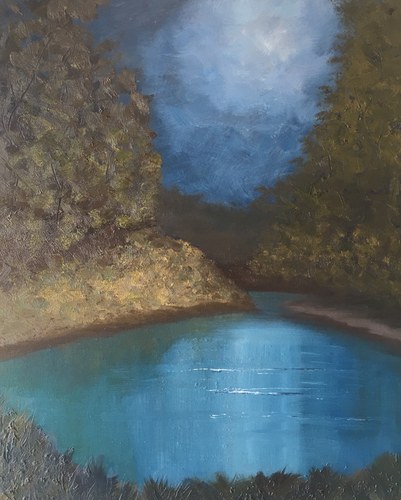
The Creek by Barbara Magor
Well you've gone all out this month Barbara with THREE paintings! GREAT! This one's got a nice kinda moonlit feel to it - very tranquil. Good work creating a spotlight effect and that water looks great too. You've really over-simplified the forms of the bank and the trees here. That happens when you paint more from your imagination than what you're actually seeing. I encourage you to keep looking hard at your subject to see what she's telling you about shape and form and light. Squint down and ask yourself, 'what are the main shapes that make that think look look that thing.' Then go ahead and paint those big shapes. Keep up the good work!
Not loving your painting lessons? No worries!
If it’s not the right fit, we’ll give you a full refund within 30 days of purchase - no questions asked.
When you purchase a DVD you also get online access to the same lesson, including any lesson resources like photos, downloadable notes and access to upload your painting to the student gallery.
That's why you need to make a password when you purchase a DVD, so you can access the online content as well. Enjoy!