
Learning from Monet
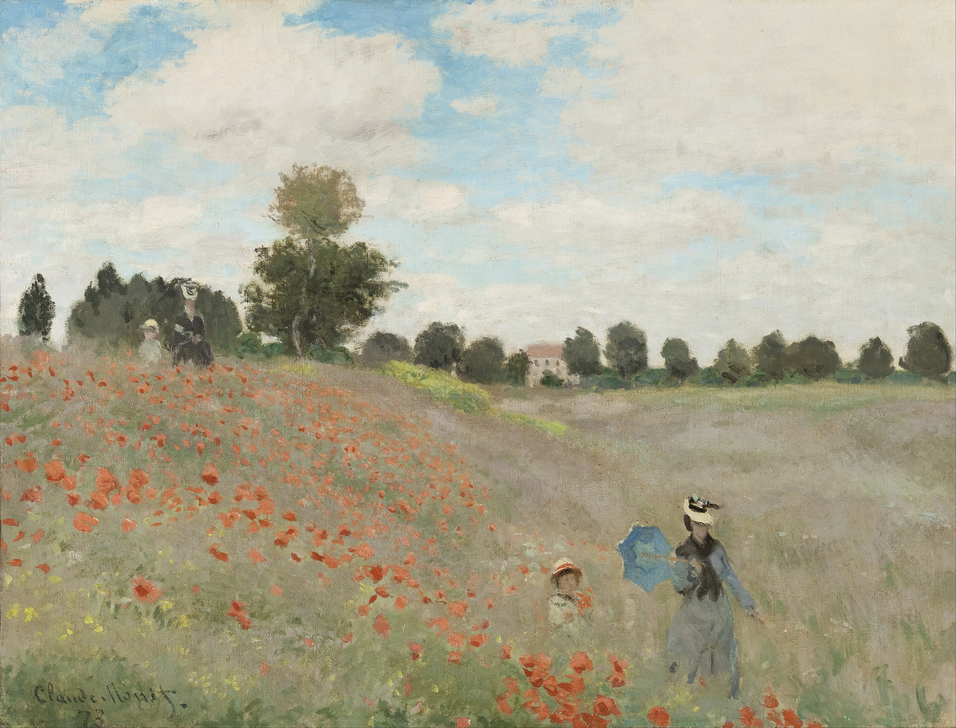
Follow me step by step as I show you the techniques I use to paint this charming Tuscan scene with reference to Monet’s painting of Poppy Fields from 1837. Feel free to follow me step by step in painting the same scene or use the photos below or your own resources to design a piece that is more your own. You can paint this any size or shape you like using any medium. Happy painting!
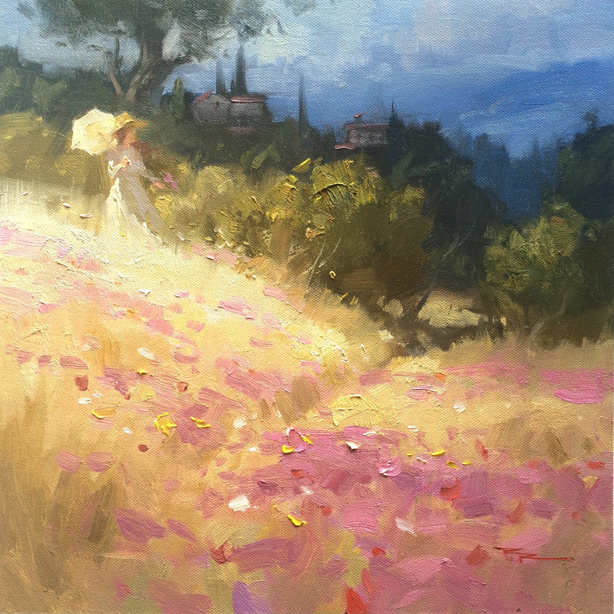
"Tuscan Fields" 12x12" Oil on Canvas by Richard Robinson.

The Poppy Field near Argenteuil (French: Coquelicots) is an oil-on-canvas landscape painting by the French Impressionist Claude Monet, completed in 1873.
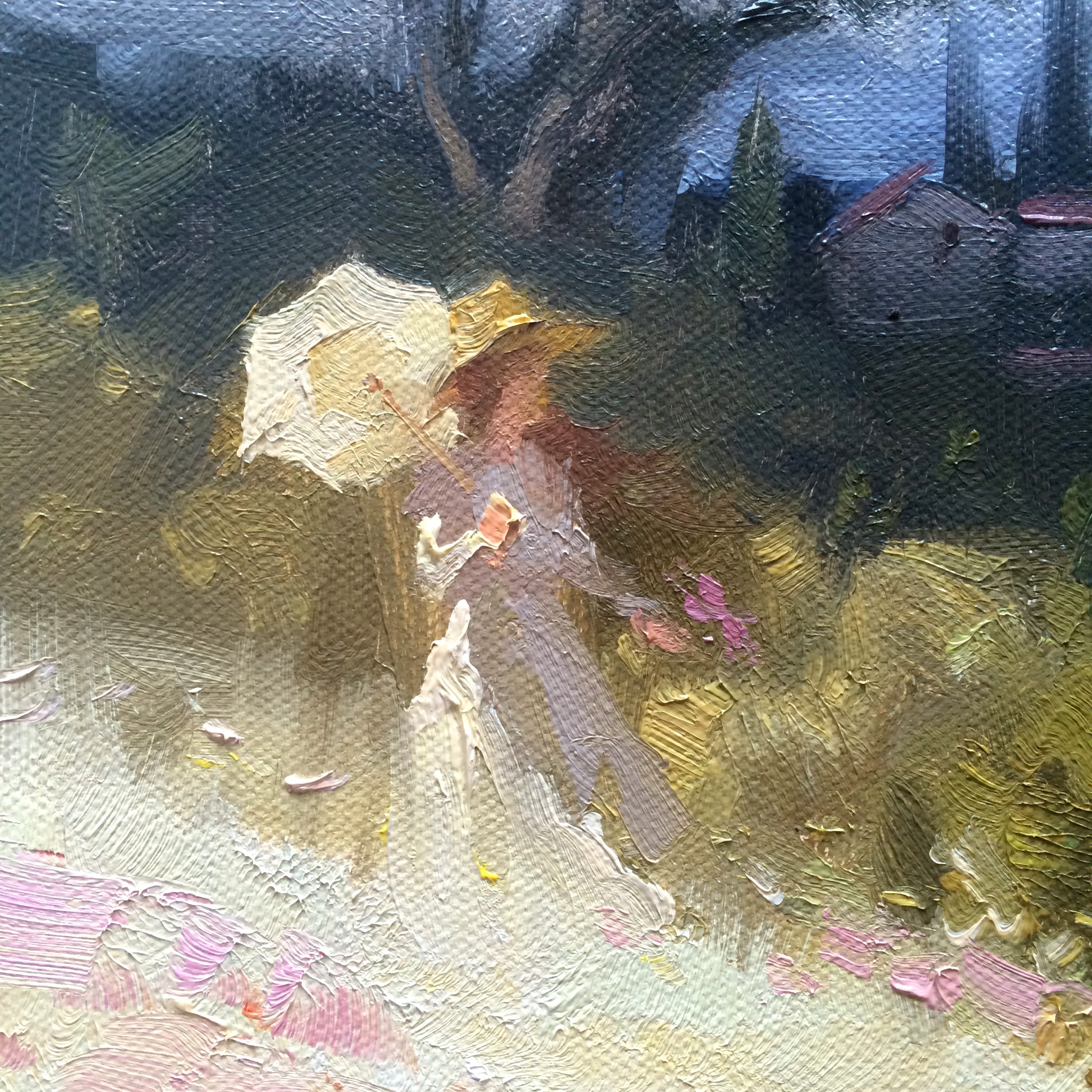
Tuscan Fields - Closeup
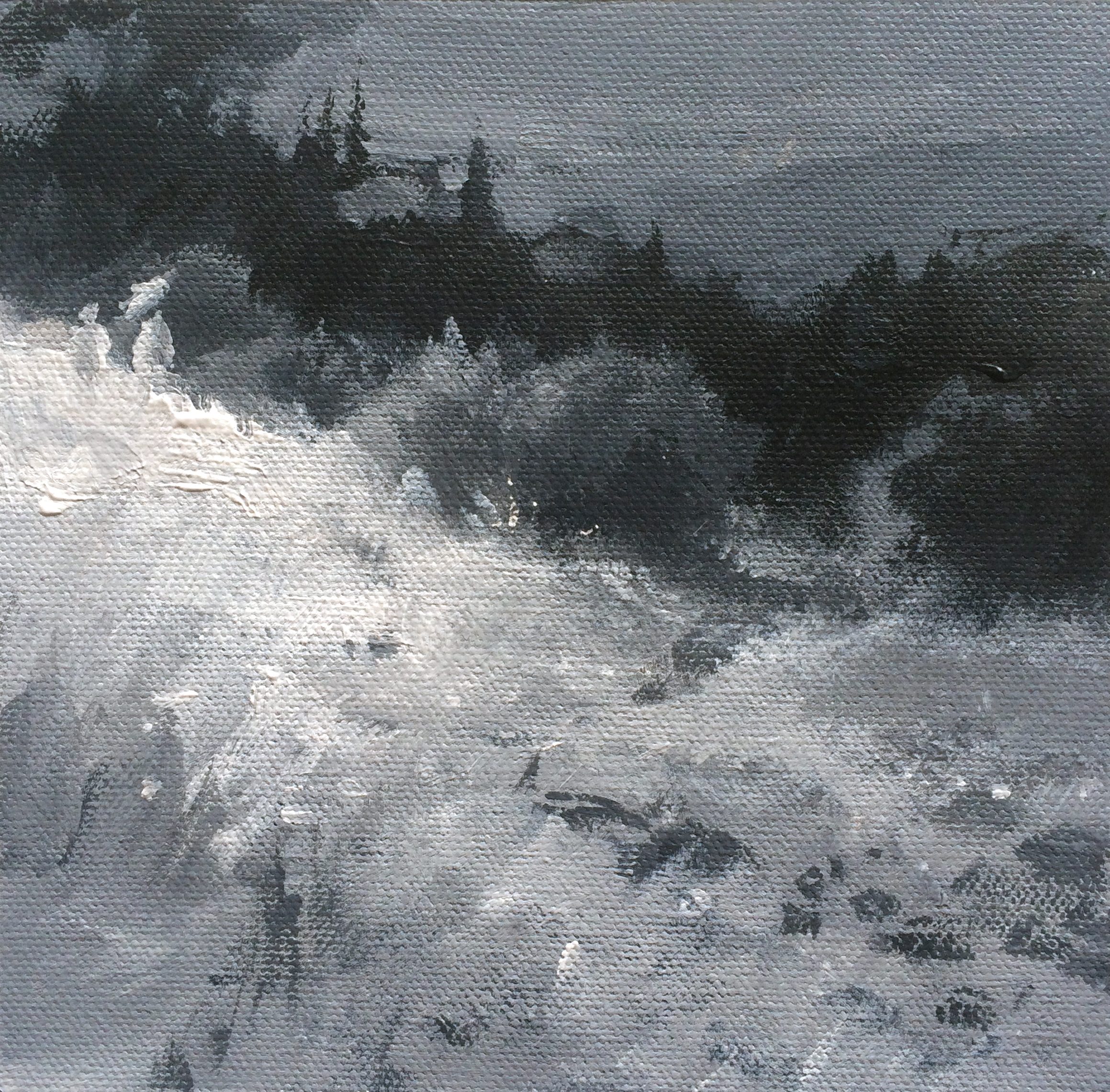
"Tuscan Fields - Greyscale Study" 5x5" Acrylic on Canvas by Richard Robinson.
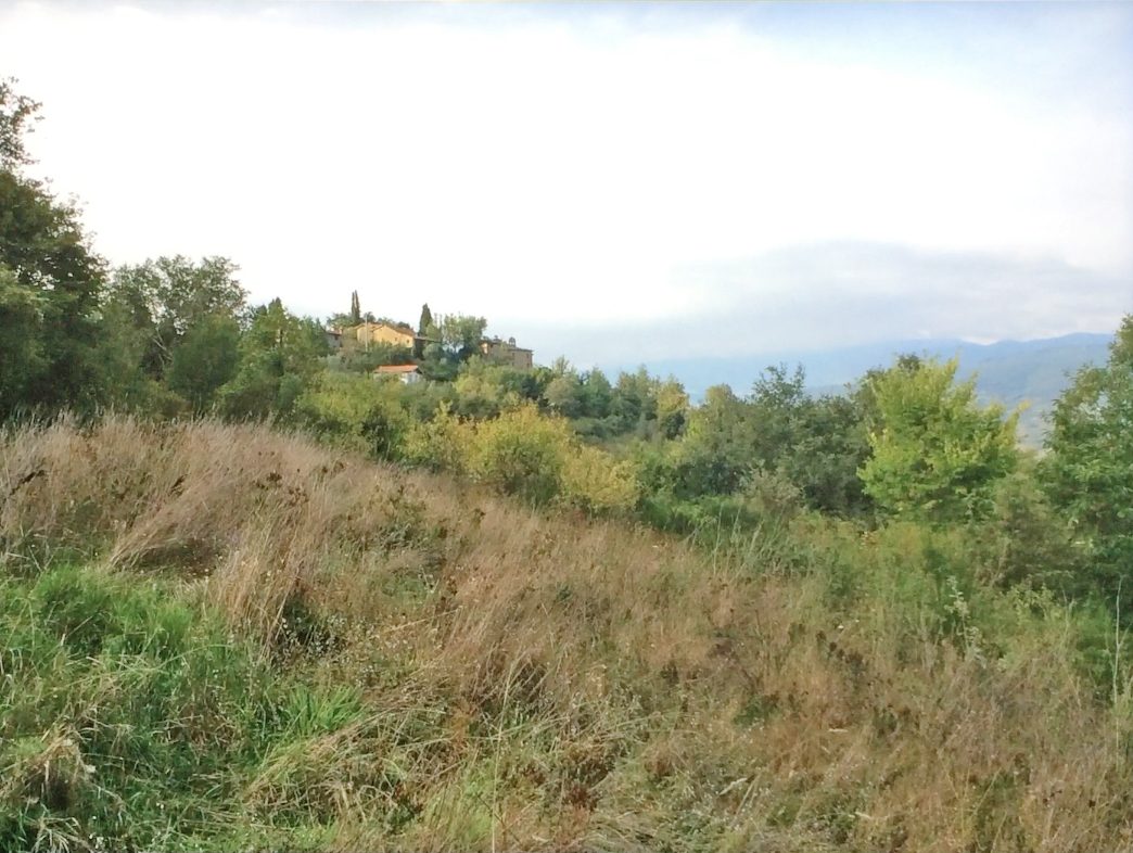
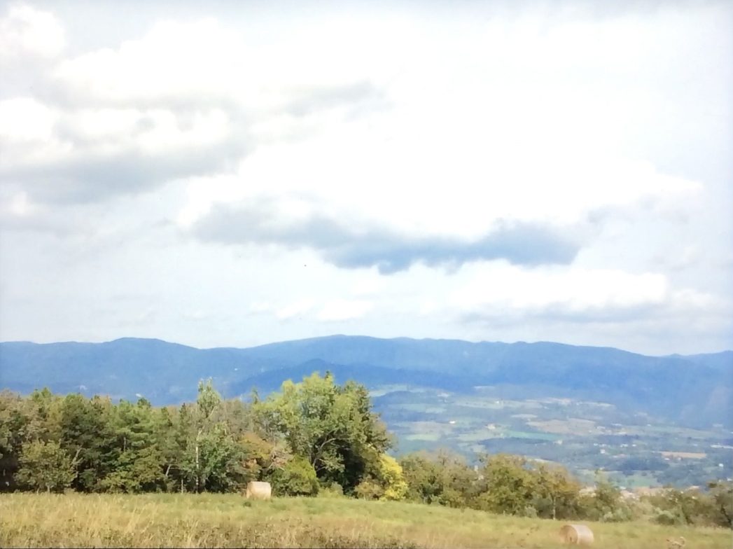
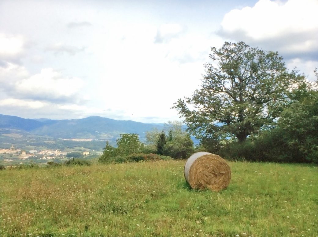
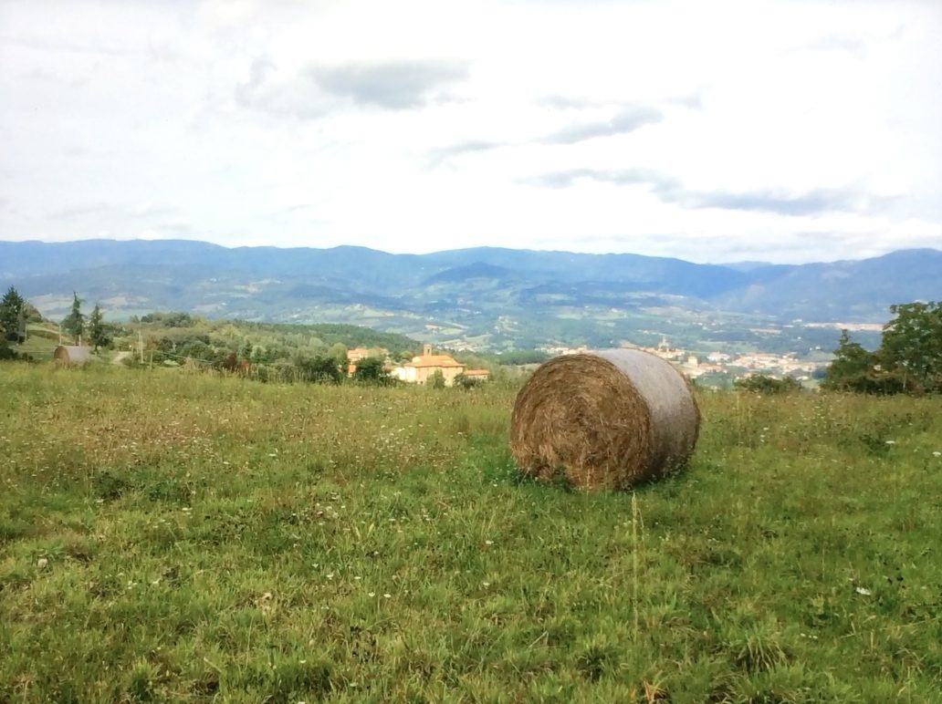
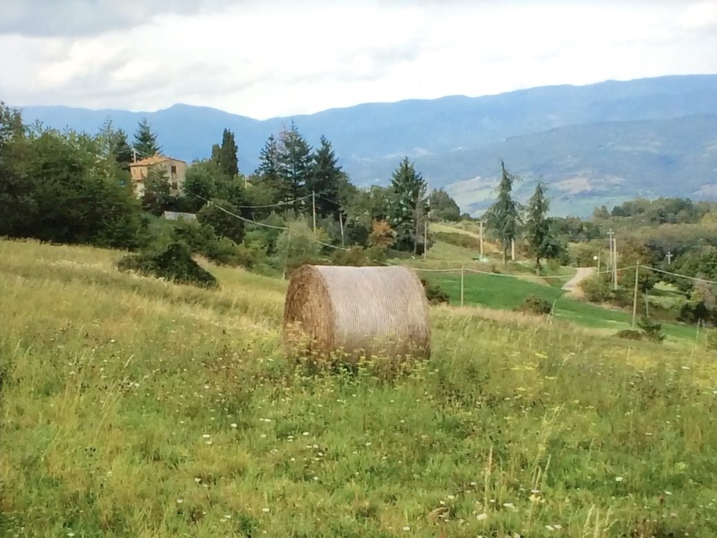
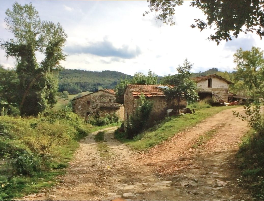
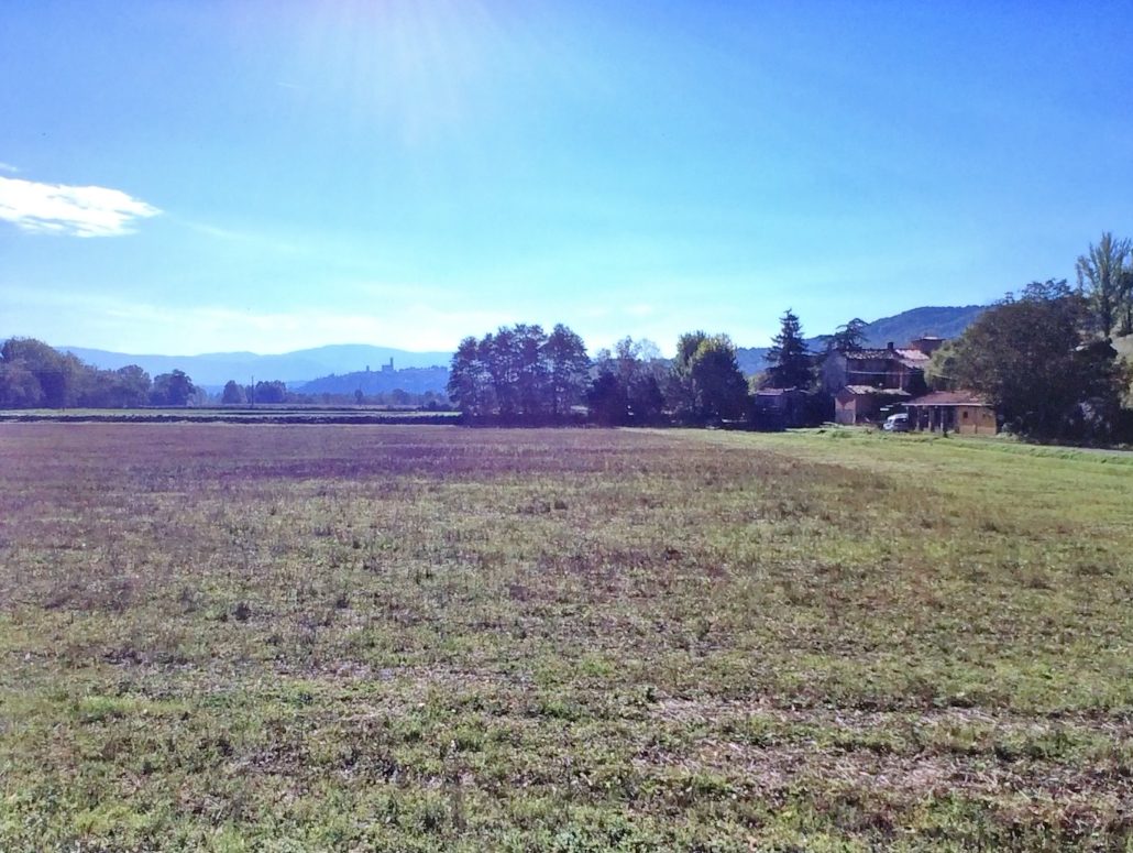
Kia ora from the studio! In this “Tuscan Fields” workshop, we’ll walk together through a sunlit hillside inspired by Monet’s Poppy Fields, exploring how loose impressionist brushwork can harmonise with clear structure. This scene is a beauty to paint because it balances broad, rolling planes of warm light with cool, recessive distances, punctuated by rhythmic tree groups and playful scarlet notes in the foreground.
Along the way, you’ll learn to juggle values and colour temperature to create believable depth, manage edges to guide the eye, and use juicy impasto to bring the field to life. The lesson includes a full video tutorial you can pause and rewatch as needed, whether you’re working in oils, acrylics, or gouache.

Starting the painting
With large brush I sketch in the major shapes - a loose start often gives a looser painting. Next I establish the darkest darks - the hillside and trees in shadow, which will form the dramatic backdrop for all the light in the foreground. Light will be coming from the left, so I make sure to slightly lighten the darks as the move to the left, and also to paint these fairly thinnly, just covering the canvas, so I won't have trouble working into it with successive layers.

Establishing values
I work the blue grey hills into the background with very soft edges, defining the tree line in front of it as I go, being sure to keep wiping my brush every few strokes so the sky doesn't get muddied with the darks.
Then I move foreward creating soft round shapes for the midground bushes, varying the edges between shapes and soft. The lights are laid on thicker with a rough brush to indicate the details in the foliage. I'm careful to keep the values no lighter than a mid tone here so the foreground light can really shine.

Foregound
With a large flat brush I block in the grasses in the foreground, making sure to not go darker than a mid tone, so the field appears to glow with light. The broad gestural strokes at the bottom of the canvas diminish in size and thickness as they recede into the scene. Small impasto specks of light lead us to the sunlit spot where the figure will appear.
The flowers are added in clumps with some outliers, rather than as multiple single flowers. This enables us to simplify the scene and to create interesting shapes that lead the eye. Notice the flowers too get lighter in the spotlit area around the figure. If they were darker it would ruin the glowing light effect.
The figure is added keeping a close eye on Monet's examples, thinner and soft edged in the darks and thicker and sharper in the lights. She dissolves into the glowing grasses. Although this looks quickly done, it takes some care to describe her accurately with very few brushstrokes.
Dive in with the video, try these techniques at your own pace, and don’t be afraid to make the scene your own—Tuscan light rewards bold, joyful painting.
Student Critiques
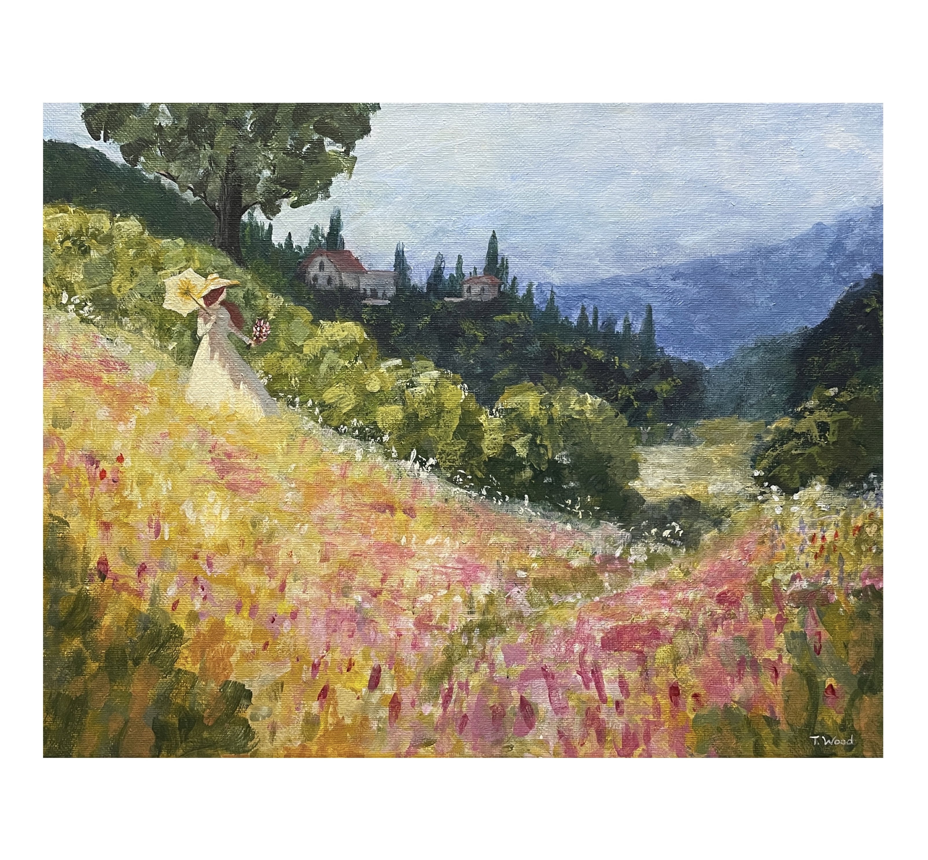
A Day in Tuscany
Artist: Tena Wood
Hi Tena, this has an airy impressionistic feel, rich with rhythmic brushwork and shimmering colour while also displaying sharp drawing skills. That's rare to see both in an artist and I commend you! There's nothing I can see that I would change. Great job!
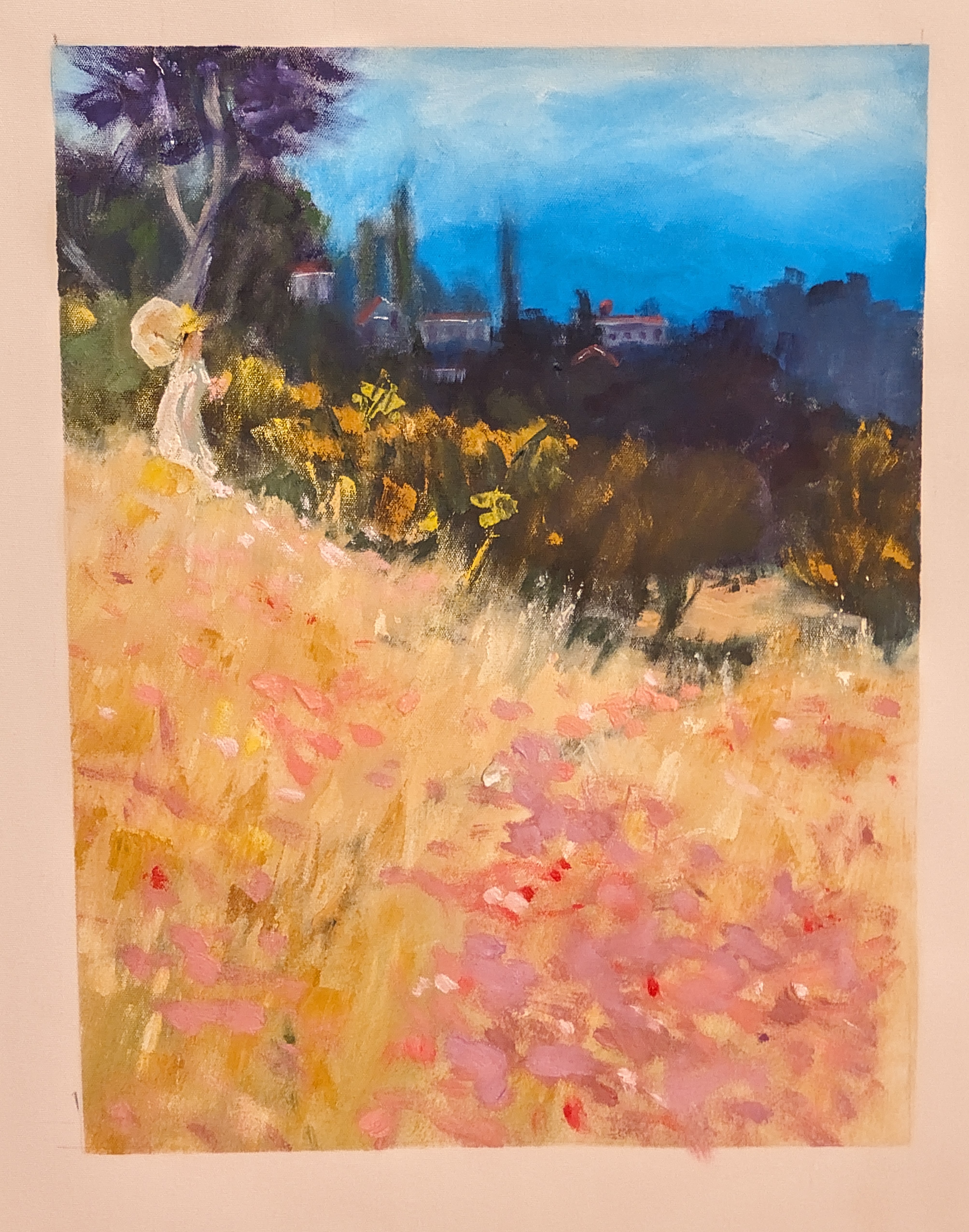
Inspired by Monet
Artist: Alisair George
Hi Alisair, there’s a lovely playful feel to this whole painting, exciting brushwork and strong colour contrast. I also like the soft, lost-and-found edges at the base of the midground trees suggesting long grass - beautiful!
What’s working well
- The big value pattern reads: bright field in front, darker band of trees, light sky on top. Value means how light or dark a colour is, and you’ve grouped them clearly. The vertical format works well.
- Your figure is a charming accent and helps tell us where to look. The hat and dress silhouette sit nicely against the darker hedge line although I would like to see a little more care in the drawing of the figure here.
I made a mistake in my demo painting by placing the large tree directly behind the figure, which is a confusing union of forms. I tried to fix that by obscuring the base of the tree so they don't actually connect. You could do that with yours too. My apologies!
I look forward to seeing what you paint next - you've got a joyful style.
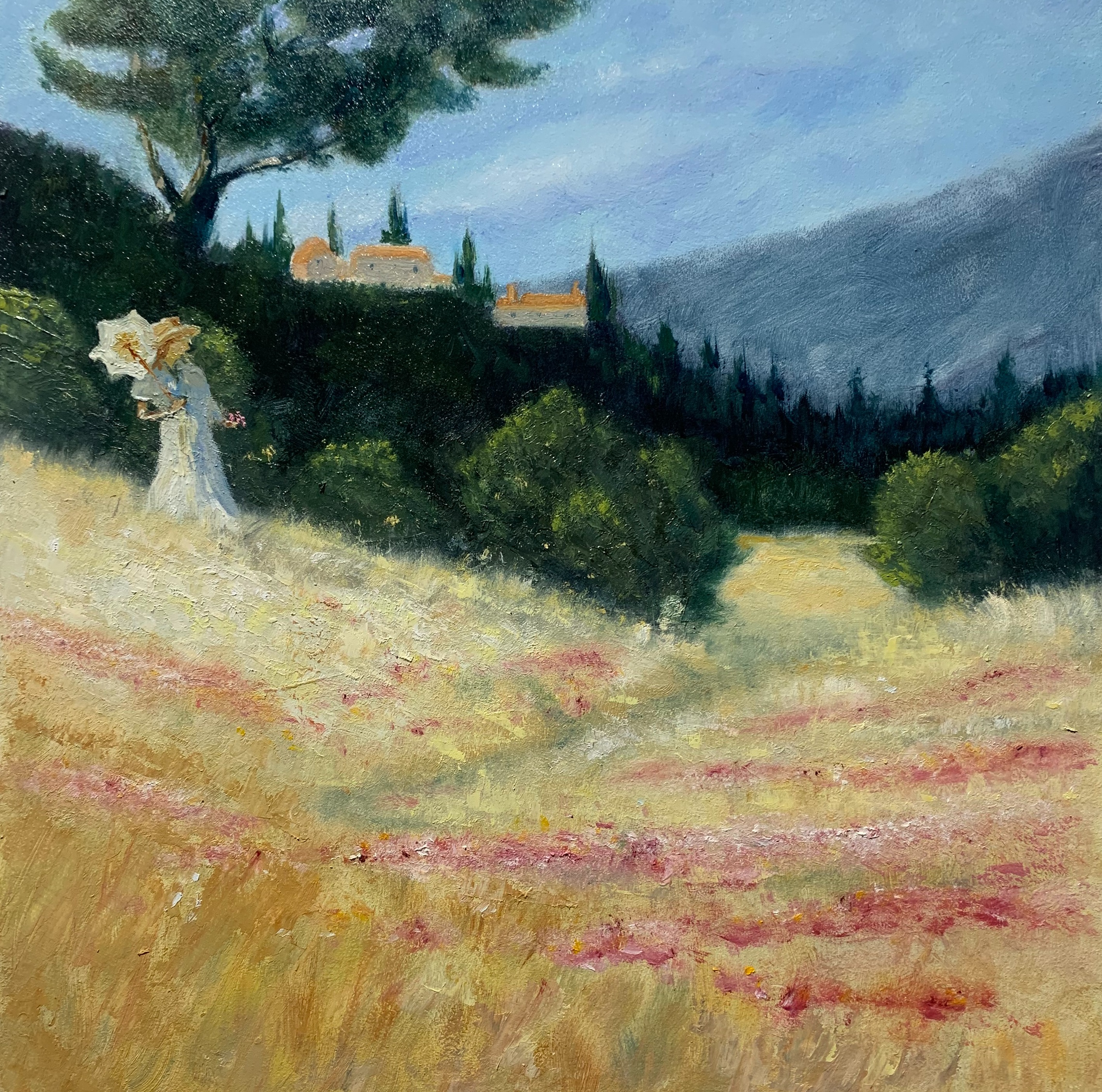
“Tuscan poppy field”, after Richard Robinson 12x12” oil on panel , Mark Price
Artist: Mark Price
I love the airy light across the field, Mark. You've subdued the colour scheme a little and sharpened the drawing and detail, bringing a little more realism to this piece. Nice! Those broken, warm strokes in the grasses feel sunlit and alive, and the pink poppy notes are placed with a nice rhythm.
Lots of interesting texture in the foreground and a nice path to walk further into the distance (although this could do with being a less symmetrical shape.) You've got a good variety of tree shapes.
Your distant mountain shape could do with some more interest - currently it's making a symmetrical sky bowl shape with the dark hill on the left. The building, although nicely painted, have strong sunlight on them as opposed to the dark land around them, which is odd, so I'd either shadow the buildings or throw some light on the hill. You’ve got a beautiful sense of light and a poetic mood here. Great job!
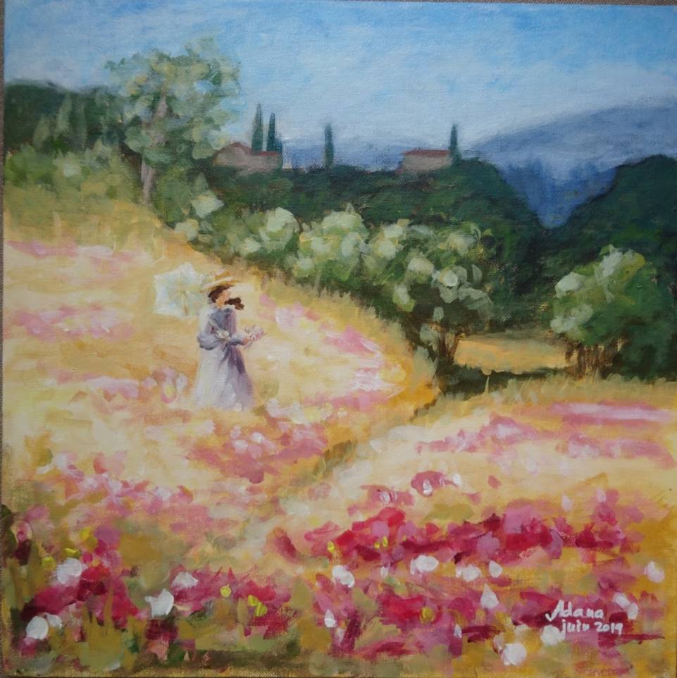
Tuscan fields, acrylics, 2019
Artist: Adana VIRNA
Hi Adana, there’s a lovely sunlit glow running through your field, and the warm pinks against the cool blue distance feel joyful. You've got pleasingly interesting organic shapes in your brushwork that diminish in size as they recede, adding depth, which is great.
If you add a little more blue/grey to the hills with the houses that will create more depth, separating those hills more clearly from the midground trees. The figure is well painted but her dark hair in front of her face is a confusing shape that could be removed.
Note that in my demo painting I was sure to place a dark background behind here parasol so the interesting shape draws more attention. You could glaze a soft brown shadow across the grass behind her to achieve the same effect. If your flowers flowed off the bottom of the canvas that would feel more natural. You’ve got a beautiful sense of light and color here, Adana. Keep that sparkle. Lovely work — keep going!
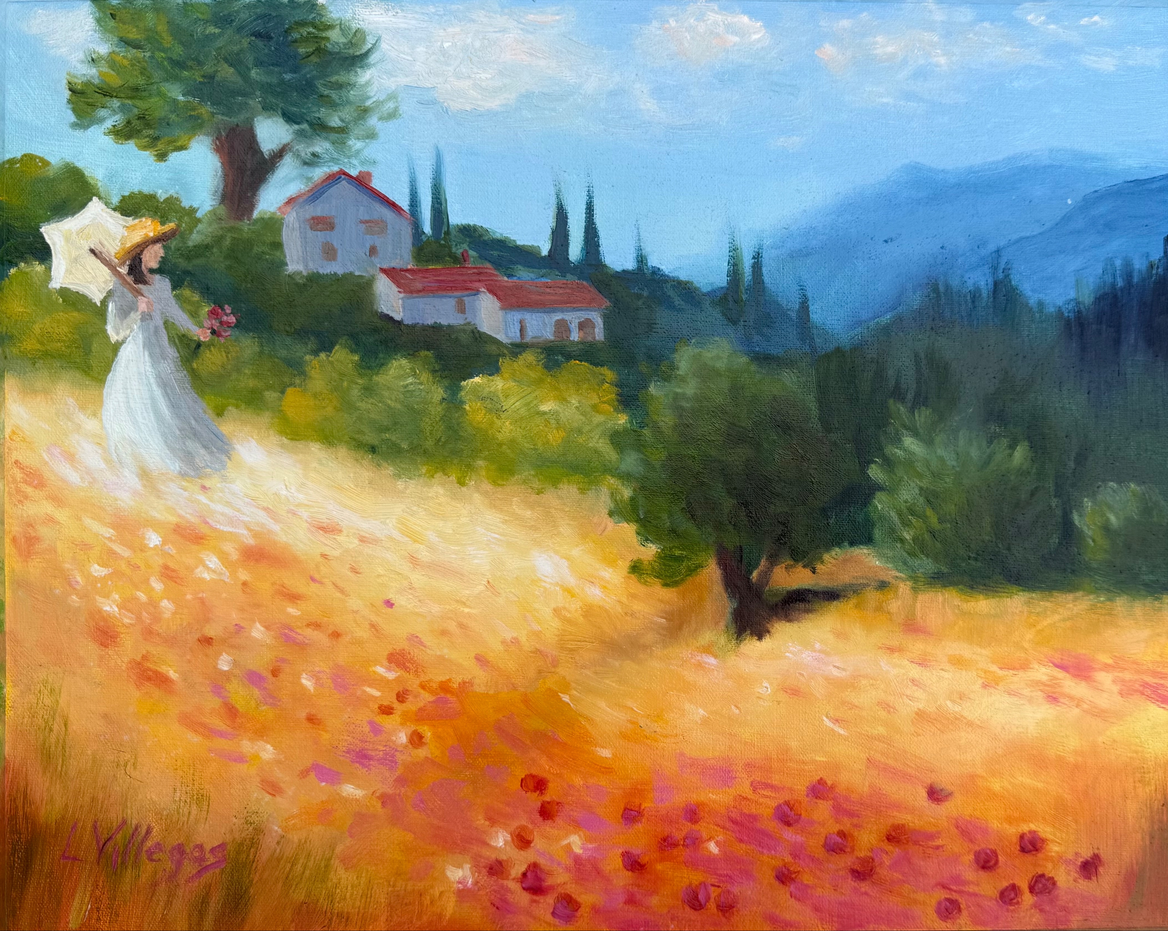
Tuscan Fields - 11 x 14 oil on linen pad. I used the scene of the Tuscan winery my son and his new bride visited on their honeymoon.
Artist: Louise Villegas
Lovely sense of sunlight here, Louise, and I love that you personalised it with the buildings. The warm gold field with those pink-red flower notes sparkles against the cooler blue mountains. The figure is charming and reads clearly. Your soft, hazy distance helps the scene feel spacious.
Some things to consider: If the buildings are in light, the land around them needs to be in the same light. The tree trunk behind here needs to come into the midground behind her, otherwise it seems too large compared to the buildings.
Your flowers are all the same shape and spacing. They're better painted in large clumps with a few outliers - then you can create interesting shapes that lead the eye. If you add more blue/grey to the greens in the housed hills and also grey the red roofs a little this will create more depth - avoiding the background jumping forward and battling the foreground. Optional practice On a postcard-sized sketch, group the flower dots into a few larger, varied shapes rather than a uniform scatter, leaving small calm patches. This will strengthen the path of the eye up the hill. You’ve captured joyful colour and light - keep that. Just a few things here for you to think about.
Congratulations and thanks to everyone who entered a painting into the workshop. Great work!
Get the full lesson here: https://mypaintingclub.com/lessons/79-Tuscan-Fields
- Richard.
Login to your account to post a comment.