Teacher
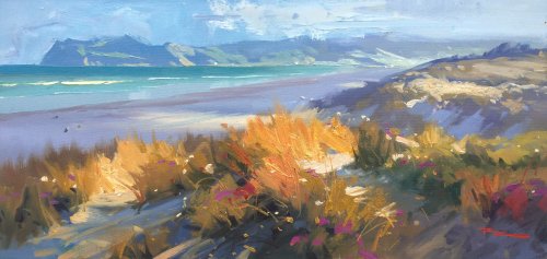
Richard is a talented full time artist, who loves painting and teaching.

with Richard Robinson
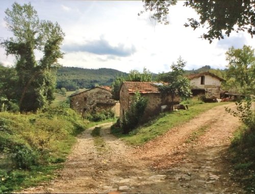
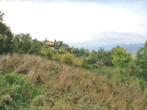
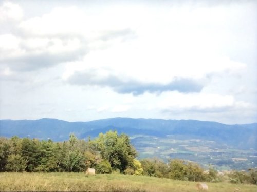
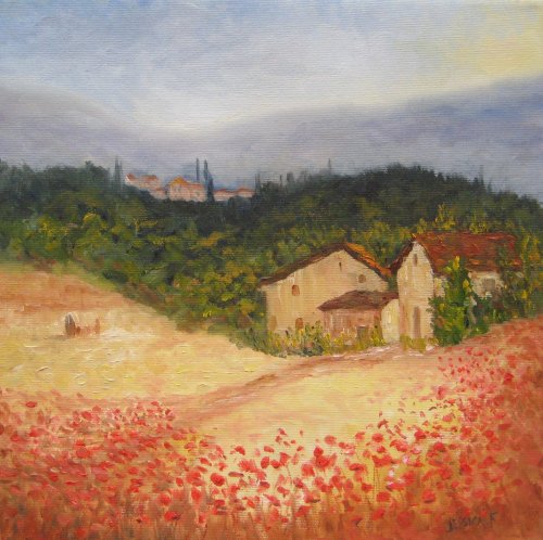
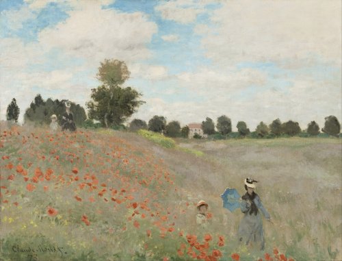
Follow me step by step as I show you the techniques I use to paint this charming Tuscan scene with reference to Monet’s painting of Poppy Fields from 1837. Enjoy!
Whenever you’re ready! The lesson is available online any time, and your access to the lesson never expires.
As long as you need! Your access never expires, so you can come back again and again.
Sorry, no you can’t download the video. This is to avoid piracy. You’ll always be able to view the video on this site though.
Richard is a talented full time artist, who loves painting and teaching.
Hi I’m Richard. I’ve been painting my whole life and back in 2001 I traded my graphic design career for the humble life of a full time artist. I love painting, and as it turns out, I love teaching too.
Nowadays I balance my life between parenting, painting, surfing, travelling and teaching. My work is regularly featured in international art magazines, in galleries in New Zealand and America, on TV and in my Mum’s house.
I give outdoor painting workshops in interesting spots around this beautiful planet of ours and love encouraging people to paint. Two of my favourite artists are John Singer Sargent and Joaquín Sorolla.
My painting website: www.nzpainter.com
I’d love to be your new teacher.

Richard is a master artist with an exceptional skill in identifying and communicating key factors to making successful paintings. I have found his video workshops an excellent resource for improving my own work.
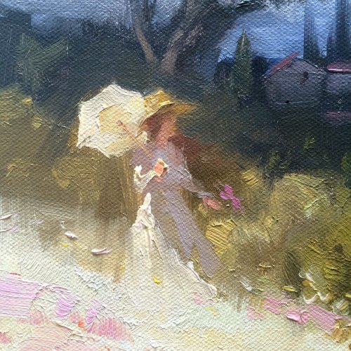
Tuscan Fields - Closeup
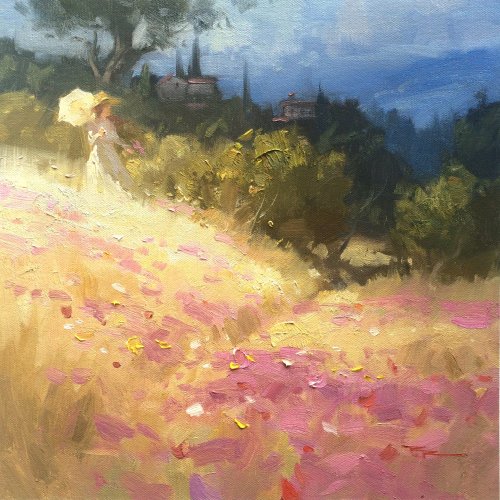
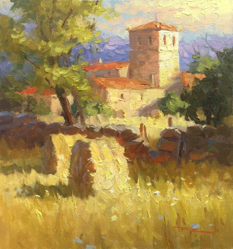
"Tuscan Fields" 12x12" Oil on Canvas by Richard Robinson.
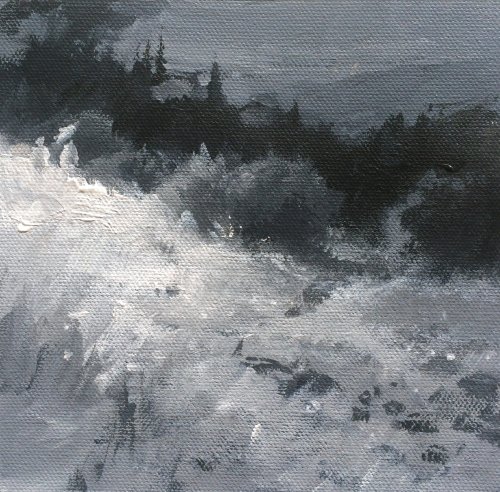
"Tuscan Fields - Greyscale Study" 5x5" Acrylic on Canvas by Richard Robinson.
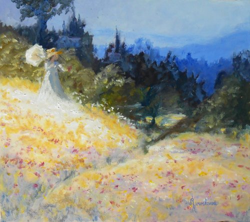
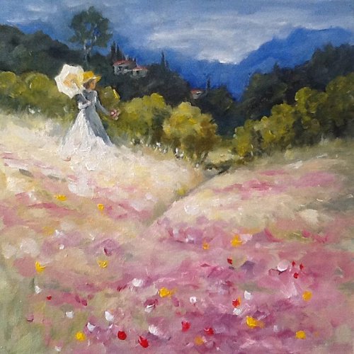
"Monet's Lady in Tuscany" 28x30" Oil on Paper by Silvana M Albano
Hi Silvana, good work here. You've keep the value pattern of the painting strong and given it some punchy colour although I don't think the greys in the foreground are helping at all because they're all the same value as the yellows there so it loses its sense of form. Below is the greyscale comparison of yours versus mine so you can see what I mean. Another thing that's a little confusing is the lighter blue shapes within your dark trees behind the green bushes. Not sure if those are intended to be holes or lighter accents on the trees. Your figure is good although the head could be a little smaller - something I'm often guilty of too. That little dark strip on the path leading into the bushes looks a little odd, not least of all because it joins in a straight line to the bush on the right. Needs looking at. Just a few things to think about. Good work!
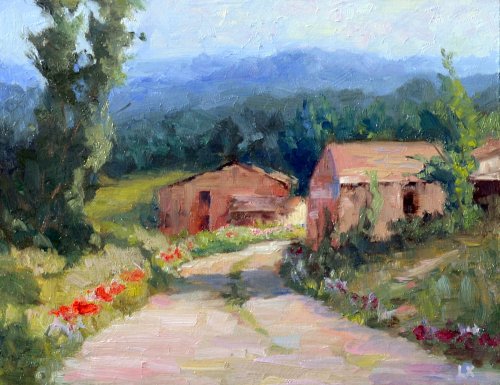
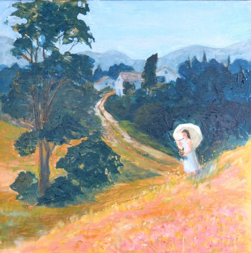
"Tuscany Homes" 11x14" Oil on Board by Laura Xu
Nice work Laura! You've managed to get a real impressionist look to this painting with your bold brushwork and broken colour, especially in the road and the sky. It's a strong design with large simple shapes though I'd like to see the edges of the road broken up more to add to the rustic charm of the place. The flower edging is a nice touch and I especially like the shape of your large tree on the left - really nice and varied with just enough detail to express the character of the tree. Your major hills are copying each other - always an easy trap to fall into. The drawing of the central barn is good but the other is a little off because the apex of the roof is too far to the right. Also you could have made the dark side of that building a touch darker to help with the form. Overall really a really nice result with just a few things to tweak.
"Tuscan Farm Scene" Oil on Canvas by Jessica Futerman
A really pleasant scene Jessica with a lot going for it. The big fluid shapes are appealing, if a little oversimplified. The colour is strong, the greyed sky making the foreground look all that more colourful and inviting. Your poppies are well painted as is the shadow effect cast onto the distant hills by the low cloud. The subtle darker shapes in your field are receding as they should because they're not clearly getting thinner and closer together further away. That's the main reason the field is looking a bit flat, and also that the pathway isn't thinning out much as it approaches the buildings. Rethinking the path and the field would do wonders for this painting as that seems to be the weak link.
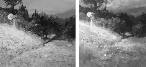
"Monet's Lady in Tuscany" 28x30" Oil on Paper by Silvana M Albano - Comparison
"Tuscan Fields" 12x12" Oil on Canvas by Valerie Kenward-Harrison
Good work Valerie, I can see the effort and struggle that's gone into this one. The green bushes have all become very similar in size and their layout is echoed by the dark hill behind and then again by the distant hills which all conspires to remove variety from the design - something our brain does automatically because it loves to put things in nice tidy rows so we must fight it constantly when painting. One place I failed in this too in my painting was where I put the tree directly above the figure which gives the feeling that she might be balancing it on her head. You've dutifully followed my poor example so I can't blame you for that one but it's a good lesson for us both. I like your lost edge in the mountains but you've muddied and muddled the sky around the tree which negates the recession you gained with the lost edge. Your figure's good, if a little laboured and too dark in the shadows which cancels out the glowing effect you so carefully created in the grasses there. Also you could have softened some more of the edges of the green bushes to stop them looking like cutouts. Your flowers are good but have become a little muddied around the edges and could do with some grass painting back in to cover some of the greys there and define a few edges. Overall a good effort with just a few things to look at.
"Tuscan Fields" 12x12" Acrylic on Canvas by Walda Juhl
Great that you played around with the design Walda - top marks for that and the design itself along with the drawing is really good. The main thing I'd like to see changed is to create more space between the foreground and background. The dark tree in the foreground is pretty much the same value as the trees behind it. This has really flattened out the painting but your good drawing of the receding road saves it from from being unreadable. To create more space you'd just need to lighten the darks in the hill a bit, seeing as you can't make the tree much darker instead. Your distant mountains know where they are though which is good.
$15.00USD
$15.00USD
$15.00USD
$45.00USD
Not loving your painting lessons? No worries!
If it’s not the right fit, we’ll give you a full refund within 30 days of purchase - no questions asked.
When you purchase a DVD you also get online access to the same lesson, including any lesson resources like photos, downloadable notes and access to upload your painting to the student gallery.
That's why you need to make a password when you purchase a DVD, so you can access the online content as well. Enjoy!