The idea of painting on a ‘toned’ (coloured) canvas is not a new one. In fact it’s been used for centuries to banish the tyranny of the white canvas and to help thread colour through a painting. It’s tried and tested.
However, not many people paint on vibrant coloured canvas. A few do, but the vast majority paint on white or lightly toned canvases with warm or cool grays or earth colours. What would be the benefit of painting on a strong coloured ground? If you’re a fan of scintillating colour, this may be something for you. The colour effect can be quite powerful.
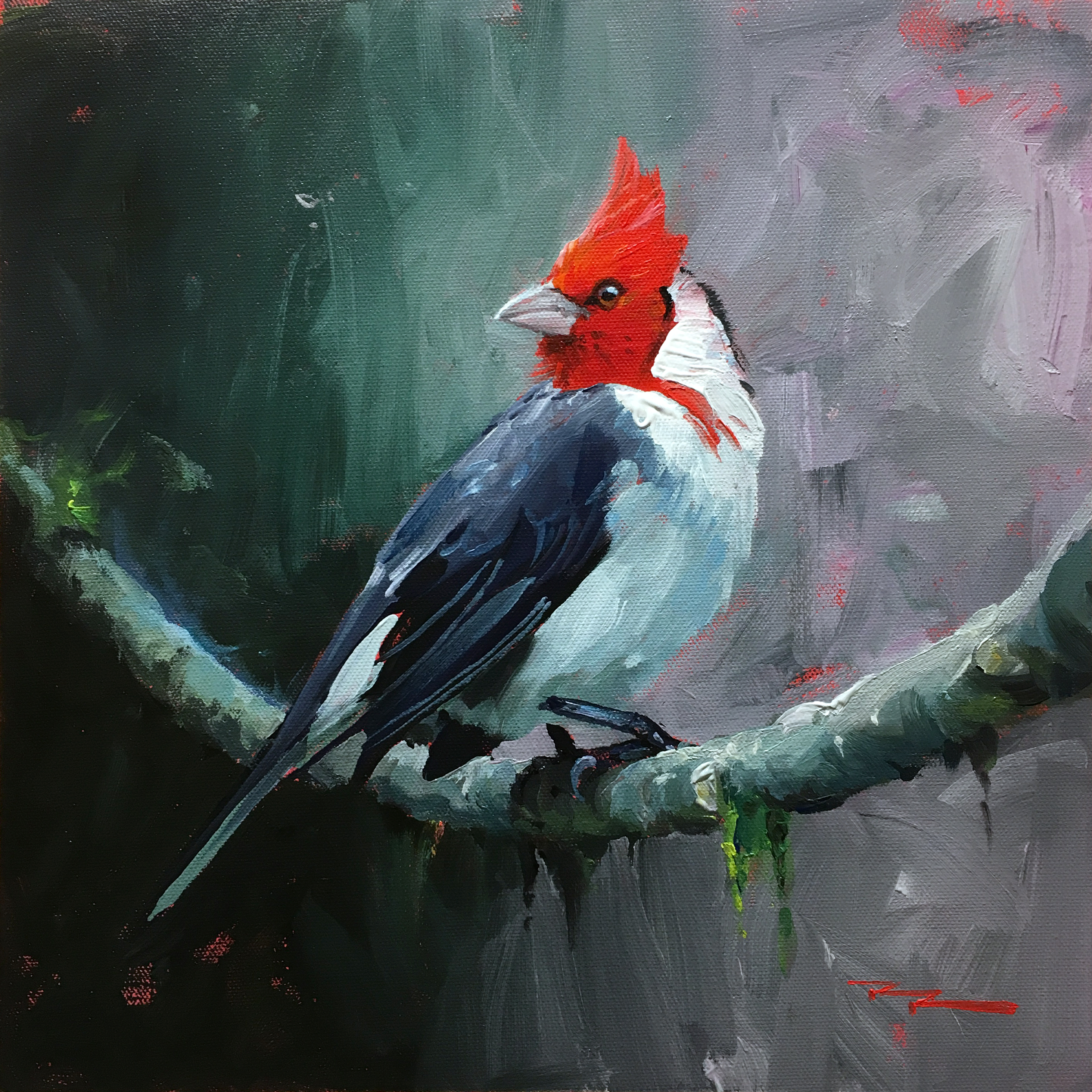
If you leave gaps in the subsequent layers to allow the base colour to thread its way through the painting you can achieve a shimmering ‘broken colour’ effect more easily than the alternative of painting threaded colour over the top layers. Attempting to leave gaps in your paintwork also leads you to more expressive, gestural painting, which can be really fun.

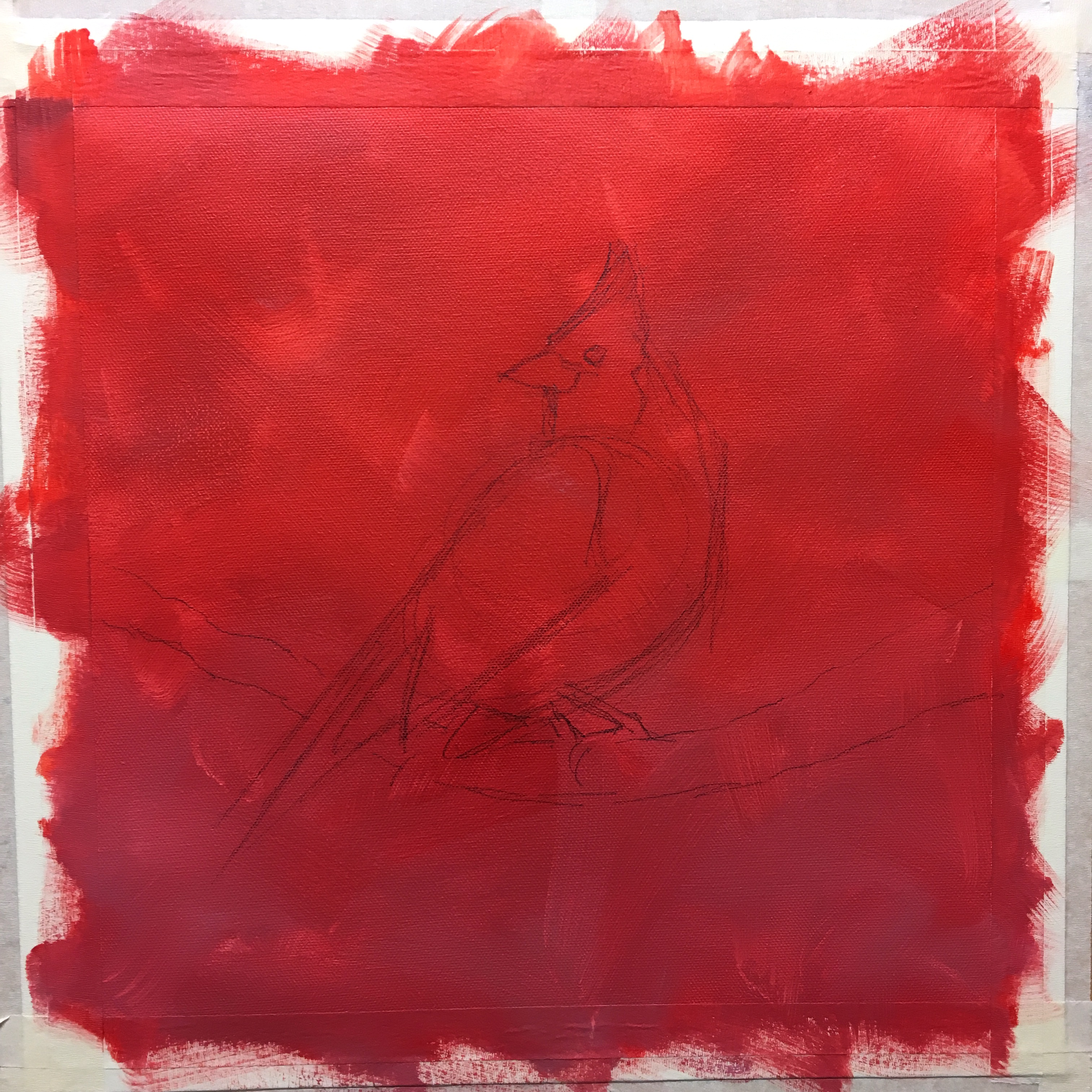
The brightly coloured ground, using cadmium red, alizarine crimson and a little white.
The strongest colour note I planned for the finished painting was the red in the bird’s head, and I also planned to counter that with a grey-green background, so I chose red as the toning colour.
This is all painted in acrylics, so I gave the background over an hour to dry before painting on it. It’s really important that it’s dry first so that the next layers don’t mix with it, which in this case would have caused a muddy mess with green and red mixing together to make brown. You can do the same with oil paints, though I’d advise toning the canvas with acrylics to avoid prolonged drying times.

Step 2
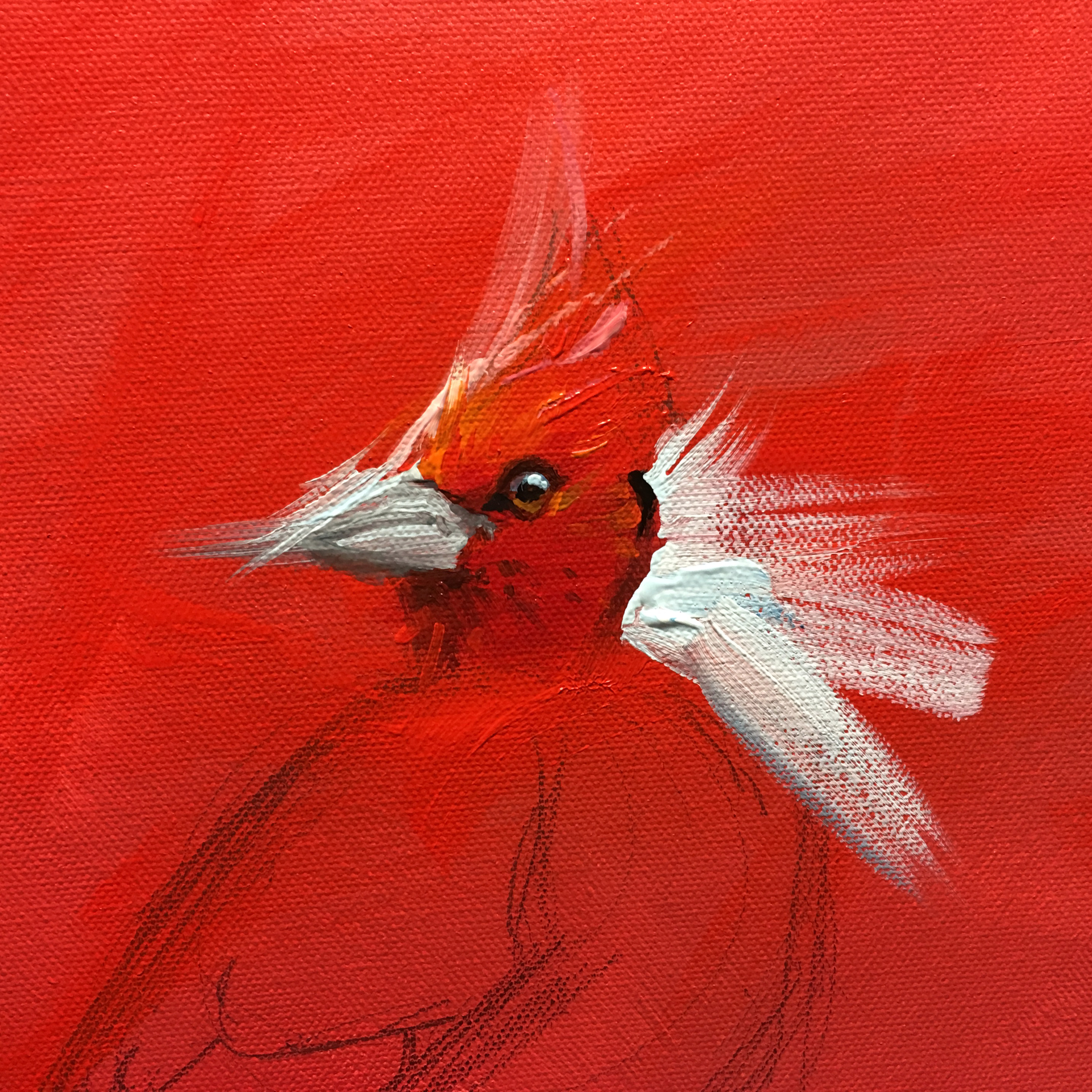
I started painting with my centre of interest, but first brushed over it with more cadmium red, so it would be as vibrant as possible. I painted the head into the red while still wet. This is called painting into a couch. (Don’t know why but there you go). I made sure my brushwork was as bold and gestural as possible, extending well past the edges of the bird so that I could easily work back into those shapes with the background, defining hard or soft edges. Planning each brushstroke allows me to let the toning red to show through where I want it.

The most difficult part of this technique may be the part that looks the easiest – painting the background in broad strokes that allow the toning to show through in places. It’s all too easy to just keep painting and brushing until it’s all perfectly coloured in. Resist the urge!
I encourage you to give it a try on your next painting. You might be pleasantly surprised!
Happy Painting,

Richard.
Login to your account to post a comment.