
I was getting ready to go do some face painting this morning to help raise money at the local church fair when I thought, hey, why not take my easel along and do a painting which I could sell to raise money while my goodly wife takes over the face painting?
So I printed out a black and white photo of a local beach, grabbed all my gear and headed out.
On the way there I also figured the way I could sell it for the most money would be to run an ongoing auction as I painted, which worked great. I've included a photo of my fancy advertising sheet below, (phone numbers omitted).
Basically I took the details of anyone who wanted to bid on the painting, and the next bidder had to bid higher to get on the list. Now, it's a really small fair - just a few cake stalls, a bouncy castle and me, with maybe 100 visitors showing up, so I was quite happy to sell the little 10x8" painting for $155 which was the top bid by lunch time. So that's one way to sell a painting eh?
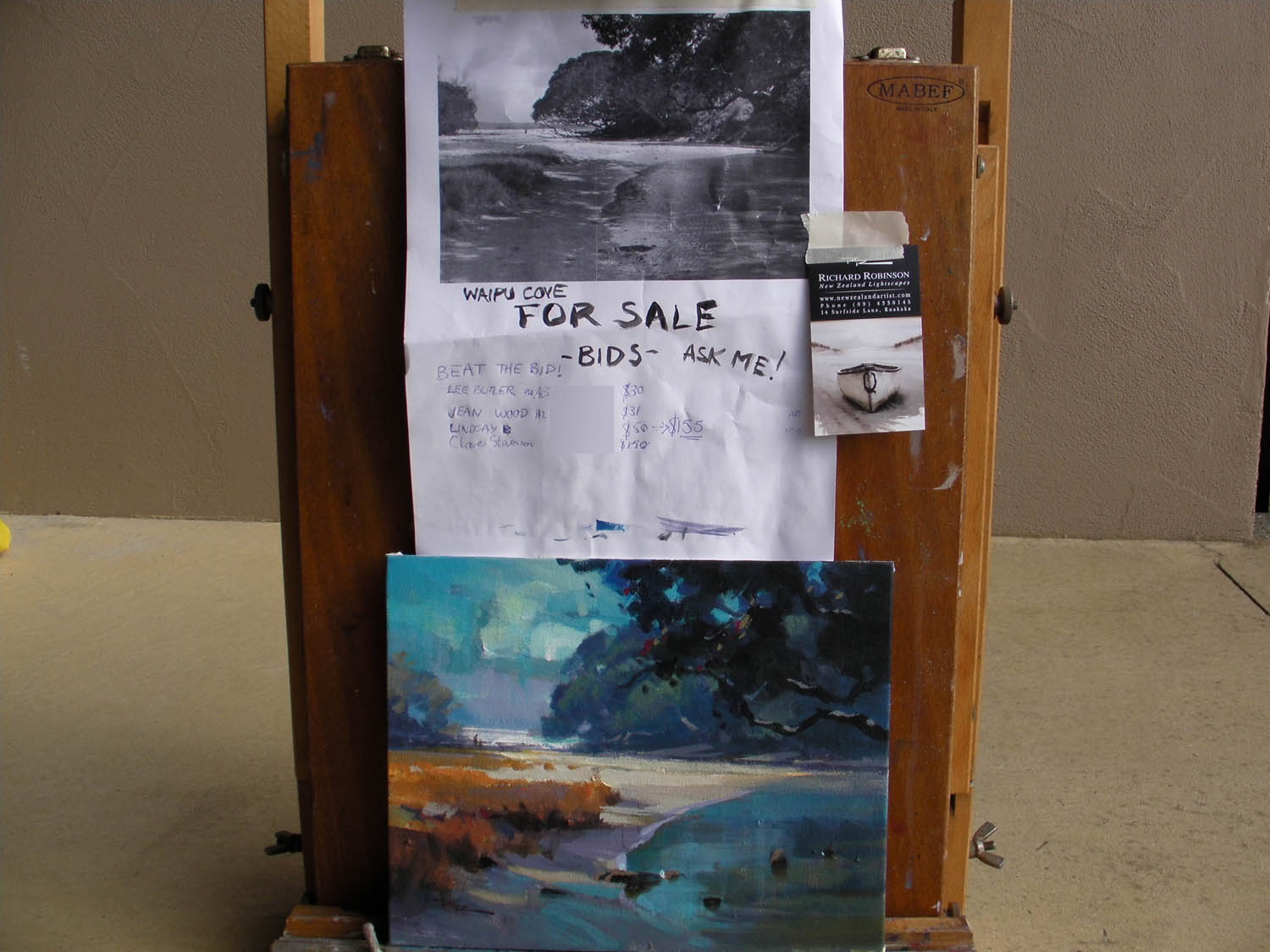
This is the setup I used - pretty fancy advertising eh!?
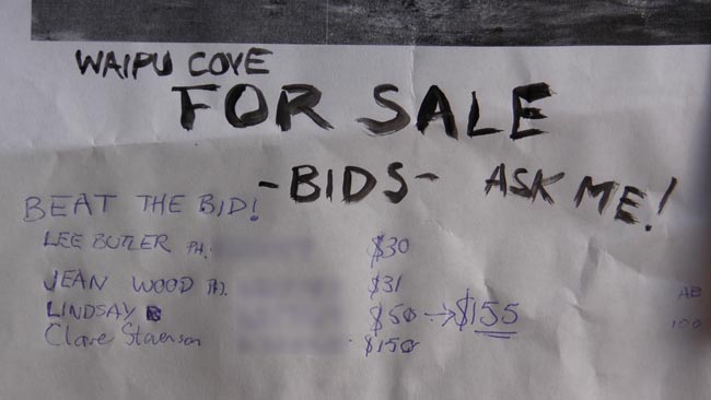
A Closeup of the auction list (phone numbers omitted here for privacy).
Each new bidder had to outbid the previous bid. Lindsay came back later and outbid Clare.
You'll see on the far right that Lindsay also had a secret 'autobid' for $100 like you can do on ebay which means that she initially bids $50 but will go up to $100 if someone bids higher than her $50. If I do this type of auction again I'll design and print a fancier auction sheet with a clearer explanation.
Anyway, what I found interesting when I got home was the difference between the colour photo of the actual scene (below) and the colours I used in my painting, so I'll let you play spot the difference there. (I always like that game.) In fact when I work from photos I often use the black and white version so that I'm not restricted by the photograph, which is always wrong anyway because it doesn't capture the colours we see in real life, especially in scenes like this with high contrast.
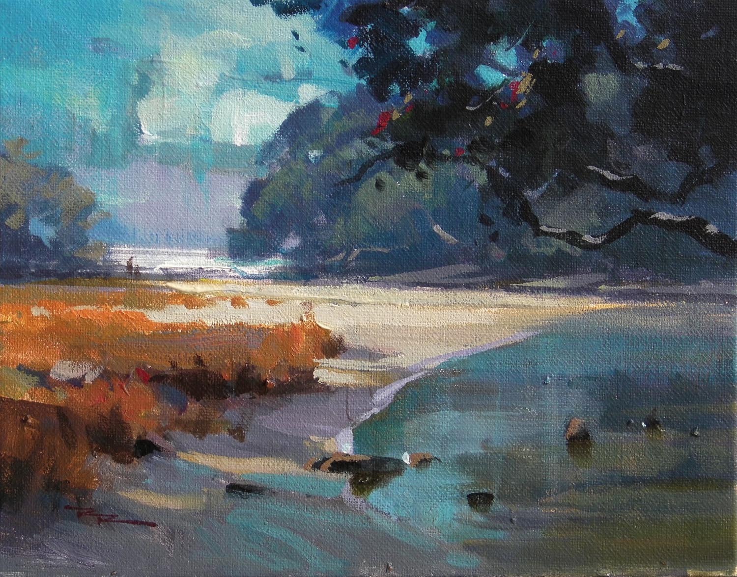
'Waipu Cove Summer' 10x8" Acrylic on Canvasboard
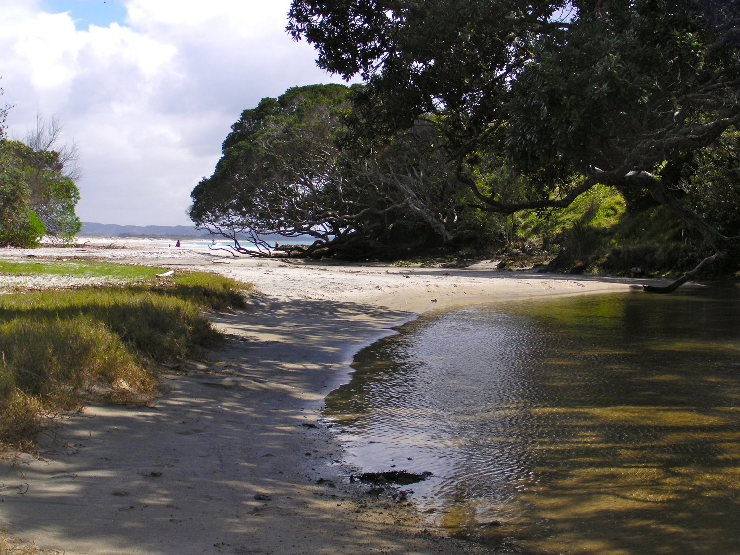
The reference photo - but I worked from a black and white version as you can see on my easel above.
Spot the colour difference between the photo and the imagined colours in my painting.
The more you paint in nature the better you get at understanding colour and being able to add-lib like this from a black and white reference. It's very freeing for an artist and a lot more fun than blindly copying a colour photograph. Next time you are considering painting from a photo, why not give yourself the benefit of the doubt and try working from a black and white image? You might be pleasantly surprised.
All the best with your painting,
Richard.
Login to your account to post a comment.