Waterfalls are one of the most alluring subjects for painters, but also one of the trickiest to get right. Learn the keys to painting successful waterfalls in this comprehensive and inspiring course.
www.mypaintingclub.com/masteringwaterfalls
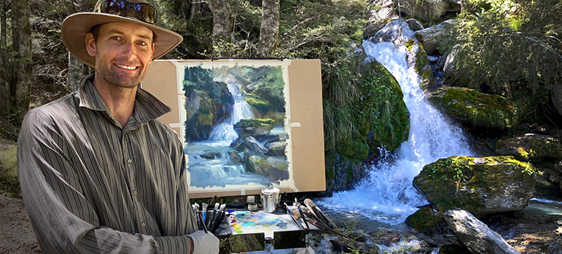
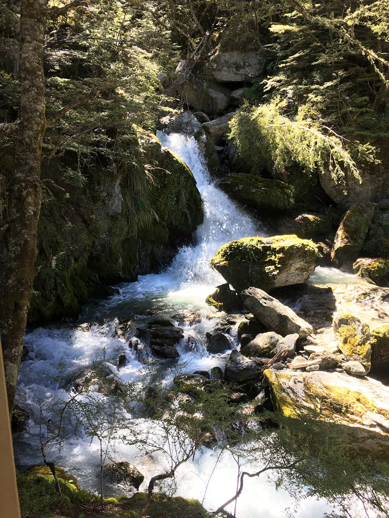
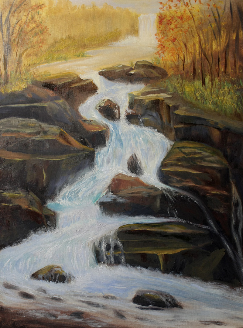
On a recent painting trip to the South Island of New Zealand I wandered away from the group, following my feet up a winding river bank, deep into the ancient forest (actually very close to where they filmed the forest scenes for 'Lord of the Rings').
I soon came to one of the most beautiful little waterfalls I've ever seen. Shafts of light flooded through the dense canopy overhead, making a stunning spotlit scene of the clear rushing waters and lichen covered rocks. All movement, all stillness, all glowing light and misted shadows. Well my mouth hung open, my chest filled with an ecstatic joy that welled up into my eyes. What a precious place!
After I retrieved my jaw I set to work painting and I soon realised just how tricky it can be to capture such a stunning subject on canvas. Not an easy task! As I toiled away I hummed a happy tune and considered myself lucky to finish with a halfway decent painting. Returning to camp I treated myself to a very brief swim in the glacial Rees Valley river.
Needless to say I was very fired up about waterfalls so as soon as I got back to the studio I started painting and researched the best waterfall painters to help on my quest to paint a truely beautiful waterfall scene.
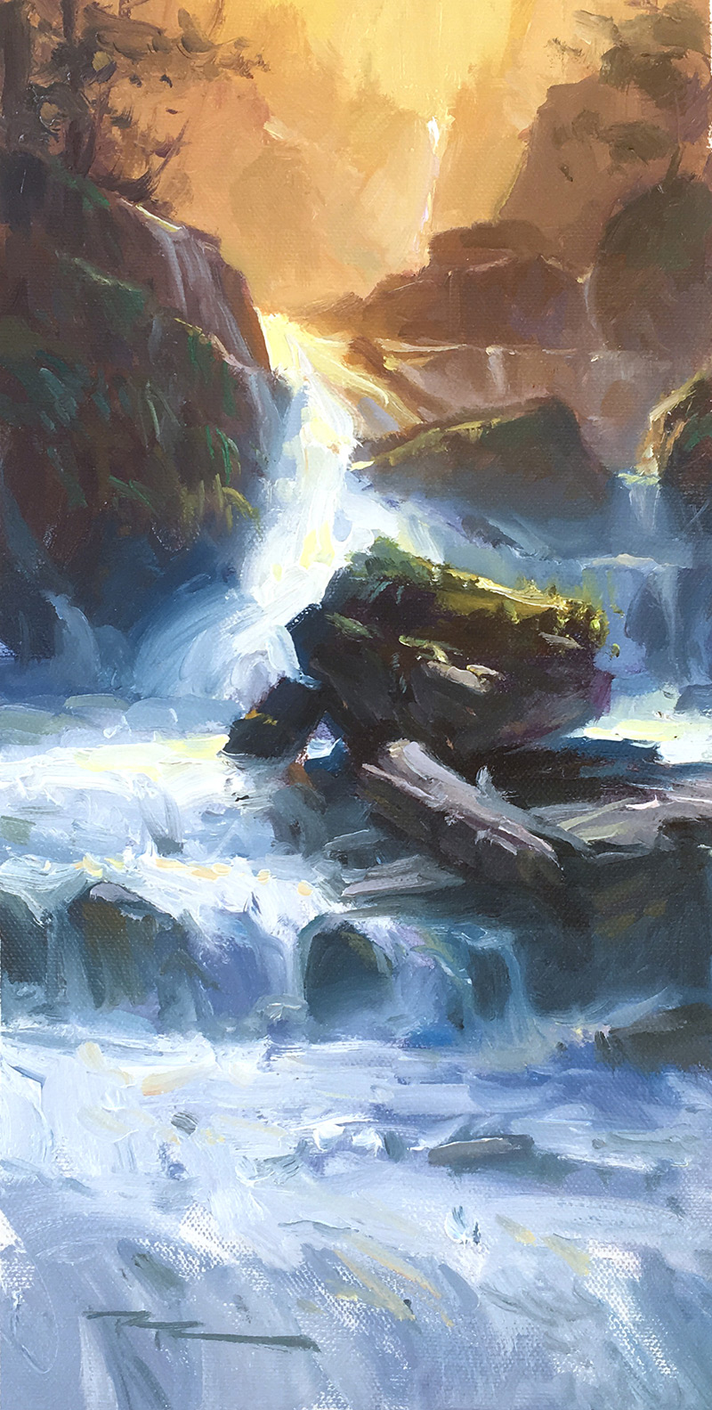
Finally I felt that I'd paid homage to that beautiful waterfall in the deep south. I laid down my brushes, took a break and enjoyed the results of my labours. There were so many valuable lessons I'd learned along the way. If only I had a way to share that knowledge. :-)
As it happens, I recorded the complete process so that you too can learn how to paint stunning, light filled waterfalls.

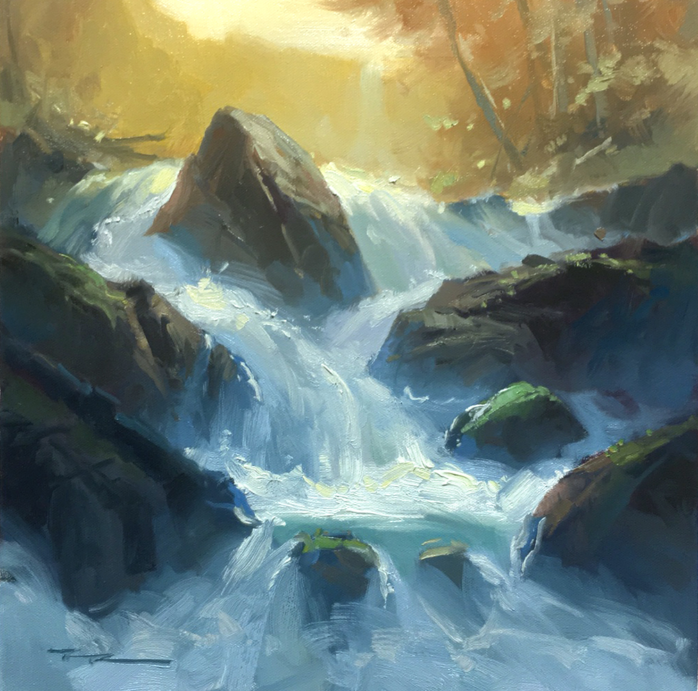
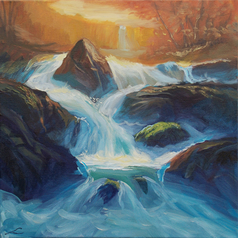
"Mystic Falls" 15x15" Oil on Canvas by Richard Robinson - Tutor
Get the Mastering Waterfalls Course
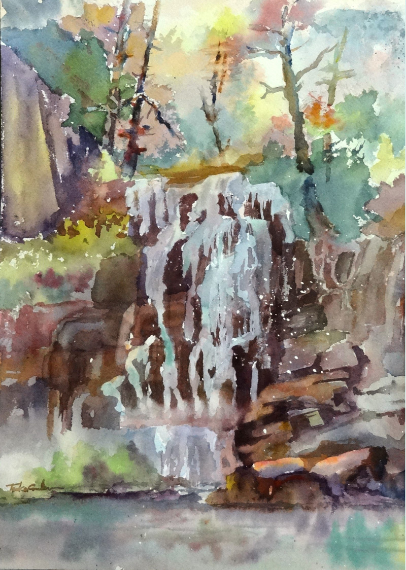
"Misty waterfall" by Elena Sokolova
Very fluid and colourful work Elena! Great to see. You've really captured the tumultuous fall of the water. Especially powerful are the vibrant contrast of cools and warms and the atmospheric effect created by the lost edges at the base of each rock. Beautiful!
My only suggestion would be to spend a little more time to soften off the brushwork in the distant cliff of the waterfall, removing most traces of texture there and adding more soft mistiness in order to give it more depth. Good job!
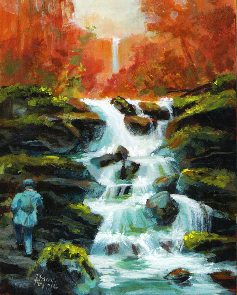
"Waterfall" by Sharon Repple
Great work Sharon! Scott will be chuffed that you put him in there. I'll send him a copy. That red/orange is pretty punchy! The colour scheme was worth a try but to my eye it's battling against the foreground making an un-earthly looking scene. What do you think? If you like it, great. If not, try a different scheme.
The waterfall has been really beautifully painted. I'd just challenge you to make it recede further up by lightening the values a little and pushing the colours all towards red a tad. Other than that, all good!
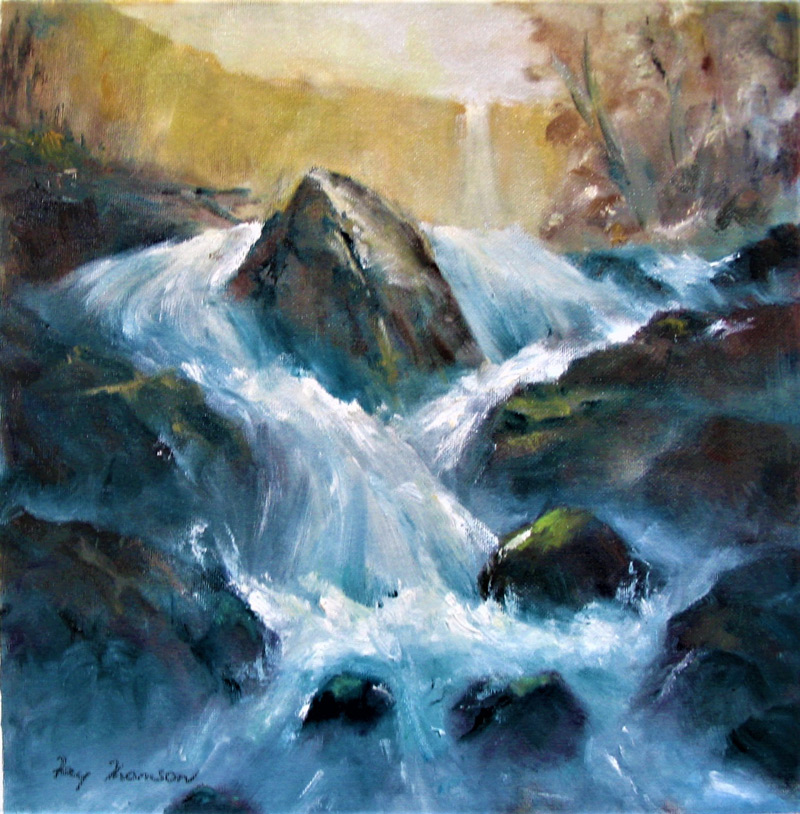
"Mystic Falls" 11 x 11" Oil on Canvas by Fay Thomson
Beautiful work, Fay. Really nice transitions from dark to light in the falling water with strong impasto highlights and thin alluring darks. Great!
"Waterfall" by Barbara Magor
Acrylic on Canvas
Hi Barbara, Good effort here using a simplified palette to create a a complementary colour scheme. The strong orange and blue makes for a dynamic painting.
Two things I'd like to see you try are to make softer edges at the base of the rocks to give the impression of the water spray in the air, and also to lighten the rocks a little as they recede into the painting to help give this some atmosphere - a sense of misty depth filled with light. Just changing those two things will take this painting to the next level. Because you're using acrylics, use a water sprayer to keep the painting and palette wet as you try to make soft edges. Keep at it!
"Falls" by Frank Brooks
Really nice design, Frank. A good variety of shapes and sizes. The physics falls apart a bit at the top where the river seems to be all on a single slanted plane towards us.
Toska Courbron - "Waterfall"
A captivating painting, Toska! Beautiful work making all those interesting colour variations. I guess you used masking fluid to preserve the white of the water itself? That's worked well to allow you to paint the darks in there, but it's left hard edges everywhere which is more indicative of a frozen waterfall rather than the soft edged look of water in motion.
If you were to paint this again (because you only get one shot with watercolours!) I'd suggest that you try painting it with masking, all into moist paper to achieve softer edges, which can always be sharpened up in places with subsequent washes. You've already achieved that a little at the base of the waterfall. I'd also expect to see darker water and reflections in the pool. Great work!
Waterfall by Denis King
Really nice work, Denis. All good except for two small things - the background waterfall is too light against its cliff and the trees on the right are nearly clones and could be a bit less regular on the edge of the foliage - a pattern has formed there presently.
The colour of the sky is too grey for the vibrant yellow of the cliff. If anything the sky would be higher chroma in this situation. That's why it currently looks a bit like a yellow cliff instead of a light-filled space.
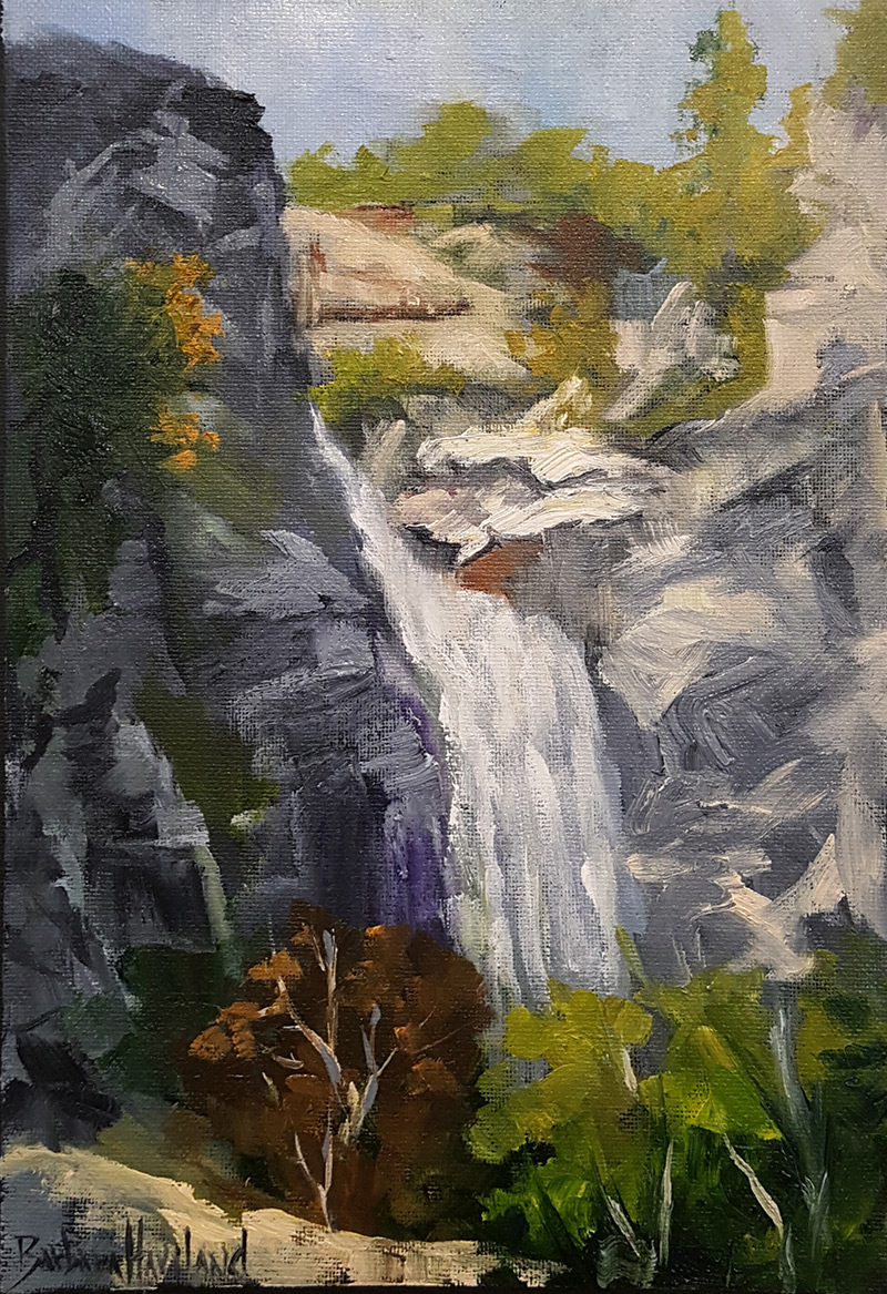
"Canyon Waterfall" 12"x9" by Barbara Haviland
Lovely painterly work Barbara. I like that you've kept your brushwork bold and focused on the big shapes, but contrasted that with some nice fine detail in the lower trees. Your composition is nicely done, excluding everything that's surplus to requirements.
I would have liked to see a stronger light and atmospheric effect in the sunlit area beyond the top of the falls. All you need to do to achieve that is make all the darks a little lighter and add a little of the colour of the light to every colour in that area. The easiest way to achieve that is to apply a light glaze over that area, maybe two. It can look a little chalky using glaze with white in it so I usually try to achieve the same effect by adjusting each colour as I go. Tricky, but well worth a try.
Notice in the resource photo that the mist rising from the bottom of the falls lightly obscures and simplifies the background behind the foreground trees. It's a great method to create depth and enhance foreground objects. Again, you can achieve that with with glazing or pre-planning.
Student critiques are made as part of the monthly online workshops available to all Premium Members.
Get the Mastering Waterfalls Course
Login to your account to post a comment.