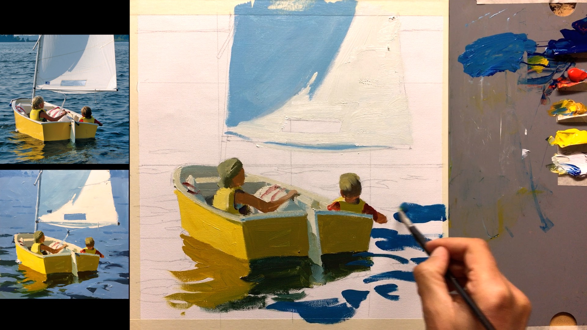
Light and Shadow Families
Your job as a painter is to simplify what you see and give it your own style. Your style grows of it’s own accord, so the question is, how MUCH should you simplify what you’re seeing?
The range of visible colour is pretty bamboozling, so as kids we decide that grass is green, just green, and the sky is blue. As an adult you can paint like that, sure, but you can’t achieve a sense of depth that way. It’ll all be flat, like paper cutouts.
The next step along from there is to divide each object into just two colours - shadow and light. NOW you can have depth and talk about the quality of light falling on those objects. That’s your starting point then. From here you leap into the world of colour.
If you can paint an apple with one colour for its shadow side and one colour for its light sight, AND (here’s the important part) get the relationship of those two colours correct, you’ve got yourself an apple (albeit a blocky one) in a certain type of light.
1 Colour
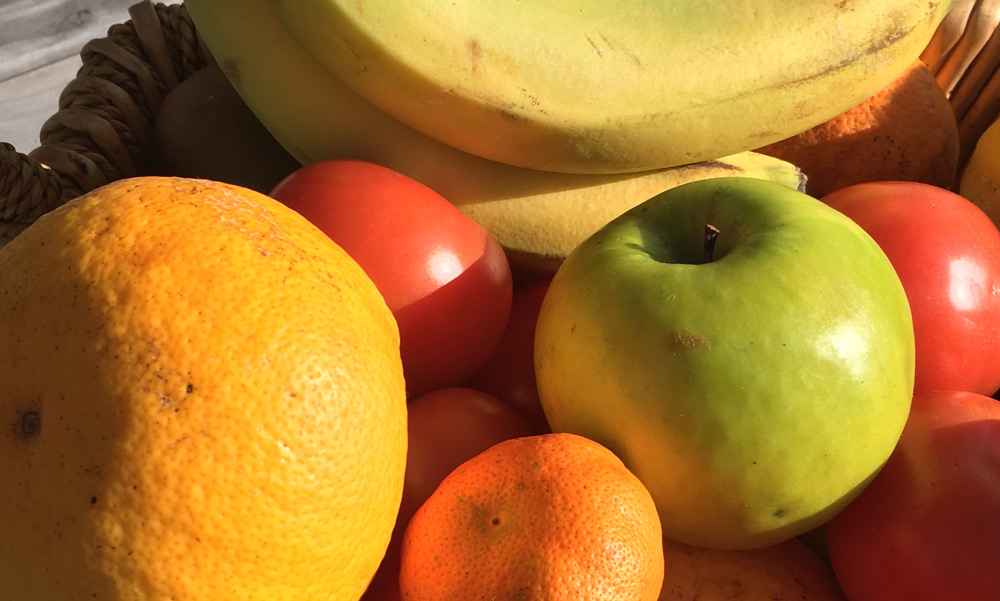
Now go ahead and do the same trick for the orange next to it, and the mandarin and the banana, and you’ll be surprised at how every new item adds to the real sense of light in the painting. It’s pretty magical!
2 Colour
Getting these colour relationships right is one of a painter’s core skills. If your colour matching muscles are flabby your paintings will fail to have a convincing sense of light in them, so let’s work those puppies out.
PLAYTIME!
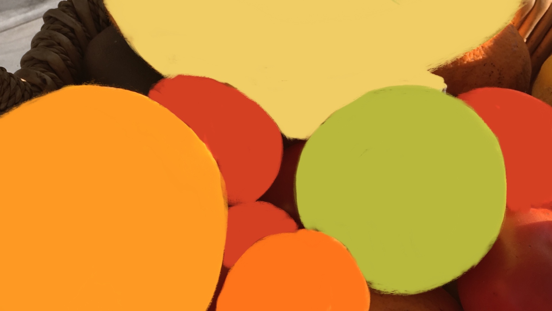
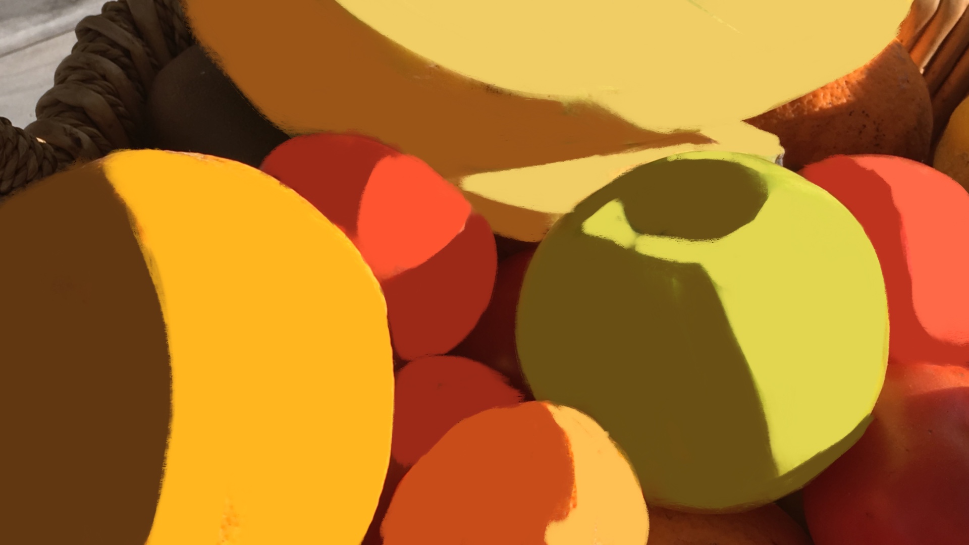
Choose one of the following images or one of your own photos with clearly defined light and shadow shapes.
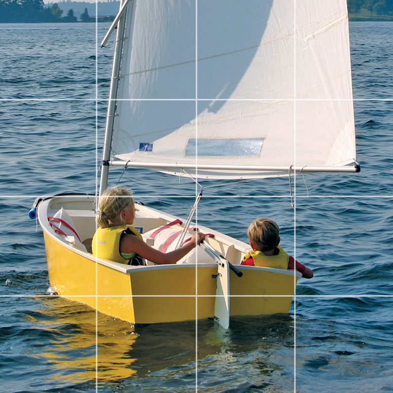
Tip: Avoiding smoothly rounded forms will make it easier, but if you do choose something like fruit then you may want to allow 3 colours for each object - shadow, mid-tone and light. Try 2 colours first though to see how it looks.
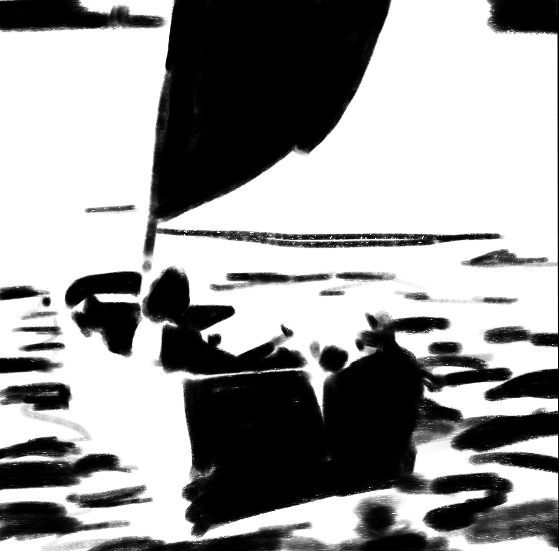
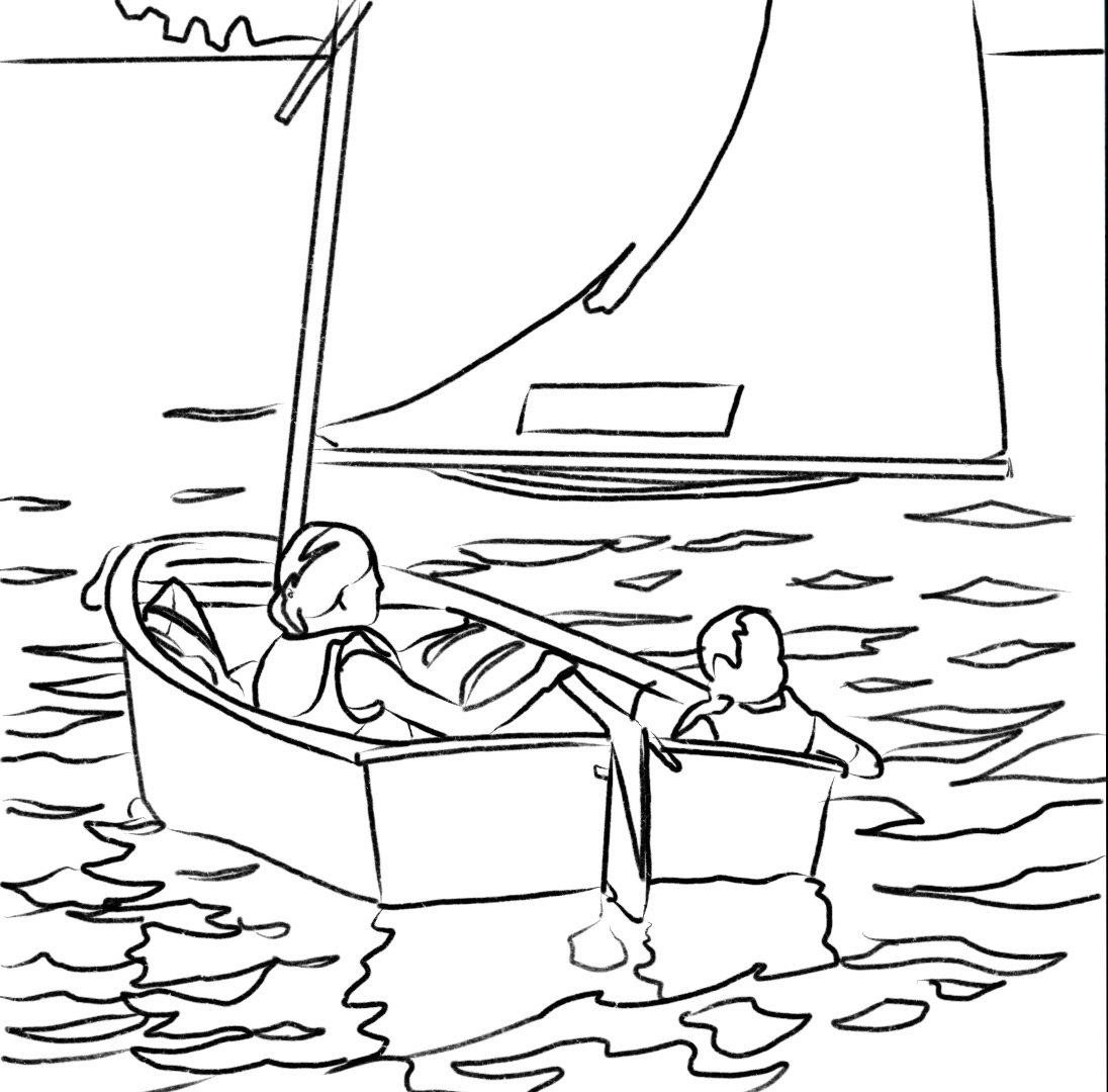
Using a marker pen or black paint work over top of a printout of your image, defining where the dark and light shapes are. You won’t paint over this. It’s just practice to familiarise yourself with the subject. Next draw the outline on your canvas.
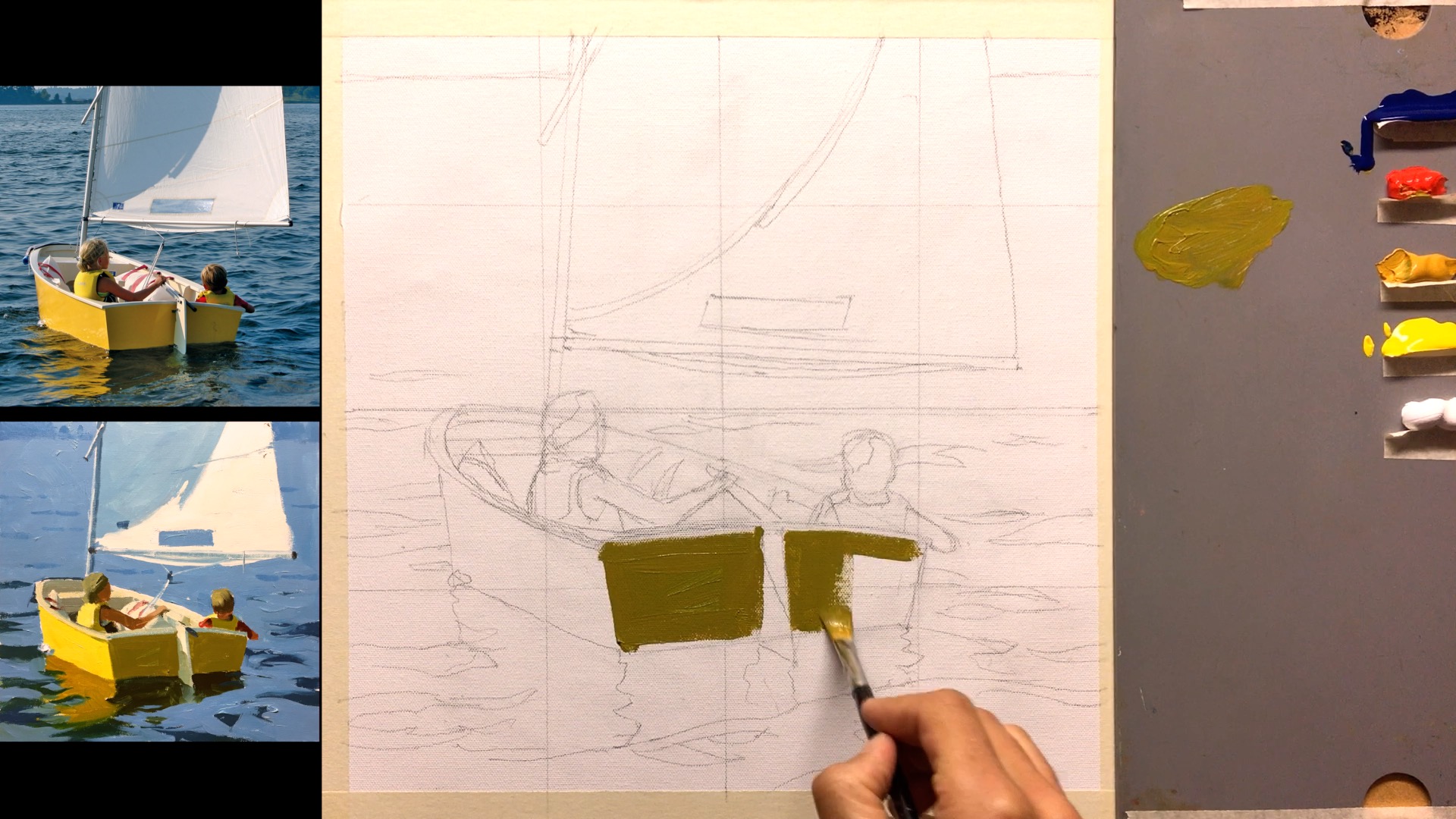
Paint the first big shadow shape.
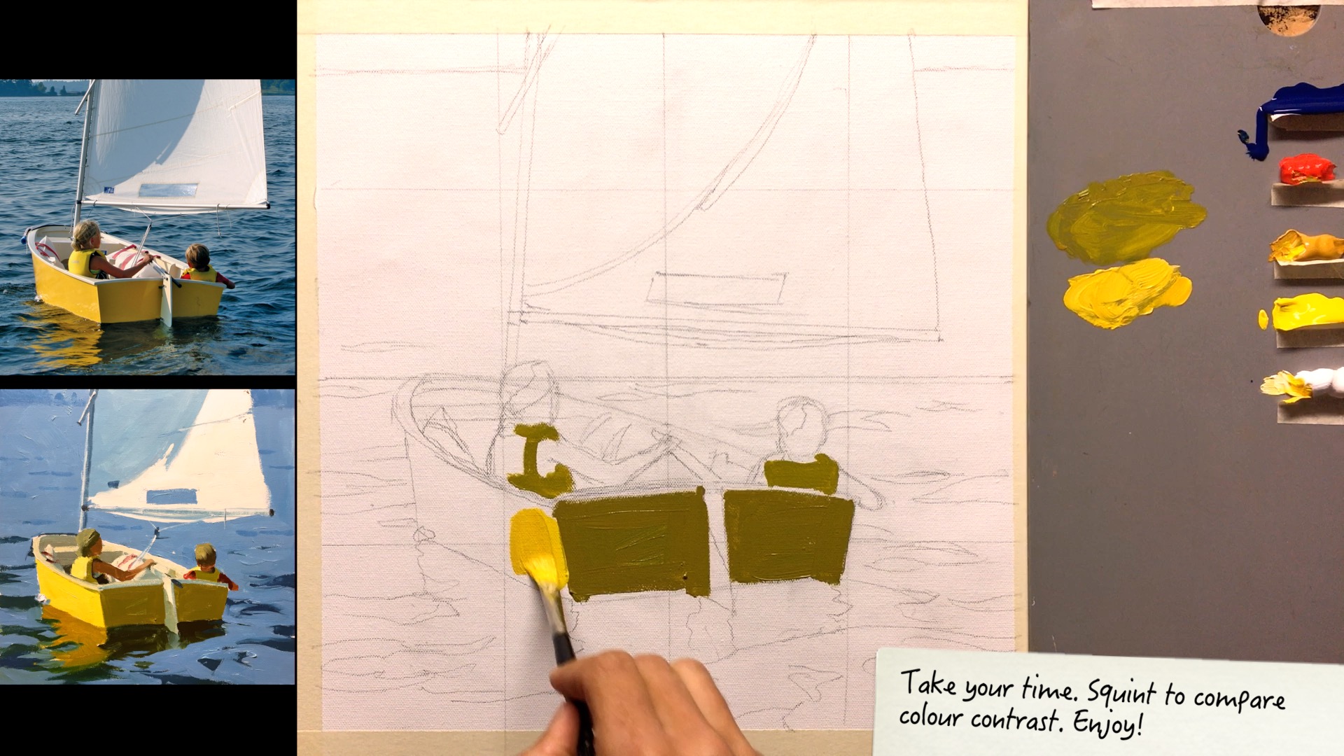
Then paint its corresponding light shape.

…and so on through the whole painting.
What’s great about this?
This exercise helps you see the world with artists eyes. A carpenter sees the wood in a tree, a miner sees the gold in them hills, but an artist sees the world with newborn eyes - as a shifting montage of coloured shapes.
You’ve heard that great artists ‘paint the light’? Here’s your chance. If you manage to paint all the colour relationships fairly accurately, hey presto, you’ll be painting the quality of the light. It’s that simple!
Which colour?
When you’re deciding exactly which colour to use for a shadow colour, for example, which colour do you choose? There are endless possibilities even within the shadow side of a boat for instance. My suggestion would be to not choose the darkest part, or the lightest part of that shadow, but something in between. The same goes for the lights.
Where to start?
Lightly sketch the big shapes in pencil. Paint the largest shadow shape, then its corresponding light shape. Check that it’s correct then move on to the next largest neighbouring shadow and light shape, and so on till the canvas is covered.
Warm and cool
Warm light (yellow-orange-red) like direct morning and evening light tends to produce cooler shadows (purple-blue-green).
Shadow/Light Ratio
The difference in value (the ratio) between light and shadow keeps constant across objects that are the same distance from you. As objects recede their values get closer together due to the intervening atmosphere. Expect variations caused by surface angle to the light, reflected light, surface texture and degree of transparency.
Photograph your work
At critical junctures in your painting make sure to take a photograph so that you can learn by reviewing the step-by-step process.
Practice seeing light and shade
Take a black marker pen to any magazine images and block in the big shadow shapes - this is excellent practice for deciding what is in the shade and what is in the light.
Notes
What could you have done better?
What did you do well?
What did you learn?
Would you say the light was warm, or cool, or neutral?
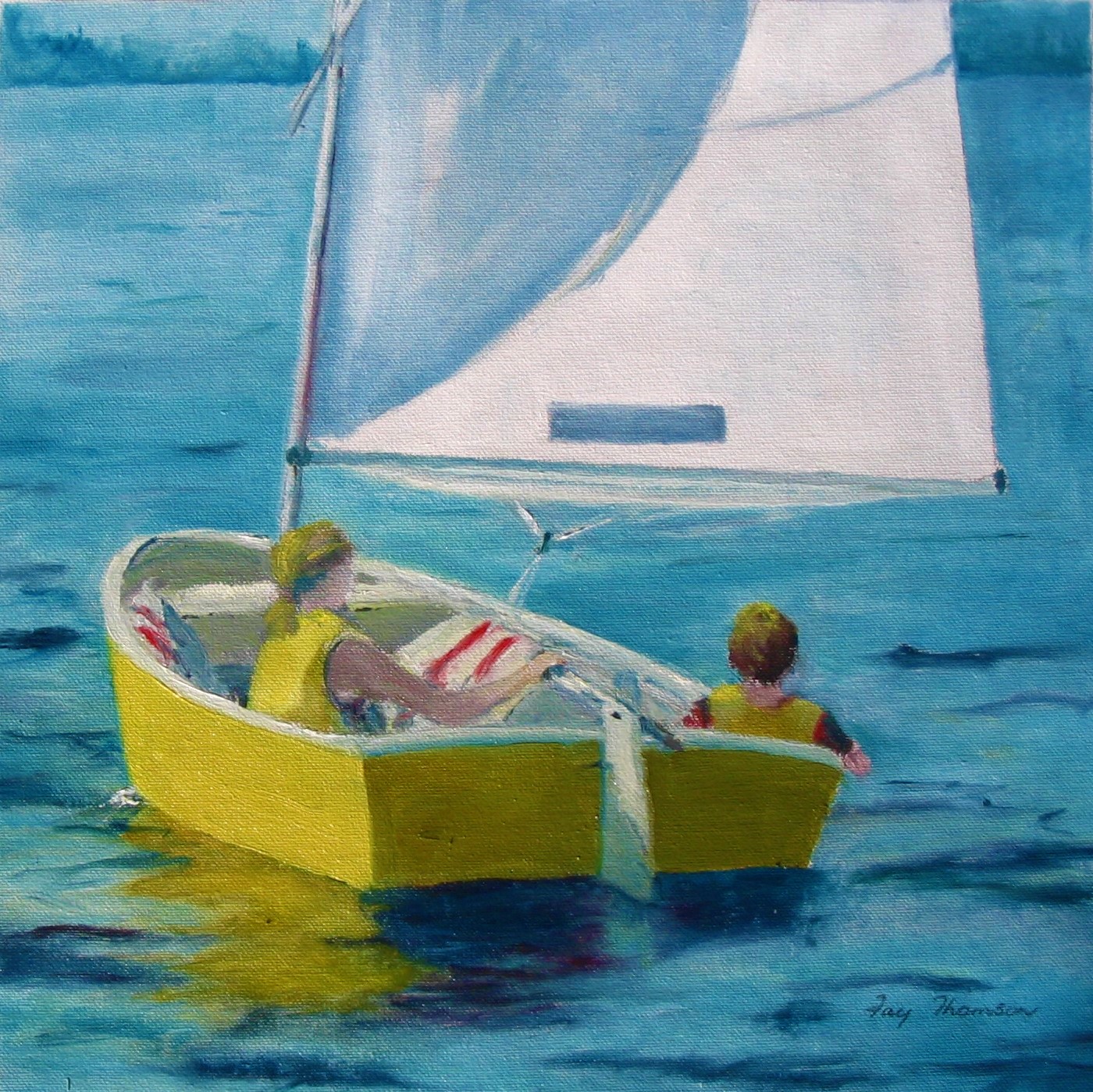
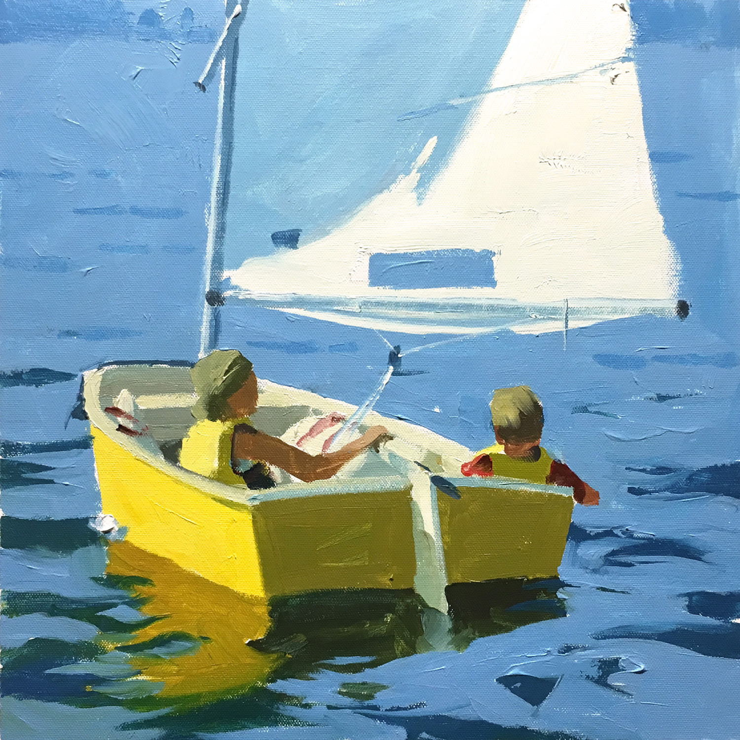
Sailing Away by Fay Thomson 12" x 12" Oils on Canvas
Nice painting Fay, colours and values are working well. Don't be afraid to be more bold with your brushwork, make every brush mark have purpose and intent. Great job.
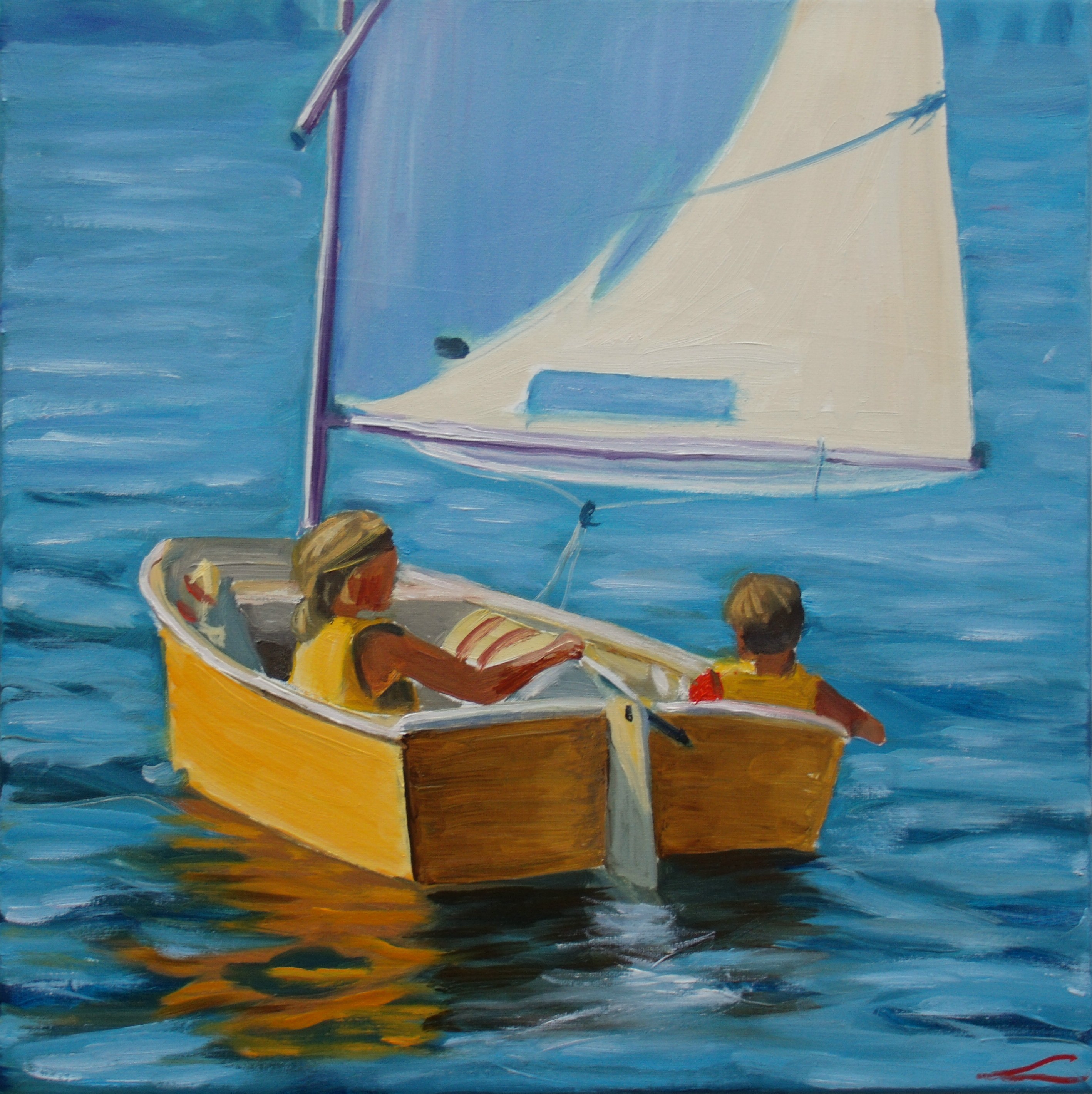
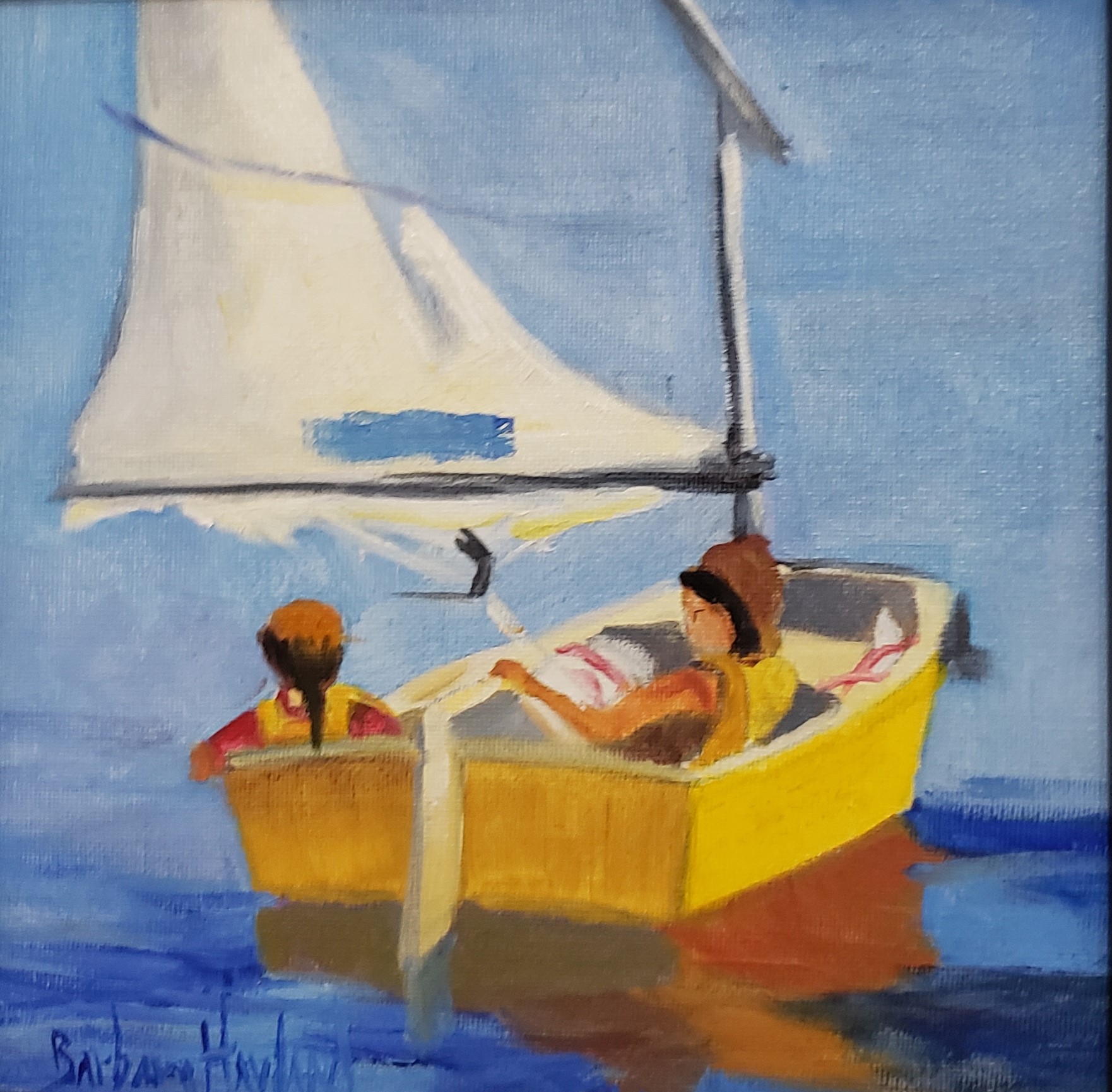 Friends Boating by Barbara Haviland
Good work Barbara, love the clean colours which are creating harmony within the painting.
Keep in mind some of those values in your painting, you may wish to darken the colour of the stern of the boat, also I would add more yellow into the boat's reflection in the water and break it up a little with a ripple or two. The dark accent of the sail's 'pulley?' seems to draw all the attention so I'd be inclined to subdue that by lightening it. Other than that, great job.
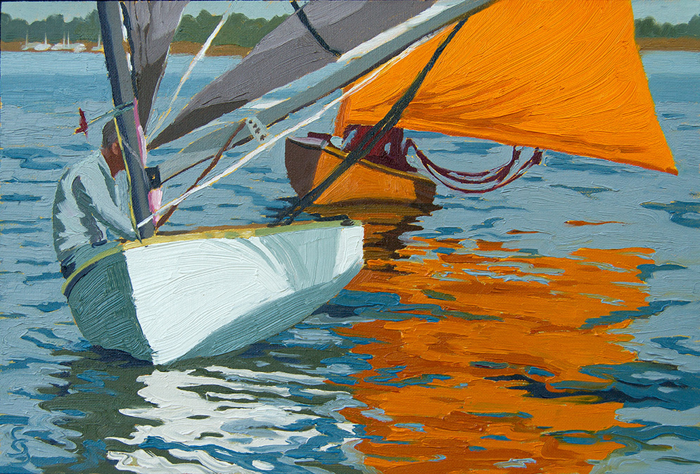
Orange overtaking grey, 18x24 oil on panel by Silke Sauritz
Wow, great painting, I love the composition and you've nailed the colours and values. Love the complex detail in the water too. Fantastic!
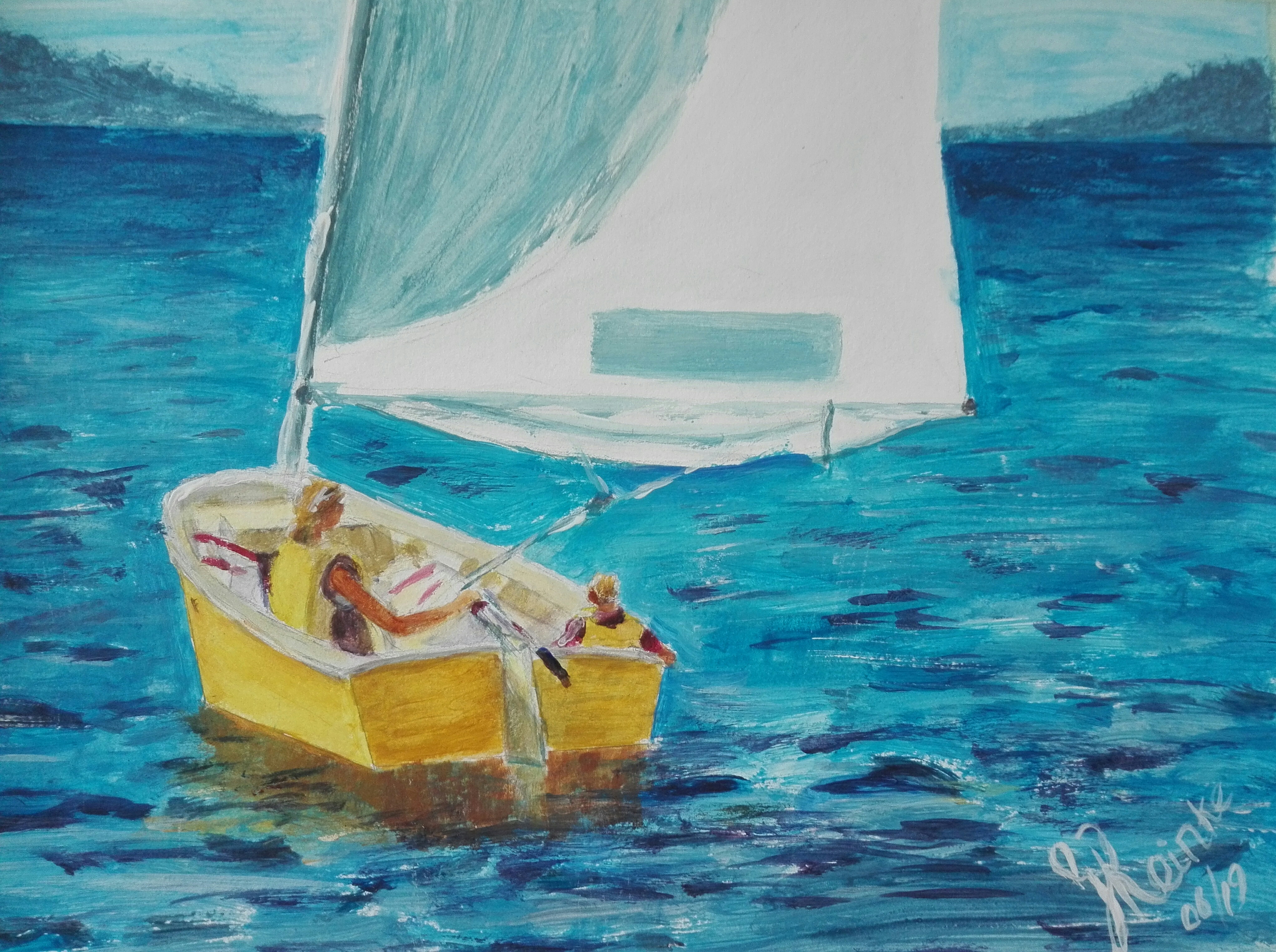
"Gone Sailing" Acrylic on linen, 24x32 cm by Genevieve Reinke
Good work Genevieve, I like the subtle change to the composition by making the boat a little smaller within the painting which gives it a sense of space.
Your use of colour is good, but pay attention to your values (how light or dark your colours are), for example the shadows at the back of the boat could be darker in value as well as the shadows of the people within the boat. If you are unsure of how light or dark your values are within the subject you are painting you can either switch the reference photo to black and white, or squint your eyes when you look at the photo. The figures heads need enlarging. Other than that you are doing well, great job!'
"Sailing Away" by Elena Sokolova
Great work here Elena, your colours and values are working well, your brushwork is fluid and not overworked and I like the additional detail in the water. All good!
Login to your account to post a comment.