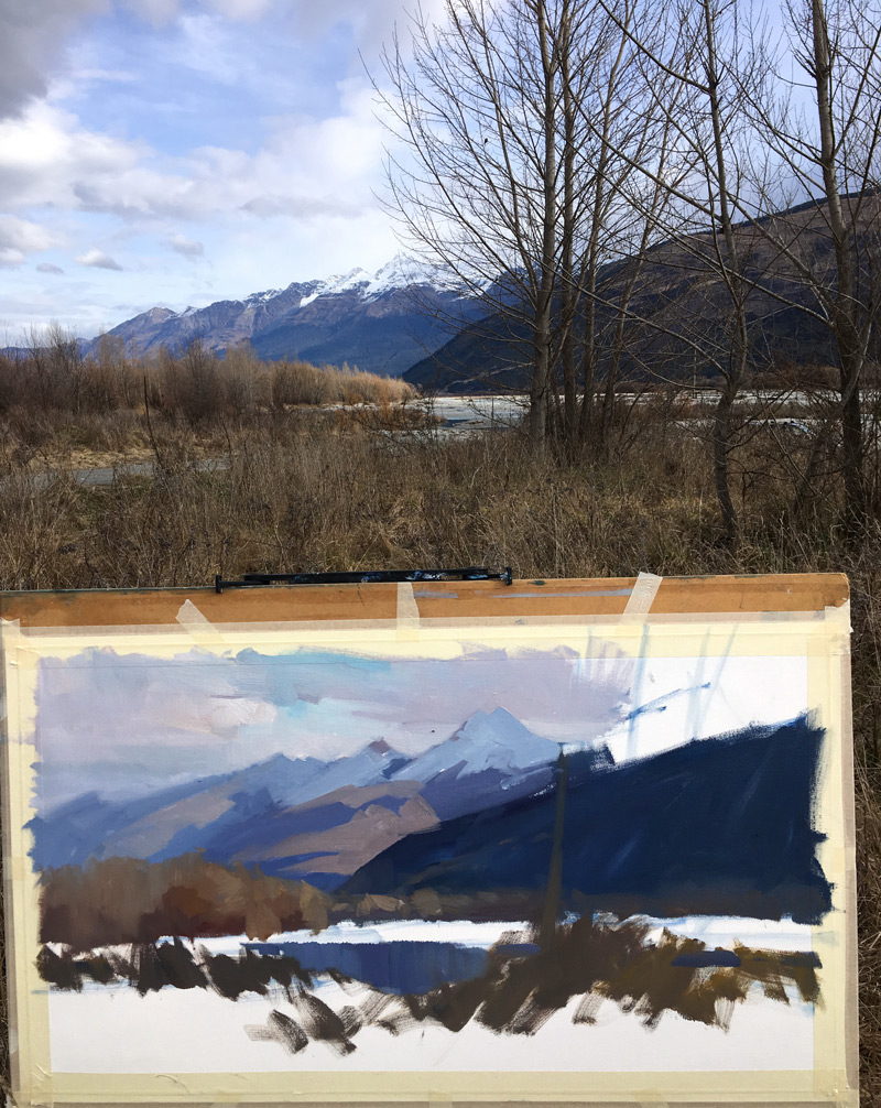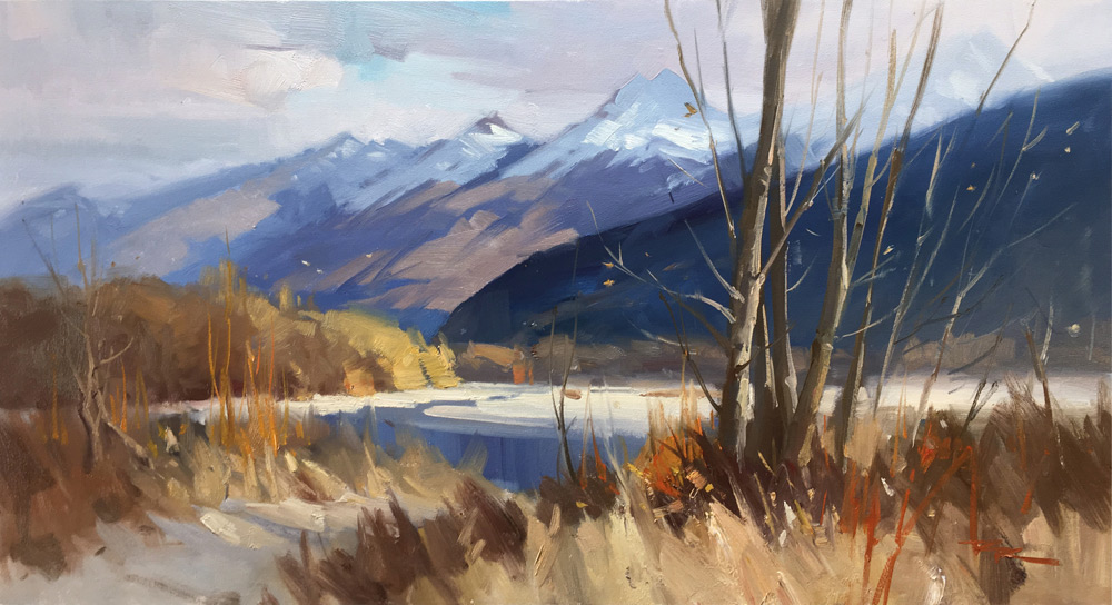

One of the easiest ways to make a dynamic design is to play dark shapes against light shapes and light shapes against dark shapes. You can see that happening all through this painting. Wherever there’s a dark shape I use that to show off a light shape in front of it and wherever there’s a light shape I use that to show off a dark shape in front of that.

I’ve also intensified the effect by over-darkening and over-lightening - in essence raising the overall contrast to make a more exciting image.
Videos lessons about painting mountains: https://mypaintingclub.com/shop?type=Online&p=1&paint=mountains
Login to your account to post a comment.