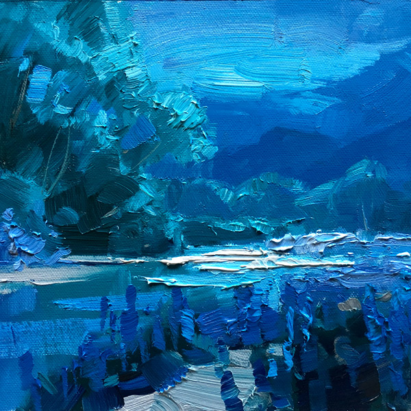
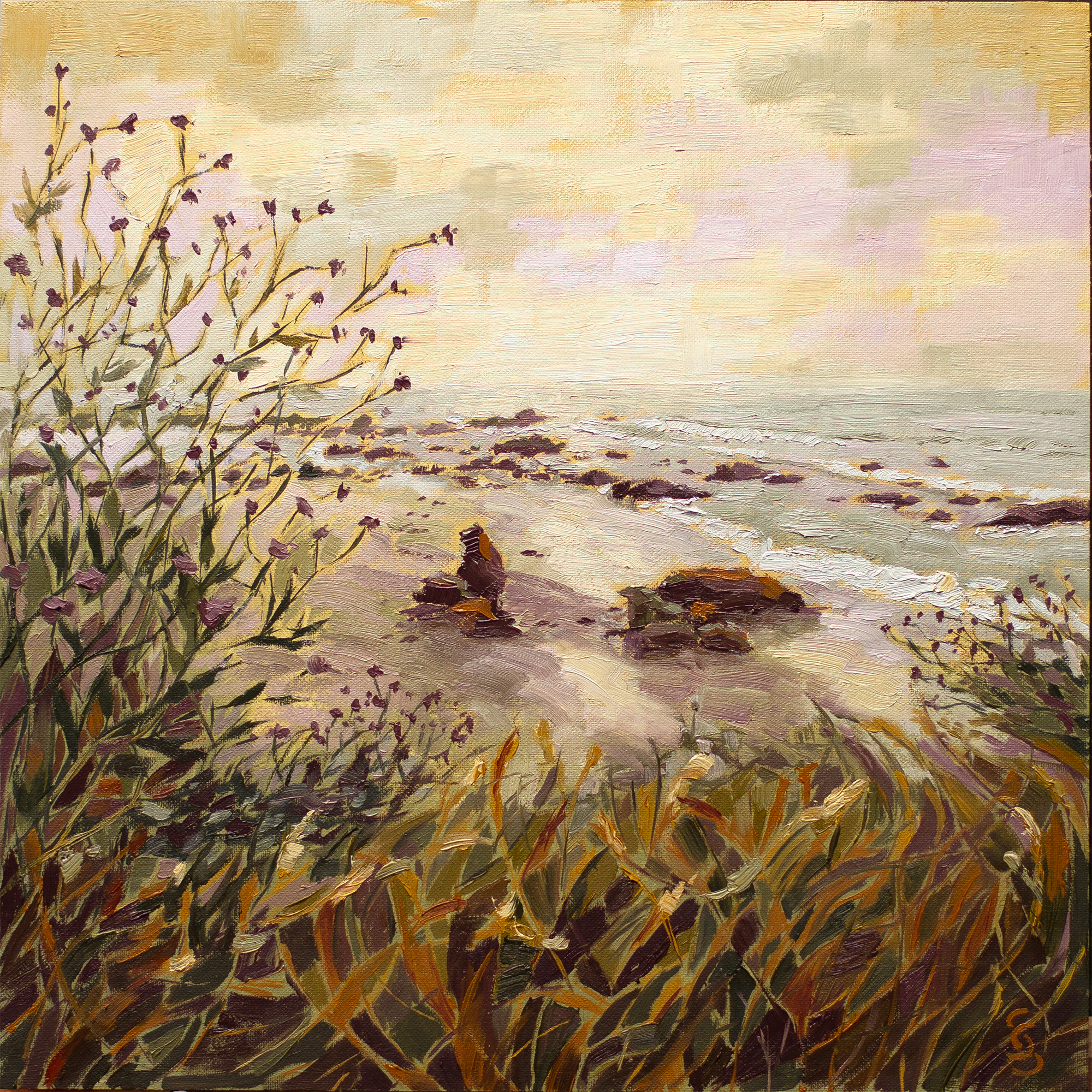
Hollywood has mastered the art of manipulating our emotions visually by creating colour moods for each scene. It’s called ‘colour grading’ and you can do it too in your paintings.
The Free Gamut Mask Tool: https://mypaintingclub.com/gamut-mask
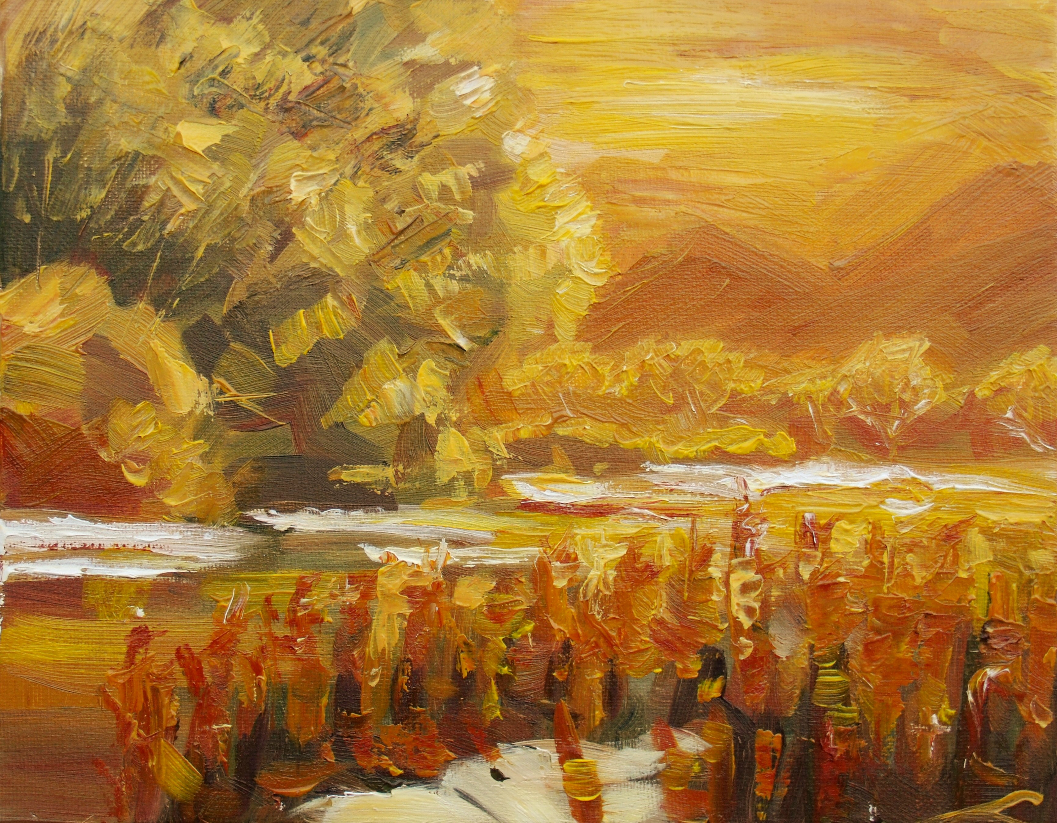
Lupins, energy mood by Elena Sokolova
Good job Elena, your colour scheme is glowing with warmth and light. Love the energetic impasto brushwork.
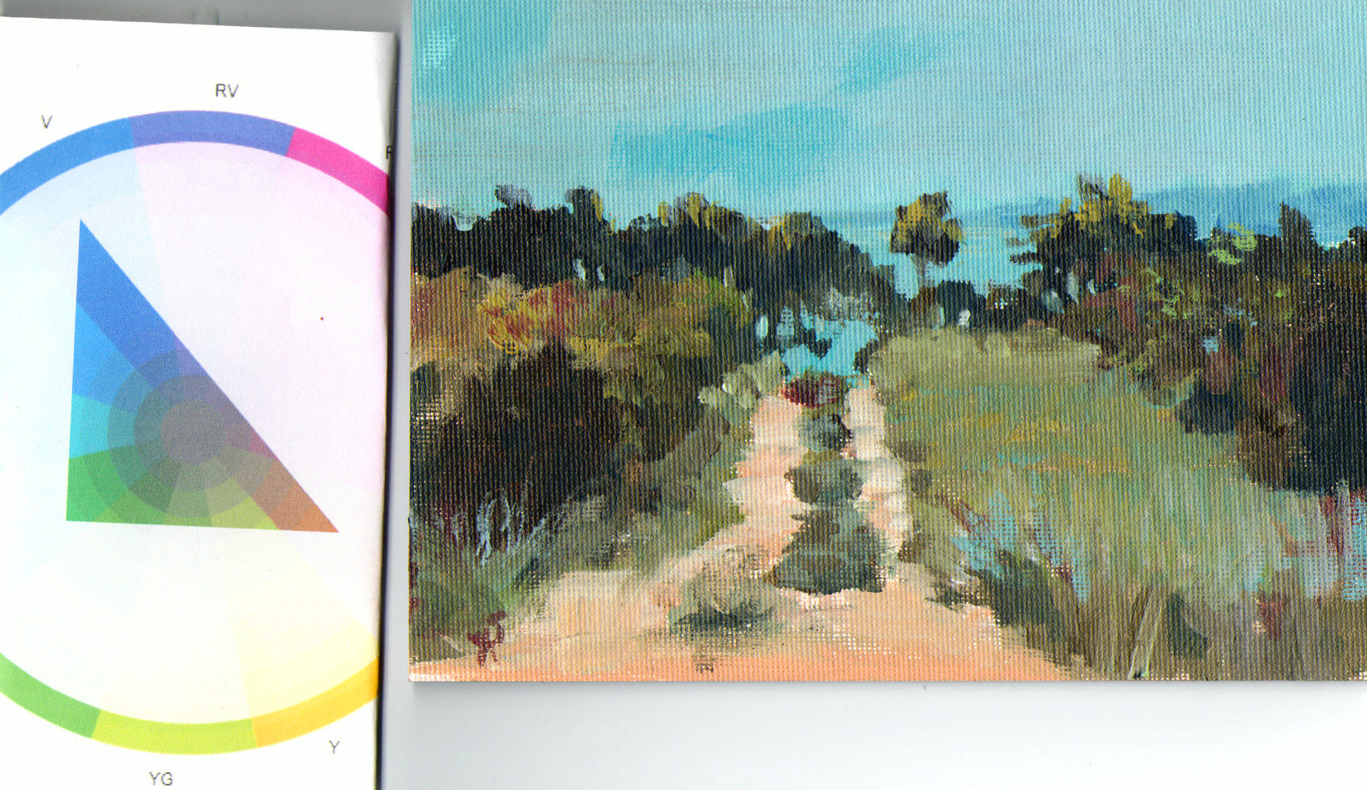
Highway_1_Morning_Beach_Zorn_Warm by Silke Sauritz
Great work Silke, nice to see the Zorn palette with no blue in action in a landscape. Really interesting linear design in the plants contrasting with the broad brushwork in the background.
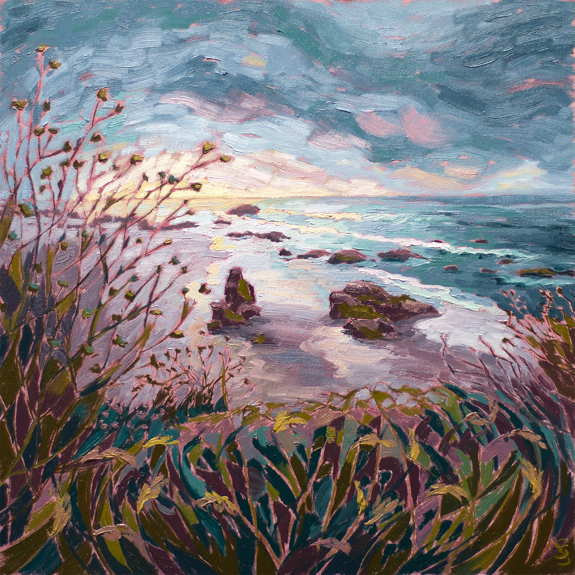
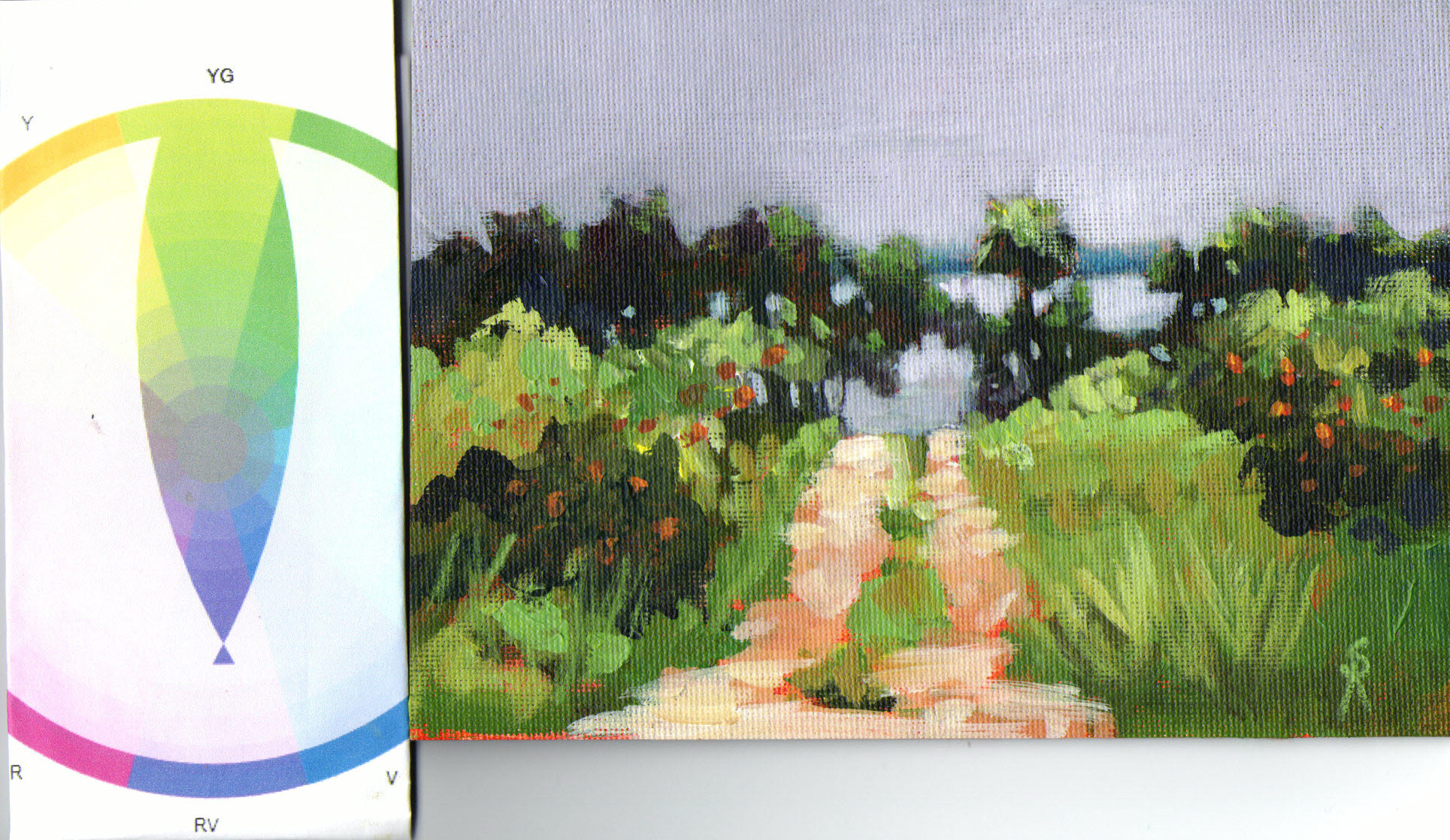
Highway_1_Morning_Beach_RP_BV_BG_YO by Silke Sauritz
Really interesting to see the difference that a change of colour scheme makes in your two paintings Silke. Great to see that you took the opportunity to alter the design in the sky as well and wonder if the colours might have prompted that decision in some way - grey clouds in a turbulent sky versus placid blocky clouds in a warm sky. As a painting I think this one works better with the sky echoing the motion in the foreground. Beautiful!

Color Mood Cheerful by Sharon Repple
Color Mood Overcast by Sharon Repple
Hi Sharon, great work on this and your other colour study. Looks like you've got the technique down pat. Interesting now to see how you might use this technique in the future.
Bright Summer Day on the Salmon River by Nancy Sands
Great spotlight effect on the hills and colour gradation through the tree, Nancy. Simplifying the detail on the water in the background and reducing the size of any details there will help create more distance there. In broken water the reflections of the hills wouldn't appear so strongly. I'd either subdue the reflections with more sky reflections or remove the waves.
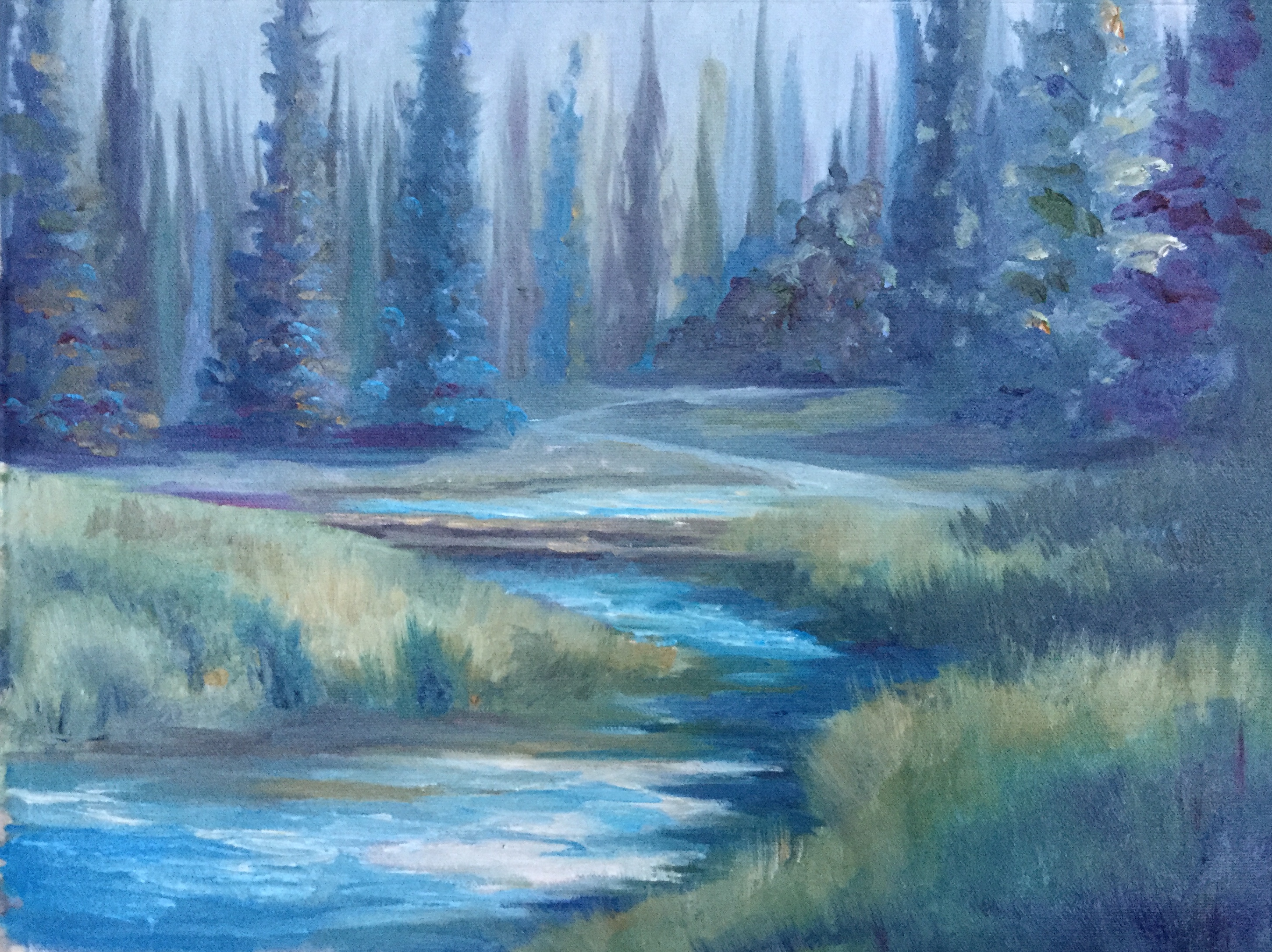
Quiet in the Gray by Nancy Sands
Hi Nancy, great use of a calming blue-green colour scheme to enhance the mood of an already calming scene. Beware making trees the same size and shape, even if they are in the photo. Building tree groups as family groups helps avoid that - a large father, smaller mother and several different sized kids.
Student critiques are made as part of the monthly online workshops available to all Premium Members.
Login to your account to post a comment.