Ever had trouble mixing a true mid value on your palette? Don't know what that is or why it's important? Here's a handy palette insert I've made for you to help with that and a bunch of other stuff. Just print it out on photopaper and put it under a glass palette. Hey presto, easy value comparisons and a colour wheel to boot. Nice!

To download it, right-click on it and choose 'save target as' or 'save image as' or something similar and save it to your desktop or somewhere else you'll be ableto find it easily.
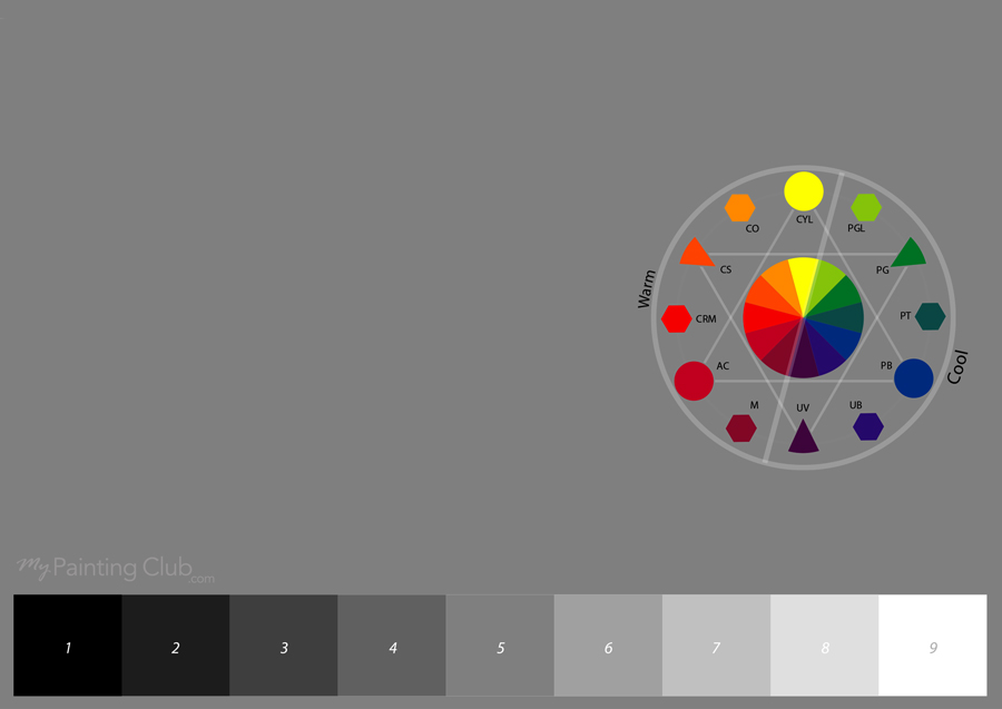
The little letters on the colour wheel standard for tube colours you can use for a well balanced palette.
CYL = Cadmium Yellow Light
PGL = Phthalo Green Light
PG = Phthalo Green
PT = Phthalo Turquoise
PB = Phthalo Blue
UB = Ultramarine Blue
UV = Ultramarine Violet
M = Magenta
AC = Alizarine Crimson
CRM = Cadmium Red Medium
CS = Cadmium Scarlet
CO = Cadmim Orange
Want to learn more about the CRITICAL importance of value in your paintings? Check out the Mastering Color course. Say NO to muddy colour! Go on, say it.

Login to your account to post a comment.