5 Student paintings critiqued by the esteemed John Crump. Enjoy.
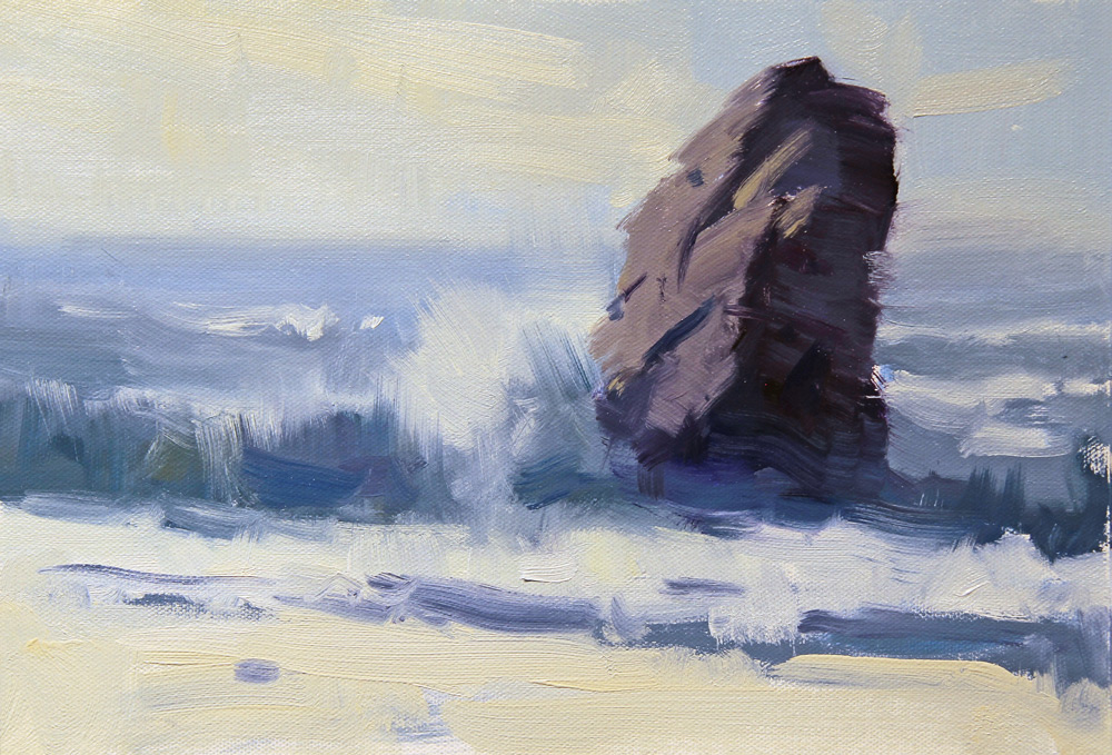
Demo Painting:Rocks and Waves by John Crump
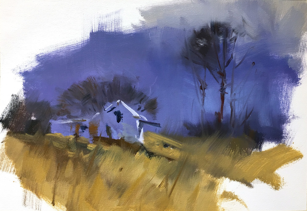
Demo Painting: Trees and Grasses by John Crump
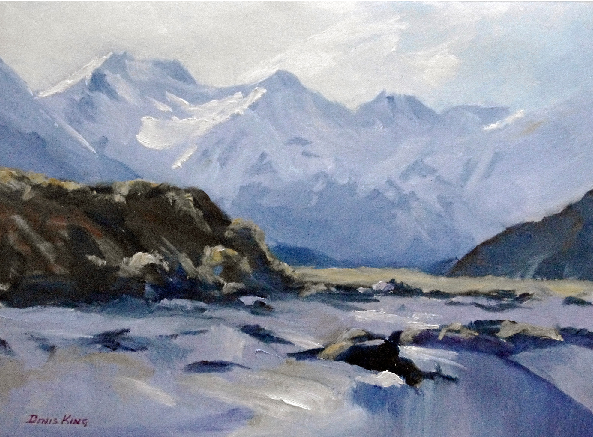
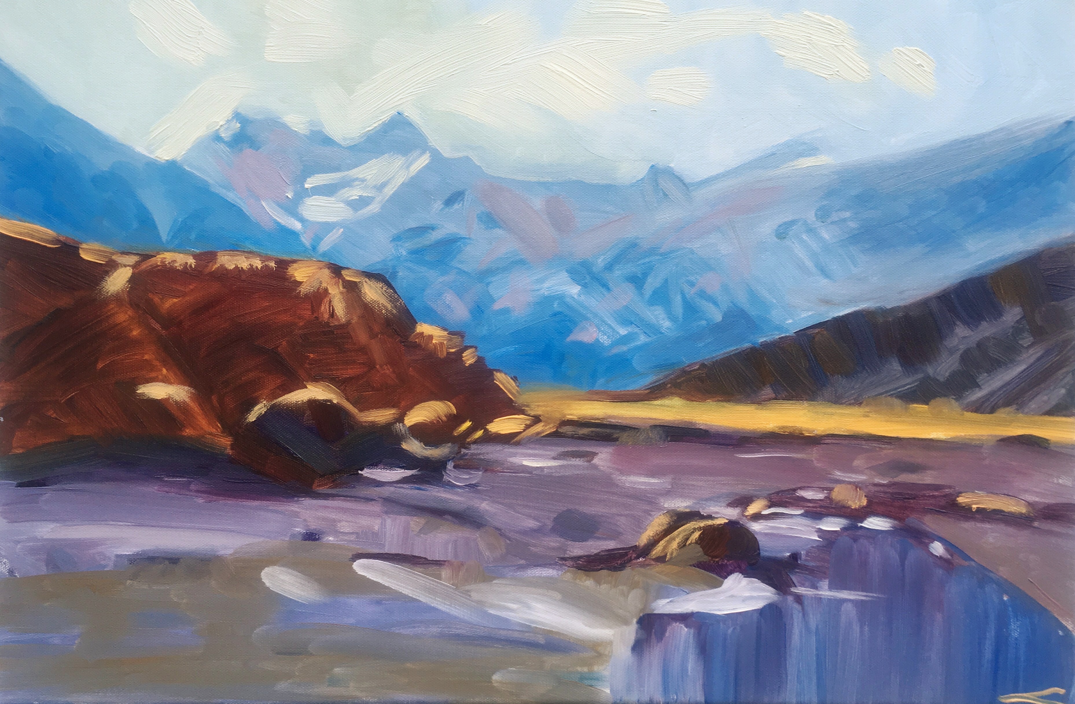
Demo Painting: Mountains and Water by John Crump
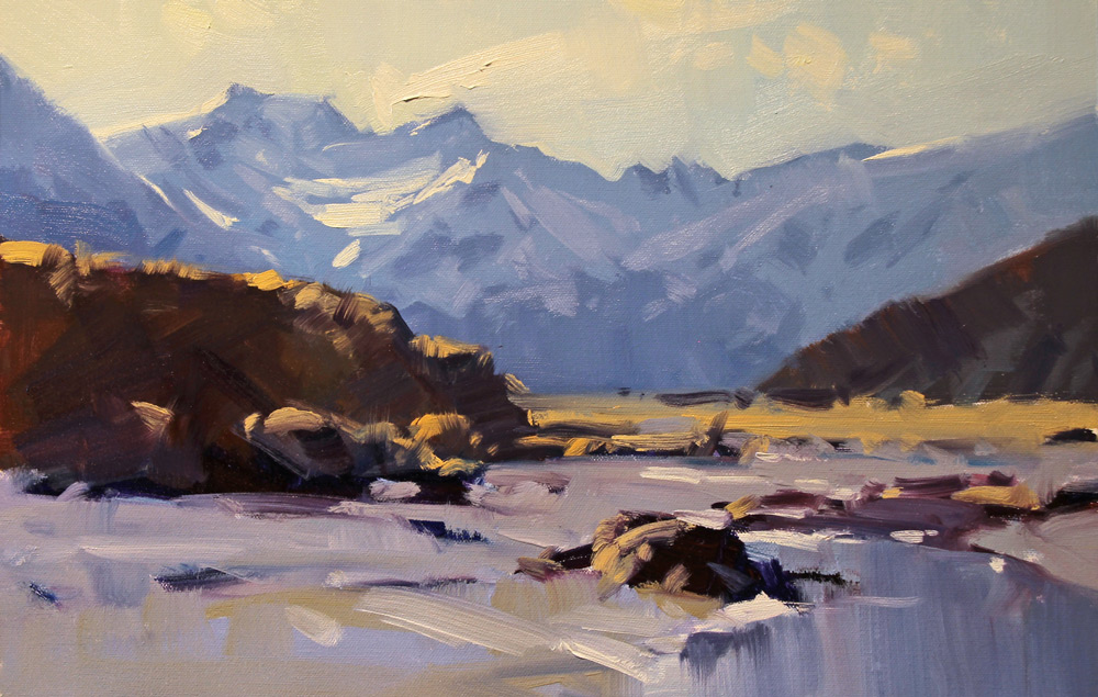
Denis King
This is a very good effort Denis. A lovely sense of atmosphere and a very good example of how we can create distance with our use of colour and tone.
Nice broad brushwork helps to give a sense of strength and vitality to the painting.
Two points that could give the painting even greater vitality. To put it simply - stronger complementaries, especially in the foreground, would be more dynamic against the cool blues of the mountain range in the background.
The colours in the foreground could be warmer - the shadowed bank needs more ochre or perhaps orange and the tussock clump highlights on the bank could be much more bronze / gold ochre. Also the sandy areas in the foreground needed to lean more towards warm greys. However, a very nice painting.
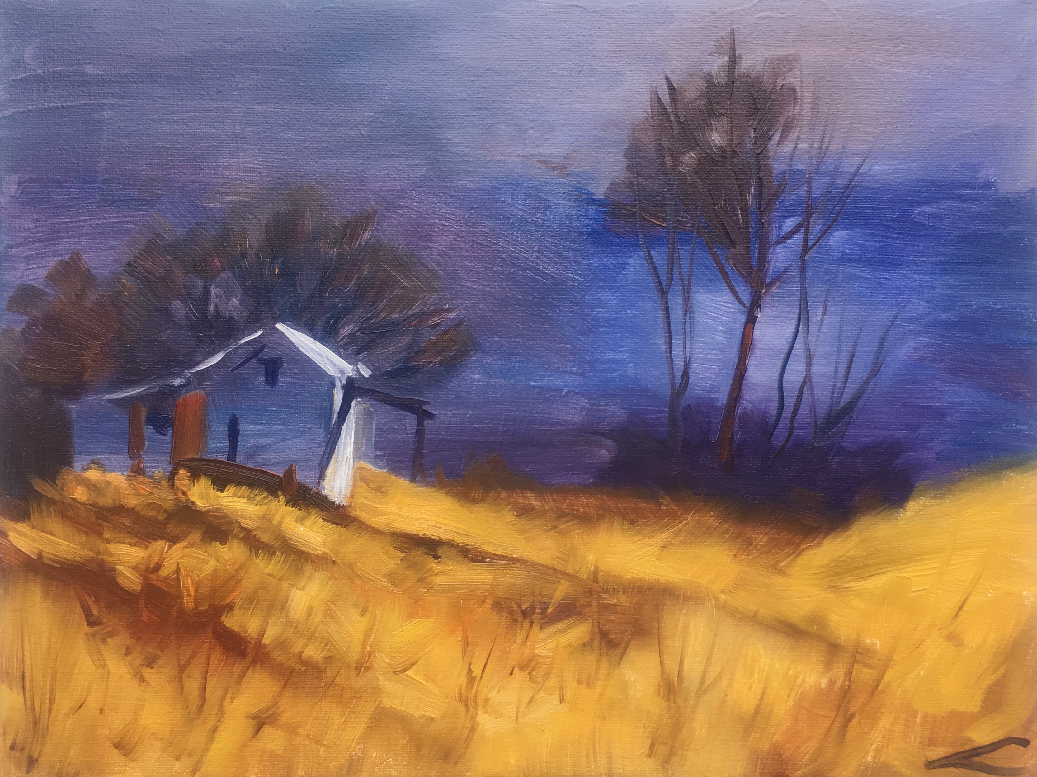
Elena Sokolova
This is courageous Elena as the demonstration I did in the DVD was made up of three disconnected sketches that you have needed to pull together for me!
Three main points come to mind for you to think about.
1 In your painting, the building has become the main point of interest. Therefore, it needs to be a little closer to the centre of painting. It is positioned too close to the left-hand side of the canvas. It makes it feel uncomfortable - too squeezed in.
2. You may notice that there is a lack of a colour theme in your picture. The very blue grey background and the foreground grass have no connection with one another. They are needing some intermediate colours that lead the eye gently from the foreground to the background in a series of subtle changes so that the colours work with each other rather than one opposing the other.
3. Lastly, I notice that you have used a small brush to draw the foreground grasses. It's good to avoid this if you possibly can - large brushes will do the job better and will look more relaxed.
Overall, I think this is a very good attempt at a difficult subject.
Elena Sokolova
This is a nice bright painting Elena that looks full of life. Nice broad brushwork.
I would suggest that a more gentle blue at the foot of the mountains may have helped the foreground and background to work together better. By that, I mean that the colours in the bank on the left and the blue of the mountains behind are too “chromatic”. Too close to being complementaries that are both fighting for supremacy! Just a little more subtlety will do the trick.
I am not sure why you added those grey areas in the snow. They look slightly dirty. The light blue colour in the shadow snow was far better without it.
I do admire your courage in applying the paint in the way you have. It's great to see confident strokes!
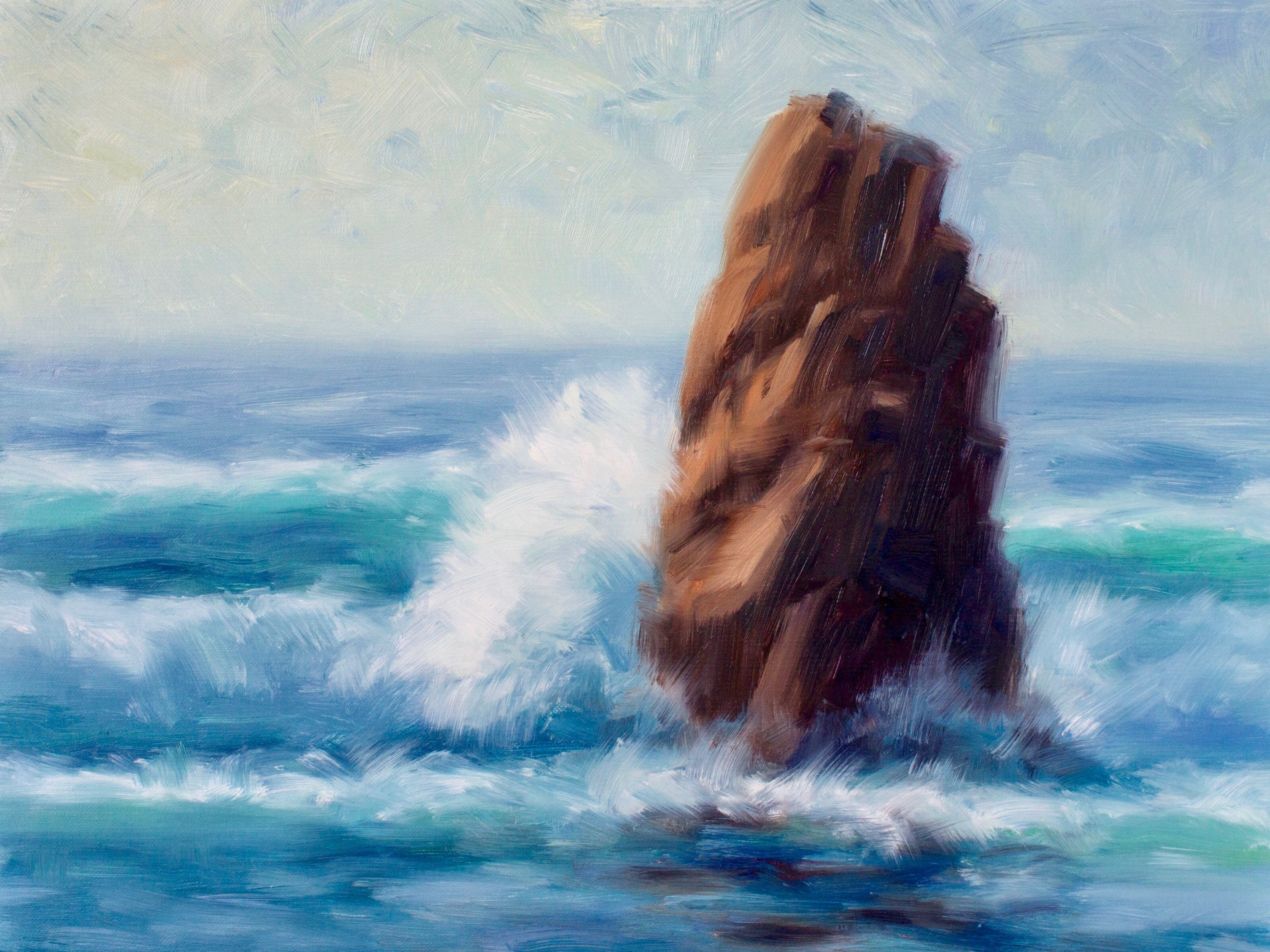
Eugenia Vracovska
This painting has a great feeling of airiness and sunlight Eugenia. A good effort at what can often be a very difficult subject - especially when you consider that you are trying to convey the movement of water in a convincing way. Not easy!
There are two main points to consider in this painting.
1. You will notice that in my painting, the rock is smaller in the canvas. This is deliberate as I want the rock and the sea to work together in their setting - not for the rock to be dominant.
2. Watch out for patterns! They can detract from what you were trying to say. In this one of yours, the waves are very equally spaced. If you try to see the painting with a fresh eye, you will see that the waves have divided the sea into four roughly equal parts.
This is just one example of pattern making. The same is true of your rock. Notice that you have divided the light side into four roughly equal slices.
If you live by the sea, it's worth going out to the coast and studying the waves, the rocks, the light on the water, etc, until you feel that you know it well. Perhaps take some movies so that you can study it further when you get home. I find the sea a beautiful subject to paint - especially
when painting outdoors. Very stimulating!
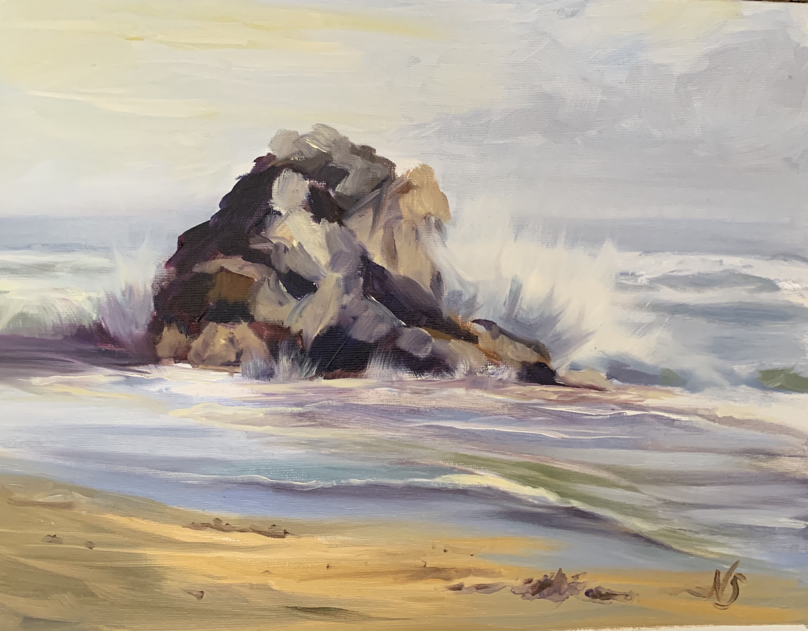
Nancy Sands
This too is a daring subject Nancy. You have made a very good job of capturing particularly the lighting. Throughout the painting there is a strong sense of a colour theme that works well with this subject.
Two small points.
1. You have gone to a lot of trouble painting the rock showing all of its faces, ridges, and hollows. It has broken up the rock in a distracting way. Try to keep the basic shapes in mind. Squint if necessary so that you see it's main characteristics, not all the details.
2. Have a careful look at the spray coming over the rock. You will notice that the shadow area in the splash speaks more of your brushstrokes than it does of a blast of minute drops of water. Try using a big dry brush and when both the shadow and light areas of the spray have begun to dry, brush lightly over them to soften the edges. Don't overdo it! Just a little is enough.
Overall, a very nice piece of work.

Get this lesson: https://mypaintingclub.com/lessons/179-Expressive-Brushwork
Login to your account to post a comment.