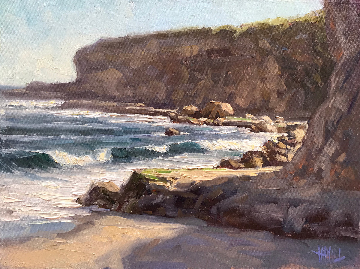
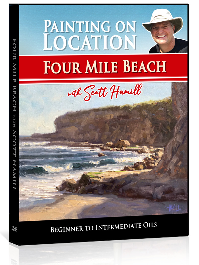
Join California plein air artist Scott Hamill painting on a west coast beach along the beautiful pacific ocean. Scott demonstrates his step by step process of painting the coastal bluffs and ocean in an impressionistic and painterly style.
Learn About
- Composition and design
- Simplifying a complex scene
- Blocking in the scene to quickly cover the canvas
- Value and color temperature relationships
- Bring your paintings to life with color theory
- Techniques to create depth in your paintings
- Painting with loose and energetic brushwork
- Plein air painting equipment and materials
Critiques by Scott Hamill
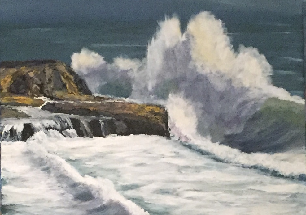
'Sea Spray' by Barbara Magor
Bam! Love it! Soften some edges along the base of the cliff where it meets the water and break that line of the darks in the wave foam under the big wave and you've got a winner. Always be aware of where your eye travels through the painting. if it stops on one spot for too long change something. Decrease the light/dark contrast, soften edges, decrease color intensity to keep the eye moving. you want your eye to travel to your focal point and to stay there for just a bit longer than the rest of the canvas.
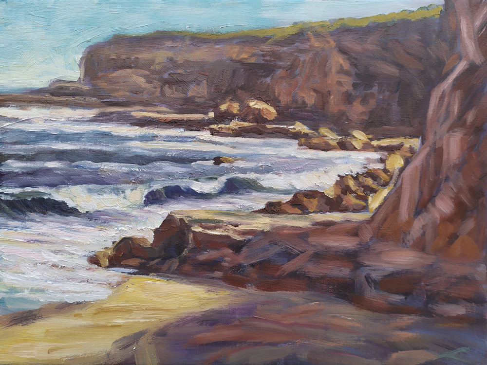
"Four mile beach", oil, canvas, 30 cm x 40 cm by Elena Sokolova
Hi Elena. You're a really good painter! I can see the hand of the artist in your brushstrokes. I think it was Emille Gruppe who said he would rather see a painting created with bold, courageous brushstrokes that may not be perfectly drawn than a perfectly rendered piece with careful, little dabs of color so intently put in just the right place. I think you've accomplished a very painterly and loose piece here. I especially like the foreground shadow. It has a feel of being created digitally. I would encourage you to paint this again but allow yourself to bring more of your own interpretation to it. You have the skills to let your intuition guide you to create a painting that comes from your heart.
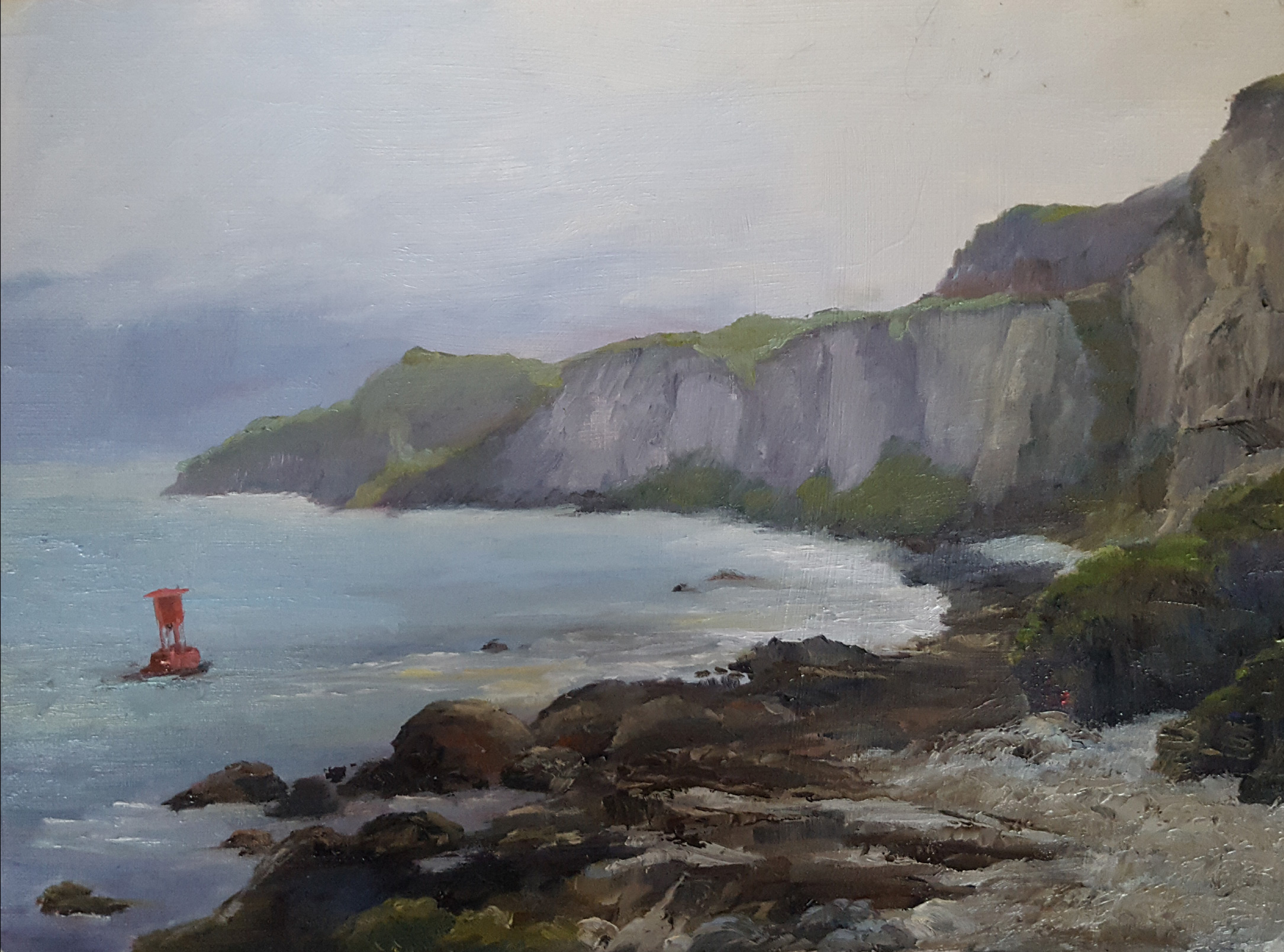
"Antrim Coast, Northern Ireland" by Mairo Piroue
Well done Mairo! Great shapes and feeling of distance. The red buoy adds a nice pop of color and interest to an otherwise tonal piece. Lovely feeling of a cool, foggy coastal day. I would suggest the painting could be improved with a bit more edge variation. The top of the headland has a pretty continuous hard edge along it's length. Try softening the edge in places to keep the eye moving back down into the composition and soften the edge as it gets to the right border of the canvas to keep the eye from traveling out of the scene. One thing to be careful of is the horizon line being right in the center of the canvas. In this piece it is not as evident because the headland and foreground have so much weight but it can be boring to see a canvas cut into equal halves either horizontally or vertically. Even without any changes you should be proud of this painting. Solid work.
Hi Sherry. Way to go after it! Some good stuff here. Very dynamic feel to this painting and I can see you've worked on the atmospheric perspective technique of warm foreground and cool distant headland. This appears to be a small canvas which can, if too small, make brushwork soft and difficult to keep clean. There are some areas that are a bit muddy which often is a result of overworking the canvas with too many brushstrokes in the same area. If you feel like you an area is losing its chroma and getting muddy it's better to scrape off and repaint with the correct color, value and temperature mix.
I can't tell if the photo is angled but your horizon, headland, and other shapes are listing to the left. This makes the viewer feel off balance and uncomfortable so be aware of that when drawing initially and when correcting toward the end of the painting. Lastly the temperature relationship is correct from warm to cool but the foreground shadow on the rock cliff is too warm and the distant headland is too cool. Paintings that sing have beautiful relationships between color, temperature, shapes, etc. These relationships are important to understand to push your paintings to the next level. Thanks for submitting your painting for critique. We all get to learn and stretch by looking at other artist's work.
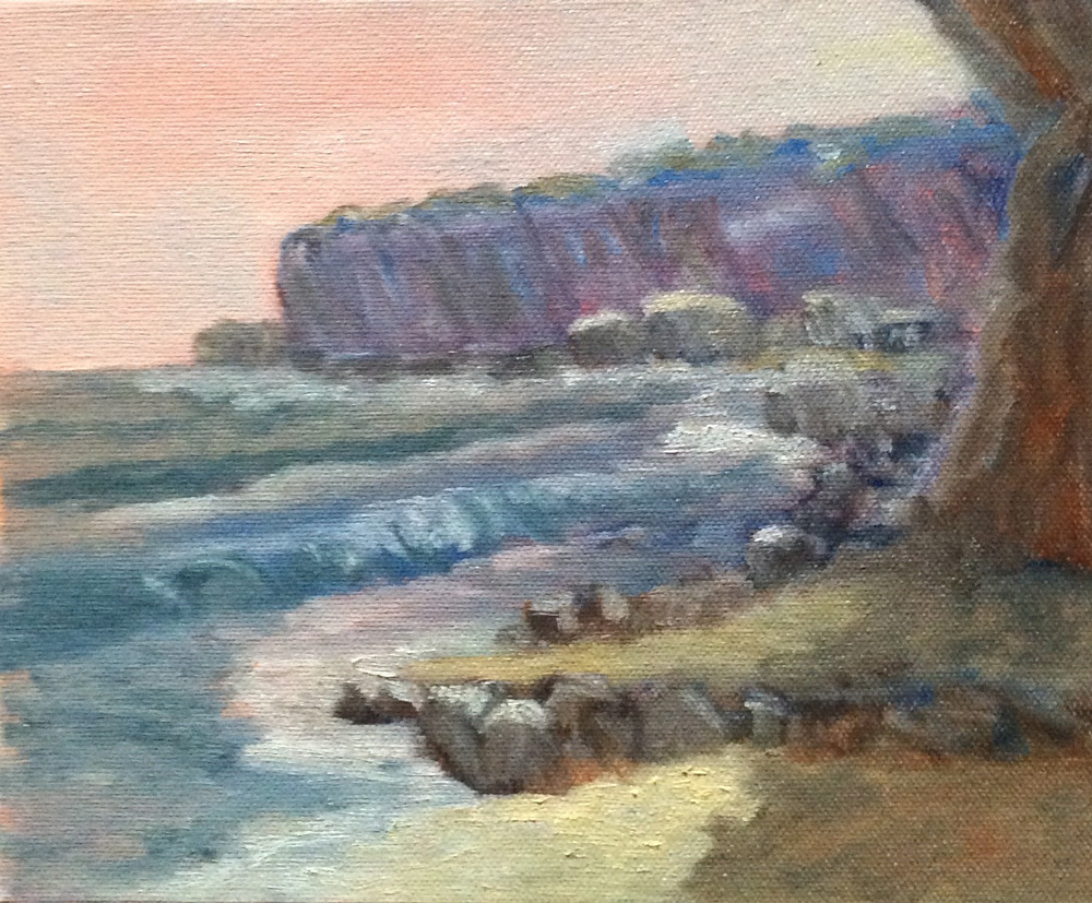
"Four Mile Beach" by Nancy Newton
Great effort! Lots to be happy with here. Nice reflections in the foreground puddle. Well constructed headland. Great color in the ocean. Nice light on the focal point rocks. Some things to work on: Try graying the green foliage at the top of the distant headland as it moves away from us. Keep the color more intense toward the right and add some of the green's compliment to gray it as it moves toward the left of the canvas. Be careful of the angle of the waves. They're a bit steep and that can make the ocean plane feel like its falling off the canvas. Good work, now get outside and paint a sunlit scene to practice seeing into the shadows with your own eyes. There's a lot of beautiful warm and cool moments in there!
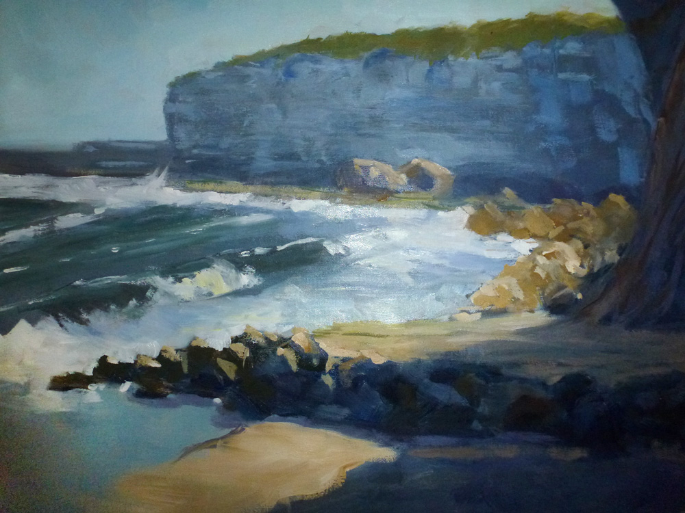
"Four Mile" by Sharon Repple
Hi Sharon. Excellent work! This painting really feels like the place. I appreciate the calm cove and warm light. Very calming piece. Well drawn and the design leads me through the canvas nicely. Shapes have become forms with excellent value structure. If I could be picky I'd like to see the foreground shape and background headland have a bit more variety. They feel pretty equal in how much canvas they occupy and both end at the same spot on the left vertical line. Try pushing the foreground rock shelf back a bit (shorten) and I think you'll have less of a feeling of two similar shapes. You'll notice in the reference photo the foreground shelf has some cuts and irregularities that could also be exaggerated to create some difference. Put a frame on it and get it under a nice light! Great piece.
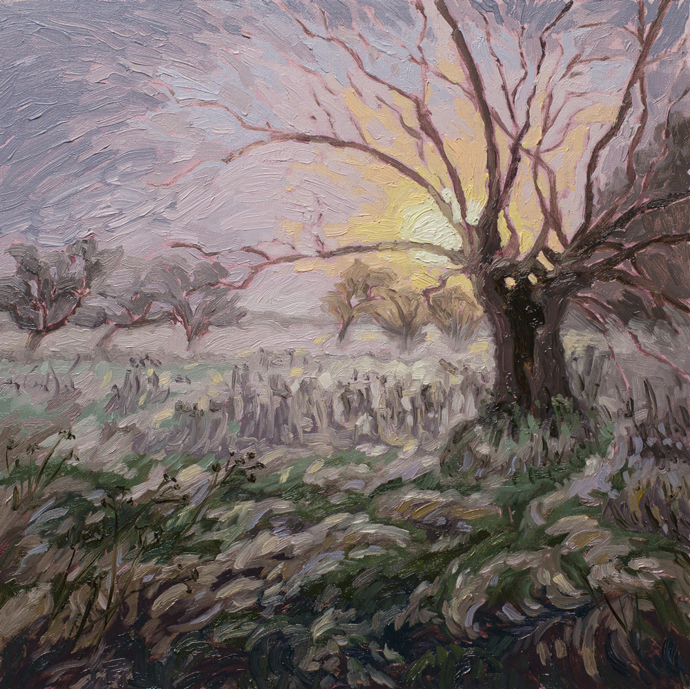
"Morning Mist Willow", 30x30cm, oil on panel by Silke Sauritz
Hi Silke! I've enjoyed seeing your recent work on facebook! It has been really beautiful. This is no exception! Love the directional brushstrokes and cool/warm color relationship in the sky. Nice tonal control as well. It may just be my interpretation but I feel like the amount of sunlight I see would be casting a shadow behind the tree. If the sky is cloudy or foggy than you've captured it just right. This is the kind of painting that is a treat to see in person because of the beautiful texture in those fluid brushstrokes. Lovely!
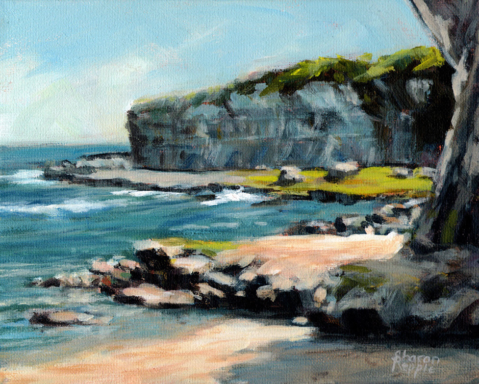
"Four Mile Beach", Oil on Paper, 40x30 cm by Genevieve Reinke
Well done Genevieve. Lively and colorful feel to this piece. I like the energy in the ocean waves. Just a few suggestions...
To help with the feeling of distance in a painting remember that in general colors coo and gray as they recede. The distant headland and rock shelf below it are a bit warm(orange, red, yellow) which brings them forward. Try using that color mixture in the foreground and cool (blue, violet) the headland and I think you will see how atmospheric perspective can create the illusion of depth. The foreground shadow and light reads well but the distant headland is not as well defined as to whether it is in light or shadow. It is very important to keep everything in either the light family or shadow family. Value structure can be difficult to grasp when color is involved. Try drawing the original scene in just three values, light, mid tones and darks with a black sharpie on white paper. Lastly, be careful to create variety in your shapes. Those two small rocks back there look like twins. Overall you should be happy with this painting and I think you have an excellent feel of the day here.
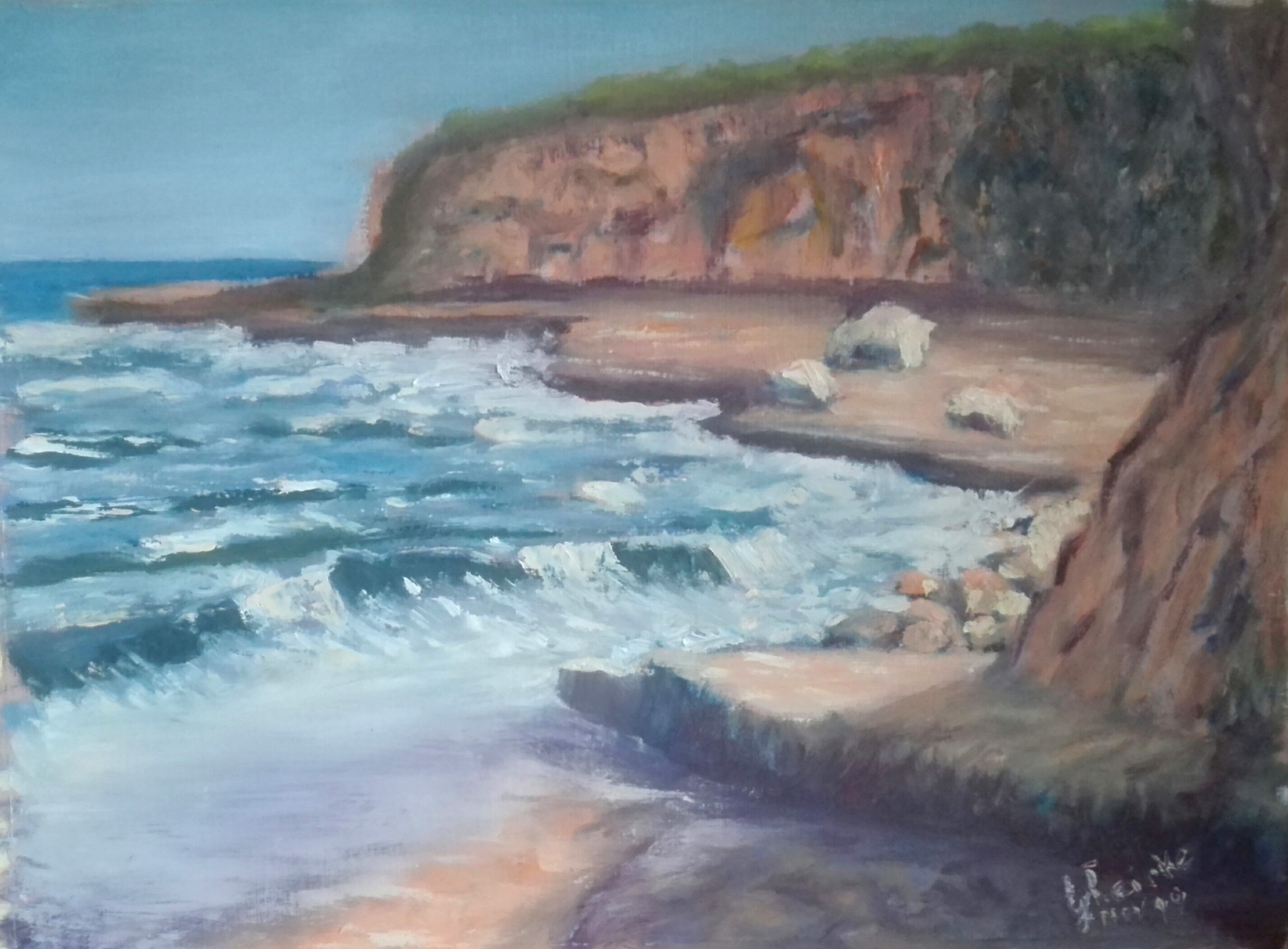
"Four Mile" by Michel Boulay
Great feeling of light and shadow here Michel. Well drawn and nice contrast makes for a very strong painting. Great loose brushwork creates an energetic piece. My only suggestion would be to make the curved line of the foreground cliff shadow a bit less regular. try cutting into it with the background or add a slash or two of shadowed color to create an implied edge or step in the cliff face. As I look at it again I might try softening the distance wave foam with a clean dry brush just touching and feathering the paint so that you create a feeling of movement which won't draw the eye so strongly. Great job!
Student critiques are made by the tutor of the monthly online Group Workshop here at mypaintingclub.com. Join Us to be part of the fun and great learning.
Login to your account to post a comment.