5 Student paintings critiqued by the esteemed John Crump. Enjoy.
Before making comments on specific paintings, I perhaps should mention that all of these paintings could be categorised as ’impressionistic’ (but inclining towards attempted realism) in style.
I have always understood ‘impressionism' to mean what we would see and absorb with a brief viewing. In other words, it’s more about the feeling of the place or subject, how it impacts us, rather than a detailed study that demonstrates a much more painstaking style. The word 'impression' speaks for itself. We could say that it is a way of allowing the viewer to complete the painting in their own mind rather than stating every detail for them.
If we try to include every blade of grass, all the details in a tree, et cetera, we run the risk of overload – too much information, every area of the painting shouting for attention rather than allowing the subject (focal point) to speak out. in fact, any extra detail should be kept for the focal point as it is our centre of attention.
In the words of the famous painter Emile Gruppe, "Every brushstroke should have a reason for being there.” If we ignore that and complicate our work with too many strokes, both the viewer and the painting suffer visual overload. We could say that the painting has been “overworked" – usually a negative criticism.
Obviously, we all want our paintings to be successful, competent pieces of work that capture the viewer’s attention. Therefore, concentrate on the things that will help achieve that goal. Beautiful colours that sing in harmony, good design, lights and darks that give depth to the painting, bold strokes that speak of confidence and the joy of painting.
Lastly, keep it simple! Try to paint with a minimum of brushstrokes. Using large's brushes can help – small brushes cry out for detail – small strokes. They're best left in your easel until you’re ready to sign your masterpiece.
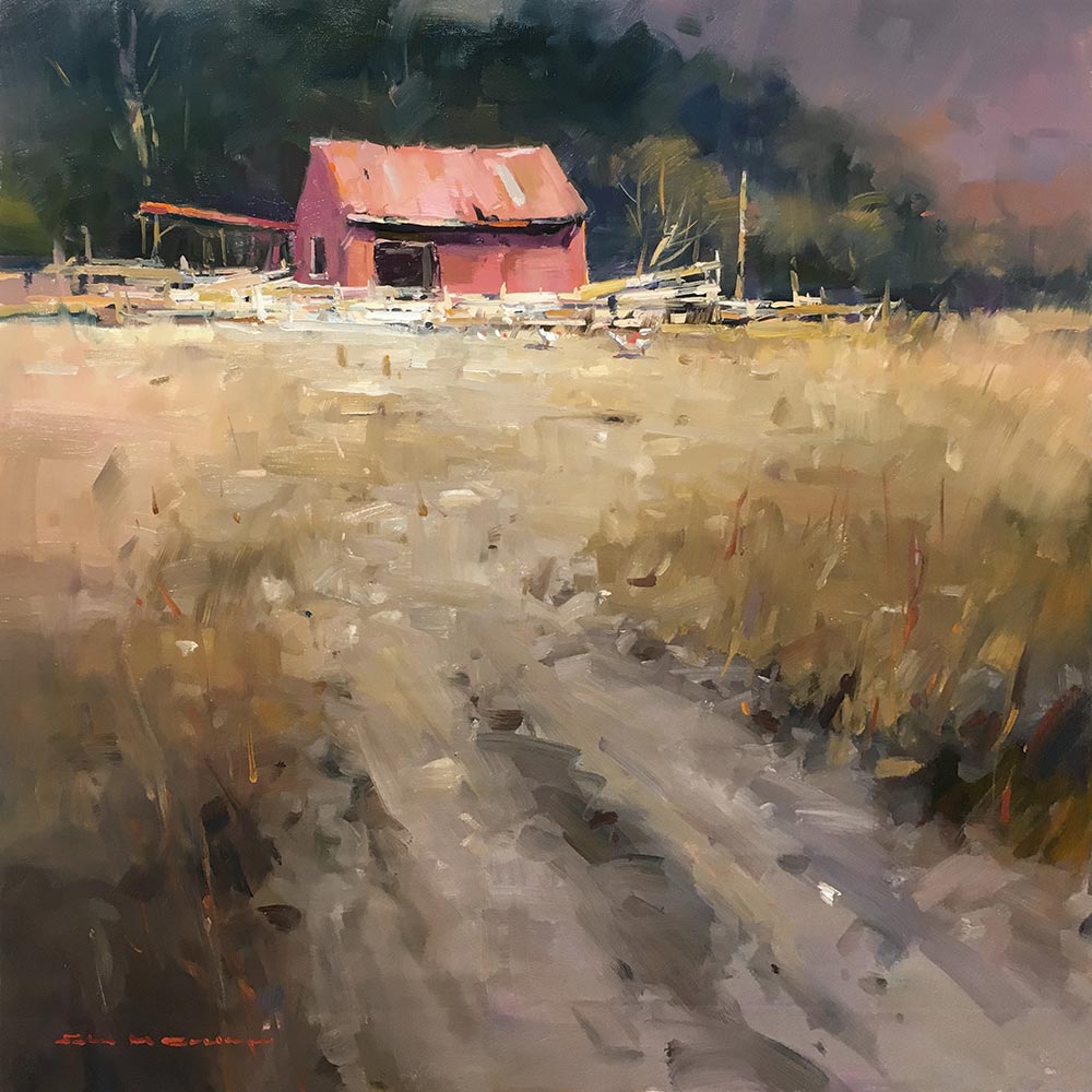
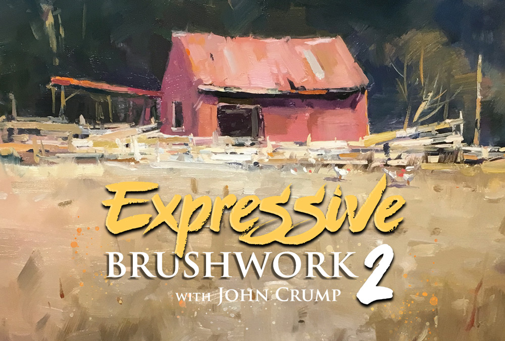
Demo Painting: Earnslaw Station by John Crump
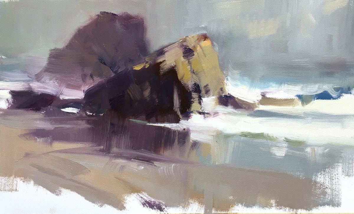
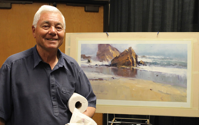
Demo Painting: Wet Sand and Rocks by John Crump
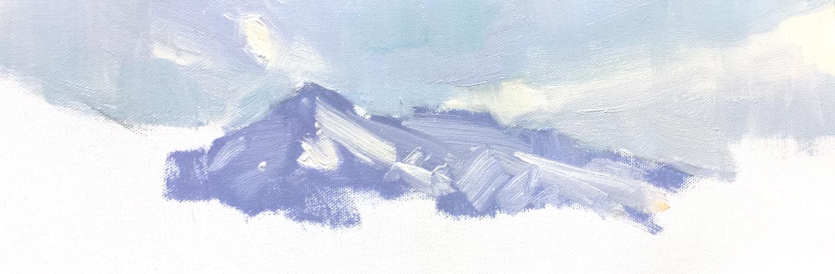
Demo Painting: Clouds and Mountains by John Crump
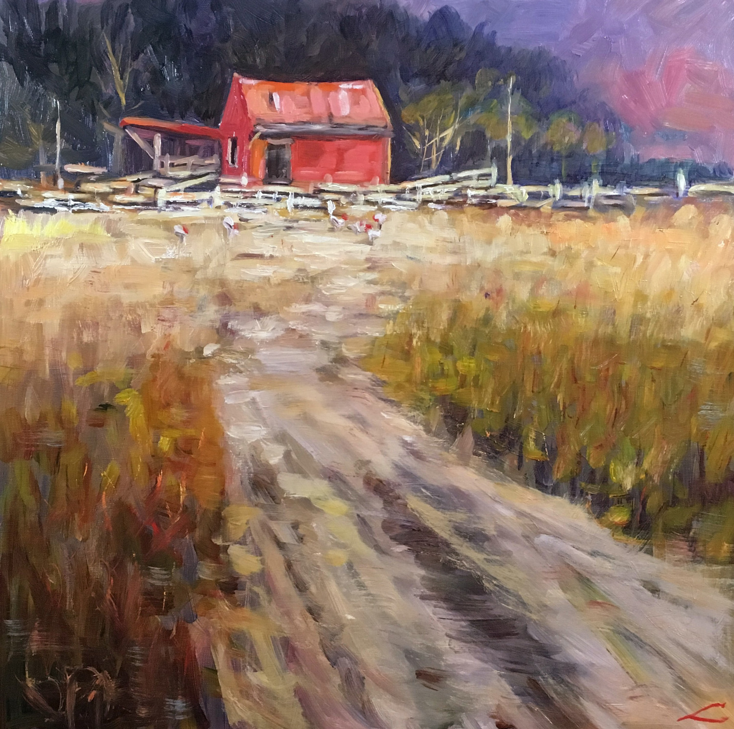
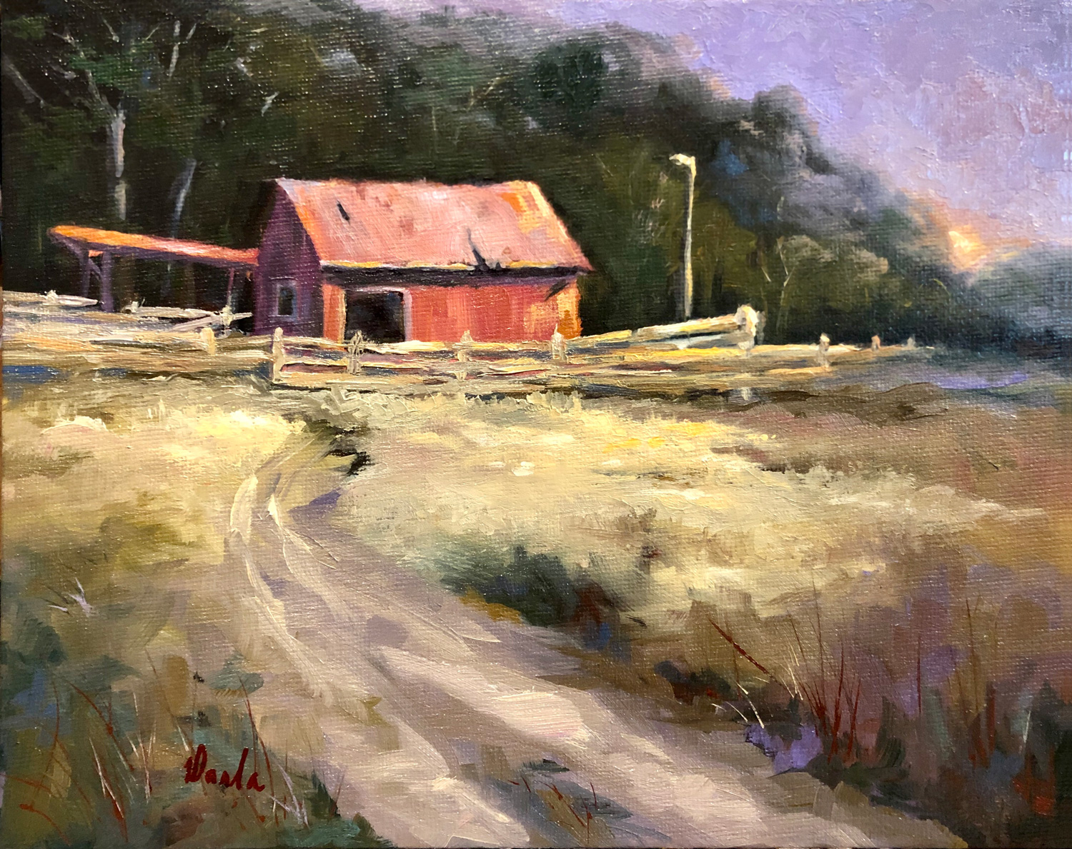
Elena Sokolova.
Well done Elena. You have achieved a very good result in this painting with only one or two things for you to consider. I don’t want to be nit- picky because generally, your colour is excellent but two areas are a little troublesome.
Firstly, the red area on the extreme right of the painting behind the distant trees. That strength of colour is calling for attention – something that you don’t want on the edges of your painting. Just a slightly quieter colour in that area would be better.
Secondly, notice that the colour you have used for the stock fences across the front of the barn are mainly white with little variation. If you look at my painting, you will see that I have deliberately kept the brighter lights on that fence around the focal point – not spreading out across the painting. It is a subtle point but it avoids having people's eyes wander across the painting towards the edges rather than leading them to the barn.
One other point. The grasses in the foreground and the track in the middle distance have a myriad of brushstrokes. Aim for simplicity. A broad sweep of darker colour in the grassy area with a few judiciously placed stalks will do the job without competing with the rest of the painting. Overall, a very nice painting.
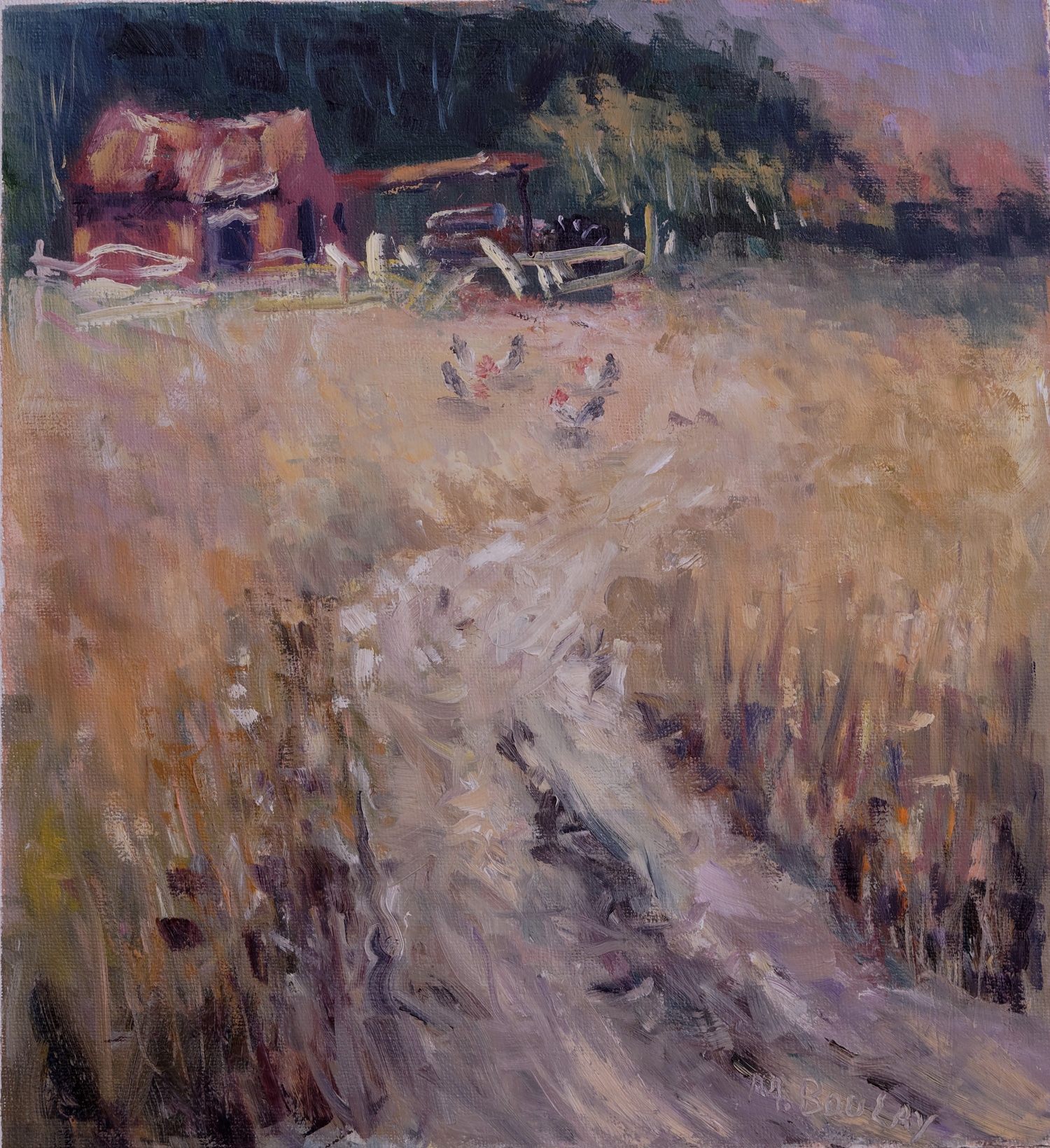
Michel Boulay.
This is a very nice slightly flamboyant painting that speaks to me about rhythm, the curve in the drive, the loose rendition of the stock fences, and the same approach to the old barn. There is almost a 'devil may care' approach to the drawing and brushwork that makes me think that you enjoy your painting Michel. The colours and tones are good but two things need to be considered. You have placed the barn perilously close to the side and top of the painting – it feels slightly squashed in. I like the idea of pushing the boundaries
when it comes to designing a painting, but in this case, I think the building could have had a little more breathing space around it.
The poultry in the middle of the paddock, because of their central position and size, are almost trying to compete with the barn. They would have been better placed over against the stock fence where they would then become a part of the focal point rather than competing with it. I wonder Michel if you felt that the centre of the paddock was an empty space that needed something to fill it and so the poultry got involved? Paintings need rest areas, quiet areas that we should try to preserve.Try not to feel compelled to fill them!
Incidentally, some paintings need a frame to contain them. Because of the vigourous brushstrokes, I think this painting will feel more complete if it is framed.
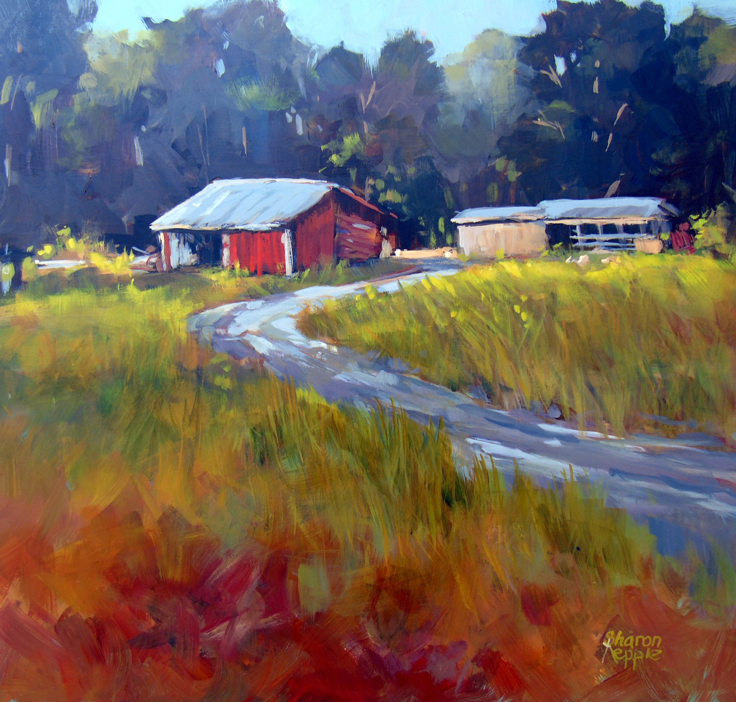
Sharon Repple.
This is a nice, bright and competent painting Sharon with a good feeling of sunshine and shadows. You demonstrate good drawing and brush skills and a nice sense of lighting. However, there is a design problem. The two buildings are too separated so that they are two focal points. Even if they were separate, I would have placed one slightly behind the other so that they connected and became one focal point.
One other thing I feel to mention. The red area in the immediate foreground feels out of place. It is too chromatic against the bright greens in your grasses. It needed to be a darkish khaki like colour – perhaps like the sedge grasses that often grow in damp areas. It would then relate better to the colours throughout the rest of the painting.
Incidentally, several of your trees come to the top edge of the canvas. Much better if they go right past the top, or stop well clear of the edge. Otherwise, a very nice painting.
Deborah Crowley.
This is a great effort Deborah. Nice colour, tones and good drawing. However, there are two things that need your attention. Try to loosen up! Let the brushstrokes show – don’t smooth them out. It takes the feeling of vitality out of your work. Secondly, you don’t need to be so careful with your edges. Notice your painting of the stock fences and the edges of the building – very careful and painstaking.
Painters often talk about being ‘painterly.’ Something that most of us strive for. It means relaxing and enjoying what you’re doing without worrying too much about being exact. So… you’ve got colour and tones sorted, now go for the more painterly.
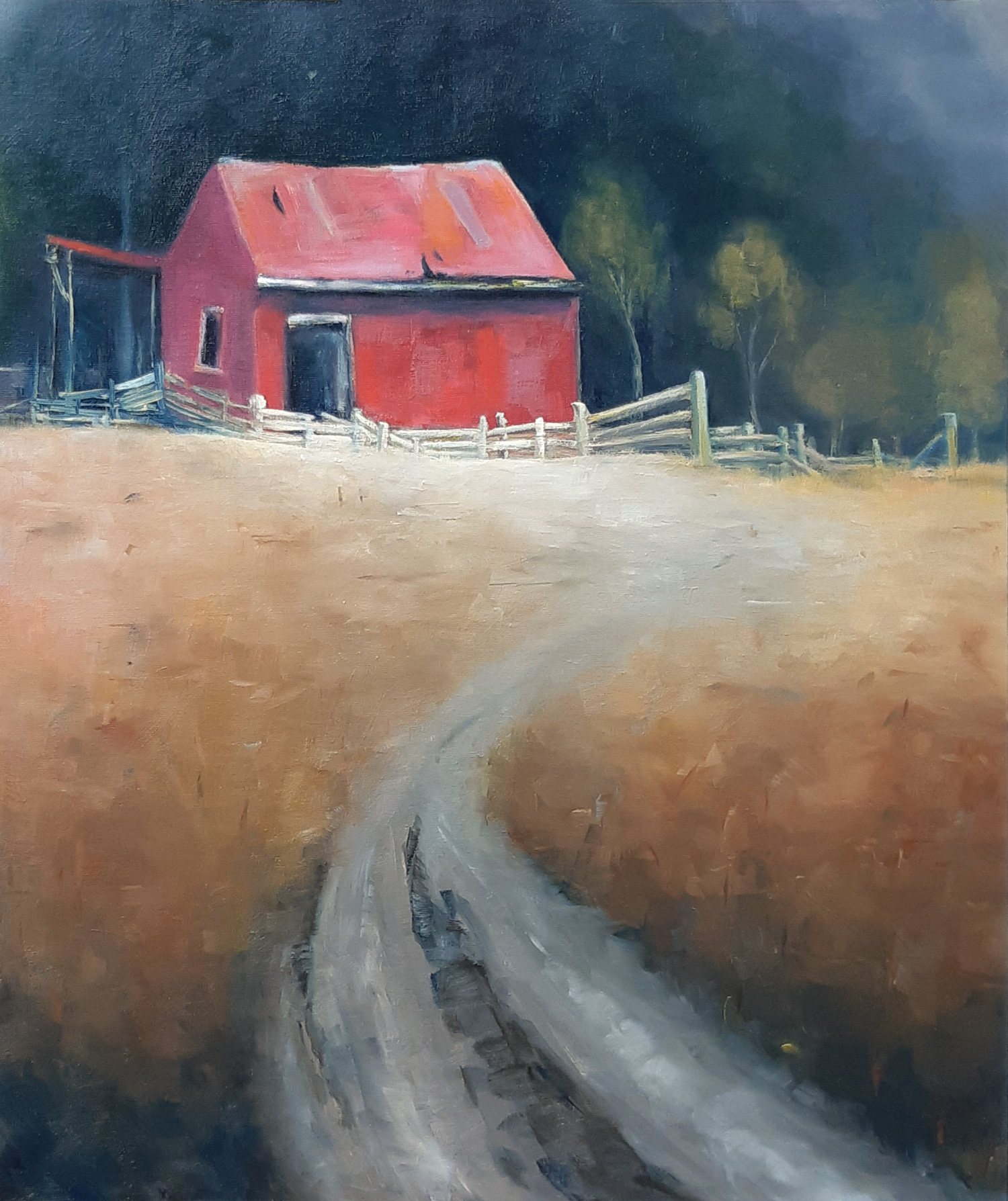
Darla Calhoon.
Your painting has a wonderful feeling of highlights and shadows Darla which, along with bold brushstrokes give a nice lively feeling. Try not to be too careful when painting fences and posts (have a look at mine – they are quite rough really) and avoid putting
highlight effects (behind the trees on the right side of the painting) as any highlight near the edge of a painting will drag the eye away from the focal point. Well done!
All the best,
John Crump
Get this lesson: https://mypaintingclub.com/teacher/John-Crump
Login to your account to post a comment.