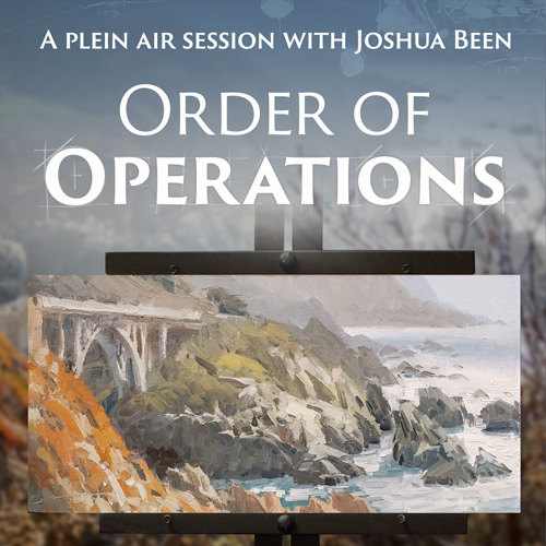
Order of Operations with Joshua Been - Student Critiques
February 18, 2020
By Joshua Been
Critiques of student work by esteemed guest artist Joshua Been. Enjoy!
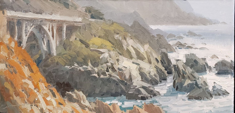
Garapatta by Joshua Been
Student Critiques
Oliver Hatton Great piece full of subtlety. These kind of pieces where the lighting is diffused, overcast skies, fluorescent lights, etc. are a hard sell where I'm from because people love their sunshine. You've done a great job in the feeling of space due to the shape awareness, and understanding of linear and atmospheric perspectives.
Truthfully, I don't have a lot of suggestions, but a pitfall in paintings like this is a lack of truly dark darks, and exploiting any and all opportunities to lose and find edges between shapes of similar value. Punch a couple darks in there behind those lighter trees on the left and right, and play up the lost and found edges along their trunks. Doing this is so arty, and poetic. I think that will take this piece over the top!! CHEERS!! JB
Laurena Beirnes Great feel for the perspectives, both linear and atmospheric. Each layer of distant terrain ought to have it's own distinguished value/color relationships, even if you are pushing it. By pushing it, I mean making room between the values for more relationships. This is a fairly complicated idea, but once you put it into practice a few times it becomes more second nature.
There are choices that are specific to each problem, but to get that middle ground terrain to read a bit better, you'll need to create relationships in those values that distinguish it from the really far and from the more close. At the moment, the values there are almost indistinguishable from the distance, and the foreground elements are much darker, popping them forward. In this case, you'll want to darken the middle terrain values, both light and shadow elements, so they have more contrast than the background, but not as much as the foreground. CHEERS!! JB
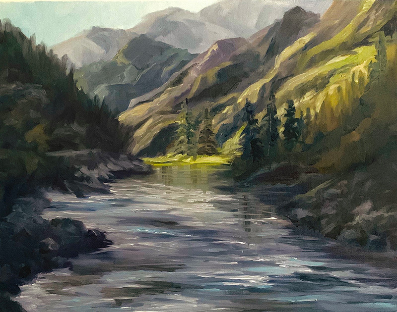
Nancy Sands
This is my type of painting. I've had the Salmon River on my bucket list of stuff to float and paint for years. Great sense of space due to effective rendering of the atmospheric and linear perspective. The distant water looks great, where it is smoother and more reflective. It looses its watery effect as it gets closer due to overworking it a bit. With water often less is more.
A layered rendering is best, and for this reason requires some forethought. Just as in the video, I set things up, then do the white water, white caps, or surf last. Look for a slight gradation across the surface, a green to deeper green, or blue to deeper blue, keeping the gradation slight, but obvious. Then place white caps etc. on top of these, and be careful to not place them everywhere, but place them in very specific places to help describe the banks, or rocks, or other information. Let none be in there that are unnecessary.
This is how to edit with INTENTION. Think this out at length while in the process. Where the water meets the land is one of the most important elements in paintings like this, so this information should be spelled out very well for the viewer, as this is what they look for. This is extremely well done here, so cheers to that!! JB
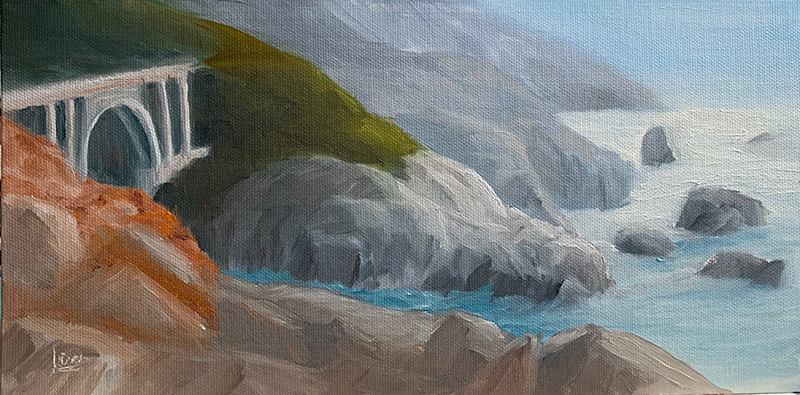
Elena Sokolova
You've done an amazing job with the colors/values, and the shapes are also quite effective in selling the illusion of space. The thing you should be working on in your work is edges. There needs to be more variety in the relative sharpness or softness in this poetic visual language element. The most effective one in your piece is where the orange iceplant overlaps the dark cliffs below the bridge, but it's sharp where it needs to be softer and soft where it should be the sharpest.
Where the lit sides of the rocky spires of the foreground overlap the dark cliffs, the edges need to be sharpest, as this is a very rigid material. Where the iceplant overlaps the darker cliffs, the edge should be firm but softer than the rock overlap edge. Where the shadow of the rocks in the foreground overlap the dark cliffs, is an opportunity to be a lost edge. Deliberately losing the edge all together gives a painting an arty feel which makes people want to give you money.
They can't help themselves. It also gives the viewer amazing insights as to the material nature of what is overlapping what, helping the read, and adding to the poetry. Cheers, and very well done!! JB
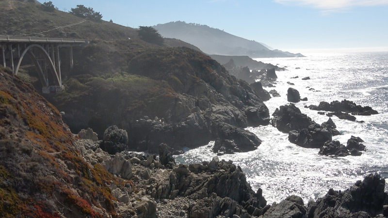
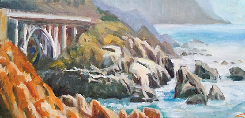
Nancy Newton
The linear perspective and atmospheric perspective are both showing a high level of understanding. Great job with the foreground having the highest saturation in color, this really is effective in bringing it forward in the painting. The middle ground, the land just across the bridge may be exaggerated slightly in this regard, it could go more saturated and have slightly more contrast in the light and shadow, thus anchoring it more solidly in the middle.
The background is wonderful beyond this overlap. In the foreground the shadows in the rocks could be darker, and this would pull it even more strongly forward. These are slight tweaks to your already solid understanding of this concept of atmospheric perspective. The next stage for you to concentrate on is edges. I'm seeing most of your edges as too same or similar across the painting. This is actually a great foundation for exploration while the painting is wet.
On your next session, get it to this point, then try out one or two super sharp edges in your area of focus. Then try softening edges where there are similar values overlapping similar values. Just as in all of the other foundational Visual Language Elements, it's not one edge that does anything, but a relationship of all edges painting wide. To have sharp, there must be examples of soft, and vice versa. Cheers!!! JB
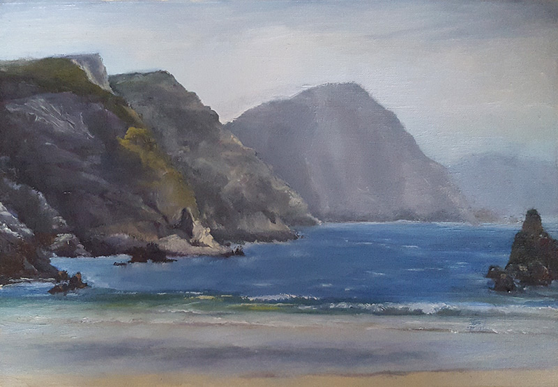
Mairo Piroue
This piece has a lot of corrects, but not a lot of BANG. Looks like a great spot to paint, and upon first discovery this, or something like this, would also likely be my first go at it. This critique will be great reasoning for returning to a spot time and time again to see it in all the ways that it shines. So, while this is a fine piece for many reasons, and has many areas of stellar rendering, it has a few things as well that are hindering its performance.
The mountains all are of similar height. Even if they look just like this, vary them more. The one most left, take it off the top of the canvas, for instance. That might be enough. Doing this just made the whole cove feel more intimate, deep, yet ponderous. I must say, the wave sparkles, and brings life into this piece, and the whole painting could be zoomed in on just it. That's what I mean by returning to a place and painting the finer points of the area, as opposed to this, what is the entirety of the inlet. Perfectly okay to do this, but is a overview of the experience, a broad-brush of the subject.
There's another painting zooming in on where the water meets the land on the far left. Another where you've chosen to really pop that spire out from the cliffs on the left. All of those are worthy compositions, where sky is not mandatory at all. A great piece overall. Cheers. JB
Darla Calhoon
19/02/2020
Thank you, Joshua Been, I learned so much from your instructional video "Order of Operations" and really enjoyed the painting experience. Equally helpful was reading your student critiques and then taking a second look at my own painting. Please give us an Encore performance! If you missed viewing it for free as part of Richard Robinsons, My Painting Club then I highly recommend purchasing Joshua's video.
Darla
Login to your account to post a comment.