 Thank you to everyone who watched my video and did a painting! It's so fun to see your interpretations of the scene. I'm going to critique your works the same way I critique my own, using the 5 of the 6 criteria listed in the video. ...I'll leave off "Feel" since, as I said in the dvd, that's a hard one to quantify and is more of a personal emotional connection to the painting.
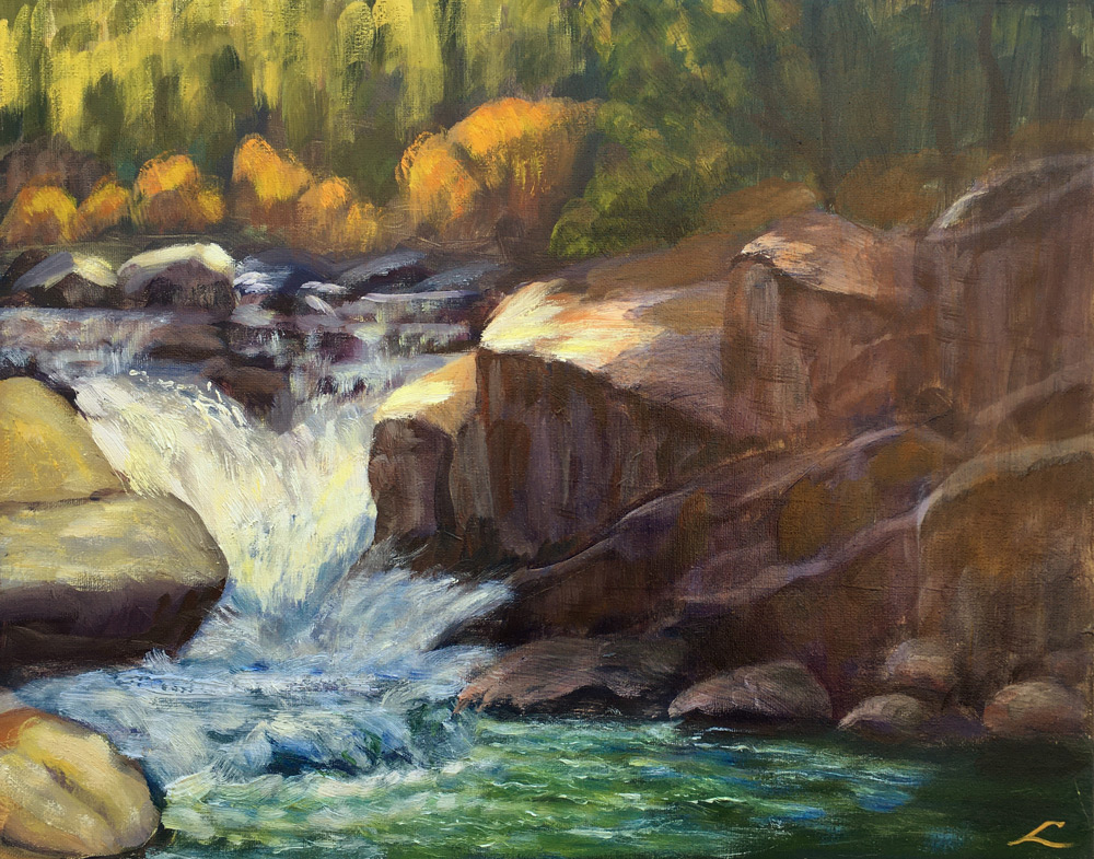
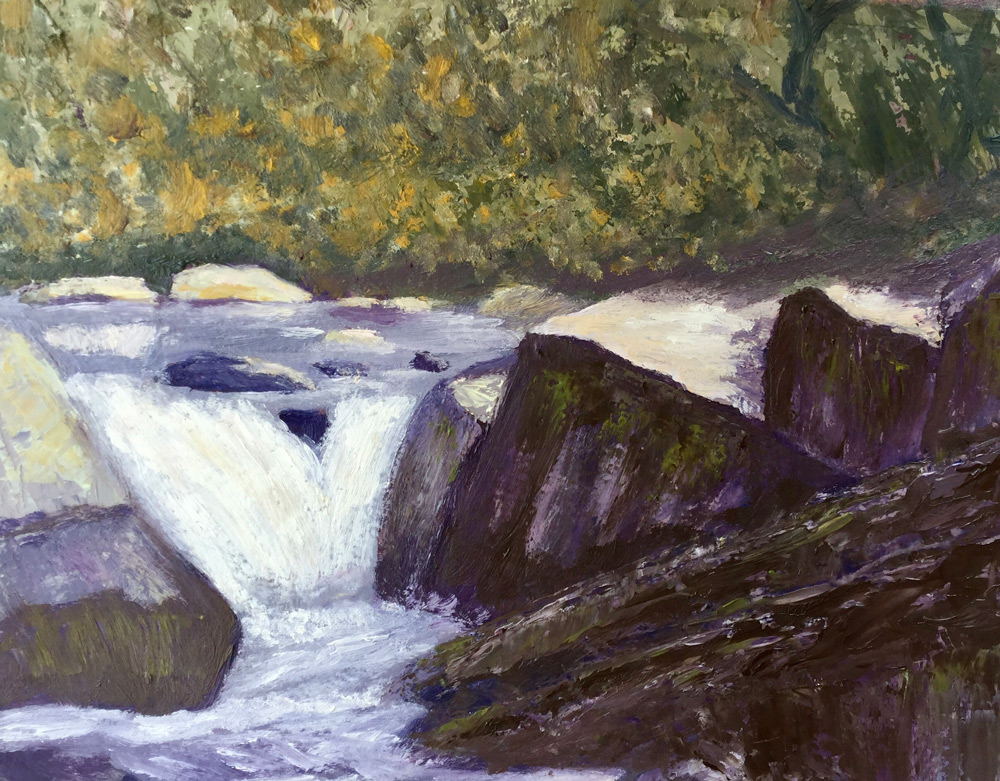
"Waterfall" Oil on canvas, 40 cm x 50 cm by Elena Sokolova
Design: Great job on the drawing and placement with this, Elena. Your shapes work well and read very accurately.
Value: Values are good but be careful of some of the very dark spots in the rocks toward the back--they will read further away from us if you lighten and cool those dark areas a little bit
Color: I think the area that needs the most work with this painting is color temperature. The shadow side of the rocks on the right is too warm and it's making them not sit in shadow. Add a little blue or gray to your mix and ease up on the yellow and red. Also, the highlights on the trees in the background are too saturated. They will feel further away from us if you lessen the intensity of the color, adding perhaps a bit more white to the mix and a touch of red and using less lemon yellow in that.
Edges: The variety of edges works well - watch out for the hard dark edge on the rock on the left at the top of the falls. If you cover that with a little of the foamy water, it will feel like it's sitting in the water better.
Paint Quality: - looks like you've got a great mix of thick and thin passages in this painting
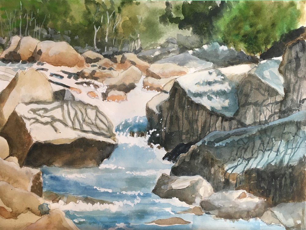
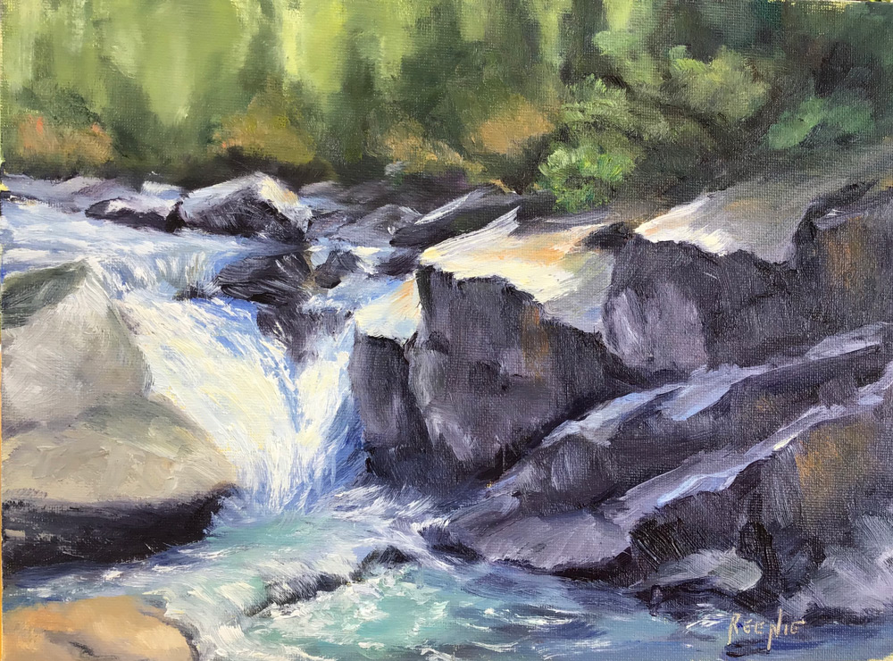
"Capturing The Light' watercolour & Gouache, Eric Hillmer, Toronto, ON, Canada.
Design: Very nice job with the design, Eric, and I like the addition of the tree trunks in the background and rocks in the lower left.
Values: Values read well, but I think there are a few areas on the shadowed rocks on the right that are reading too light to stay in the shadow. Be careful of getting too high in value with the reflected light.
Color: Nice balance of warms and cools and very natural-looking color. I would suggest warming up the light on the sunlit top of the rock just to the right of the falls
Edges: Edges work well, especially where they soften into the various foliage in the background. But be careful of the lines on the rocks, especially on the top of the one to the right of the falls--those lines to me seem distracting and might be better if you made the lines closer in value to the sunlit part of the rock or just eliminated them entirely
Paint Quality: Wonderful passages of opaque vs. transparent here. The white added to the water makes it look lively and sparkly
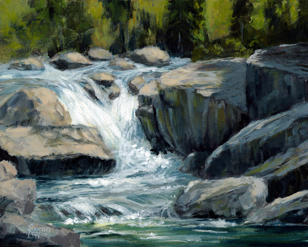
"Stanislaus River" by Sharon Repple under the instruction of Kathleen Dunphy
Design: Good drawing and placement here, Sharon. I like your addition of a couple more rocks to the bottom left corner of the design.
Values: Overall, I think your values are good but your darks are reading too dark, especially in the background. Try lightening them up just a bit in the foreground and also cooling them a bit in the background. The light areas read very well and their temperature feels warm and sunny. Good job keeping the reflected light on the face of the rocks interesting but dark enough to stay in the shadow. Be careful that the top planes of those rocks in shadow on the right stay dark enough to be in shadow--I think they're a little light now
Color: Try to find a little more variety in your colors. The addition of red in the trees looks great; try adding some cooler colors to the trees in the back left to push them further back in the scene. You could add a little more warmth to the sunlit side of the rocks in the foreground to make them appear closer to us
Edges: Edges look great - nice contrast of soft and hard
Paint Quality: I love the chunky brushstrokes on the rocks and the scumbling on the water. Nice job.
"Stanislaus River" by Barbara Magor
Design: Placement on the canvas is good, Barbara, but be careful with the drawing of the rocks--some of the lines are too straight and parallel, making the rocks look a little too architectural. It also might be a more effective design if the water continued over towards the right at the bottom to create a more interesting pathway through the painting.
Values: Be careful of going too dark in the shadows of the rocks on the right and on the small rocks at the top of the falls. In the background, try to find a little more structure to a few of the trees, more clearly indicating the dark and light side of the trees, to give them a little more form
Color: Very natural-looking colors in the background trees and on the sunlit part of the rocks. Try finding a little more variety of cooler colors on the shadow side of the rocks on the right.
Edges: some of the edges on the rocks on the right are a little rigid---find areas to break up the hard lines so that our eye doesn't go right to that area of high contrast and hard edges. Nice softening of the edges as you go back in the scene
Paint Quality: Good play of thick and thin paint and active brushwork in the falls. I can feel the water cascading over there top there.
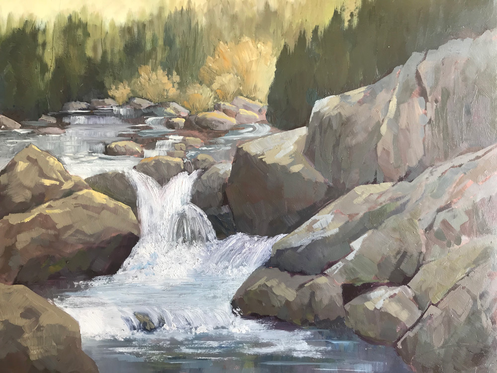
“Stanislaus River” after the video done by Kathleen Dunphy. 9x12 oil. Reenie Mccallum
Design: Great drawing and placement, Reenie.
Values: Values read really well overall, just be careful to not let the darks on the rocks in the water above the falls get too dark. Also, some of the top planes of the rocks in shadow in the lower right of the painting are getting a little too light to be in the shadow. Darken them just slightly
Color: Try to find a little more variety of color on the shadow side of the rocks on the right. The orange accents work well there. Add a little more warmth to the sunlit side of the rocks at the top of the falls.
Edges: Nice play of hard vs soft going from foreground to background
Paint Quality: Nice variety of brushwork and lovely whitewater action!
"Rocky Waterfall" by Lindsay Shaw
Design: Lovely painting overall, Lindsay, but be careful of the parallel angle that the top of the rocks on the right and the top of the dark trees on the right are making: it draws our eye out of the upper right corner of the painting. You might want to flatten out the top of the rocks a bit
Values: You did a great job observing the correct values in most of the painting, but you're losing your darks on the rocks on the right. The rock just to the right of the falls works great, but the shadows on the others further to the right are just getting too light. Squint and add more darks to help create the form.
Color: Beautiful color scheme! Wonderful variety in the rocks
Edges: Nice variety, especially going from the yellow aspen/willows back to the trees in the background.
Paint quality: Great variety of brushstrokes and nice action in the water. You've really created movement here.
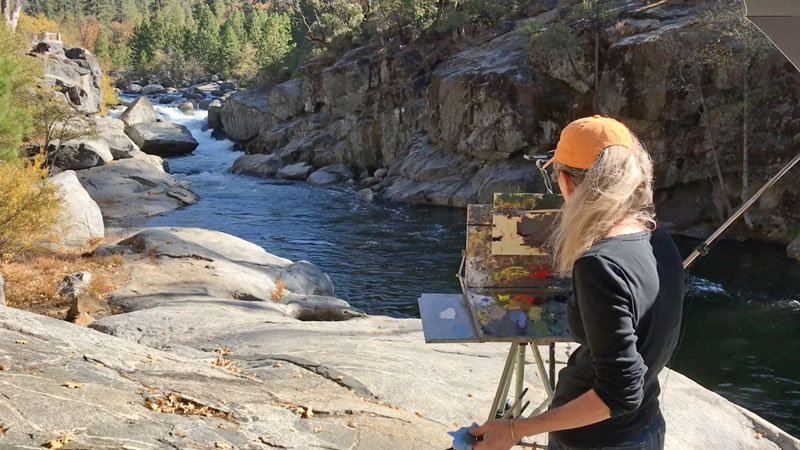
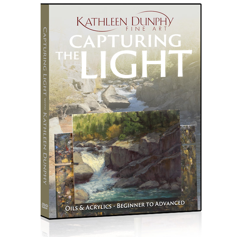
Get "Capturing the Light" here: https://mypaintingclub.com/teacher/Kathleen-Dunphy
Also visit Kathleen Dunphy's painting website: https://kathleendunphy.com/
Oil Paint
Titanium White – Rembrandt
Cadmium Yellow Lemon – Rembrandt
OR Cadmium Yellow Light – Rembrandt
Permanent Red Medium – Rembrandt
Ultramarine Blue Deep – Rembrandt
Naples Yellow Deep – Rembrandt
Brushes
Robert Simmons Signet Bristle Brushes
Flats, size 8, 10, 12
Rounds, size 2, 3
Rosemary & Co. Brushes
Kathleen Dunphy Brush Set
Ultimate bristle Long Flat 6,8,19,
Ultimate bristle Pointed rounds 2,4,6
Evergreen Rigger 2
Open Box M portable easel, size 11x14
Palette Knife – 3-4” long, tapered blade
Gamsol Odourless Mineral Spirits
Winsor and Newton Liquin or Natural Pigments Oleogel
Wind River Arts AC14 linen panels
Paper Towels
Garbage bag
Small sketch book
Pencil or marker
Small mirror
Login to your account to post a comment.