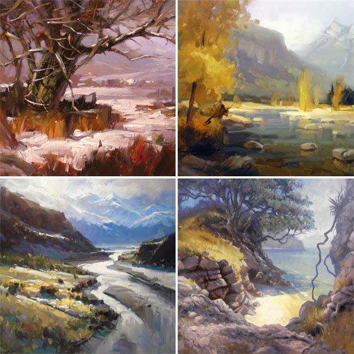
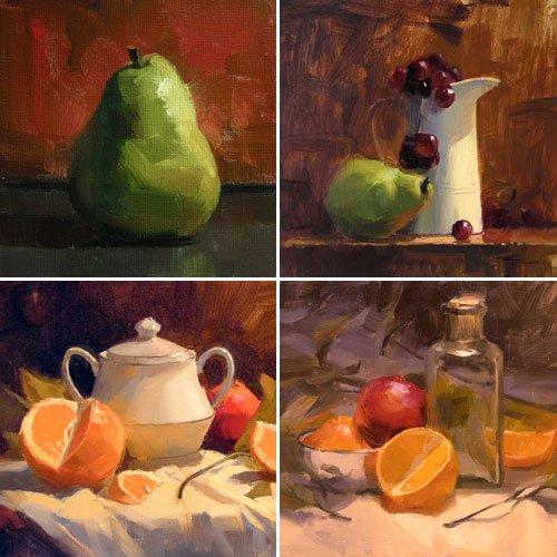
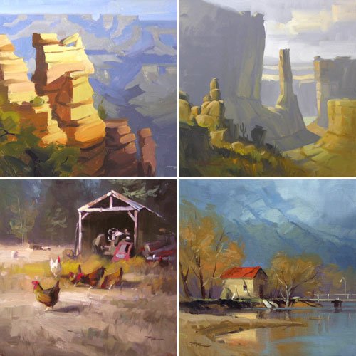
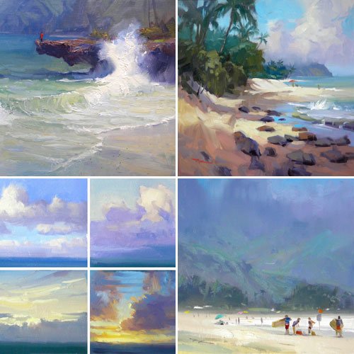
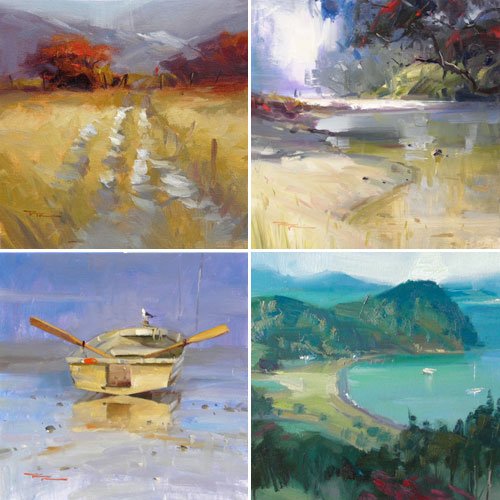
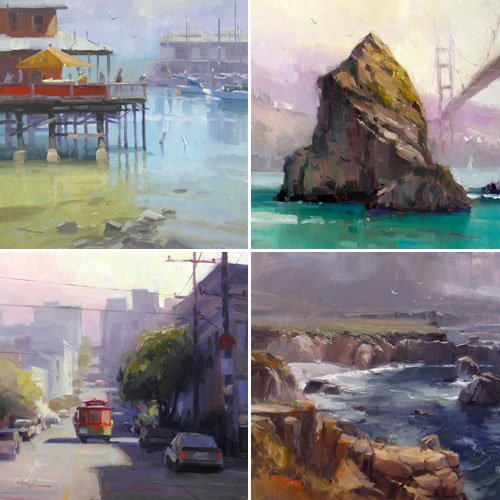
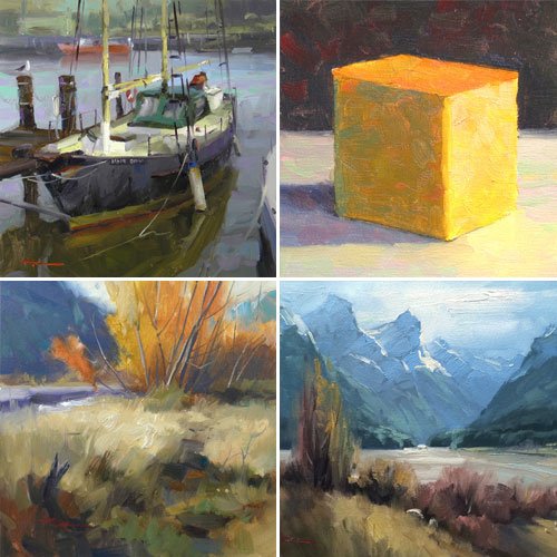
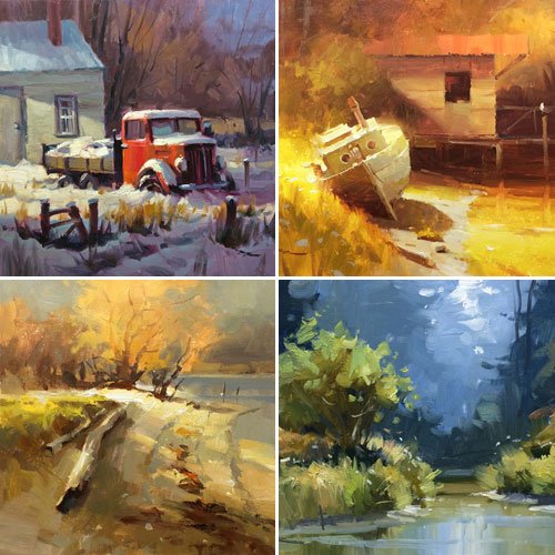
Hi I’m Richard. I’ve been painting my whole life and back in 2001 I traded my graphic design career for the humble life of a full time artist. I love painting, and as it turns out, I love teaching too.
Nowadays I balance my life between parenting, painting, surfing, travelling and teaching. My work is regularly featured in international art magazines, in galleries in New Zealand and America, on TV and in my Mum’s house.
I give outdoor painting workshops in interesting spots around this beautiful planet of ours and love encouraging people to paint. Two of my favourite artists are John Singer Sargent and Joaquín Sorolla.
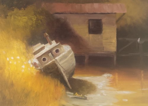
Weekly Class Recommendations- whiskey Slough 9 1/2”x12” Acrylic on canvas by Karen Woodhouse (South Australia)
Hi Karen, you’ve got a gorgeous glow running through this—love that sunlit flare on the left dissolving the edge of the boat.
I'm impressed with the variety of colour you managed to squeeze into the painting by adding the warm greens and reds - a great addition. There's good contrast between the soft and hard edges creating a lot of interesting variety overall. For instance your soft aerial haze in the trees helps the boat sit forward as the star.
Lovely atmosphere here—keep chasing that glow!
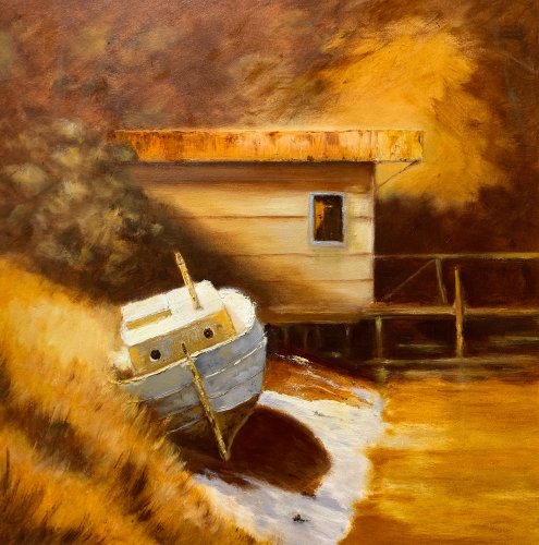
“Whiskey Slough” after Richard Robinson . 24x14oil on panel. Mark Price .
Hi Mark, you’ve created a beautiful, cohesive amber mood here—the warm, honeyed palette ties the shed, boat, and bank together wonderfully, and that soft atmospheric background sets the scene nicely. The boat’s form reads well, and I love extra detail you've added into the rusted roof, weathered hull and long grasses - the benefit of good observation and your larger canvas. Beautifully done!
To push it further, consider deepening the darkest darks under the boat and along the shed’s underside to anchor the forms and punch the value range. You could also cool and gray the shadow planes just a touch (a whisper of blue-gray into those browns) to separate light from shadow and make the light feel brighter. Finally, vary the brushwork in the water and grassy bank—soften a few edges and introduce slightly larger, simpler shapes so the eye rests more on the boat and the shed’s doorway. Lovely work—this has heaps of atmosphere; a few tweaks and it will really sing!
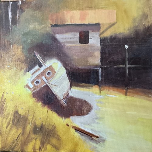
Lovely overall sense of warm, late-day light here, Nancy—the golden atmosphere knits the scene together beautifully. You've kept all the colours within that warm spectrum. The darks in the background could do with lightening a little. Currently they're so dark it doesn't allow for the warm light washing across the scene, so it brings the background forward, spoiling the sense of depth and also making it somewhat foreboding.
The boat is well drawn with strong sharp edges, great for the centre of interest, while You've gone a bit too far with the glowing light off the stern. I'm loving the lively brushwork and good colour sense. Good job.
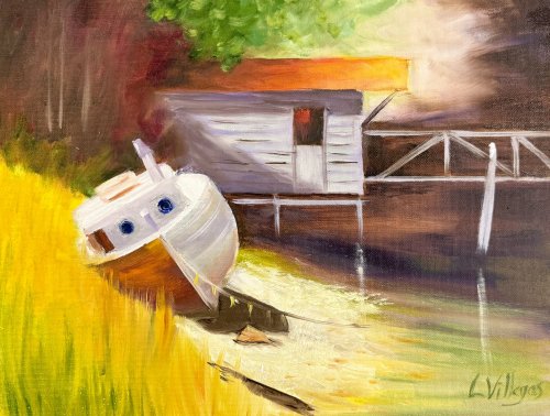
Hi Louise, I love the warm, sunlit atmosphere you’ve created here by using strong lights and crisp dark shadows. The burst of golden grasses really sings, and those crisp portholes pull the eye. I feel these should be a warm dark instead of a cool dark however, because all the arm light there would not allow a cool within it. Similarly the cool green foliage could be warmed to bring it into harmony with the warm light.
The shed roof’s warm orange glow is a lovely echo to the grasses and adds to the vibrant palette.
Try deepening the shadows in the woods behind the boat and shed and darkening the side of the shed and posts a little. Think about how their angle to the sun differs from the boat deck, and so they would be darker, allowing the lighter boat to take more of the attention, rather than fighting for attention with the shed.
Beautiful energy and brushwork.
Whiskey Slough -10x14in Oil on Canvas, Tracy Randell
Lovely mood here, Tracy—the warm, hazy light wrapping around the shed and the golden grasses gives the whole scene a nostalgic glow, very atmospheric!
Your drawing of the boat and shed is also spot on. I can't see anything to improve upon. Nicely done!
"San Francisco" 50x50cm Oil on Canvas by Elena Sokolova
Hi Elena, I ILIKE your take on this scene. Strong colour and a good range of values from dark to light. The Sky is a bit flat though - could do with more of a gradation in value and hue from right to left. Your drawing of the buildings and a few of the cars is really good (except that much of it seems to be leaning to the right a little) but the drawing of the cable car lets the painting down. Well, mine could have been better too. It just needs some panel beating to straighten it up and the figure needs some serious physical therapy.
Your recession of colours is working beautifully up the street except for the trees which seem to have stayed the same green until right at the top. Some of the shadows on the street are a little too blue and because they've been drawn fairly wobbly it gives the appearance of being shadows of trees cast on a dirt track rather than straight edged shadows cast on a slightly curving but otherwise flat concrete road. Other than those few points though I think it's really good and I can tell you've knuckled down on this one and been quite studious with it. Good job.
"California street - San Francisco" 28x38" Oil on Canvas Paper by George
A very striking image George and I think you're onto something here. I'm a sucker for a blue and orange complementary colour scheme. A picture speaks a thousand words so I did a little photoshopping of your image to show how I might change the lighting in it if you don't mind. Note the placement of the cable car too. Good on you for even attempting such a technical scene - it's not easy getting all those lines pointing in the right direction! If you want to keep those verticals straight it pays to use a ruler or a guide and keep using it throughout the painting to keep it all in check.
"One Sunny Day #2" 12x12" Oil on Canvas by Jessica Futerman
Not too shabby Jessica, a nicely balanced composition and a good play of colour against grey. The drawing is my first concern here - all those straight lines are tricky with a wobbly paint brush right!? We seem to be having an earthquake in your painting as some of the buildings are swaying to and fro. I had the same trouble with my buildings. Using a ruler helps. Looks ILIKE you ran out of room for a sidewalk on the right too and so the tree on the right seems to be growing out of a crack - again just a drawing thing.
Looking at your colours you've done pretty well getting the buildings to recede in the distance but it could have been much more interesting overall if you'd put more oomph into your darks and mid values in the foreground, which is all I did with the Photoshopped version of your painting, as well as slightly lightening the lights. It creates a better sense of depth. I also changed the shadow of the cable car and the blue car. You're getting there.
Hey good colours Mariangela! I ILIKE the extra kick of warms you've injected into the sky especially. Your atmospheric perspective is working really well too as your building begin to merge in colour with the sky. The soft edges are really helping there too. I would just say that your shadowy blues going up the street and into the distant buildings are a little too light and that's creating some visual confusion there. You could either slightly darken those or slightly lighten the sky to sort that out. You could look closer at the drawing of some of the cars if you want to be picky but overall I think you've done a great job. Nice one!
"Streets of Italy" 16x20" Oil on Canvas by Sandra Harris
A beautifully coloured and structured scene Sandra! I'm glad someone painted this photo because it was my favorite one that was submitted. I've included the image here to compare it to your painting. First of all I think it was a great idea to bring the orange jacketed guy out of the shadows and into that key spot there, however, it would have worked out better if you'd painted him moving. Figures standing still in paintings (unless they're in a group conversing) always have the appearance of posing for a photo.
The only other thing I would have changed would be to darken the distant hills and sky as shown in the Photoshopped version in order to simplify the the background area which seems to be a bit of a jumble. What about putting some really thick impasto paint on the light areas in the foreground too add more textural interest and help with the recession? Could be good. Great job!
When you purchase a DVD you also get online access to the same lesson, including any lesson resources like photos, downloadable notes and access to upload your painting to the student gallery.
That's why you need to make a password when you purchase a DVD, so you can access the online content as well. Enjoy!