Teacher
Richard is a talented full time artist, who loves painting and teaching.


A friendly place to learn at your own pace.
with Richard Robinson
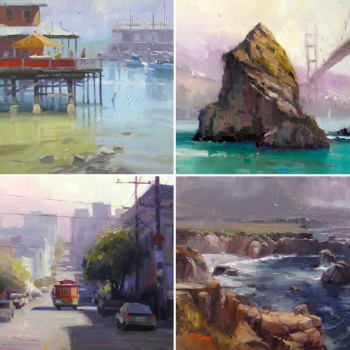
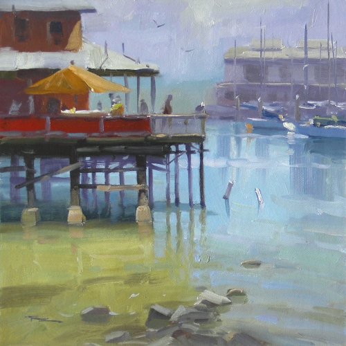
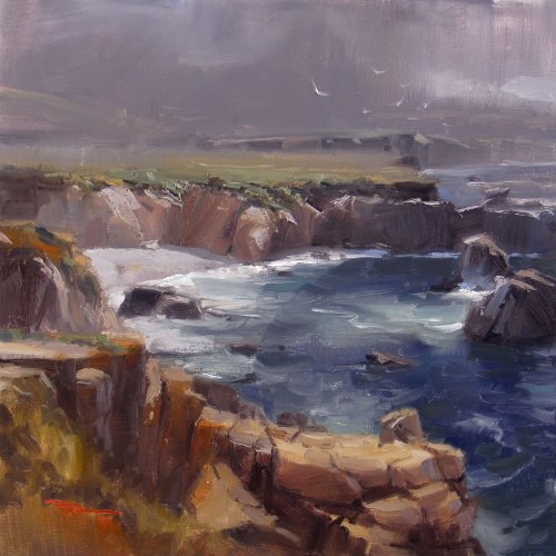
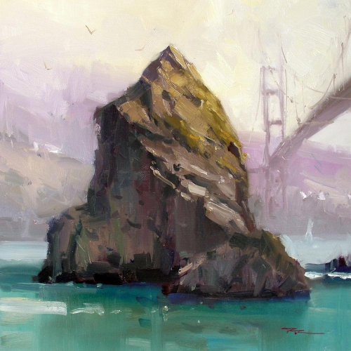
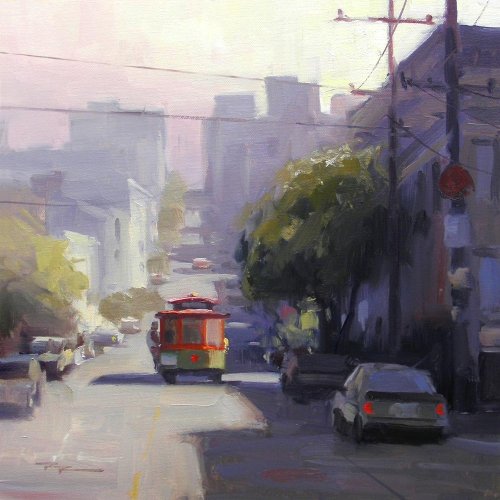
Join Richard for 4 Complete Landscape Painting Lessons from California as he guides you through each painting project step by step. Compare your work with other students and learn from the insightful student critiques that Richard has made.
This is a uniquely powerful learning experience based on comparison and solving common painters problems with simple and effective solutions. Enjoy!
Whenever you’re ready! The lesson is available online any time, and your access to the lesson never expires.
As long as you need! Your access never expires, so you can come back again and again.
Sorry, no you can’t download the video. This is to avoid piracy. You’ll always be able to view the video on this site though.
Richard is a talented full time artist, who loves painting and teaching.
Hi I’m Richard. I’ve been painting my whole life and back in 2001 I traded my graphic design career for the humble life of a full time artist. I love painting, and as it turns out, I love teaching too.
Nowadays I balance my life between parenting, painting, surfing, travelling and teaching. My work is regularly featured in international art magazines, in galleries in New Zealand and America, on TV and in my Mum’s house.
I give outdoor painting workshops in interesting spots around this beautiful planet of ours and love encouraging people to paint. Two of my favourite artists are John Singer Sargent and Joaquín Sorolla.
My painting website: www.nzpainter.com
I’d love to be your new teacher.

Richard is a master artist with an exceptional skill in identifying and communicating key factors to making successful paintings. I have found his video workshops an excellent resource for improving my own work.
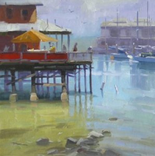
“Fisherman’s Wharf†12×12″ Oil on Canvas by Richard Robinson
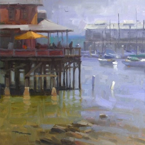
Harbour Light
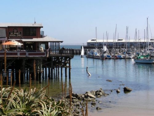
Fisherman’s Wharf, Monterey, USA
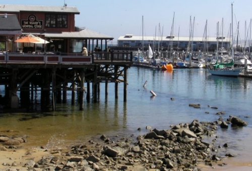
Fisherman’s Wharf, Monterey, USA
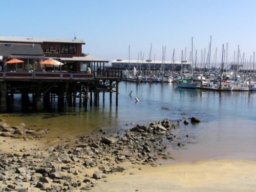
Fisherman’s Wharf, Monterey, USA
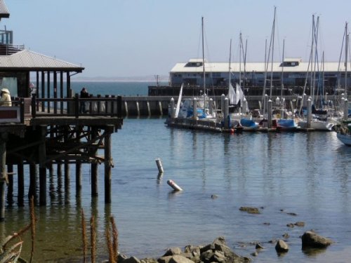
Fisherman’s Wharf, Monterey, USA
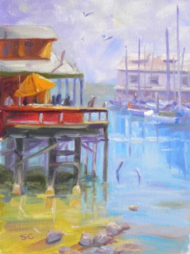
“Monterey Wharf, CA†11×14″ Oil on Canvas by Sharon Casavant
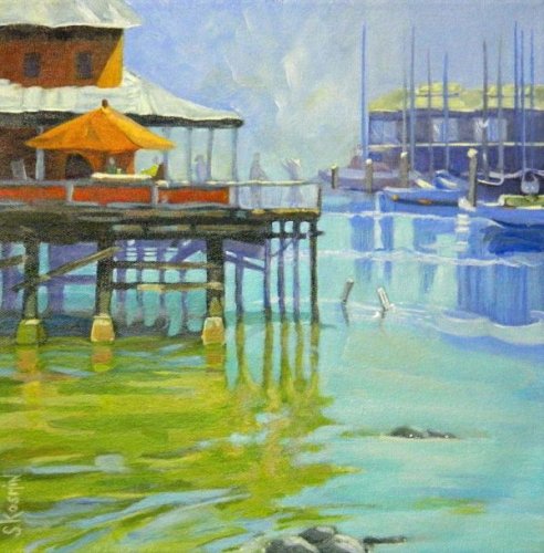
“Fisherman’s Wharf†12×12″ Oil on Canvas by Sharon J Kosmin
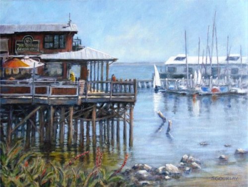
“Fisherman’s Wharf†12×16″ Oil on Canvas by Stuart Gourlay
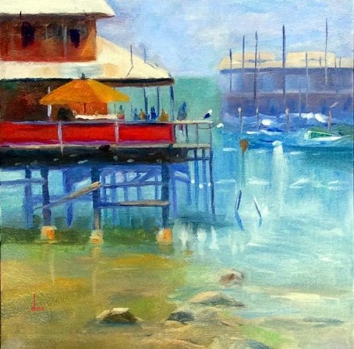
“Fisherman’s Wharf†12×12″ Oil on Canvas by Dorian Aronson
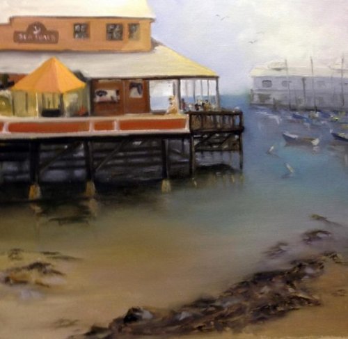
“The Sea Shack†20×20″ Oil on Canvas by Lori Ippolito

"San Francisco" 50x50cm Oil on Canvas by Elena Sokolova
Hi Elena, I ILIKE your take on this scene. Strong colour and a good range of values from dark to light. The Sky is a bit flat though - could do with more of a gradation in value and hue from right to left. Your drawing of the buildings and a few of the cars is really good (except that much of it seems to be leaning to the right a little) but the drawing of the cable car lets the painting down. Well, mine could have been better too. It just needs some panel beating to straighten it up and the figure needs some serious physical therapy. Your recession of colours is working beautifully up the street except for the trees which seem to have stayed the same green until right at the top. Some of the shadows on the street are a little too blue and because they've been drawn fairly wobbly it gives the appearance of being shadows of trees cast on a dirt track rather than straight edged shadows cast on a slightly curving but otherwise flat concrete road. Other than those few points though I think it's really good and I can tell you've knuckled down on this one and been quite studious with it. Good job.

"California street - San Francisco" 28x38" Oil on Canvas Paper by George
A very striking image George and I think you're onto something here. I'm a sucker for a blue and orange complementary colour scheme. A picture speaks a thousand words so I did a little photoshopping of your image to show how I might change the lighting in it if you don't mind. Note the placement of the cable car too. Good on you for even attempting such a technical scene - it's not easy getting all those lines pointing in the right direction! If you want to keep those verticals straight it pays to use a ruler or a guide and keep using it throughout the painting to keep it all in check.

"One Sunny Day #2" 12x12" Oil on Canvas by Jessica Futerman
Not too shabby Jessica, a nicely balanced composition and a good play of colour against grey. The drawing is my first concern here - all those straight lines are tricky with a wobbly paint brush right!? We seem to be having an earthquake in your painting as some of the buildings are swaying to and fro. I had the same trouble with my buildings. Using a ruler helps. Looks ILIKE you ran out of room for a sidewalk on the right too and so the tree on the right seems to be growing out of a crack - again just a drawing thing. Looking at your colours you've done pretty well getting the buildings to recede in the distance but it could have been much more interesting overall if you'd put more oomph into your darks and mid values in the foreground, which is all I did with the Photoshopped version of your painting, as well as slightly lightening the lights. It creates a better sense of depth. I also changed the shadow of the cable car and the blue car. You're getting there.

"S.F." 12x12" Oil on Canvas by Mariangela Margoni
Hey good colours Mariangela! I ILIKE the extra kick of warms you've injected into the sky especially. Your atmospheric perspective is working really well too as your building begin to merge in colour with the sky. The soft edges are really helping there too. I would just say that your shadowy blues going up the street and into the distant buildings are a little too light and that's creating some visual confusion there. You could either slightly darken those or slightly lighten the sky to sort that out. You could look closer at the drawing of some of the cars if you want to be picky but overall I think you've done a great job. Nice one!

"Streets of Italy" 16x20" Oil on Canvas by Sandra Harris
A beautifully coloured and structured scene Sandra! I'm glad someone painted this photo because it was my favorite one that was submitted. I've included the image here to compare it to your painting. First of all I think it was a great idea to bring the orange jacketed guy out of the shadows and into that key spot there, however, it would have worked out better if you'd painted him moving. Figures standing still in paintings (unless they're in a group conversing) always have the appearance of posing for a photo. The only other thing I would have changed would be to darken the distant hills and sky as shown in the Photoshopped version in order to simplify the the background area which seems to be a bit of a jumble. What about putting some really thick impasto paint on the light areas in the foreground too add more textural interest and help with the recession? Could be good. Great job!

12" x 12" oil on canvas by Jeff Danzik
Strong work, Jeff. Good drawing and an eye for keeping the large value masses clear and not over complicated - putting the detail where it counts. If you layered over the light shapes in the road again and sharpened up the cast shadow edges you'd get a better sense of strong sunlight there. Intensifying the light and colour on the right side of the cable car would help with that too - accentuating the centre of interest. The greens leading up the street should grey down as they recede. Overall, great job!

"STREETS OF SAN FRANCISCO" watercolour & gouache by Eric Hillmer, Toronto, ON, Canada.
Very vibrant and energetic, Eric - it draws my attention. You’ve captured the bustling atmosphere beautifully with the bold use of color and strong shapes—particularly the lively greens of the tree constrasting the punchy red of the streetcar. Your composition draws the viewer right into the scene, leading them up the hill and into the distance. If you'd gone a little lighter in value in the buildings in the top right of the street that would have created even more depth. When painting trees, try to avoid patterns of same sized splotches. A stronger design is achieved by building a tree with larger organic light and dark shapes, then adding some variety of smaller details in and around those base shapes. You're nearly there with this one. Great work overall, and I can see so much personality in this piece—keep it up!

Street Scape
This is a lovely depiction of a quaint street scene. The warm tones and direct light on the building facades create a welcoming atmosphere, and the sky is beautifully rendered with its dynamic cloud shapes and subtle colors contrasting the angular structures below. You've captured an inviting sense of place, which is so important in street scenes, although this could be aided by including more life on the street - vehicles and people. Another element you could add to release the boxed-in feeling of the street is to create a haze of light spilling over the furthest buildings, coming from the right, pushing them further back in space and inviting the view to walk around that corner into the light. At present, all the dark values back there are the same as the dark values in the foreground, which flattens the image. Adding atmospheric perspective could be the next step up the ladder for you. This could be achieved in this painting with light glazes, but the effect is generally more effective and colourful when planned and executed in the first layers. You're doing great—keep pushing forward, Paul! I’m excited to see your next painting.

If you're going to San Francisco, don't forget to wear some flowers in your hair 🎵🌸🌻
This is a beautifully atmospheric piece! I love how the soft haze envelops the city, creating a sense of distance and mood. To have that cablecar really pop you could lighten the street around it and sharpen up the edges, and it also needs that strip of light on the road to its right to make more sense of the light there - indicating a gap between the buildings letting in a shaft of light - that perfect moment where the cable car emerges from the shadows into the light. Your powerpoles are making a 1,2,3,4 pattern, which for the sake of variety is to be avoided generally, which you can do by removing the second or third pole. They also need to get much thinner as they recede. Hope that helps. You’re doing some lovely work here. Keep it up!

Weekly Class Recommendations- Streets 9 1/2” x 10 1/2” Acrylic on canvas by Karen Woodhouse
Hi Karen, you've done a great job of the soft atmospheric perspective in the background, being careful to avoid and dark values that would have spoiled the illusion of depth. You're drawing is solid too, with the perspective of the street well handled, though the cars could do with a little tweaking, namely making them bigger, and the cablecar as well. Wonderful work overall—this is a tricky subject, and you've done a great job capturing its charm! Keep it up! - Richard
Not loving your painting lessons? No worries!
If it’s not the right fit, we’ll give you a full refund within 30 days of purchase - no questions asked.
When you purchase a DVD you also get online access to the same lesson, including any lesson resources like photos, downloadable notes and access to upload your painting to the student gallery.
That's why you need to make a password when you purchase a DVD, so you can access the online content as well. Enjoy!