Teacher
Richard is a talented full time artist, who loves painting and teaching.


A friendly place to learn at your own pace.
with Richard Robinson
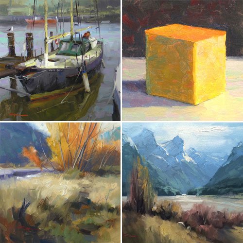
Join Richard for 4 Complete Painting Lessons as he guides you through each painting project step by step. Compare your work with other students and learn from the insightful student critiques that Richard has made.
This is a uniquely powerful learning experience based on comparison and solving common painters problems with simple and effective solutions. Enjoy!
Whenever you’re ready! The lesson is available online any time, and your access to the lesson never expires.
As long as you need! Your access never expires, so you can come back again and again.
Sorry, no you can’t download the video. This is to avoid piracy. You’ll always be able to view the video on this site though.
Richard is a talented full time artist, who loves painting and teaching.
Hi I’m Richard. I’ve been painting my whole life and back in 2001 I traded my graphic design career for the humble life of a full time artist. I love painting, and as it turns out, I love teaching too.
Nowadays I balance my life between parenting, painting, surfing, travelling and teaching. My work is regularly featured in international art magazines, in galleries in New Zealand and America, on TV and in my Mum’s house.
I give outdoor painting workshops in interesting spots around this beautiful planet of ours and love encouraging people to paint. Two of my favourite artists are John Singer Sargent and Joaquín Sorolla.
My painting website: www.nzpainter.com
I’d love to be your new teacher.
Richard is a master artist with an exceptional skill in identifying and communicating key factors to making successful paintings. I have found his video workshops an excellent resource for improving my own work.
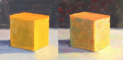
Before and after
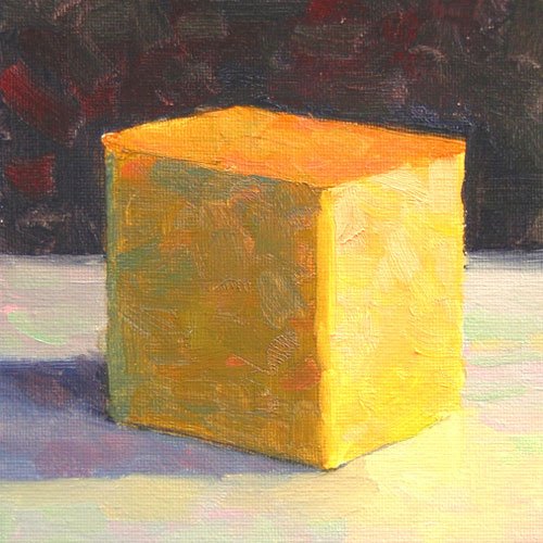
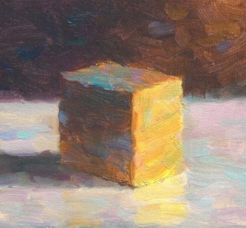
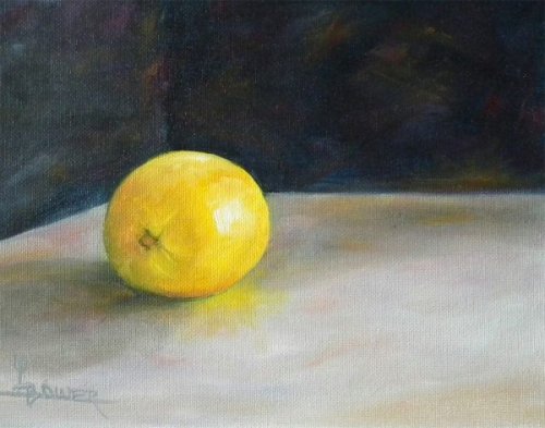
“Broken Color Study†8×10″ Oil on Canvas by Lisa Bower
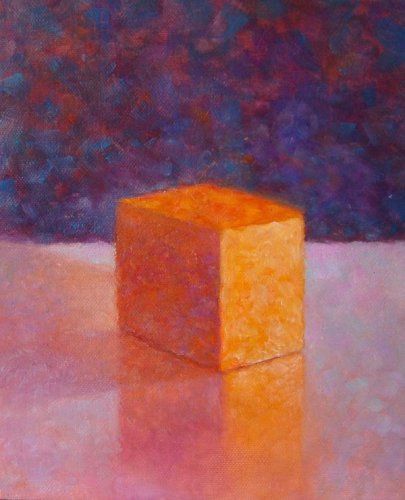
“Broken Color Workshop 31†by Luba Robinson
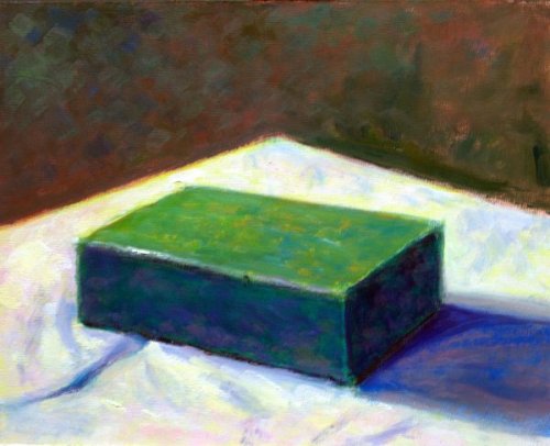
“Green Block Study†Oil on Canvas by Michael Severin
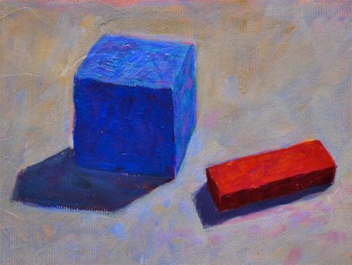
“Block Study†4×6″ Acrylic on Canvas by Yngvar Nilsen
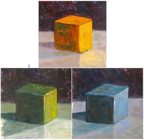
“Workshop 31 three color study†Oil on Panel 6×6″ Each by Xiao Li
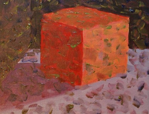
“My red cube final step†Oil on Canvas by Jocelyn Arsenault
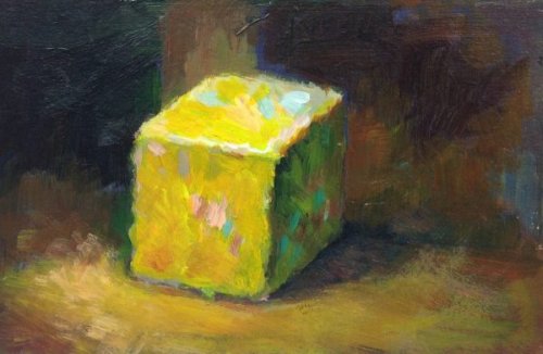
“5×7 Acrylic on matt board†Oil on Canvas by Hyun (Jane) Kim
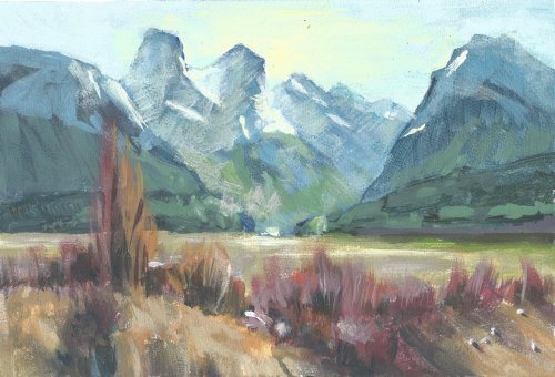
2026 08 20 - Paradise
Artist: Tom Gysel
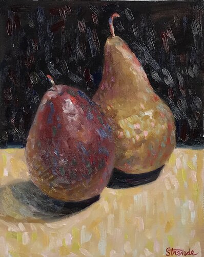
Pears
Artist: Mike Strande
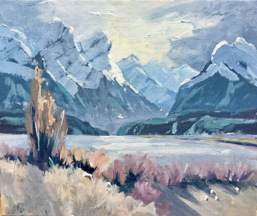
Paradise Valley 10 x 12 inch. Acrylic
Artist: Robert Mitchener
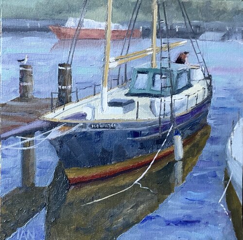
Boatman
Artist: Ian States
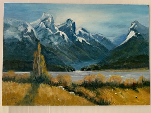
Painting paradise #33
Hey Mark, great painting. Solid drawing, interesting brushwork and strong colour. I'd just suggest that you lighten and blue the colours more into the distant mountains, adding more depth. Also you could do with practicing the shapes of the snow in shadow and light. As can I. Have a good look at how John Crump does that. Copy a few of them and then do the same with a few photos. It's trickier than it looks of course to translate all the intricacies of a snow clad mountain into a simplified version on canvas. By focusing on those for a while you'll get the hang of it and figure out your own visual shorthand for it.
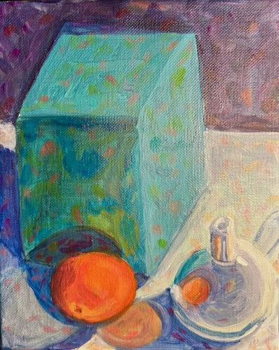
TKF broken color
Artist: Tracy Feldman
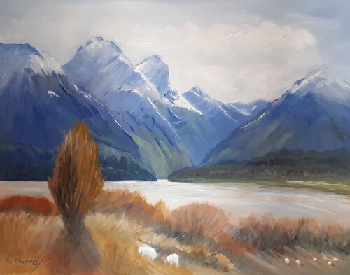
Second go, if at first you don't succeed, try, try again. At least I hope I succeeded this tine🤔
Hi Nancy, good effort on this painting. Lots of work gone in I can see. Overall the colour works well, and there are sections of nice painterly brushwork and the drawing is not half bad. Beware leaving those dark contrasty lines in the mountains that attract the eye. Ask yourself why would they be darker than any other shadow on that mountain. They wouldn't. Also ask yourself why would shadows in the distant mountains be darker than shadows in the foreground hills. Again, they wouldn't. Those in the foreground need to be darkened. Similarly, the shadow sides of the sheep need to be darker for a better sense of light and form. Look also at your tree which seems too symmetrical and pruned for a natural specimen. Making it less regular gives it more character and interest. Happy painting!
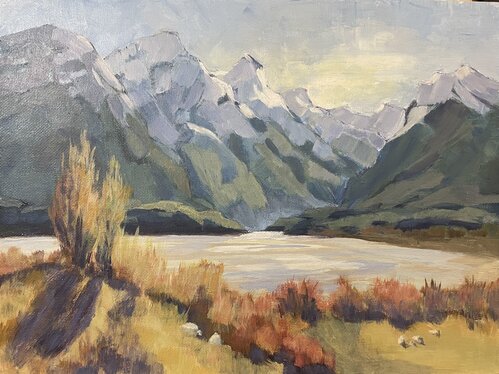
Paradise, Isabel Gibson, acrylic
Nice work Isabel. The drawing is good, the overall colour scheme is nice and warm due to your shadowed snow being more neutral grey than blue grey and your brushwork is bold and painterly. Good to see. 3 things I'd like to tweak: Make less contrast and more blue in the colours in the mountains receding into the distance. If you squint at mine you can see those colours blend together into a blue grey because they're all very close to each other in hue and value. Squint at yours and you can still see those dark greens popping out. They're too dark and not blue-grey enough. Easy to fix. Secondly, while you're there, be mindful to avoid leaving little lines along the edges of the mountains that give them a slight outlined look. Outlining objects is the quickest way to flatten a scene, and we don't want that in this painting that's all about creating depth. Lastly, a small thing too, the edges of the shadows in the long grass cast by the tallest tree need to be more soft edged and grassy. And if you vary the long dark shape on the top edge of that hill more it'll look less like an outline as well. Hope that helps.
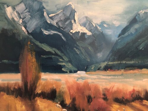
Paradise: Oil on canvas 11x14
Great bold painterly work, Nancy. There's a lot of contrast in value and warms/cools in there that's quite striking. I do like how your left most mountains are so big they're cropped at the top, but I'd like to see those pushed clean out the top rather than trying to squeeze them in there. The cropping gives a great sense of scale, like they are so big they can't even fit. Nice.
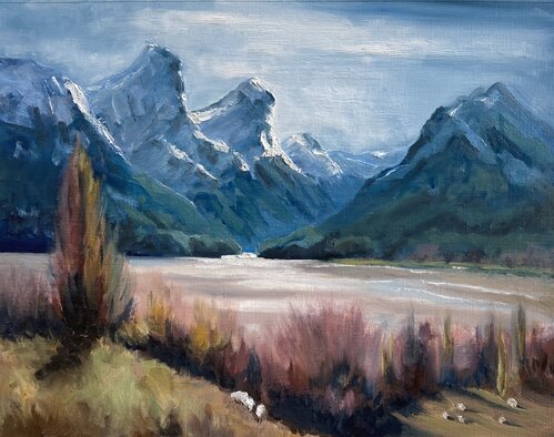
Paradise in Oils V:2
Geoffrey this is all good. I'd only change one thing and that's the brushwork of the sunlit snow on the mountains. It just seems disproportionately thicker and textured than the rest of the painting. It's great to try these things, and if you like that I'd encourage you to continue, but for me the texture is too different from the rest of the painting which is all brushed on rather than dabbed on. There's my two cents. Otherwise, love it!
Not loving your painting lessons? No worries!
If it’s not the right fit, we’ll give you a full refund within 30 days of purchase - no questions asked.
When you purchase a DVD you also get online access to the same lesson, including any lesson resources like photos, downloadable notes and access to upload your painting to the student gallery.
That's why you need to make a password when you purchase a DVD, so you can access the online content as well. Enjoy!