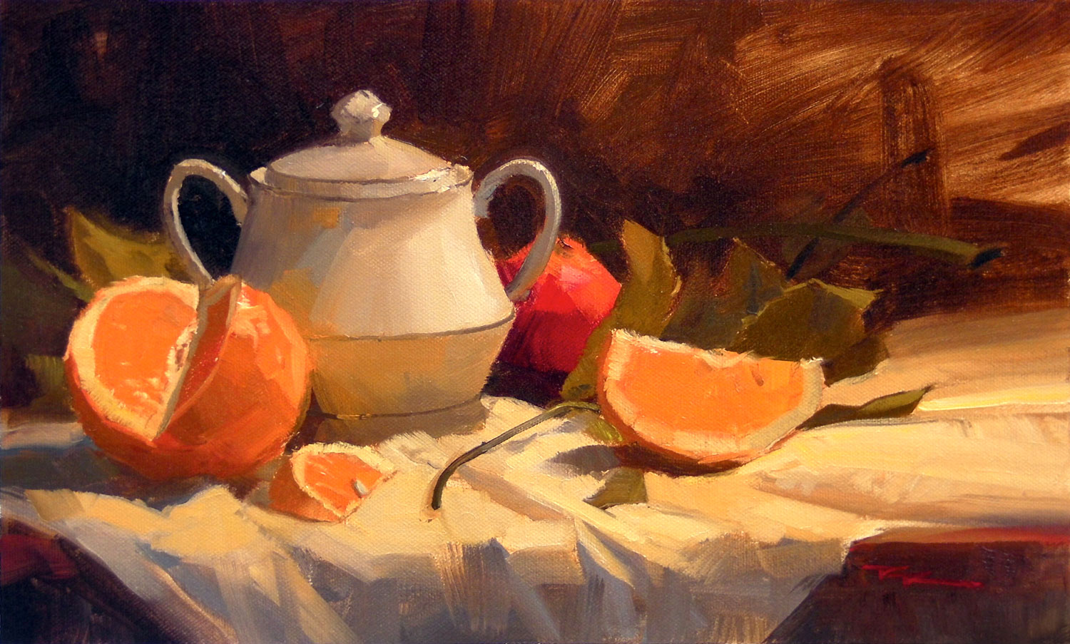
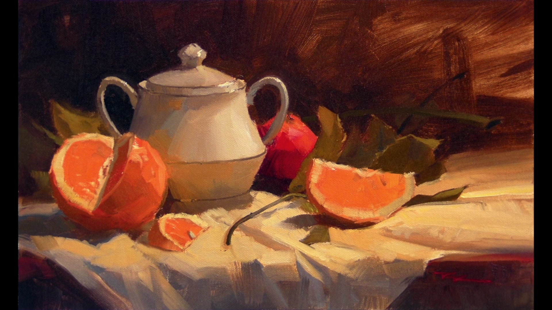
In this chapter, we dive into the vibrant world of still life painting with a focus on the humble yet striking orange. We've moved on from the pear and grapes, though you're welcome to include them if you wish. The white vessel remains, offering another opportunity to master those subtle greys that challenged us in the last workshop. This time, I've added leaves, stems, and a white tablecloth to enrich the composition and elevate the complexity of the scene. You'll learn to capture the luminous quality of the cut oranges, with the light source strategically placed above and slightly behind them. This positioning creates a stunning stained glass effect as light passes through the orange flesh, resulting in a powerful, high-chroma color. This lesson is designed to refine your skills, offering a rewarding challenge that enhances your understanding of light, color, and composition in still life painting. Let's embrace the beauty of these oranges and explore the depth they bring to our canvas.
This guide accompanies the full video lesson. The lesson includes the complete narrated video, the printable PDF chapter, and personalised critique support.
Focus on capturing the vibrant orange color of the cut oranges. The light source should be positioned above and slightly behind the oranges to create a stained glass effect. This setup allows the light to pass through the orange flesh, producing a powerful, high-chroma color.
Pro tipPosition the light source to come through the orange flesh for a stained glass effect.
In this lesson, you embarked on a vibrant journey to capture the essence of oranges in a still life painting. By positioning your light source strategically, you created a stained glass effect, allowing the rich, high-chroma colors of the oranges to shine through. You learned to use the white tablecloth to reflect light, creating dynamic interactions that enhance the luminosity and energy of your composition.
As you progressed, you explored color progression and unity by introducing a red nectarine, transitioning smoothly from red to orange to yellow. You mastered the art of setting limits with drawing and color, ensuring balance and accuracy in your composition. The interplay of dark leaves and a contrasting background further accentuated the brightness of the oranges, while careful attention to ambient light and shadow colors added depth and realism.
Finally, you focused on the finer details, using precise brush strokes and subtle highlights to bring out the juiciness and dimensionality of the fruit. By maintaining the purity of vibrant colors and incorporating warm tones, you achieved a cohesive and glowing effect. Your painting journey concluded with the addition of finishing touches, enhancing the realism and vibrancy of your still life masterpiece.
Points to remember
Position the light source to create a stained glass effect through the orange flesh.
Use the white tablecloth to reflect light and enhance luminosity.
Experiment with color progression for unity in your composition.
Start with a center line for symmetrical objects to maintain balance.
Use ultramarine blue with cadmium orange for warm dark green backgrounds.
Squint to better perceive value differences between shadows and backgrounds.
Compare new colors to adjacent ones by asking if they are lighter or darker, warmer or cooler.
Introduce more yellow into highlights to create a warm glow and enhance light sensation.