Teacher
Richard is a talented full time artist, who loves painting and teaching.

with Richard Robinson
Improve your still life painting with this more advanced lesson. Follow along step by step using the resource photo or create something more your own following my suggestions. See the previous lesson here.
Whenever you’re ready! The lesson is available online any time, and your access to the lesson never expires.
As long as you need! Your access never expires, so you can come back again and again.
Sorry, no you can’t download the video. This is to avoid piracy. You’ll always be able to view the video on this site though.
Richard is a talented full time artist, who loves painting and teaching.
Hi I’m Richard. I’ve been painting my whole life and back in 2001 I traded my graphic design career for the humble life of a full time artist. I love painting, and as it turns out, I love teaching too.
Nowadays I balance my life between parenting, painting, surfing, travelling and teaching. My work is regularly featured in international art magazines, in galleries in New Zealand and America, on TV and in my Mum’s house.
I give outdoor painting workshops in interesting spots around this beautiful planet of ours and love encouraging people to paint. Two of my favourite artists are John Singer Sargent and Joaquín Sorolla.
My painting website: www.nzpainter.com
I’d love to be your new teacher.

Richard is a master artist with an exceptional skill in identifying and communicating key factors to making successful paintings. I have found his video workshops an excellent resource for improving my own work.
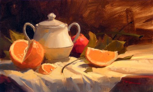
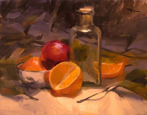
"Oranges" - Oil on Canvas by Richard Robinson
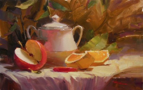
"Apple & Orange" 14 x 8" Oil on Canvas
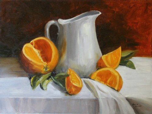
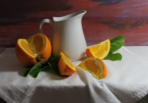
'Orange with White Jug' Oil on Canvas, 30.5 x 40.5 cm (12 x 16") by Annie Cullen
Design Looks like a good strong design to me Annie - you've tied everything together in a circular fashion and the overall dark/light construction is very strong. I might have tried adding a leaf or two behind the jug on the right, but that's all. Colour Good bold colour nicely arranged. The strong red in the background might be stealing a little of the orange's thunder, but on the other hand it helps bring the greens to life. You have noted some subtle colour variations like the cloth getting cooler on the left (although it could have gone a bit darker too) but have missed a few key ones like the difference in value between the light and dark sides of the oranges. For instance look at the two on the right. It is not very obvious that the piece behind is in light and the other in shadow. The colours are too similar. Also, look at the rind in shadow in the full orange. Squint at it and it does not blend in with the other shadow colour there. It should. The value is too light. Also your reflection of that orange in the jug is mostly darker in value than the jug's shadow which it is actually supposed to be lightening, so the value of the orange there is too dark or the shadow is too light, or both. The gradation of colour across the jug could have been smoother to give the effect of glazed pottery, but that's more about brushwork. Hope that helps. The more you look the more you see. Brushwork Some of your brushwork is is fluid and bold and beautiful, while other parts are overworked - you know where, because you felt it when you did it. I see beautiful brushwork as an art in itself, but when you can describe something with a few luscious strokes it's a double-whammy - a perfect harmony of form and function. Something to aspire to. I'm always asking myself, 'how many brush strokes does this really need?' How can I use the brush in a clever way to paint a Haiku rather than an Encyclopaedia? But that's me. Depends on your goals. One note that might be useful to you is to be careful that your quest for exciting brushwork does not ruin your value structure. At the moment I'm seeing that happen in most of your surfaces, most noticeably in the jug where slight changes in value because of left over paint in the brush or moving from one area to another are causing streaks of different values and confusing the form. Realism There are the few things I've mentioned detracting from the realism, but also the drawing in some places which is very easy to see when you place the finished painting next to the photo. Just compare individual shapes and it's easy to spot small errors to watch out for next time. It's much harder to do while you're actually painting of course but hey it wouldn't be exciting if it wasn't challenging right!? Reading this again it seems I've really picked this painting to death but that's because I want to encourage you to do even better next time. Overall I think it's a very pleasing painting which leaves a lasting impression because for the most part it's been boldly and elegantly done. Good work!
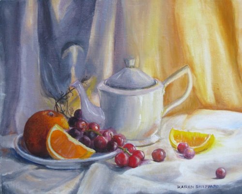
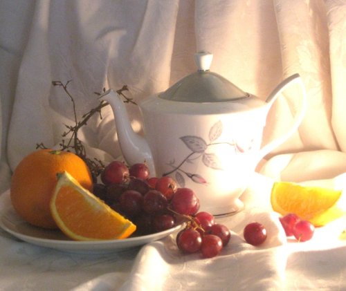
'Light on Oranges' Acrylic on canvas, 16 x 12", by Karen Sheppard
Design I love your design Karen, it's lovely to have the grapes flowing over the plate and leading the eye to the glowing orange segment. Good use of dramatic lighting - it's almost ethereal and perhaps you could have brought a little more light into the shadowed area on the left by rotating the orange segment there clockwise so that its right side was catching the light. As it is at the moment your two segments are very much the same shape where you had an opportunity to add a little more variety. That's being pretty picky but same shapes are something I try to avoid in my own arrangements. Colour You're getting somewhere now. Nice contrast between warm and cool overall, and you've noted some subtle difference within those too. A few things you could look at are the value of the pith in both the orange segments - it's too light which is destroying the illusion of shadow there. Squint squint! In the teapot you have a nice subtle cool to warm transition but perhaps the light is not quite light enough? It's great to see you casting reflected light from the orange segment on the right and that's something I encourage you to keep playing with. In the teapot you may have missed the opportunity to reflect the red grapes into the shadow side which would have made a nice counterpoint to the grey blue there. The orange light in the background fabric is striking from a distance but you've lost a little realism there by excluding some cooler grays in there, and the orange colour is so strong there it really takes the eye away from the subject of the painting. Similarly it looks to be a little too cool in the shadowed backdrop on the left and might have been more balanced including some slightly warmer notes in there. Brushwork Your brushwork has a nice feminine fluidity about it in some parts, however a lot of it is overworked - many brush strokes where one would suffice, flattening the paint and muddying the colour. That's only going to improve with brush miles and you're already doing so well so keep it up! Consider using a larger brush, more paint and be aware of painting value planes as described in the first still life workshop. Realism Well you can see yourself you're getting there. The grapes look pretty convincing as do several other portions of the painting, and your drawing is not too shabby. One thing you might try next time is losing some edges. For instance you could lose all that detail under the plate where it joins the table - just blur it together. Similarly in the photo the left side of the big orange is nearly the same value as the background so there's another opportunity to lose an edge. Same story in the big shadow area of the grapes - you've delineated every single grape which is not strictly necessary. Some things to think about. Hope that helps.
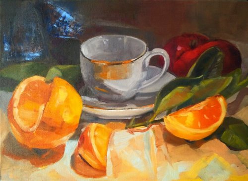
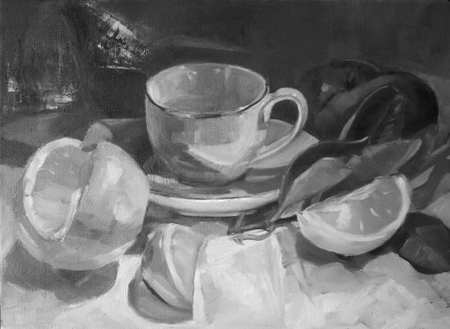
'Oranges & Tea Cup with Blue Leaves' Oil on Canvas, by Justine Wardle
Design Justine I like your design and arrangement of colours - quite similar to my own setup so I guess I'm biased there. It's got plenty to interest the eye and keep it moving around the canvas. I would perhaps have given a tad more room on the left of the big orange and maybe a teaspoon in the cup leaning to the left would help with that empty area there. Colour Your colour is very rich and vibrant - a joy to look at, made more so by the contrast with the gray background. You have lightened the reflected light in many of the shadow areas more than what is natural which does add to the vibrant colour as a whole but tends to flatten the form as it confuses the distinction between shadow and light areas. If you want to avoid that just be sure to squint down on those shadows and compare the areas of strong reflected light with the surrounding shadow areas. Areas of reflected light still belong to the shadow family and should not be as light as the same object in the light. Nice to see the warm/cool variations in the cloth although there too the form is a little confused due to incorrect value relationships. The orange in the teacup is a little overstated and detracts from the form, as do the sharp edges within the face of the cup. You've really just got to look at the major colours and shapes that are happening, get those right and then add subtler variations. Brushwork A lot of your brushwork is bold and beautifully done - laid down once and left there. I can see you're battling like I am to paint the big shapes in a simple fashion but then add some fine detail to hold the whole painting together. I can only encourage you to keep going because you're well on your way there. The next thing to consider might be the possible relationship between thin washes and thick impasto brushwork. I think there's real beauty to be found there. You could also afford to loose some edges here and there in the shadows and glowing parts. Realism You're very close to some crisp realism here, especially in that orange on the left - beautiful! It's mainly just the incorrect values that are letting you down and the drawing could be a bit better too. Getting there, getting there! I haven't mentioned the light blue marks in the background as you said you have now painted over those, which is good. You've got a bit of glare happening on the left of this photo so just be aware of that when you're taking your next shot. Try to get a large dark background behind you (like an open garage). Great work Justine - keep it up!
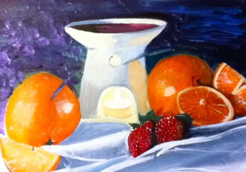
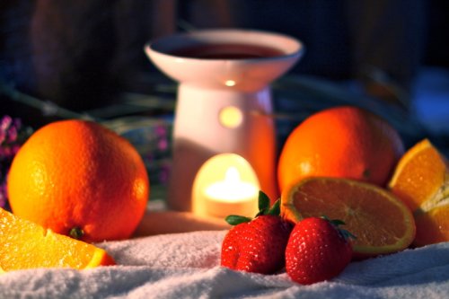
'Heaven's Scents' Acrylic on Canvas by Stephanie Burgess
Design This is one of the most interesting designs we've had I believe, using the candle is a really nice idea. Makes me think of a little village. So yes you've got good elements in there but I do feel the design itself is not quite working. It's such a subjective thing though. If it was me I would have taken one of the big oranges out or have one behind the candle, or add another one. It's so hard to balance two of the same objects in a still life and you did try to hide one a bit but they're both similarly placed on each side of the canvas so it creates a division. Colour Good strong colour throughout and with a few subtle variations noted here and there. You handled the glowing candle light particularly well. Here are a few things you could look at: you might have grayed the purple in the background to avoid it jumping forward, the cloth appears to be too light, as does the ceramic holder which lessens the effect of the candle light. The fold in shadow on the right of the big orange on the left is much too cool as it should be picking up that reflected orange light and getting darker closer to the orange. Brushwork Looks like you have a tendency to try and smooth everything out which is easily overcome by cutting one finger off every time you do this. Jokes! No, it's hard to stop yourself doing this. One good exercise is to do a small simple painting of a pear for instance and limit your painting to say, 30 brush strokes. That's 30 times the brush can touch the canvas. You'd be surprised what a bold dynamic pear you can paint with 30 brush strokes. You've tentatively started softening some edges there and I encourage you to continue pushing forward with that. Realism Some of this rates very high for realism, which is really just a measure if how well you have seen your subject, so it encompasses everything. I love the way you have handled the candle and think that's the crowning achievement of this painting because it's a very tricky thing to do well. Your oranges are beautifully round and edible (and I don't say that to everyone I meet) but your drawing is a bit wonky in places like the tilted ellipse of the half orange and the symmetry of the candle holder. Some good work here though. Keep it up!
$15.00USD
$15.00USD
$15.00USD
$15.00USD
Not loving your painting lessons? No worries!
If it’s not the right fit, we’ll give you a full refund within 30 days of purchase - no questions asked.
When you purchase a DVD you also get online access to the same lesson, including any lesson resources like photos, downloadable notes and access to upload your painting to the student gallery.
That's why you need to make a password when you purchase a DVD, so you can access the online content as well. Enjoy!