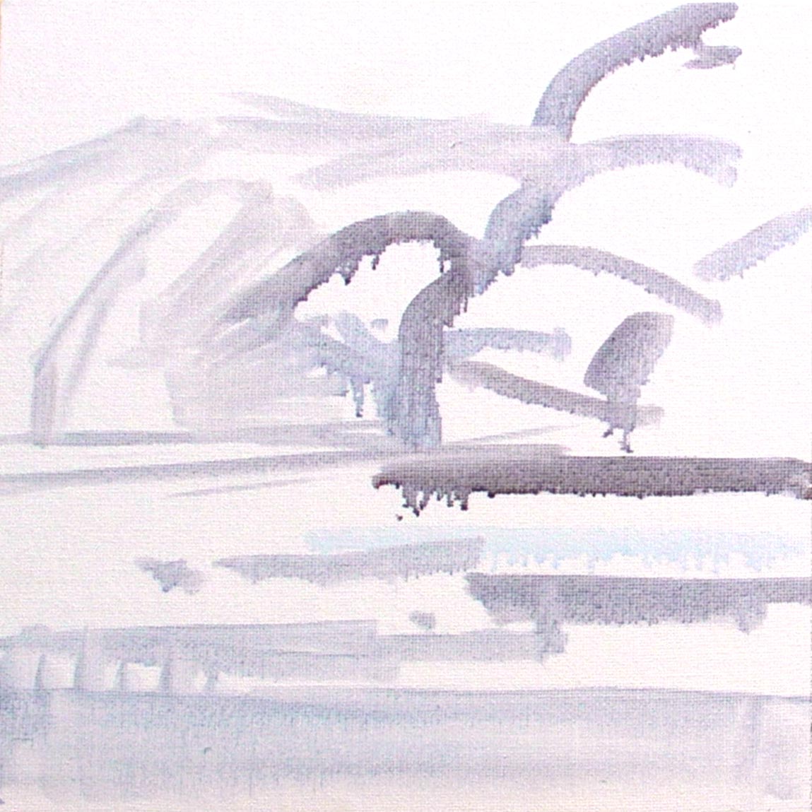
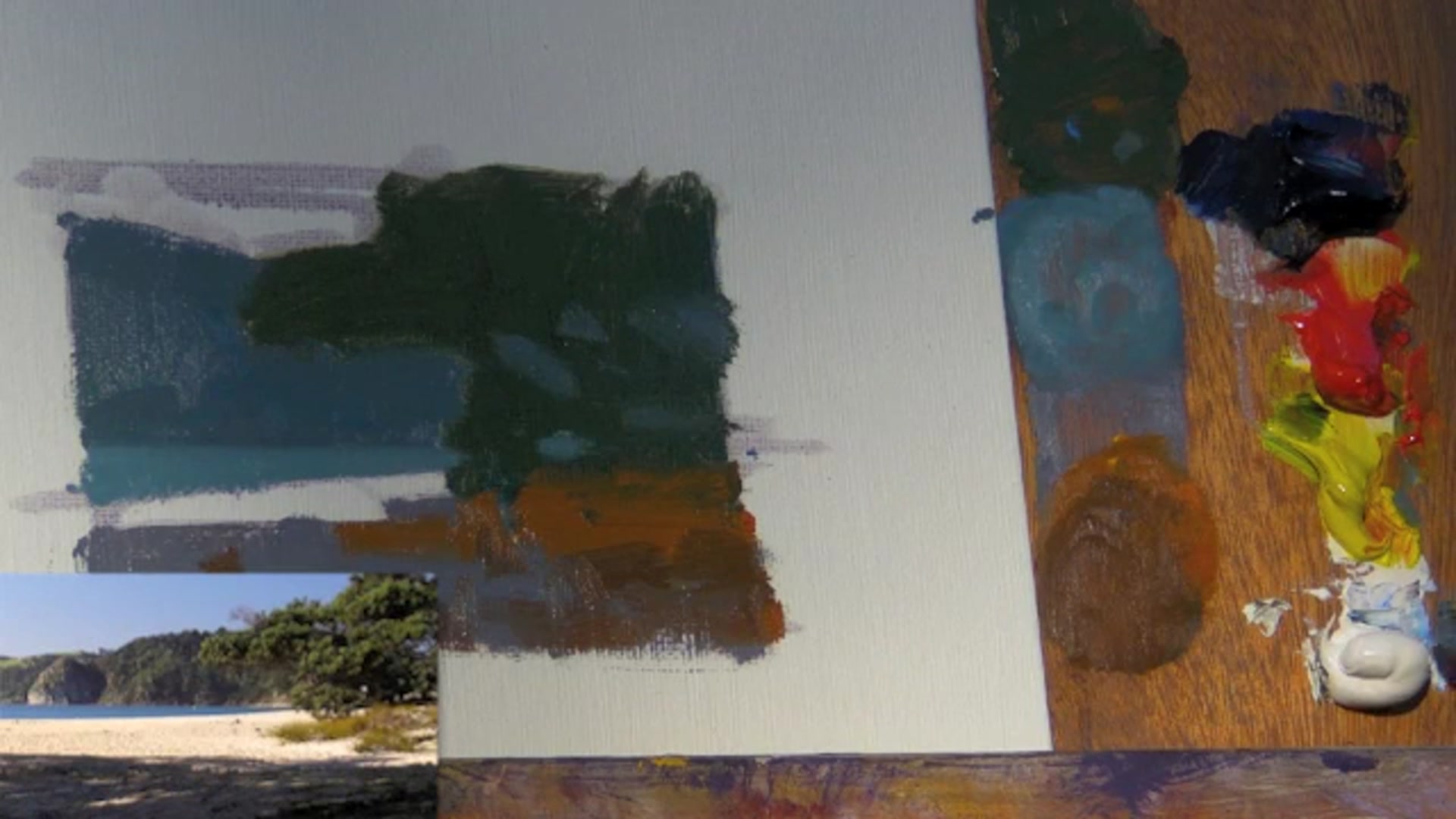
As I begin this lesson at Langs Beach, I'm excited to guide you through the process of capturing this stunning scene with a focus on warm and cool color variations and expressive brushwork. We'll start with a very watery mixture of blue and red to sketch out the scene, defining its limits with a simple box and a horizon line. This initial step is all about creating a strong abstract design, known as a no tan design, which balances light and dark elements. You'll select a main element to paint, like the hills or a tree, and choose a single color to represent it. For instance, a greyish blue for the hills or a mid-green for a tree. We'll mix colors to ensure a thick, opaque coverage, starting with the darkest elements. This approach is akin to building with cut-out pieces of colored paper, keeping it simple yet effective. I hope you find this scene as rewarding to paint as I do, and that it inspires you to create something uniquely your own.
This guide accompanies the full video lesson. The lesson includes the complete narrated video, the printable PDF chapter, and personalised critique support.
Embark on your painting journey by focusing on the foundational elements of your composition. Begin with a strong abstract design, balancing light and dark elements to create a compelling no tan design. Mix your colors thoughtfully, starting with the darkest elements and ensuring you have enough paint to cover the canvas completely. Use broad brushstrokes to lay down your base colors, avoiding the temptation to dive into details too early.
As you progress, refine your colors by adjusting hues and values. Use complementary colors to tone down vibrancy and incorporate painting medium to improve flow. Pay attention to the relationships between foreground and background elements, using techniques like the dab method to ensure your values are distinct and harmonious. Apply your colors boldly, reshaping elements like trees and hills to maintain a cohesive design.
In the final stages, focus on lighting effects and the details that bring your scene to life. Use thick paint to highlight the center of interest and keep shadow edges soft to draw the viewer's eye. Test your colors directly on the canvas to ensure they match the surrounding hues, and remember to reload your brush frequently to maintain vibrant, pure colors. Step back often to review your work, ensuring a natural flow of light and a cohesive, engaging scene.
Points to remember
Mix enough paint to cover the area completely.
Use red to grey down a vibrant green.
Use a big brush to cover the canvas quickly.
Use the dab technique to check color value.
Adjust the hue of the foreground shadow by adding more red.
Keep shadow edges soft to enhance focus on the center of interest.
Always test your color on the canvas.
Reload your brush frequently to maintain pure colors.