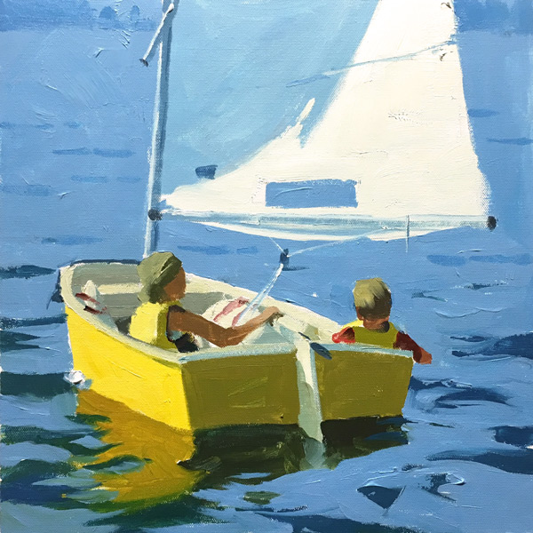
Welcome to this exciting chapter on Color Simplicity, where we explore the art of capturing the essence of any subject through the use of simple light and shadow shapes. As painters, our task is to distill the complexity of the world into something uniquely our own, and this chapter will guide you in deciding just how much to simplify what you see. Building on the foundation of Mastering Color 1, which many of you have already found beneficial, this course delves deeper into the nuances of color. Over the past decade, I've gained new insights into color theory and application, and I'm eager to share these with you. Throughout this chapter, you'll encounter fresh ideas, techniques, and tools designed to spark those 'aha' moments, revealing aspects of color you might not have realized you were missing. Each chapter concludes with a playtime project, allowing you to apply your newfound knowledge and solidify these skills. Remember to download the lesson notes, engage with the community by sharing your progress, and enjoy the journey of making each painting truly your own.
This guide accompanies the full video lesson. The lesson includes the complete narrated video, the printable PDF chapter, and personalised critique support.
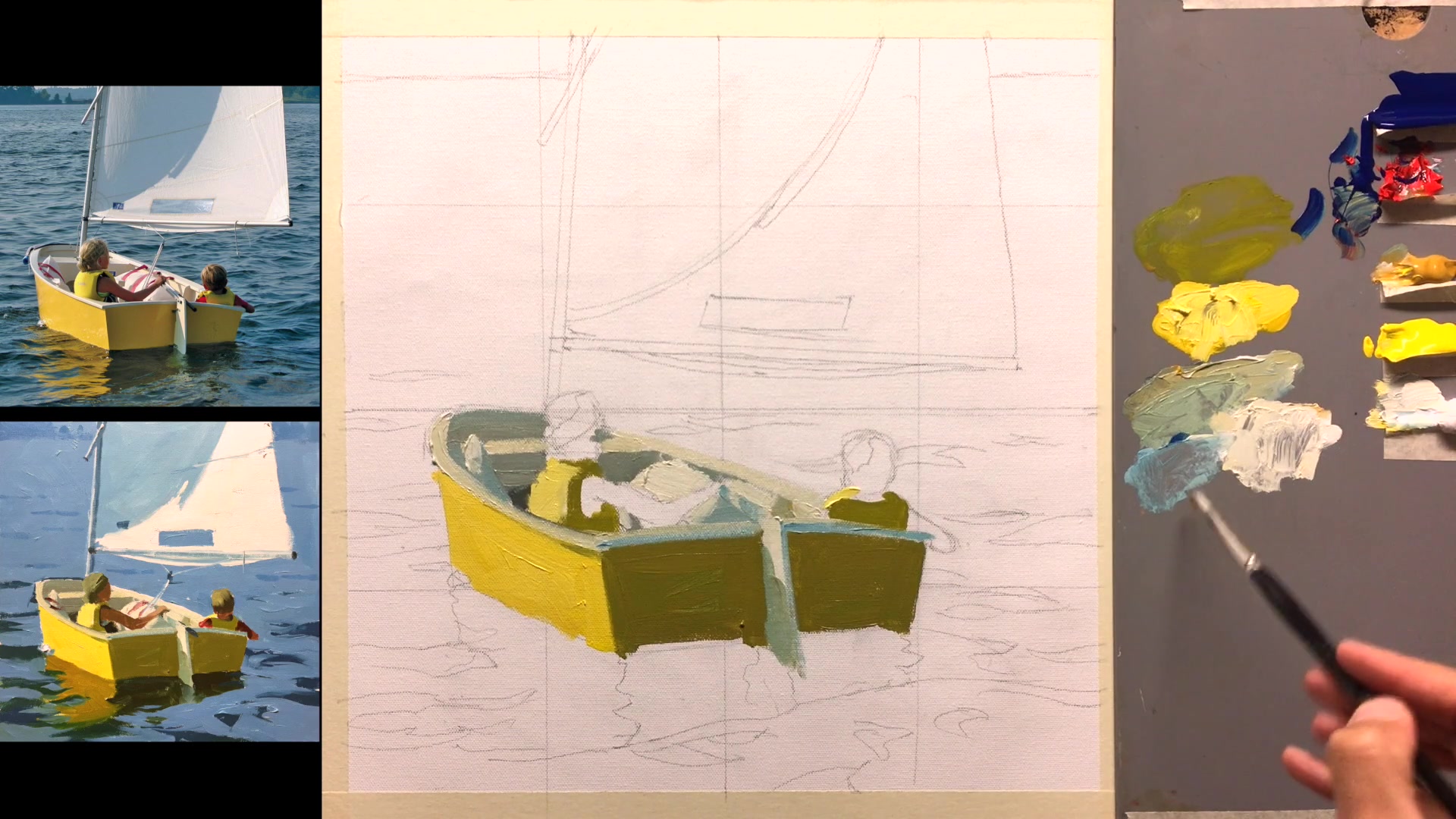
Combine a little bit of blue with white to create the color for the sail. This mixture will give you a soft, light blue that is perfect for the sail's surface.
Paint the Sail
Use a big brush to apply the sail color. Focus on creating broad, expressive strokes to give the sail a painterly and artistic appearance. Enjoy the process and let your brushwork convey movement and texture.
Pro tipUse a big brush to create expressive, painterly strokes for the sail.
Embark on your painting journey by embracing the concept of color simplicity. Start by downloading the lesson notes to guide you through the process and engage with the community by sharing your progress. As you begin, focus on simplifying your scene by dividing objects into two colors: shadow and light. This approach will help you convey the essence of your subject and create depth in your painting.
As you progress, identify the shadow and light shapes in your reference image. Use tools like digital drawing programs or printed images with markers to practice seeing these shapes clearly. Prepare your canvas with a secure setup and transfer your reference image using a grid system to ensure accuracy. Mix your colors thoughtfully, starting with shadows and moving to light areas, maintaining the correct relationships between them.
In the final stages, refine your painting by adjusting color relationships and adding expressive brushwork. Focus on the big shapes and their interactions, capturing the simplicity and blockiness that form the painting's foundation. Remember, the goal is not perfection but improvement and learning. Document your progress with photos, allowing you to reflect on your journey and celebrate your growth as a painter.
Points to remember
Download lesson notes for additional tips and tools.
Divide objects into two colors: shadow and light.
Practice identifying shadow and light shapes in images.
Use a 6B pencil for easy image transfer onto the canvas.
Mix a generous amount of paint and apply it thickly.
Adjust color relationships by considering surrounding colors.
Use ultramarine blue for more control over color mixtures.
Create expressive, painterly strokes with a big brush.