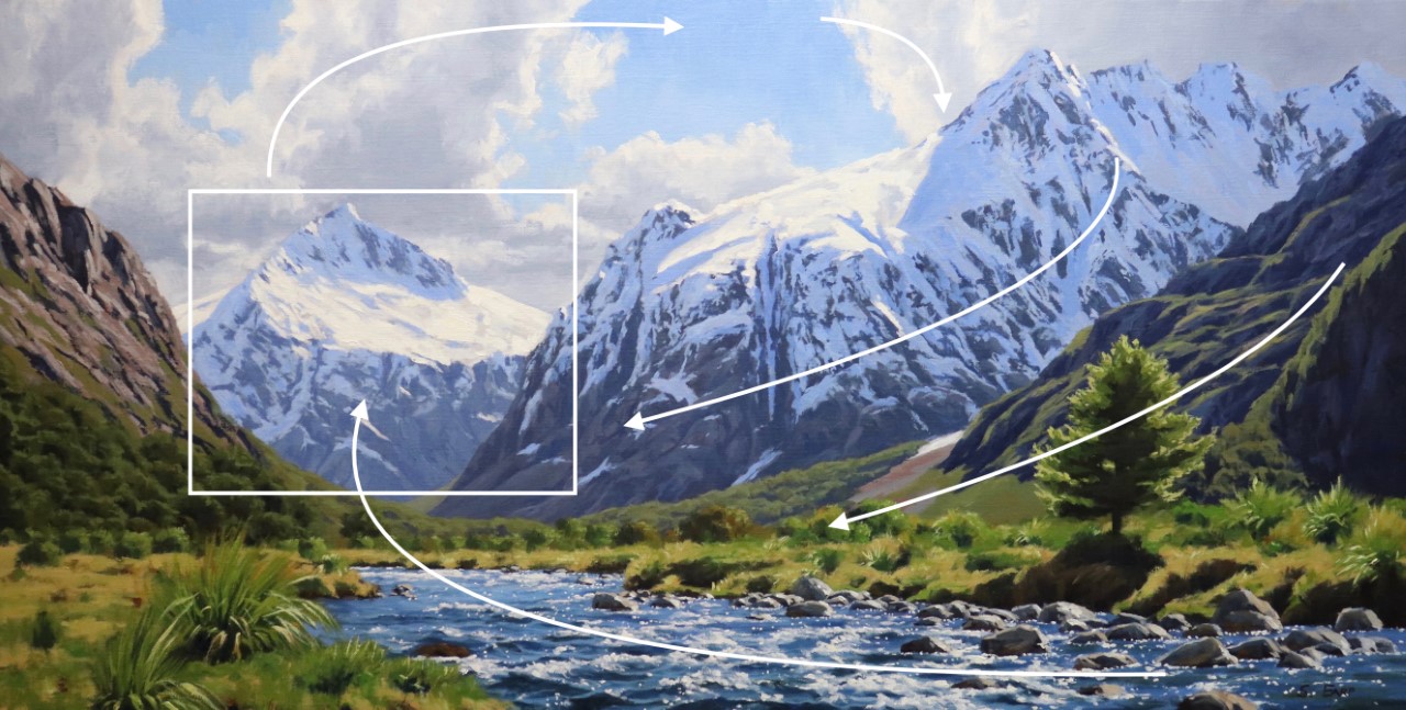
Welcome to my studio, where I'm excited to guide you through painting one of my favorite New Zealand landscapes—a stunning mountain valley on a beautiful spring day. Picture the sun glistening on a cool mountain stream with snow-capped peaks in the background. In this chapter, I'll walk you through the entire process of capturing this scene, starting with footage from my photo expedition. Back in the studio, we'll dive into designing a composition, beginning with quick thumbnail sketches in my sketchbook and progressing to a detailed pencil sketch. These sketches are invaluable references when you embark on your larger painting. Before tackling the main piece, we'll create a color study, a small yet crucial painting that helps ensure your colors, values, and tonal dynamics are spot-on. I'll guide you through mixing colors and understanding color theory in a straightforward way, making it easy to apply to your own work. Whether you're just starting out or have been painting for years, this lesson offers tips to elevate your landscape painting skills and create art that truly captures the beauty of nature.
This guide accompanies the full video lesson. The lesson includes the complete narrated video, the printable PDF chapter, and personalised critique support.
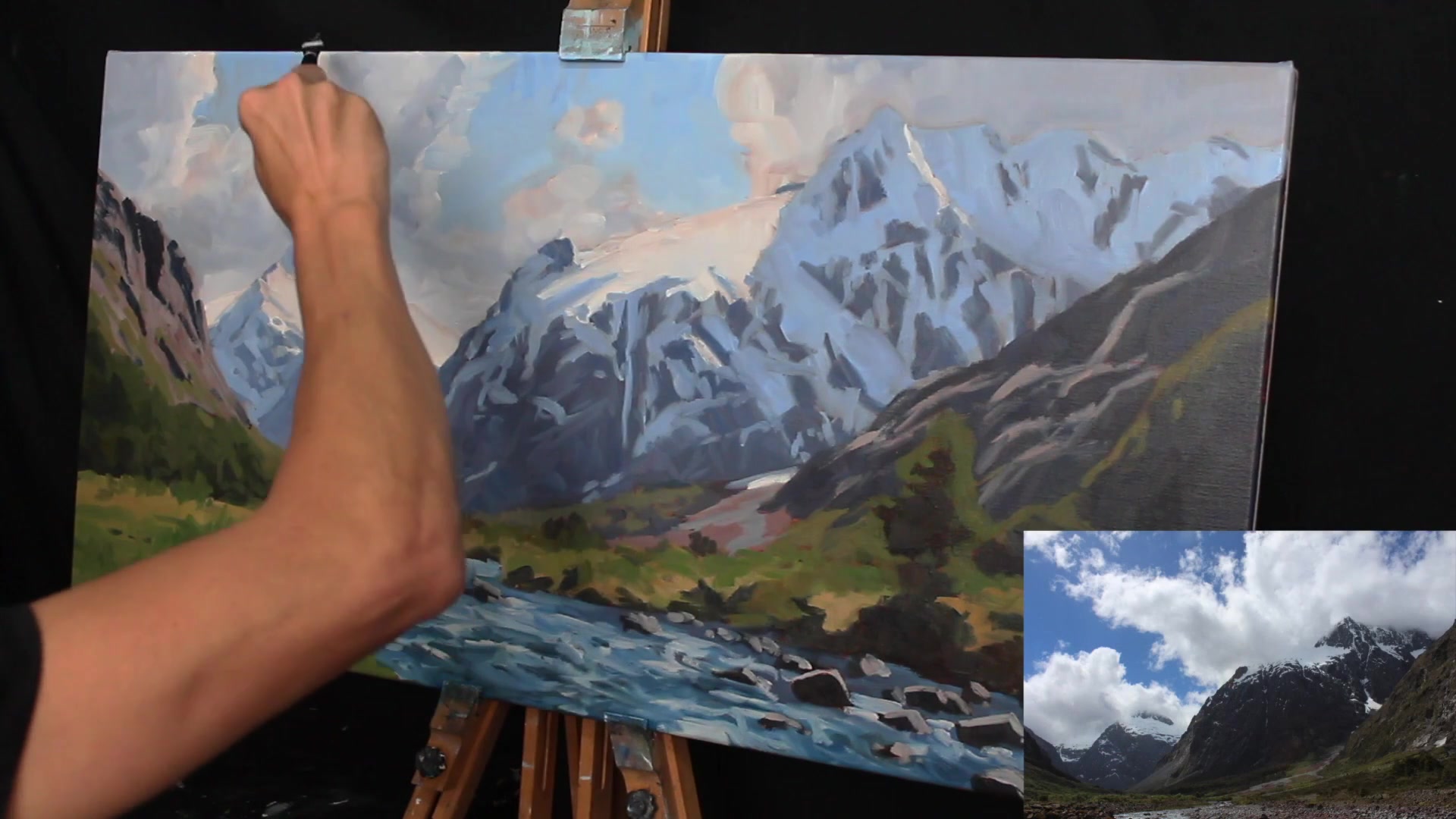
Use a number eight flat brush to begin working on the cloud highlights. Mix titanium white with ultramarine blue, burnt sienna, and quinacridone crimson to darken the white slightly. This lighter value compared to the first layer helps the clouds recede and adds depth.
Add Cloud Edges and Wisps
Mark the edges of the clouds where the sun shines through. Paint wisps on some cloud edges to create the illusion of windy conditions at the mountain tops.
Mix and Apply Cloud Shadows
Add ultramarine blue, burnt sienna, and quinacridone crimson to your cloud highlight mix for shadows. Edge the mixture towards blue for cleaner, natural-looking clouds. Blend the shadow mix with the highlights to build form and texture.
Refine Sky and Clouds
Repaint the sky using titanium white, ultramarine blue, and a touch of phthalo green. Adjust the sky mix with more titanium white to define negative spaces around clouds and mountains. Add highlights to clouds as needed.
Evaluate and Adjust Composition
Remove any distracting elements, such as a small cloud near the canvas center. Adjust as you paint to maintain a harmonious composition.
Pro tipEdge your cloud shadow mixture towards blue for cleaner and more natural-looking clouds.
Embark on your mountain valley painting journey by thoughtfully planning your composition. Nature is your muse, but not your master—use your artistic license to rearrange elements for a more compelling design. Begin with quick sketches to explore different compositions and establish a solid foundation for your painting. This preparatory work ensures that your painting will capture the essence of the scene while maintaining artistic integrity.
As you progress, focus on the interplay of light and shadow. Use a variety of pencils to sketch and define your values, and create a small color study to test your palette choices. This step is crucial for ensuring that your colors and values are effective in conveying the mood and depth of your scene. Pay attention to the harmonious use of colors, employing a limited palette to maintain cohesion and using complementary colors to enhance vibrancy.
Finally, bring your painting to life by carefully layering colors and textures. Use larger brushes to establish the foundation and smaller ones for detail work. Remember to prepare your canvas properly and use the color wheel to guide your color mixing. As you block in shadows and refine details, keep the atmospheric perspective in mind to create a sense of depth and realism. With these techniques, your mountain valley painting will be a testament to your growing skills and artistic vision.
Points to remember
Use a sketchbook to experiment with different compositions before starting your painting.
Use a 4H pencil for light marks and a 4B pencil for dark shadows to effectively plan your composition.
Create a small color study to test your painting's colors and values before committing to a larger piece.
Avoid placing the focal point in the center to maintain a dynamic composition.
Use Phthalo Green sparingly to prevent it from overpowering your color mixtures.
Begin with larger brushes to establish the painting's foundation, then use smaller brushes for detail work.
To desaturate a color, mix it with its complementary opposite on the color wheel.
Convert your reference photo to black and white to easily identify and match dark values.